Swiss Army Knife

Imagine you are a Swiss Army Knife with at least 8 to 10 tools you will need to be successful in your career after SCCA. List the tools you will need, in the following three categories:
Tools you currently have.
Tools you have that need development.
Tools you do not have that you need to learn.

Tools I currently have

  • Illustration
  • Basics of Adobe Illustrator, InDesign and Photoshop
  • Some real-world experience as a graphic designer
  • Some real-world experience working with clients

Tools that need development

  • Effective use of my illustration skills in design work
  • Adobe CC keyboard shortcuts and other time-saving tricks
  • Organization skills (for files, layers, tasks, invoices, etc.)
  • Building a portfolio
  • Tips and skills for communicating/setting expectations with clients

Tools I need to learn

  • All things Figma
  • Accessible design
  • How to create effective, balanced color palettes
  • How to integrate type into my designs
  • Working with a creative brief

Playing Art Director with an AI Image Generator

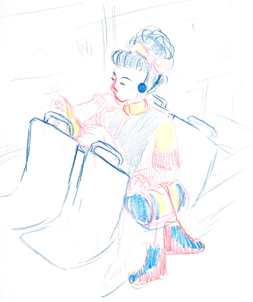
Our project this week was to use an AI image generator of our choice to generate three rounds of images. The theme I chose from the provided list was “taking the bus to the roller rink,” and I used Microsoft Bing Image Creator to generate my images. After writing my first prompt, I made this quick sketch of what I wanted my image to look like:

The first prompt I wrote was:

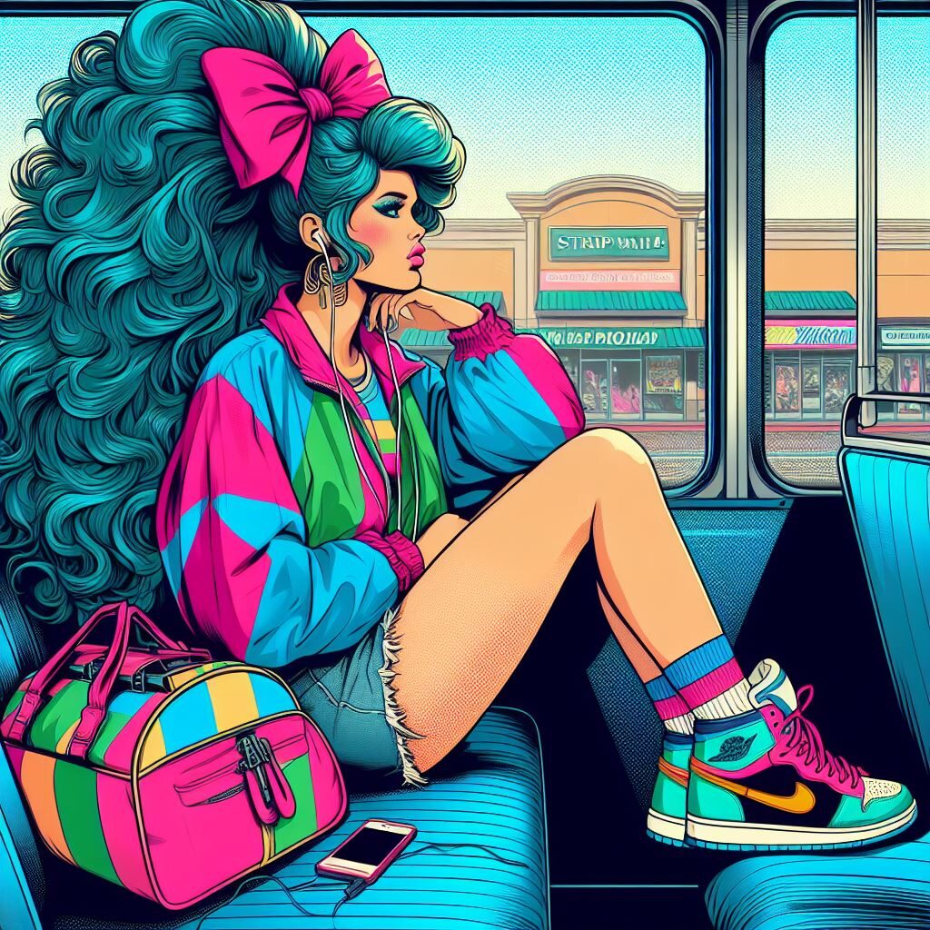
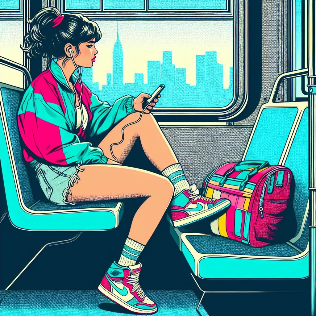
A pop art illustration of a teen girl on a city busy. She is wearing tennis shoes, cutoff jean shorts, and a colorful windbreaker. She is listening to a walkman and looking out the window. She is sitting slouched down in her seat with one foot propped up on the seat back in front of her. On the seat next to her is a color-block duffle bag and a pair of pink roller skates. Out the window of the bus is a blurry cityscape. The image is rendered mostly in aqua blue, bubblegum pink and fluorescent yellow.

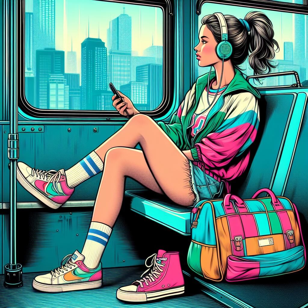
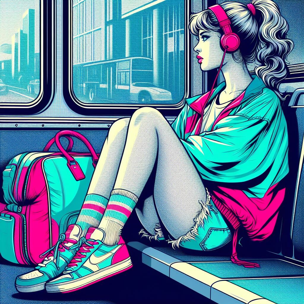
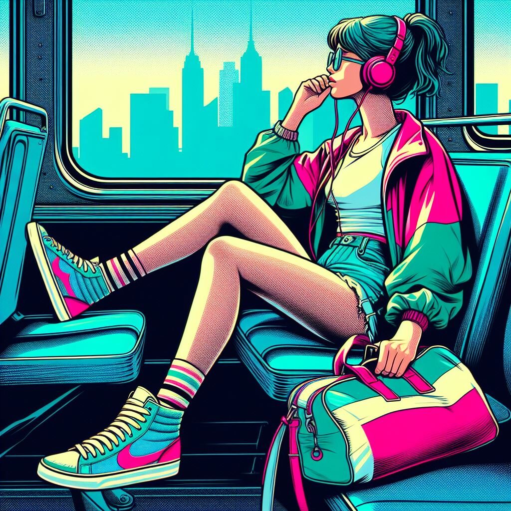
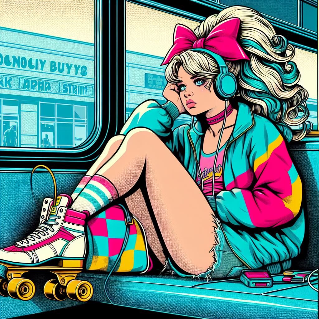
With this prompt, Image Creator generated the following four images.

I was honestly pretty surprised by how close this got to my initial vision in color, style, and mood. However, these images were missing a few details, including the big hair (which I forgot to write into the prompt) and the roller skates (which I did not forget to write into the prompt). For fun, I also decided to add a different setting in the second round—in my head, she’s a fun-loving girl stuck in a stripmall town without much going on, so the roller rink is her outlet.

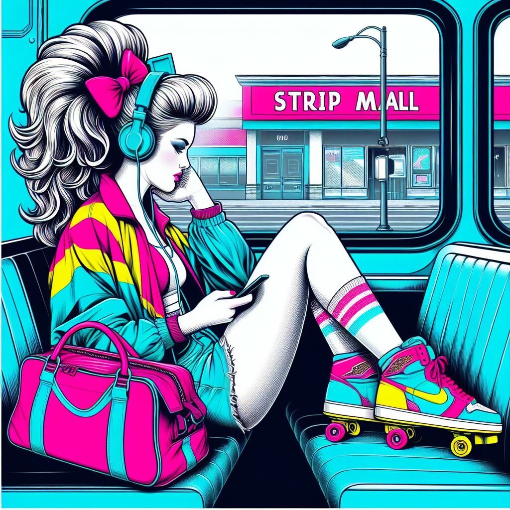
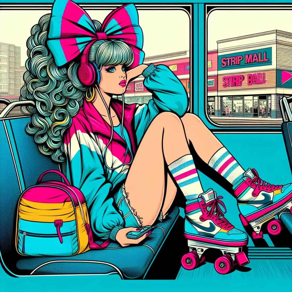
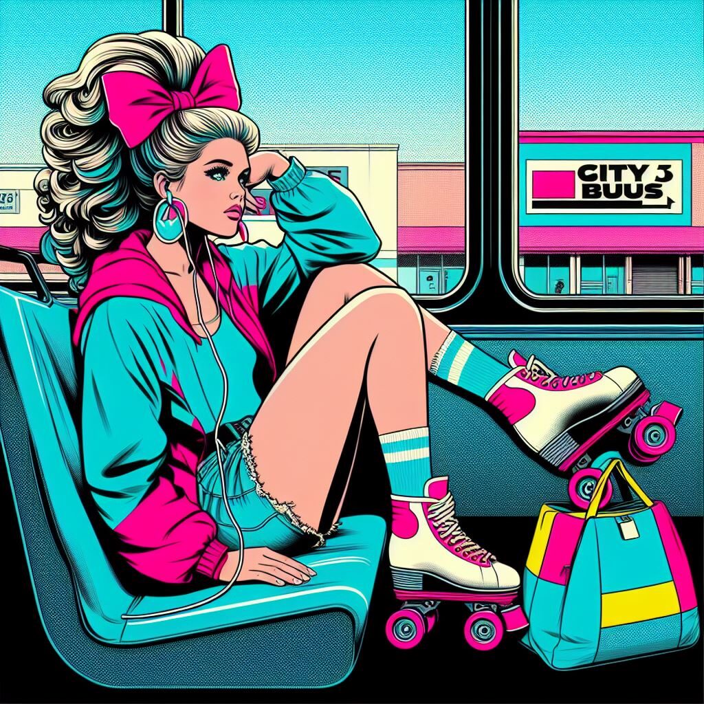
A pop art illustration of a teen girl with big hair on a city busy. She is wearing tennis shoes, cutoff shorts, a giant hair bow, and a colorful windbreaker. She is listening to a walkman and looking out the window at strip mall. She is sitting slouched down in her seat with one foot propped up. On the seat next to her is a color-block duffle bag. On top of the duffle bag is a pair of roller skates. The image is rendered mostly in aqua blue, bubblegum pink, and neon yellow.

In the second round, I think the AI did fine with the hair and decently well with the strip mall (even though most of the buildings literally have “STRIP MALL” written on them), but it had a lot of trouble with the roller skates.I tweaked the prompt to try to get some of the details closer to what I wanted:

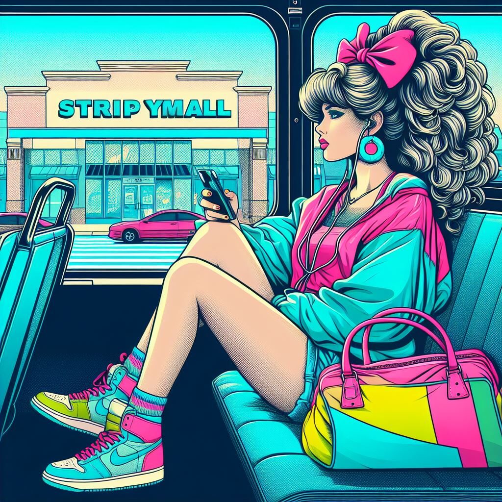
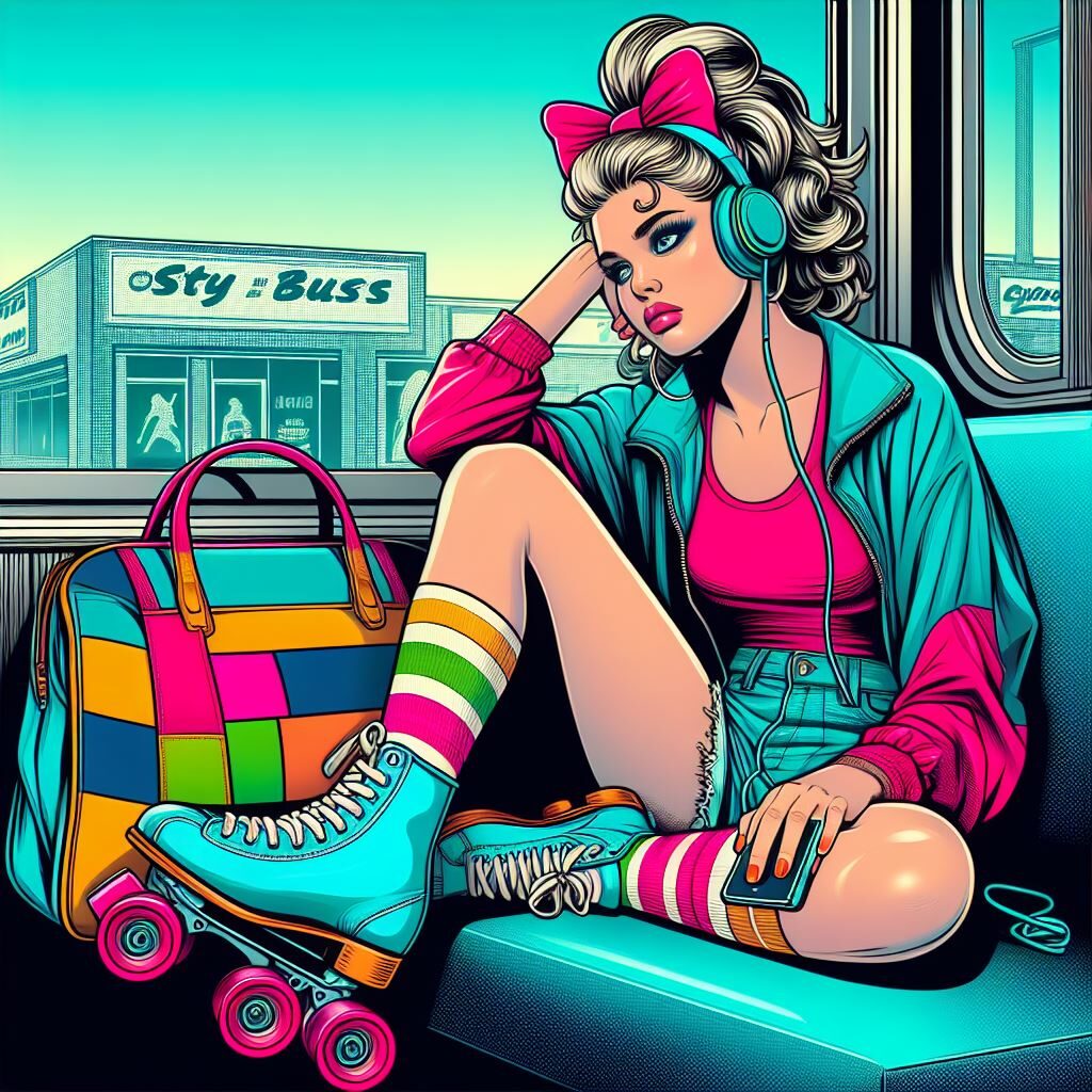
A pop art illustration of a teen girl with a bored expression and big hair on a city busy. She is holding a pair of roller skates on her lap. She is wearing tennis shoes, cutoff shorts, a giant hair bow, and a colorful windbreaker. She is listening to a walkman and looking out the window at strip mall. She is slouching with one foot propped up. On the seat next to her is a color-block duffle bag. The image is rendered mostly in aqua blue, bubblegum pink, and neon yellow.

Well, at least there was a minimum of one skate in each of the images in the last round. Not important, but I thought it was interesting that instead of STRIP MALL, it’s pulled some other text (variations on “city bus”) from my prompt to put on the sides of the buildings.

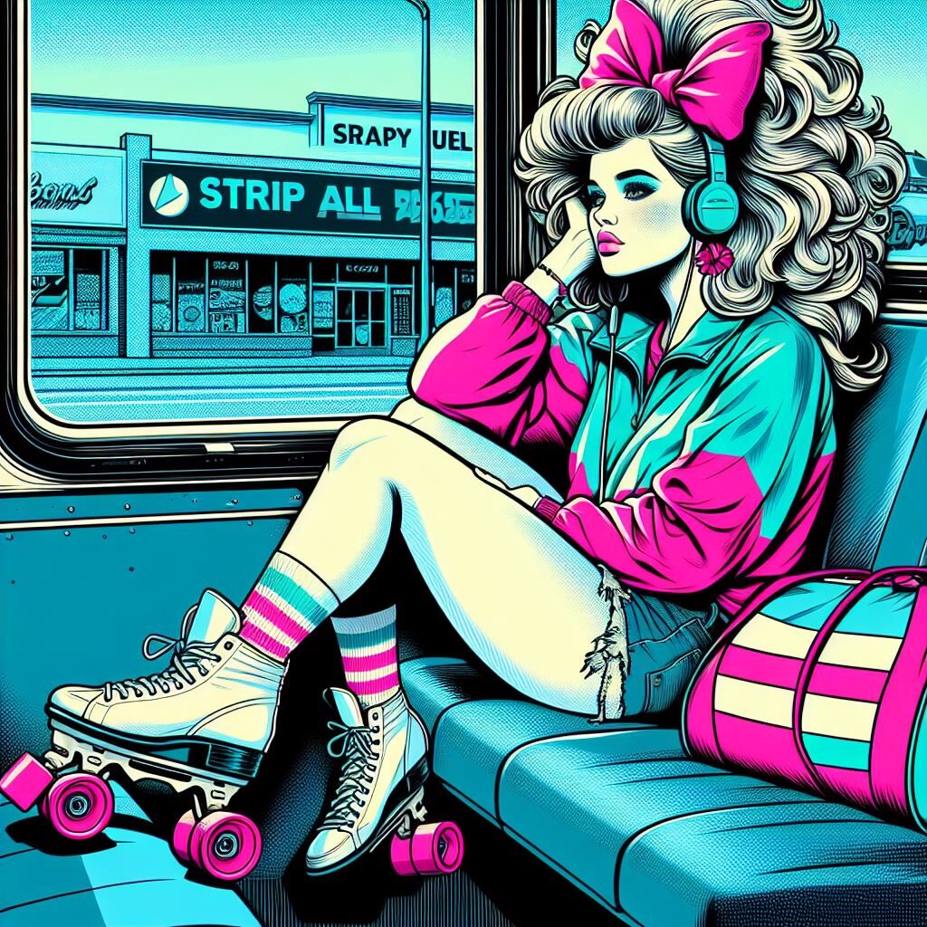
This was fun and challenging. I tried to make the request even clearer in the third round, but the skates were on her feet no matter what, sometimes missing wheels or combined with the tennis shoes or suspended in the air for no reason.

As far as usefulness, these are not images I would show to a client or use for any final product. They just have too many little anomalies—and because they are generated images, they wouldn’t be very easy to tweak. Where I do see this tool being helpful is in generating ideas and helping to flesh out my original vision. The small differences in mood, color palette, style, and composition of each of the images is helpful to me in visualizing how I could take my very rough sketch and turn it into a fleshed-out final illustration.

Why SCCA Should Get a RISO

I’m pitching some equipment today: a riso duplicator!

I picked this piece of equipment to research initially because I sell some zines that are printed on riso (by Paper Press Punch in Georgetown), so I wanted to take this opportunity to better understand the production process and equipment. In the process of researching these machines, though, I’ve come to believe that a risograph duplicator would actually be an amazing addition to the production studio at SCCA for their beauty, efficiency, and technical edge. The big caveat is the price–but more on that later. 

Riso is a brand of duplicator designed for high volume, limited color, short run printing by the Riso Kagaku Corporation. Riso machines use soy-based ink and uncoated paper to produce vibrant prints very quickly. The machine prints by burning tiny holes in a thin master sheet, then pushing ink through those holes onto the paper used for printing. Riso come in one and two-drum models, with the number of drums corresponding to the number of colors the machine can print in one run. Prints with additional colors require running the same piece of paper through the machine more than once.

 The production process is more complex than a laser printer, but less technical than traditional offset printing–and the resulting prints are beautiful and vividly colorful. The layering of spot color and slight variation in registration also give riso prints a certain retro aesthetic, which I think is part of why they are so popular with zinemakers and artists right now. It’s definitely why I’ve chosen to have the zines I sell printed by Paper Press Punch. Here’s a quote from a video I watched (linked below) that describes the joy of printing with riso: 

As a design major, almost everything we do ends up being a laser print… you design something on a computer and it looks one way when it’s on a backlit screen, but then once it comes out [of the laser printer] it’s just dull. But with riso, it’s literally the opposite experience where you’ll design something and it comes out and it’s, like, bright and punchy and saturated and really unique.

In addition to the look of riso prints, I believe a riso machine would have value for my education and that of future students because of the opportunity it would afford for production experience with an ink printer. When I worked at Pride Foundation, I was the contact for our print vendor, Girlie Press. The experience of working with them to submit our design files, keep our printed materials on brand, and eventually design for the organization with their specifications in mind gave me a tiny glimpse into the world of offset printing. I don’t think I would have considered production as a career path before that, but once I started to learn how technical and physical as well as artistic that work is, I was fascinated. Riso is not the same as offset printing, but based on what I’ve heard from local riso shops and from a very excellent video out of the School of Visual Arts in New York’s RISO Lab, I think a risograph duplicator would give students like me to get hands-on experience with some of the key skills involved, setting up files, to working with spot color, to registration. 

Riso Kagaku makes many different models. Their M line of 2-color printers seems to be the most popular, but their S line is (presumably) less expensive and can still print multiple colors if you have the drums and the time. Additional materials required are ink, master sheets, and drums. The Riso Kagagu website does not publicly list prices, but I did reach out to them and will plan on updating this post (or the SCCA faculty) when I hear more. Friends have also recommended keeping an eye out for used or refurbished machines. Hallagans (based in Chicago) sells refurbished risographs and also sells other supplies necessary for printing. Local print shops like Paper Press Punch might also have leads on where to look for equipment closer to Seattle. Used machines online range from $1500 to upwards of $5000, depending on the model and condition. 

All in all, I had a great time researching riso. This is likely not something I’ll ever be able to buy for myself, due to space as well as price, but I would love to learn how to use one and to have access to a machine for projects. I believe a riso is something I and future students at SCCA (in both Graphic Design and Visual Media) would enjoy using! For further learning, I’ve included a few links to resources and local riso artists below. 

Links

RISO Lab: School of Visual Arts, NYC (video, 10 min) – great video on a dedicated riso lab in a school setting, featuring interviews with faculty and students about why riso is such a great fit for the school environment 

All About Riso (video, 13 min) – gets into how the machines work and why

Paper Press Punch – they print, teach classes, and run a Zine of the Month Club that I think SCCA students would really enjoy! 

Risograph Printing by Push/Pull Seattle – super cool art shop in Ballard with riso printing 

Anemone – zine resources, software, and collabs

Bear Bear – not local (they are based in Wisconsin), but their work is gorgeous (look at this one!)
Crafting Community Through Graphic Design

My path to design hasn’t been a direct one, but my varied personal and professional experiences inform my work and give me direction.

My love of illustration, my care for other humans, and my desire to leave any place I go a little better than I found it are all lessons from my early life that I bring to my design practice today. My father is a fine woodworker, naturalist, and environmental activist, and my mother is a physical therapist. I grew up in rural northern California in a little hippie artist town, going back and forth between their two homes. From my parents, I learned the importance of caring for people who are hurting and caring for the water and trees and animals we lived alongside. I also learned how to be flexible–maybe a little too flexible sometimes–and to listen and adapt quickly to change. I was a creative kid and was lucky to grow up surrounded by creative adults, from my dad’s woodworker friends to encouraging teachers to painters and printmakers. I was encouraged to draw, and I did that a lot growing up, especially during the summer when I would go with my dad to the Alaskan bush for a month or more at a time for his work. I kept an illustrated journal there to help me remember the plants and scenery I saw when we were out hiking. This instilled in me a desire to draw and write in a way that was not just pretty but also accurate and informational. I never felt like much of an “artist” for this reason, but looking back on it now, I can see the seeds of my interest in graphic design.

When I first came out as queer and trans to friends and family, I was recently divorced and living far from my hometown. My workplace wasn’t a safe space for me to be out. I found refuge in my off hours through volunteering in LGBTQ+ community. I’ve been a volunteer at Lambert House, an LGBTQ+ youth center here in Seattle, since 2016. My experiences as a drop-in center volunteer had a huge impact on me I got to witness the youth building connections with one another and supporting each other through all of the things they were going through,including the average teen challenges of navigating relationships or the less average (but sadly still not uncommon) experience of familial rejection or homelessness. I got to share little moments with them, like learning how to put on a chest binder for the first time and watching them dye their hair. It sounds pretty cheesy, but they taught me way more than I ever taught them. In particular, the experience of connecting with queer and trans people much younger and much older (the staff and some of the other volunteers) than me helped me feel rooted in my own community’s history and gave me a sense of connection and hope for the future. Seeing how vital and life-saving something as simple as an old house with some comfy couches, art supplies, and an army of volunteers convinced me that I wanted my work to be in service of something like that.

I was eventually able to take a position at a more affirming workplace when I started working at Pride Foundation in 2018. At that job, I really started to see how my love of illustration and design could intersect with community-building work. My work at Pride Foundation focused initially on event planning and written communications, but I had a hunch that I could do more, so I started asking for small design projects. They were well received and led to more, some of which were, in retrospect, far bigger and more complex than I had the skill for at the time. My proudest moment was when our “Community Care Package,” a printed year-end fundraising piece I designed and laid out in Illustrator and InDesign went out to hundreds of our supporters at the end of 2020–and people not only wrote back to us to tell us how much it meant to them, but mentioned it specifically when they made donations to our organization. It felt good to know that people liked my designs and illustrations, but even more than that, it hit me hard to think that something I made gave people a sense of community and even inspired them to give. My design translated into concrete support for BIPOC and LGBTQ+ communities across the Northwest. Sure, I hadn’t used global swatches and had to go back and recolor every little piece of every flower vector illustration individually before we could publish the digital version. And sure, I didn’t know anything about color theory or kerning. There are things I would do differently now, after just one quarter at SCCA. But I think this experience taught me that there is a massive need for design and effective communication outside of the corporate sector.If anything, I am more proud now of the Community Care Package and my other design efforts than I was in the moment.

I decided to drop everything and return to school because of these experiences. I’m here to build a more robust professional toolkit so that I can take those tools back to my community in some way. I’m not sure where my path after school will lead, but it’s been interesting and helpful to hear from guest speakers who incorporate their own identity, social justice, and activism into their practice. When I feel overwhelmed or frustrated, I think about their work, and the impact my work has already had, and it gets me excited for all of the new possibilities ahead.

Design Abroad

For this project I researched graphic design and UX/UI jobs in and around Tokyo, Japan. I picked Tokyo because I have lived in Japan before, I speak Japanese, and I have close friends there who I would like to be able to spend time with. I also think that the quality of life there is overall good. Japan has national health insurance, which means that medical care is accessible and affordable. Social systems and public infrastructure are also good. One challenge as a non-resident, however, is finding work and obtaining a visa. My Japanese used to be fluent, but I haven’t had much opportunity to use it over the last few years, so I’m pretty rusty. I was curious to see what jobs, if any, would be available that fit my situation.

Graphic Designer (Asus Japan) – 4,000,000-6,000,000 Japanese Yen

UX Designer – 4,800,000-6,000,000 Japanese Yen

Website Production – 3,720,000-4,243,200 Japanese Yen

Graphic Communication (IKEA) – salary not listed

Given the current exchange rate, these salaries wouldn’t go very far in Seattle, but even the lower range is more than enough for an apartment and other living expenses, at least outside of the Tokyo city limits. I checked out apartments along the train line I used to live on in Saitama Prefecture, and it looks like average rent is around 50,000-60,000 yen. Add to this another 70,000 to 100,000 for other living expenses and the salaries listed above would be comfortable. Only one mentions visa help, so I’m not sure how viable this fantasy really is, but it’s fun to think about.

Time is Fake (But Also Real)

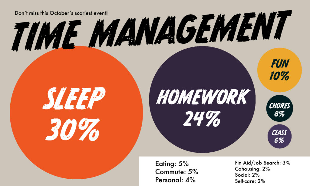
Task: track everything.

Frankly, I absolutely hated doing this, but I see the value in the exercise. I get sucked into projects and lose track of time frequently, so seeing the last week mapped out this way is helpful. My big take-aways are:

  1. I could probably be more efficient with my schoolwork outside of class hours. Maybe setting a timer when I start a project would be helpful.
  2. At least I’m getting enough sleep and making some time for fun.
  3. Do I really spend that much time eating??
Coding practiceHomework10/21/2023 8:30:0010/21/2023 9:30:00
Folding and putting away laundryChores10/21/2023 9:30:0010/21/2023 10:15:00
Ate breakfast and talked with my partnerMeal10/21/2023 10:15:0010/21/2023 10:35:00
Coding PracticeHomework10/21/2023 10:35:0010/21/2023 13:00:00
Lunch + watching YouTubeMeal10/21/2023 13:10:0010/21/2023 13:40:00
Yale School of Art ImageHomework10/21/2023 12:20:0010/21/2023 13:35:00
Apple Press EventSocial10/21/2023 15:10:0010/21/2023 16:12:00
Coding HomeworkHomework10/21/2023 13:40:0010/21/2023 15:05:00
Making pizza doughFood prep10/21/2023 16:15:0010/21/2023 16:45:00
Cat litterChores10/21/2023 16:45:0010/21/2023 16:50:00
Big John’s PFIShopping10/21/2023 16:53:0010/21/2023 17:05:00
Watching The ThingFun10/21/2023 17:05:0010/21/2023 18:00:00
Made pizzaFood prep12/30/1899 18:00:0012/30/1899 18:35:00
The ThingFun12/30/1899 18:35:0012/30/1899 20:00:00
DinnerMeal10/21/2023 18:45:0010/21/2023 19:15:00
The Mouth of MadnessFun10/21/2023 20:15:0010/21/2023 22:15:00
Sewing Halloween CostumeHobby10/21/2023 20:15:0010/21/2023 22:30:00
Get ready for bedHygiene10/21/2023 22:30:0010/21/2023 22:50:00
Bedtime ReadingPersonal10/21/2023 22:50:0010/21/2023 23:00:00
SleepSleep10/21/2023 23:00:0010/22/2023 8:35:00
BreakfastMeal10/22/2023 8:50:0010/22/2023 9:00:00
Feed CatsChores10/22/2023 8:40:0010/22/2023 8:45:00
Mop Common HouseJPC10/22/2023 9:05:0010/22/2023 10:10:00
Chatted with partnerSocial10/22/2023 10:10:0010/22/2023 10:25:00
ShowerHygiene10/22/2023 10:25:0010/22/2023 10:35:00
Updating this spreadsheetHomework10/22/2023 10:35:0010/22/2023 10:55:00
History ProjectHomework10/22/2023 11:00:0010/22/2023 12:45:00
ShisoChores10/22/2023 12:45:0010/22/2023 13:15:00
Making lunchFood prep10/22/2023 13:15:0010/22/2023 13:50:00
Eating lunchMeal10/22/2023 13:50:0010/22/2023 14:10:00
Washed cat cansChores10/22/2023 14:15:0010/22/2023 14:35:00
Set up for biz meetingJPC10/22/2023 14:45:0010/22/2023 15:00:00
JPC Business MeetingJPC10/22/2023 15:00:0010/22/2023 16:30:00
History readingHomework10/22/2023 16:30:0010/22/2023 17:00:00
Intro class mind map for Gender Justice LeagueHomework10/22/2023 17:00:0010/22/2023 17:30:00
DinnerMeal10/22/2023 17:35:0010/22/2023 18:20:00
Mind mappingHomework10/22/2023 18:20:0010/22/2023 18:45:00
More coding practiceHomework10/22/2023 18:45:0010/22/2023 20:00:00
Watched Our Flag Means Death and cuddled with catsFun10/22/2023 20:00:0010/22/2023 21:30:00
Get ready for bedHygiene10/22/2023 21:35:0010/22/2023 22:00:00
Bedtime ReadingPersonal10/22/2023 22:00:0010/22/2023 22:18:00
SleepSleep10/22/2023 22:18:0010/23/2023 6:40:00
Made coffeeFood prep10/23/2023 6:45:0010/23/2023 6:55:00
Fed catsChores10/23/2023 6:40:0010/23/2023 6:45:00
Coding gameHomework10/23/2023 7:10:0010/23/2023 7:41:00
Get dressed and ready for schoolPersonal10/23/2023 7:41:0010/23/2023 8:08:00
Bus to schoolCommute10/23/2023 8:10:0010/23/2023 8:45:00
Getting organized and logged in before classSchool10/23/2023 8:45:0010/23/2023 9:00:00
Erik’s Interactive ClassSchool10/23/2023 9:00:0010/23/2023 11:30:00
Coding study with classmateSchool10/23/2023 11:30:0010/23/2023 12:05:00
Groceries at H-Mart and QFCShopping10/23/2023 12:05:0010/23/2023 13:05:00
Walk homeCommute10/23/2023 13:05:0010/23/2023 13:40:00
Unpack and get ready for meetingPersonal10/23/2023 13:40:0010/23/2023 14:00:00
Financial Aid MeetingFinancial10/23/2023 14:00:0010/23/2023 14:35:00
Erik’s Zoom Office HoursSchool10/23/2023 14:35:0010/23/2023 15:30:00
FAFSA updateFinancial10/23/2023 15:30:0010/23/2023 16:10:00
Resume update and applying for jobsJob10/23/2023 16:10:0010/23/2023 17:30:00
Feed catsChores10/23/2023 17:30:0010/23/2023 17:45:00
CookingFood prep10/23/2023 17:45:0010/23/2023 18:45:00
Dinnner and Illustrator homeworkHomework10/23/2023 18:45:0010/23/2023 19:30:00
D&DFun10/23/2023 19:30:0010/23/2023 22:00:00
Get ready for bedHygiene10/23/2023 22:05:0010/23/2023 22:45:00
SleepSleep10/23/2023 22:47:0010/24/2023 6:45:00
ShowerHygiene10/24/2023 6:55:0010/24/2023 7:10:00
Photo project for auntPersonal10/24/2023 7:10:0010/24/2023 7:25:00
Made breakfastFood prep10/24/2023 7:25:0010/24/2023 7:40:00
Get dressed and ready for schoolPersonal10/24/2023 7:40:0010/24/2023 8:05:00
Walk and bus to schoolCommute10/24/2023 8:10:0010/24/2023 9:05:00
History of Graphic DesignClass10/24/2023 9:05:0010/24/2023 12:00:00
LunchMeal10/24/2023 12:00:0010/24/2023 12:15:00
Working on Illustrator ProjectHomework10/24/2023 12:15:0010/24/2023 13:02:00
In class work timeClass10/24/2023 13:0210/24/2023 14:05:00
Finished, printed, and submitted files for Illustrator Project #1Homework10/24/2023 14:05:0010/24/2023 15:10:00
Editing transcript for history projectHomework10/24/2023 15:10:0010/24/2023 16:00:00
Moodboard and sketches for Intro Project #2Homework10/24/2023 14:05:0010/24/2023 17:08:00
Worked with a classmate on using the pen toolHomework10/24/2023 17:08:0010/24/2023 17:25:00
Bus homeCommute10/24/2023 17:25:0010/24/2023 17:45:00
Ate dinner (leftovers)Meal10/24/2023 17:50:0010/24/2023 18:05:00
Changed into nicer clothesPersonal10/24/2023 18:05:0010/24/2023 18:30:00
Bus to Seattle CenterCommute10/24/2023 18:35:0010/24/2023 19:15:00
Suzy Izzard showFun10/24/2023 19:30:0010/24/2023 22:45:00
Second dinner at Dick’sMeal10/24/2023 22:45:0010/24/2023 23:00:00
Bus + walk homeCommute10/24/2023 23:00:0010/24/2023 23:25:00
Get ready for bedHygiene10/24/2023 23:25:0010/24/2023 23:45:00
SleepSleep10/24/2023 23:45:0010/25/2023 6:00:00
Fed catsChore10/25/2023 6:00:0010/25/2023 6:10:00
Watch Illustrator tutorial videosHomework10/25/2023 6:10:0010/25/2023 7:35:00
BreakfastMeal10/25/2023 7:35:0010/25/2023 7:50:00
Get dressed and ready for schoolPersonal10/25/2023 7:50:0010/25/2023 8:10:00
Bus to schoolCommute10/25/2023 8:15:0010/25/2023 8:50:00
Illustrator class Project 1 critiqueSchool10/25/2023 9:03:0010/25/2023 10:15:00
Illustrator lesson: curvature, width, blend toolsSchool10/25/2023 10:15:0010/25/2023 11:30:00
LunchMeal10/25/2023 11:30:0010/25/2023 12:15:00
Illustrator lesson: rotate tool, tips for graphic representation (project 2)Class10/25/2023 12:15:0010/25/2023 13:35:00
Worked on graphic representationHomework10/25/2023 13:35:0010/25/2023 14:20:00
User testing for a UX/UI module studentsHelping classmates10/25/2023 14:20:0010/25/2023 14:30:00
First round of sketches for graphic representationHomework10/25/2023 14:30:0010/25/2023 15:15:00
User testing for another UX/UI projectHelping classmates10/25/2023 15:15:0010/25/2023 15:30:00
Send first round of sketches to JasonHomework10/25/2023 15:30:0010/25/2023 15:50:00
Packed up my stuffPersonal10/25/2023 15:50:0010/25/2023 16:10:00
Walked into Cap Hill to drop off a resumeJob search10/25/2023 16:10:0010/25/2023 16:30:00
Walked downtownCommute10/25/2023 16:30:0010/25/2023 16:50:00
Job interviewJob search10/25/2023 17:00:0010/25/2023 17:15:00
Walked to the IDCommute10/25/2023 17:15:0010/25/2023 17:30:00
Bought a few groceries at UwajimayaShopping10/25/2023 17:30:0010/25/2023 18:00:00
Walked homeCommute10/25/2023 18:00:0010/25/2023 18:20:00
Cleaned up a horrible cat poop situationChores10/25/2023 18:20:0010/25/2023 18:40:00
Started beans in the crock potFood prep10/25/2023 18:50:0010/25/2023 19:10:00
Ate dinnerMeal10/25/2023 19:20:0010/25/2023 19:50:00
Washed food dehydratorChores10/25/2023 19:50:0010/25/2023 20:15:00
Called MomPersonal10/25/2023 19:35:0010/25/2023 20:35:00
Roasted tomatillos and jalapenosFood prep10/25/2023 20:40:0010/25/2023 20:55:00
Finished sketches for Jill’s classHomework10/25/2023 20:55:0010/25/2023 21:40:00
Updated this spreadsheetHomework10/25/2023 21:40:0010/25/2023 21:57:00
Get ready for bedPersonal10/25/2023 21:57:0010/25/2023 22:10:00
SleepSleep10/25/2023 22:30:0010/26/2023 7:35:00
Put away beansFood prep10/26/2023 7:35:0010/26/2023 7:45:00
BreakfastMeal10/26/2023 7:45:0010/26/2023 8:00:00
TherapyTherapy10/26/2023 8:00:0010/26/2023 8:30:00
Bus to schoolCommute10/26/2023 8:31:0010/26/2023 8:55:00
Jill’s intro class: added our sketches to Google SlidesClass10/26/2023 9:00:0010/26/2023 9:20:00
Jill’s intro class: split up unto groups based on subject for Project 2 and give feedbackHomework10/26/2023 9:20:0010/26/2023 10:20:00
Break (worked on sketches)Class10/26/2023 10:20:0010/26/2023 10:30:00
Jill’s intro class: iterating on sketches based on principlesClass10/26/2023 10:30:0010/26/2023 11:30:00
Jill’s intro class: provided feedback to group matesClass10/26/2023 11:45:0010/26/2023 12:15:00
Lunch: ate instant noodles (overslept and didn’t have time to make lunch this morning); talked with classmates over lunchMeal10/26/2023 12:15:0010/26/2023 13:15:00
Jill’s intro class: watched some videos about the grid systemClass10/26/2023 13:15:0010/26/2023 13:50:00
Jill’s intro class: asked for a little feedback on my logoClass10/26/2023 13:50:0010/26/2023 13:55:00
Worked on editing history project transcriptHomework10/26/2023 13:55:0010/26/2023 14:50:00
Chatted with Marc and classmates about this project, avoiding burnout, time managementSocial10/26/2023 14:50:0010/26/2023 15:20:00
Walked home (stopped on the way to pick up ginko seeds from the sidewalk in First Hill)Commute10/26/2023 15:30:0010/26/2023 16:20:00
Made dinnerFood prep10/26/2023 16:20:0010/26/2023 17:15:00
Washed dishesChores10/26/2023 17:15:0010/26/2023 17:40:00
Cleaned ginko nutsFood prep10/26/2023 17:40:0010/26/2023 17:55:00
Chatted with neighborsSocial10/26/2023 17:55:0010/26/2023 18:08:00
Capitol Hill Block Party: Husbands poster

CHBP Band Poster: Husbands

The assignment

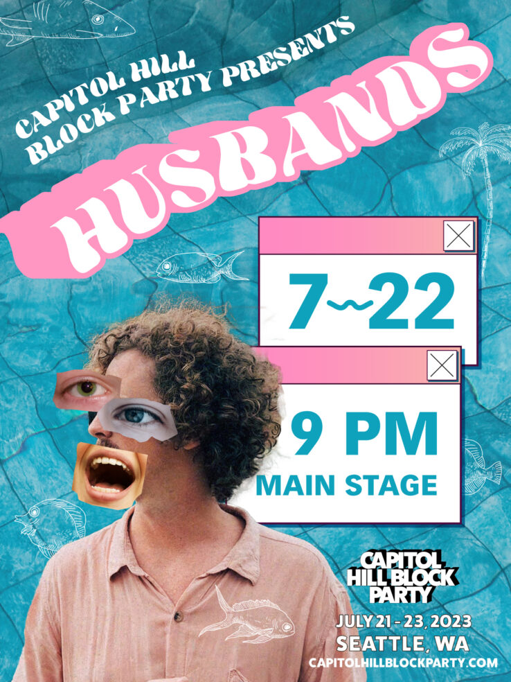
Design an 18” x 24” poster for the Husbands performance at Seattle’s Capitol Hill Block Party. The poster must include relevant information about the performance (fictional date/time/location) and the Block Party (city, state, dates, URL).

The “client”

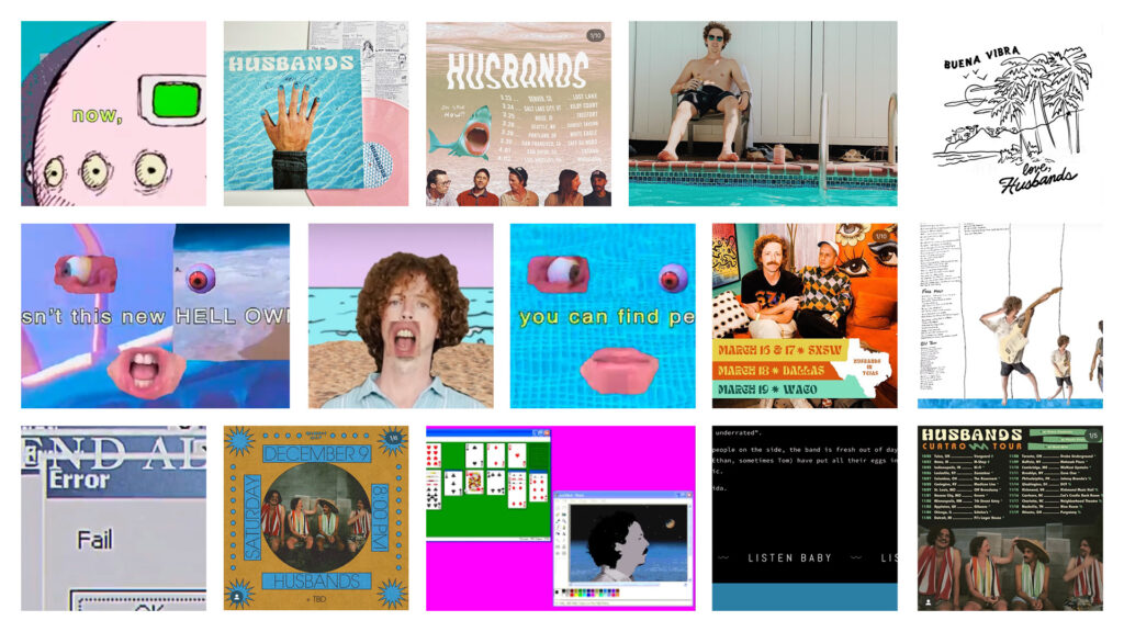
Husbands is a “indie, garage, surf, pop, rock” band based in Oklahoma City. Their sound is laidback and beachy, with what 405 Magazine describes as “intentional hints of anxiety” in some of their newer music. Their aesthetic is retro in a broad sense, with graphic references in their promotional materials and music videos ranging from midcentury beach vacation, to 70’s animation, to 90’s Windows computer graphics and early 00’s memes.

Husbands upcoming album, Cuatro, is the first solo project by Dan Davis following the recent departure of his bandmate, Wil Norton.

Want to give them a listen? Check out their recent release, Face Molt.

Images from Husbands website, social media, and music videos

The concept

I wanted a design that mirrors Husbands’ newest album art and music videos. My vision was for something summery, retro, and cheerful, but with a bizarre and unsettling edge that fits both the music scene and this band in particular. To achieve this, I used a bright teal, salmon, and pink color palette and a blue tiled pool background. The title typeface, HWT Arabesque, is modeled on 1960s psychedelic design with excessive effects applied—a nod to 1960’s surf rock and to 1990’s computer graphics, both of which are present in the band’s theming. The digital collage over Dan’s face with large eyes and mouth echoes how the musician depicts himself. The computer alert boxes serve practically to highlight the most important information about the show, evoke Husbands music videos, and add that “intentional hint of anxiety” as a counterbalance to the summer vacation vibes. Finally, I added some hand illustration to mirror Capitol Hill Block Party’s 2023 theming and add to the watery vacation feeling.

The solution

Additional photos by Adam Neumann, Addy Mae, Georgina Vigliecca, Maria Fernanda Pissioli (Unsplash).

Sources

Husbands Find Bliss in the Apocalypse (405 Magazine)

OKC duo Husbands gets intentional with sophomore album (The Oklahoman)

Optimism, Sunshine and Gearing up for SXSW (District Fray Magazine)

A Conversation with Husbands (Square One Magazine)