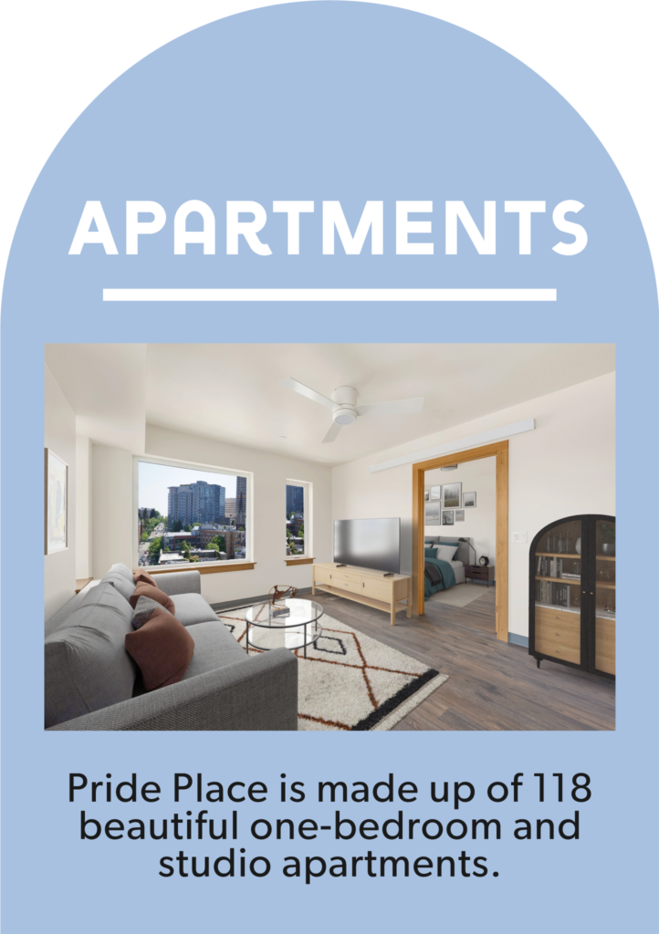
For my final AR project, I decided to focus on affordable housing in Seattle. I chose this Point of Interest because I think it’s important for people to know how public dollars like the Seattle Housing Levy go toward creating invaluable housing for people and communities who increasingly cannot afford to live in our city. Pride Place is located just a block away from Seattle Central, and it’s a really cool example of a collaboration between the city, a seasoned local affordable housing provider, and a nonprofit without prior experience administering housing but with deep knowledge of a specific community (in this case, LGBTQ+ elders) who are disproportionally affected by housing insecurity. I got to take a tour of Pride Place last year when it was still under construction, so I thought this would be a fun opportunity to share what I learned with my classmates.
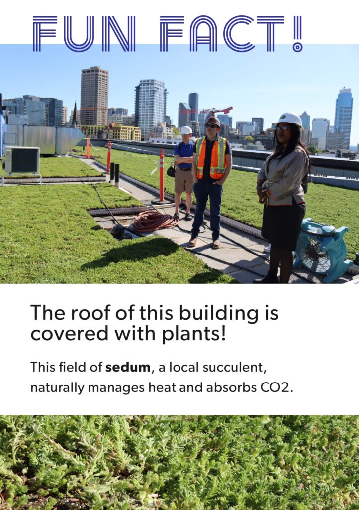
I created the panels in Illustrator with a combination of my own photographs, images from the Pride Place website, and images from Capitol Hill Seattle Blog’s coverage of the opening (photos by Alex Garland). The project is 6 panels introducing the building, its apartments and amenities, and some “fun facts” about the development and why it’s important. I opted for extra panels instead of trying to include sound with this.
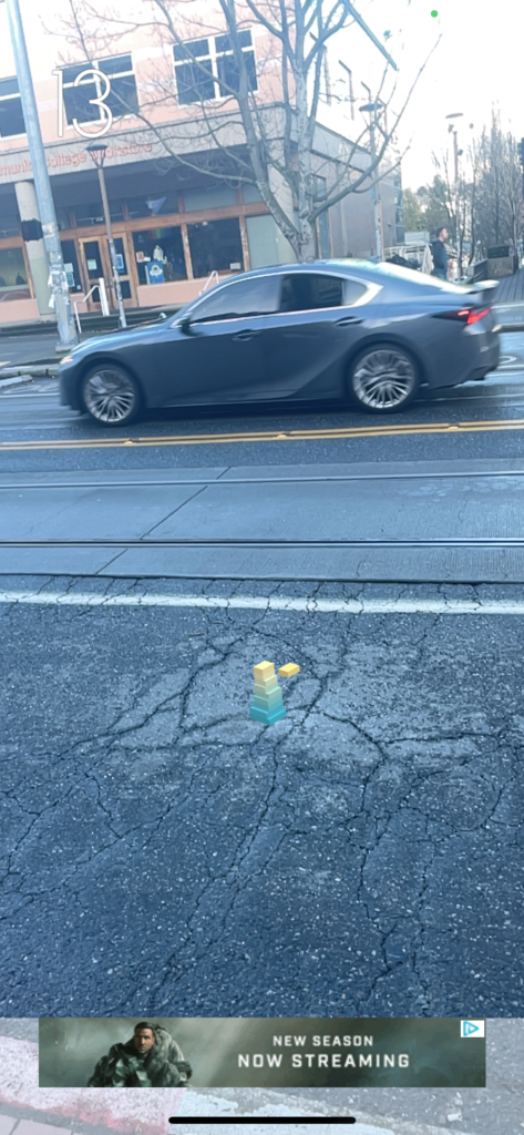
This was a fun project! The file size limit was definitely a challenge, but otherwise Eyejack was easy to use. The only other unexpected challenge I encountered was recording the experience. Pride Place is on Broadway, a busy pedestrian thoroughfare, and I was especially mindful of not wanting to make any residents who were coming or going uncomfortable. In the end I was able to get a relatively clean recording, but I would definitely think more carefully about my filming location if I were doing this again!
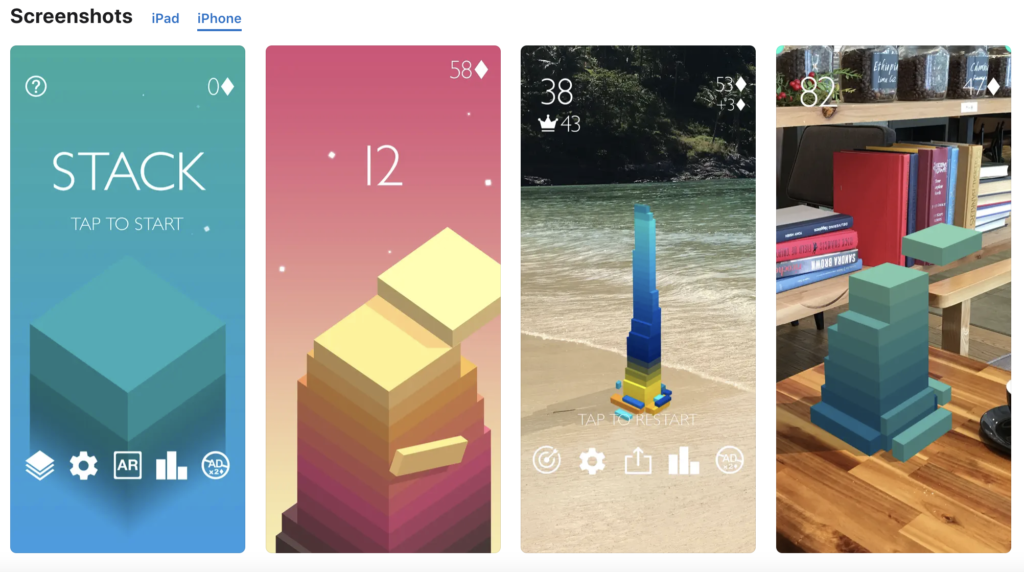
This week I’m reviewing Stack AR, a free game with an optional AR experience available in the App Store.
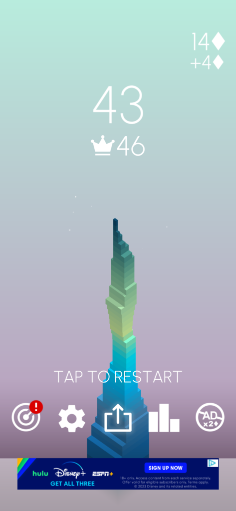
The game is simple and intuitive. A block slides back and forth rhythmically, and you try to tap it as it passes over the block underneath so that it lands perfectly on top. If you miss by a little, the part of the block that didn’t overlap the one below it will be cut off, leaving you with a smaller surface to place your next block on. The blocks shift in color as you go along, creating a pretty gradient. The aesthetic and UI are overall pretty minimalistic and clean (sometimes to the detriment of the user experience, in my opinion–but we’ll get to that in a moment). The App Store description says you can “play in Augmented Reality anywhere” and shows a screenshot of gameplay in AR mode on a lovely beach and a home library. Sounds low-key and fun.
Here’s what I thought worked well. The game is relatively intuitive, and this goes for the AR version too. There’s no real onboarding, but it’s not hard to pick up what you’re supposed to do. The color gradient on the blocks is pleasing. The animation is kind of fun to watch in your environment.
And that’s about it for positives. There might have been more if I weren’t here to review the AR functions, but I am.
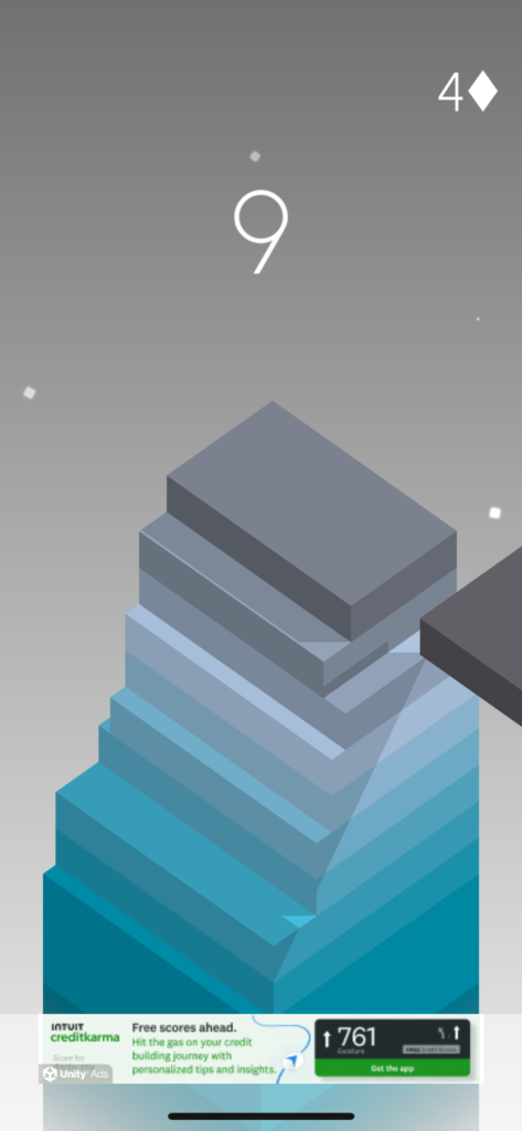
The AR mode in this game seems like a cool idea, but I found the experience a little frustrating for several reasons, including: As with a lot of AR experiences in my cluttered urban home, it was really tough to find a surface it would launch on to begin with, and when I did the stack often ended up very small–so small that it made it pretty hard to play the game at all. It worked better outside, but that left me with even more distance between myself and the stack. This is especially apparent when you compare AR and non-AR modes; the latter is much more zoomed in and the play takes up a lot more of your screen.
AR vs. Non-AR mode. Even on the closest surface I could get the experience to work on, the play area is just a lot smaller. In this game, that makes a difference.
The ads were OUT OF CONTROL. I know that’s how free mobile games are, but it was definitely worse that several others I play regularly. This combined with the poor display size in AR mode meant I spent a lot more time watching ads than actually playing. I would have absolutely given up over this after just a couple of rounds if I weren’t doing this for homework.
Non-AR mode is a visually appealing game, with nice composition and a subtle color gradient in the background. By comparison, when I play in AR mode I get to stack blocks in my messy apartment, or on the sidewalk, or on the bus! (Actually not on the bus–it does NOT work on the bus). The environment is distracting and, more importantly, not the escape I’m looking for when I play a mobile game like this. The beach/library screenshots from the app store shots look lovely, but my environment isn’t like that most of the time–and if it was I think I’d rather enjoy my time in other ways than playing this. This makes me question the point of having AR play for this game at all. For me, it doesn’t make a lot of sense.
AR vs. Non-AR mode gameplay. Which one would you rather play?
Finally, it felt like there were more on screen prompts, goals, and other messages when I played in non-AR mode than in AR mode. Later on when I looked at my own screenshots, it looks like some of them (ex: the counter for how many blocks you’ve stacked) might be there in AR mode but displayed differently. They were definitely easy to miss, and as one of the few elements of clear UI in the game it would have been nice to have them more prominent.
This was an interesting opportunity to reflect on what makes an AR experience fun and intriguing. For example, I haven’t played Pokemon Go, but I get why it’s exciting to have Pokemon you can capture and interact with appear in your environment with AR. Adding animated blocks to the world, however, doesn’t feel like a big add; in fact, the AR functionality takes away from the charm of the non-AR version of the game.
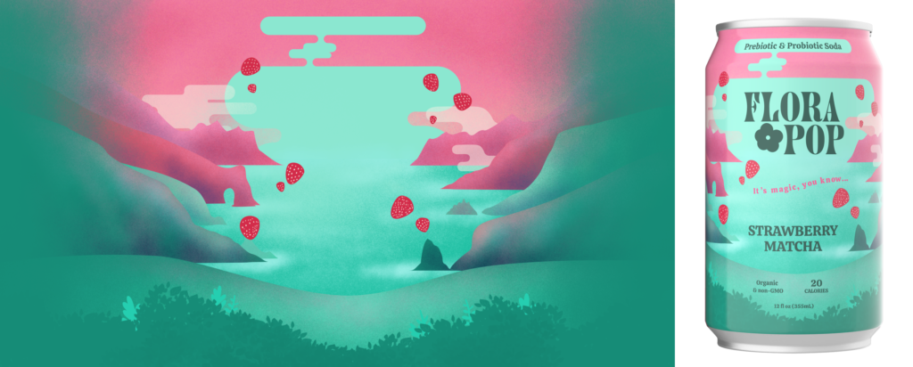
I found inspiration for this project through one of the example Aero projects on Behance: Take Me There by Susi Vetter and Carrie Gotch. I enjoy illustration and was intrigued by the idea of adding dimensionality and simple animation to something like this. Creating an illustration as detailed as the example that inspired me felt like too much to take on for this project, but I happen to have some layered scenery illustrations already made for packaging for a probiotic soda brand for Erik’s class, so I opted to modify one of those images for this project. This had the added benefit of a narrative for the project, as I can imagine a branded AR experience being an interesting addition to our website or social media.
This is the illustration from our probiotic soda can design that I attempted to turn into a 3D mural in Adobe Aero.
Fortunately, the creators of Take Me There included some information about their process in their Behance post. Before exporting separate layers from my Photoshop illustration, I took their advice and tried to eliminate sharp edges on the layers so that the scene would appear to dissolve into the environment. I added transparency to many of the clouds. I also changed the ratio of the image dramatically and shifted a lot of elements around to fill the additional space. My final experience includes clouds that shift back and forth, as well as a a strawberry that appears on proximity which, when tapped, flies upward and bursts into many other strawberries.
I ran into quite a few issues. Here are just a few:
Before even getting into Aero, figuring out how to structure and export my numerous Photoshop layers was a lot of work. My attempts to make the backmost layer “fade out” look pretty shoddy. Time ended up being a limiting factor and I wasn’t able to go back and make adjustments to the edges.
Placing the layers into the Aero scene was also a challenge. I thought the elements might include their relative place in my Photoshop canvas so that, by importing them in order and changing their Z coordinates, they would naturally line up, but this turned out to not be the case. I solved this by placing and adjusting the location of each element manually. This took a lot of time, and was essentially recreating the layout of an illustration I’d already created once in Photoshop. Adding to this was the fact that I didn’t really account for the viewing angle in 3D space, so some of the elements that overlapped each other didn’t actually extend far enough down. Now that I know this I would approach my workflow differently next time. I would definitely not spend so much time on the intricacies of my layout before placing everything in 3D space, and I would ensure that when 2D elements overlap, the element in the back extends much further behind the one in front than I would have it do in a purely 2D piece.
I initially set the cloud movements to be triggered by proximity, then later decided I’d rather have them animated from the start. I tried changing the trigger, but it seemed to mess up the movement of the clouds–instead of drifting slowly back and forth, they made several sudden, jerky, drastic jumps and then stopped moving altogether. With more time, my next step to solve this issue would be to delete the trigger and start over with the clouds, but as there are quite a few of them and I was already quite a few hours in, I opted to keep the trigger as proximity. Unfortunately, even though I set the proximity range pretty high, they don’t always seem to work in the actual experience (although in the preview they work just fine). The movements are also fairly small and subtle, so it’s sometimes difficult to tell if they’re actually moving or not when I’m viewing the experience on my phone.
I think the strawberry animation came out okay, but one thing I couldn’t figure out how to do was to stop the triggered strawberry from throbbing after it has been tapped and done its thing. Currently you can continue to tap the strawberry multiple times, and each time the animation causes it to climb higher and higher–which is funny, but not really what I was going for.
Finally, I had a lot of trouble finding surfaces that Aero would project onto, especially in my small apartment! I used a vertical anchor for this project, so I needed a wall, and the only place I could find in my house that Aero would acknowledge as a vertical surface was high up on a bookshelf in the bedroom, which made it pretty much impossible to view. Fortunately I remembered that this had been an issue in the past with Polycam and didn’t waste too much time trying to make it work at home. Even at school, though, where there’s plenty of open wall space, it took quite a long time to find a spot where the experience would actually launch.
Overall I found this challenging, but pretty fun. Even though my execution on this project was a little rougher than my original vision, I loved seeing my illustrations come to life, seeing how shifting perspective changes the experience, and getting to explore a scene I created. Aero is something I could see myself wanting to spend more time with in the future.
I love to go down to the water at low tide and look for intertidal animals, and I think it’s a great way for anyone to learn more about ecology, gain knowledge of local ecosystems, and build empathy and care for the natural world. For this project, I wanted to use some of the video clips I already have from those excursions to promote awareness of some of the cool things you can see at low tide.
Rather than using photos on the poster, I thought a bold graphic with a mysterious message would create a sense of intrigue and excitement. I designed the poster in Illustrator with a simple animation concept in mind that would segue into the nature clips in my video. The video/animation was created in AfterEffects.
I actually found this project pretty smooth and straightforward. The biggest challenge I encountered were remembering the basics of AfterEffects. It also took me a couple of tries to realize that I had to tap the “done” button at the end of the Eyejack upload process for my project to actually be published, but that wasn’t difficult to figure out.
The video clips are mine. The song is Swans in Flight by Asher Fulero via YouTube’s audio library, which is also where the wind sound effect at the beginning (which is pretty quiet) is from.