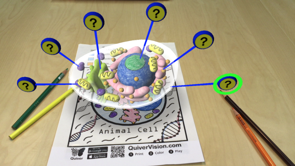
This week, I tested out the augmented reality coloring app, QuiverVision, to evaluate both user experience and educational value. While the app shows some promise, there were several pain points I noticed, that would be especially impactful for young users.
The onboarding process was confusing for me as an adult, no doubt even more so for children to manage independently. Requiring account registration by email before gaining access added unnecessary complexity compared to most apps targeting 6-10 year olds. Streamlining this process would definitely improve overall approachability.
Concerning educational content, the free version consisted of only a couple vaguely “educational” pages amidst more generic options. Expanding free access to include more substantive educational content would better align with the app’s billing as a learning resource. Ideally, some more free options that include science, history, and math subject matter could provide better enrichment for young learners.
Technically, I found the augmented reality animations in this app to be highly prone to glitching and errors. Frequently needing to re-scan colored pages due to AR failure points to optimization needs. Smoothing AR responsiveness and function, expanding device compatibility, improving tilt tolerance, and solidifying educational concepts behind animations would create a much more seamless experience.
While QuiverVision certainly shows creativity in transforming a typical coloring book activity into an interactive AR experience for kids, the execution falls short. Addressing frictions around registration, educational content, and technical performance could help the app live up to its premise. Furthermore, a focus on optimizing not just for engagement, but also for accessibility, enrichment, and delight for younger users, could really elevate overall user experience.