#3: Game Review

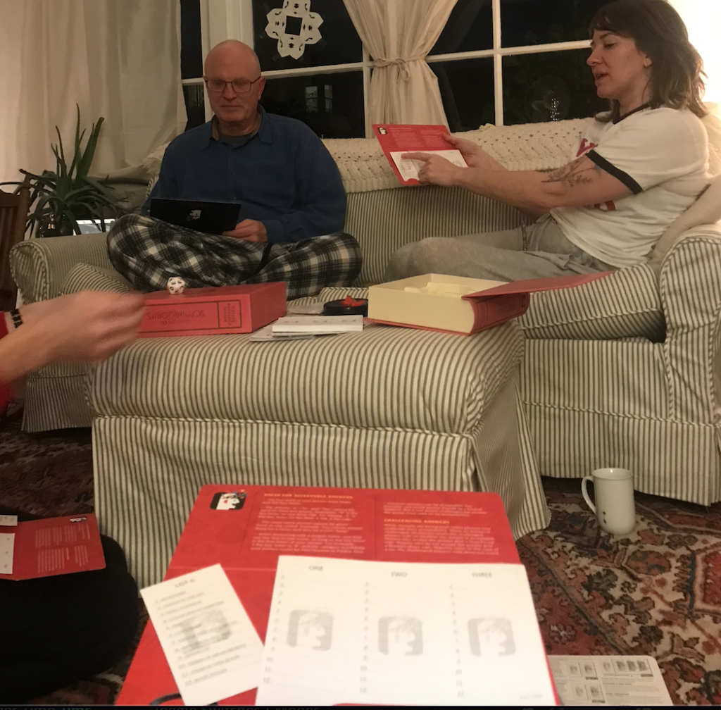
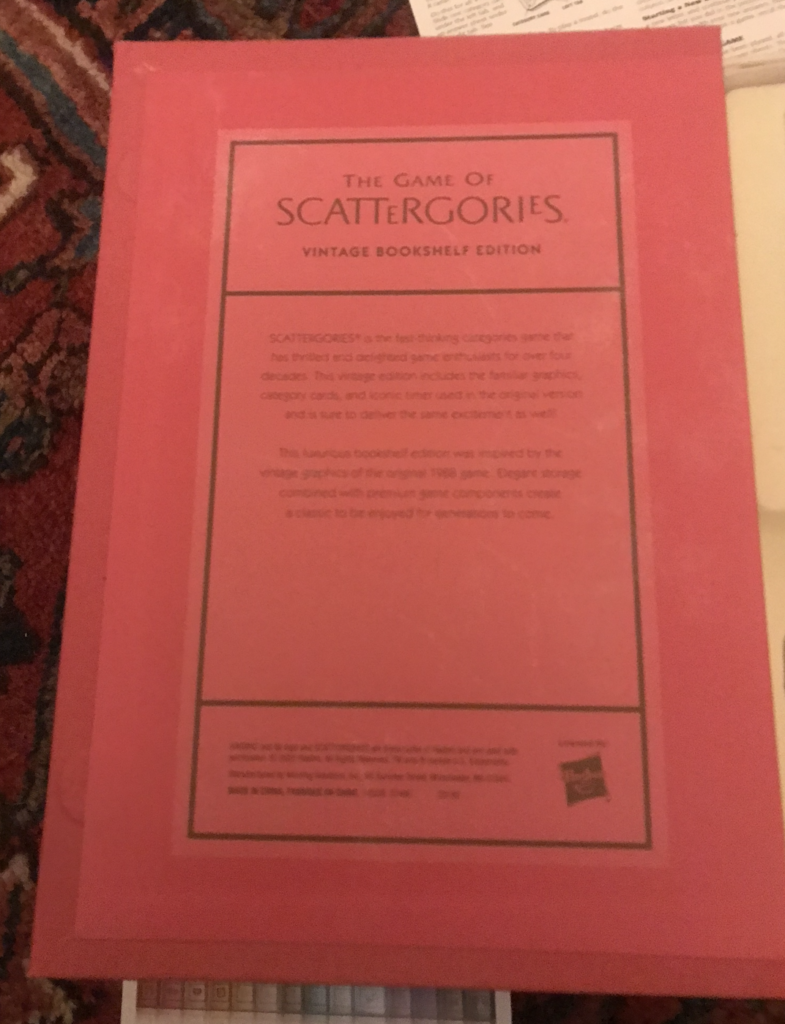
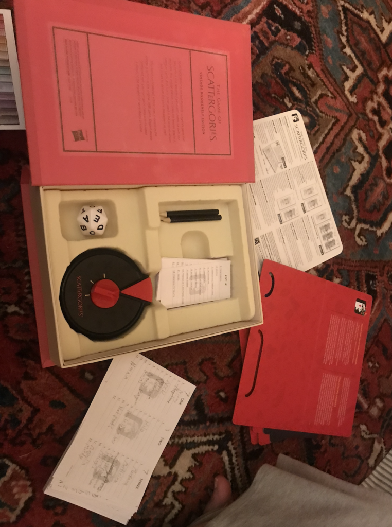
In the interest of expediency, I condensed my review to a series of bullet points. I chose the *UPDATED!* game of Scattergories as the focus of my review. I was playing and gathering feedback with friends Chelsea, Bob, and Cole. Images and observations as follows:
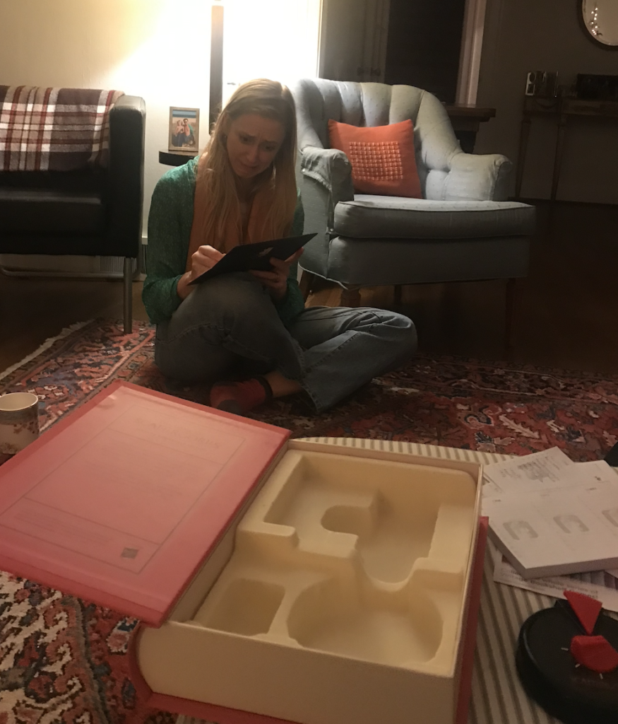
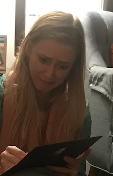
  1. Chelsea: “I LOVE everything about it”
  2. Effective new design/rebrand- book spine concept, logo
  3. Pads of paper should be printed on both sides- we wound up using the other side anyway
  4. “keeping score doesn’t matter” says Bob- Chelsea disagrees, saying she loves keeping score. I don’t give a rip about keeping score. We all decide it is personality-dependent.
  5. Timer sound is distracting and exciting at the same time. *see my face, above*
  6. Rebrand is great, inspires collecting the full set of similarly branded board games
  7. There is an interior decoration component, not just a game: meant to look good on a bookshelf, in a zoom call/instagram background shot
  8. Aesthetically pleasing
  9. Typeface fits Harry Potter collection on the bookshelf
  10. More likely to be prominently displayed on a shelf, not tucked away somewhere
  11. Pieces fit very well in containers

Who might be interested?

  1. airbnb hosts
  2. Mormons
  3. vacationers
  4. families
  5. ages 10+
  6. people who have some trivia knowledge

Specific thoughts on the manual timer component:

  1. “I was trauma laughing from the anxiety resulting from that timer.”
  2. mechanical vs digital click is slightly variable, adding to the tension of timer countdown
  3. we experimented with phone timer instead of ticker
  4. ticker was preferred by Chelsea, as it “kept my energy level high”
  5. Bob liked the quiet with phone timer, helped improve concentration without adding agitation
  6. I agreed with Bob

#2: My life as a pocket knife

Childhood camping experiences with my dad remain a vivid memory; the red Swiss Army knife with which I first learned to whittle by the campfire symbolizing a world of potential and discovery through successful use of a variety of tools. Just as that knife felt weighty in my hand and pocket, particularly in proportion to its size and shape, the breadth of both hard and soft skills, mixed with boundless creativity, required for success in the creative world (particularly with my eventual goal of Artistic or Creative Direction), require metaphorical “weight” and depth in terms of ability, experience, and creative vision, put into practice daily, over time.

I draw parallels between the shiny, new, somewhat stiff and reluctant unfolding tools in that red Swiss Army knife and the revelation and gradual acquisition of my skill set as a creative. How the repeated opening and closing of the knife mirrors the continuous refinement of my technical skills. This unfolding journey feels akin to the transition of this object from a captivating toy to a highly useful tool and vehicle for creative expression, where each skill becomes an essential piece of the whole, communicating a vision that would not be possible without mastery of all the tools in my arsenal.

I consider proficiency in Adobe Creative Suite as a well-crafted blade, slicing through visual challenges with precision, while the understanding and effective application of graphic design fundamentals functions as a screwdriver, tightening elements of a composition and ensuring a seamless result. My previous experience in music and sound design becomes useful when bridging audio and visual aspects of design, branding, and storytelling across mediums. Experience with web design is yet another tool that opens up possibilities, enabling cross-discipline understanding, communication between designers and developers, and types of work that span the entire scope of the design process from start to finish.

Some tools are more intuitive, such as the way my natural empathy helps with understanding a wide range of user experiences, and/or enables effective communication in a team setting across disciplines and work styles. While I have much to learn about the language and techniques of UX/UI, I look forward to applying my intuitive understanding to concepts and skills I have yet to learn.

I think back to whittling those sticks, learning to apply consistently firm pressure to gradually shape and soften the edges of the wood with my pocket knife, turning it into something beautiful- how that compares to the supportive and soft-skill-infused communication style, coupled with consistent and firm conviction of vision required to lead a creative team and work with a client to achieve an effective, innovative, and inspiring end result. While I obviously lack experience here, the path forward feels both achievable and exciting to me.

I’d like to think I’m a bit more useful and interesting than a pocket knife, but the metaphor is a useful lens through which to consider how far I have come, and what my creative future may hold.

#1: Pet-Friendly Interstellar Vacation

Pet-Friendly Interstellar Vacation lol

  • For image generation, I went with NightCafe
  • Prompt 1: “make a simple cartoon resembling this photo, except it should be featuring a cat lying on its back making a silly expression of pain, replacing the main character in this photo. An alien is about to break through the cat’s belly.” *I included with my prompt a reference photo of Sigourney Weaver in this scene
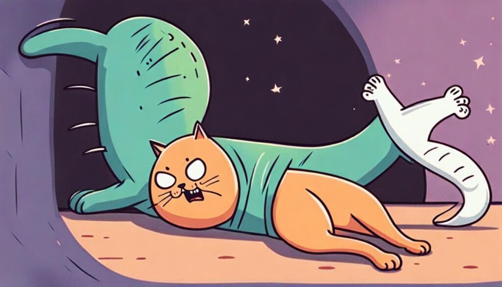
  • Result:
  • My reaction: wow, the woman is clearly more of an alien than whatever is inside her. Cat companion= cute version of Puss in Boots made creepy by strange expression and added appendages. Ok, on to the next one…
  • Prompt 2: make a pen sketch resembling this photo, with a cat (instead of a woman) lying on its back and screaming, as an alien is about to break through the cat’s belly
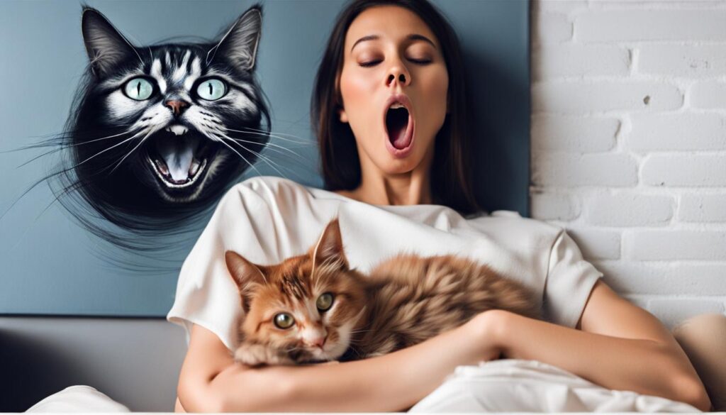
  • Result:
  • My reaction: this woman is clearly deriving too much pleasure from this experience. this image feels voyeuristic, with the combo of her expression and the vicious cat img on the wall, telling the viewer to back off/go away. ok, next:
  • Prompt 3: make a cartoon sketch with a cat lying on its back, making a ridiculous face while screaming, as an alien is about to break through the cat’s belly
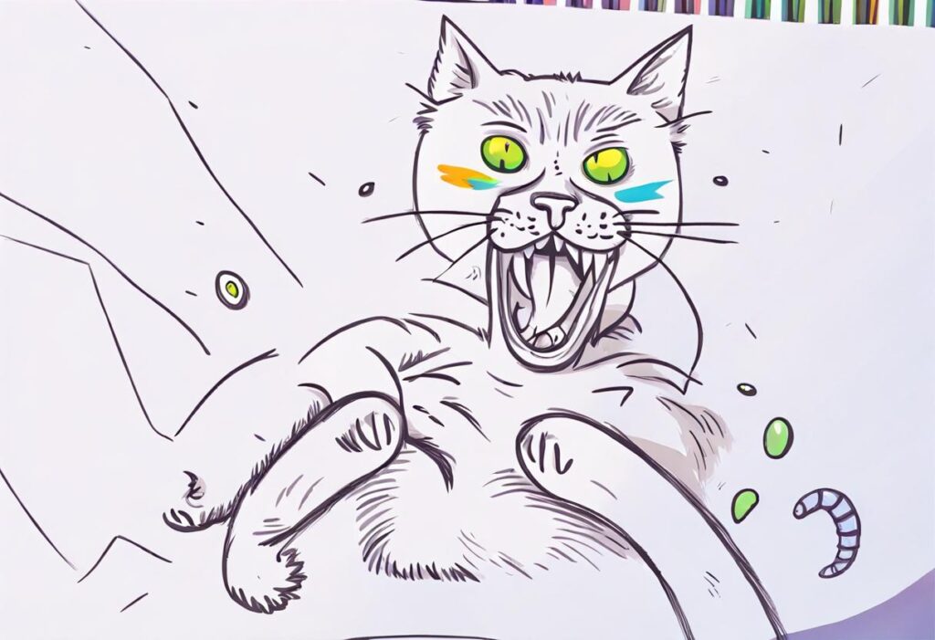
  • Result:
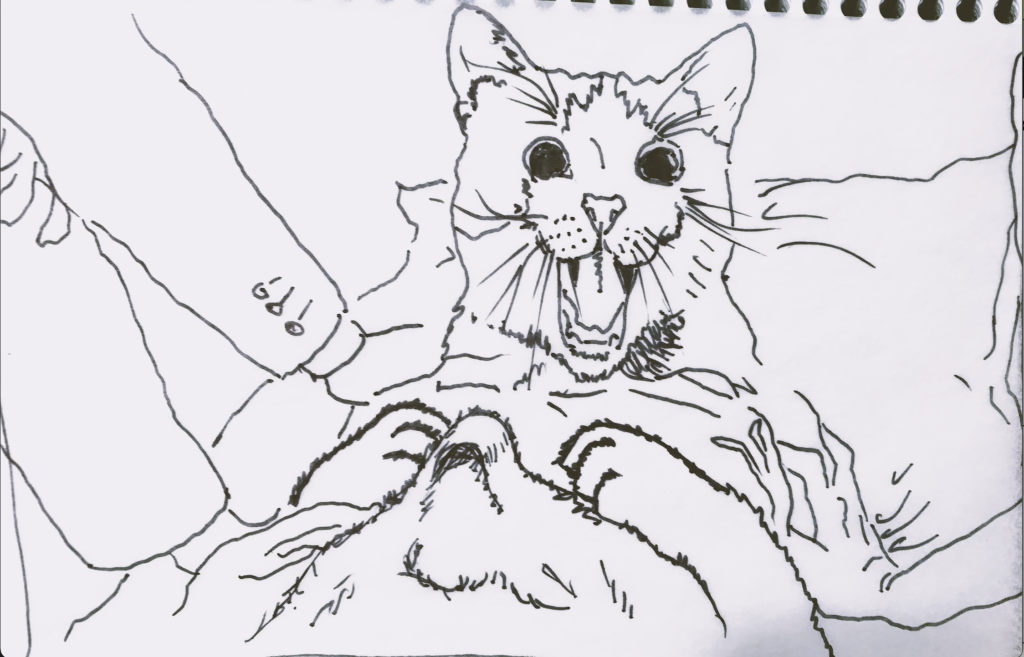
  • My reaction: I was so disappointed with this weird, straightjacketed, chicken-legged, angry cat-alient with a white elephant trunk outgrowth, that I tried one more, using my own sketch as a source image
  • Prompt 4: make a cartoon sketch with a cat lying on its back and making a ridiculous face while screaming, as an alien is about to break through the cat’s belly
  • Result:
  • This was a little closer to the end result I was after, but still pretty weak, overall.
  • Takeaways from this process, Using NightCafe:
  • 1. I liked that you could add some specificity to the image generation process by using a source image, but in this case, the source image seemed to frequently add confusion to the process of image generation.
  • 2. The minor adjustments that could be made in the side panel- prompt weight, refiner weight, noise weight, etc- also made for a more customizable user experience, giving a greater sense of control, though you don’t necessarily get the outcome you would expect by making those adjustments.
  • 3. Overall, I can see how this AI could be useful in helping generate some initial ideas and/or visuals for projects, but there are quite a few issues with it, keeping it from achieving a polished, curated, refined result that would be acceptable as a final product or project.
  • TL;DR- yet another quasi-helpful AI tool, but without the vision behind it and a lot of attempts and adjustments, won’t be terribly helpful.