Ah, the Super Bowl. One of my favorite events every year! I could barely wait to sit down with my rabid-football-fan friends and watch these modern-day gladiators destroy one another’s bodies on the field, over a stuffed pigskin, while scantily clad women on the sidelines wave pompoms and perpetuate sexualized stereotypes, doing nothing to improve the lot of women at large, all while stuffing my face with chips and pizza and beer, having some all-American couch potato fun plus a side of blatant consumerism, as the media distracts us all from pressing issues that profoundly affect peoples’ lives! What’s not to love?? Shall I keep going or can you tell I’m full of sh*t?
(This was kinda funny though.)
Anyhow, as I’m clearly not a close follower of anything football-related, I tracked down these ads online after the fact. Here are the ones I watched:
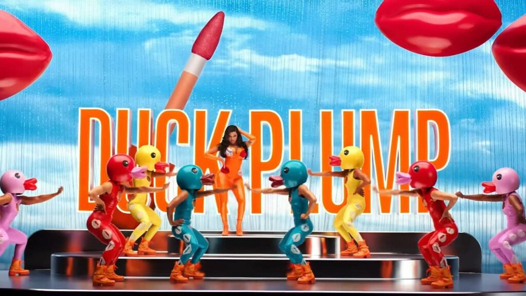
Cardi B’s D*ck Plumper for NYX Cosmetics UNCUT VERSION lol
Arnold gets lost in translation for State Farm
Unfunny celebrities being unfunny celebrities for Uber Eats
Hellmann’s waste of Kate McKinnon
Google’s refreshingly sincere “Faces in Frame” spot
Let’s start with Cardi B:

WHAT WORKED:
I learned that the racy NYX ad was only partially-aired, due to NSFW subject matter, with a QR code to see the rest of it.
The latter half of the ad is precisely what gives it a punchline/purpose, and I’m curious how intentional all of this was. Did execs know ahead of time that at least part of it would be rejected, hoping that there would be enough buzz about content in the latter half to get people to watch it after the fact?
Regardless, I thought it was successful in poking fun at typical football-dude-frat-bro advertising and consumer culture, instead centering this very demographic in the ad as the hapless bros who misread the lip gloss label and applied the product in hopeful, yet ill-advised ways: “They put it where??…Why?”
The pink/orange color scheme and vaguely Britney “Oops” meets the Teletubbies early aughts vibe touches on a current advertising trend that’s a little bit nostalgic, a little bit cheesy, a little bit sexy, featuring throwback colors and a well-recognized celeb as the face of the brand. See here for another strong example of this.
WHAT DIDN’T WORK:
I don’t find Cardi B to be a particularly compelling actress, despite her entertaining sass. Her parting words, while well-scripted, sounded wooden, to my ears, leaving the viewer with a weaker impression than it could have been. Star power doesn’t always translate into effective casting and/or storytelling.
IN CONCLUSION:
I think the ad is successful, overall. It’s saucy, silly, and fun, while being a little bit subversive in the right ways. It lands much better than some of the others.
Moving on to Google “Javier in Frame”
WHAT WORKED:
I thought this ad was well done in terms of realistically conveying a different kind of user end experience than most of us generally consider, which is an especially useful reminder in terms of designing for accessibility. I did a little research and learned that they achieved the blurred vision effect by applying petroleum jelly to the camera lens. I appreciated that the filmmaker is, himself, blind.
WHAT DIDN’T WORK:
Call me a cynic, but the emotional sucker punch ads just don’t quite get me like they used to. Maybe because I scored so many ads like that while working in the music industry. All with similar creative briefs- passage of time, people fall in love, family members grow up, touching moments between parents and kids, watery piano with a slow orchestral build, landing on the important chords at the right moments to match visual cues, etc etc. The music production house I worked for in NYC actually scored this Google “Parisian Love” spot, which ends almost identically to the “Javier in Frame” spot, only this one uses the AI Pixel “face in frame” feature, rather than the Google search bar, to illustrate the near-identical story ending. If I had to pinpoint exactly what kicked off this trend, I might suggest it all started with this scene, which has been endlessly recycled with slight variations (and less catchy music), ever since. Frankly, at this point, I’m bored. So what might have worked better, you may be asking? I think of the surprisingly emotional moments that cut through the noise of “Everything Everywhere” and how effective that was- pausing the chaos of modern life long enough to remember what matters. Maybe taking that angle more often in advertising could fill the “touching life moments montage” space that feels pretty played out at this point, idk. Does make me curious how the Daniels might have directed a different version of the Google ad. Maybe next year.
