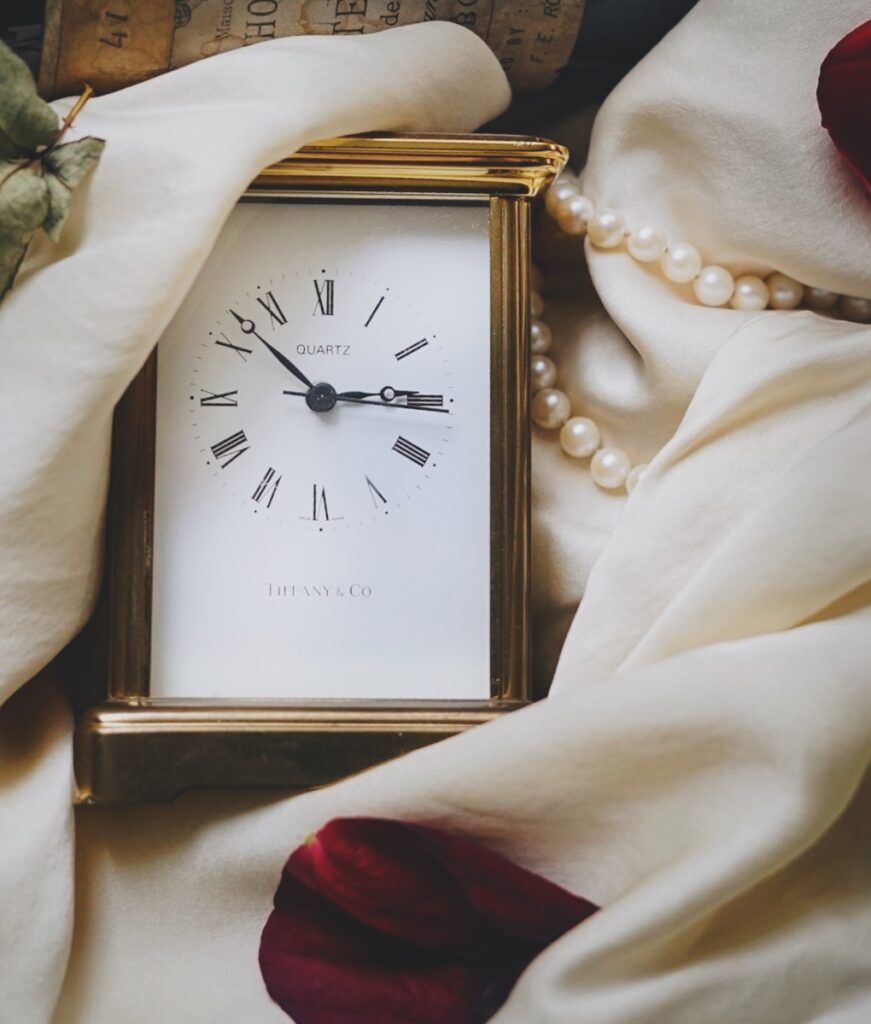
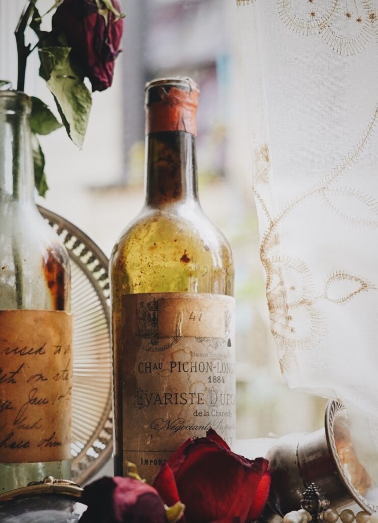
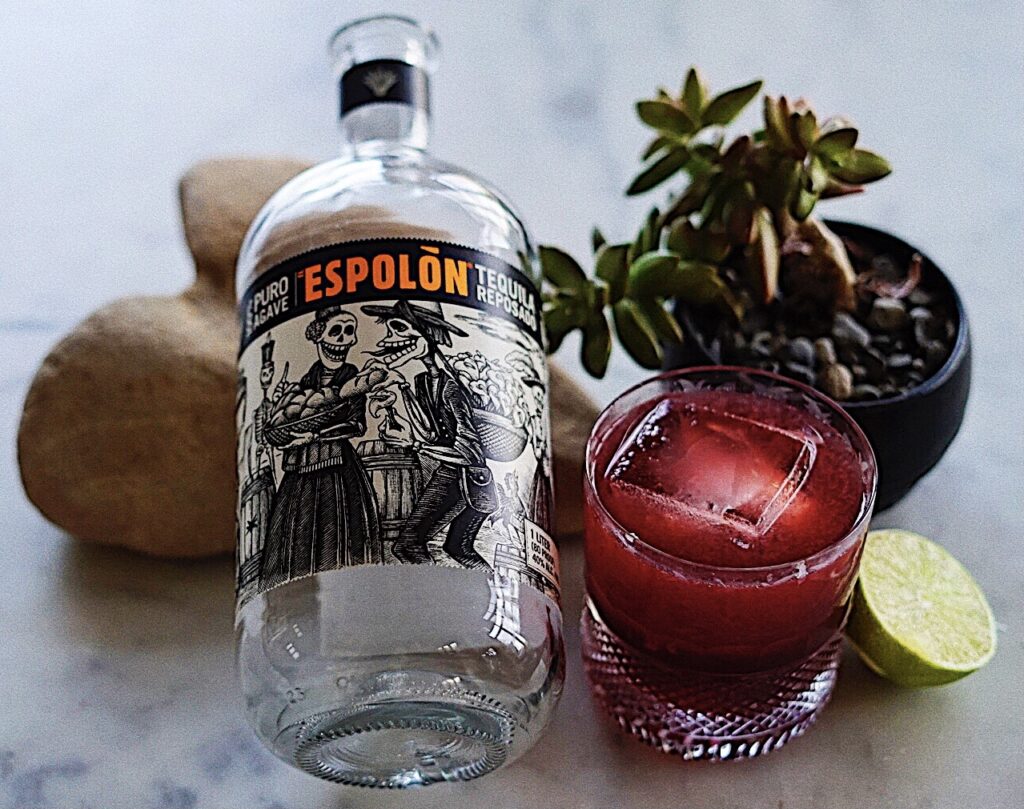
It is Friday. Time for tequila! Here is my “little world.”
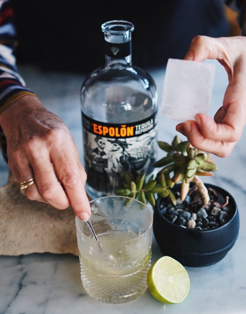
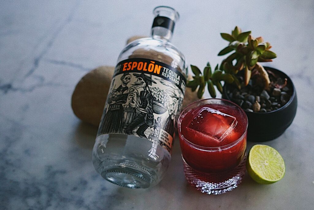
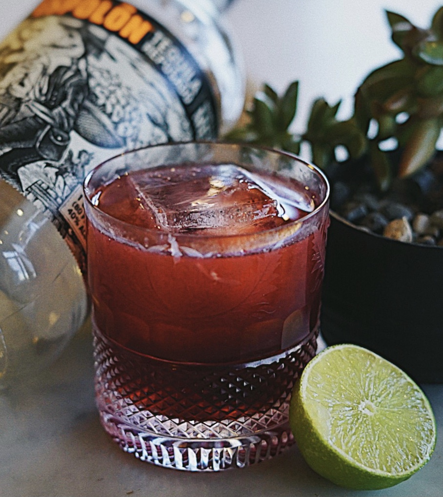
I added some saturation to bring out the red and green, added some clarity and grain to make it feel a bit cinematic (or something), upped the exposure and the contrast ever so slightly. Experimented with slightly different editing treatments, and with shifting camera focus- ice cube, hands, label, lime.
I used an earth-toned, heart-shaped rock to give a feeling of love for the art of making tequila drinks, as well as hinting at a warmer dry climate, alongside a succulent plant that adds to the feeling and balance of the composition. I went for a classic tequila pairing and pop of color with the half of a lime, and then a red drink for color, contrast, and a way to update said classic margarita. I like the geometry of the circular lime cut, paired with the square surface of the ice cube. I tried to capture the way the base of the glass catches the light. I chose various stone elements (marble counter, heart rock, pebbles at the base of the plant) for the way they complement one another. I like how the human interaction in one of the images adds momentum and tells a story.
That’s all I have. Cheers!
I got inspired to do a second round of these, when I had a bit more time over the weekend.
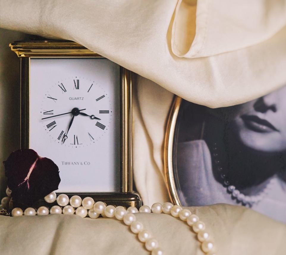
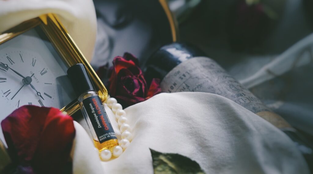
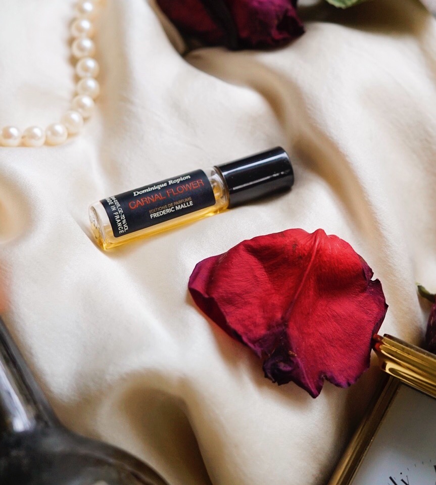
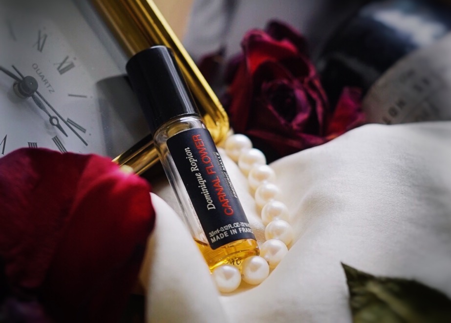
I had some wilted roses left over from Valentine’s Day, as well as an ancient wine bottle (from 1884!) that was found in the wall of my childhood home, both of which I thought could be fun to use in a second shoot. For both the clock and the perfume, I aimed for something in the realm of Miss Havisham/beauty-meets-decay/romance/TIME(LESS). This camera is new to me, and I was struggling a little bit to get the brand names perfectly in focus. However, I think my staging turned out pretty well. I messed around with different approaches to editing my images, playing with blur, warmth, vignette effects, slight saturation, fade, light and shadow. See results below:
