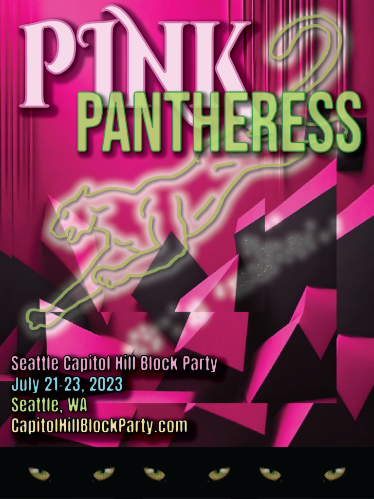
Bringing a Playful Edge to Capitol Hill Block Party

In my poster design for PinkPantheress’ show at Capitol Hill Block Party, I was inspired by her unique blend of Y2K pop, bedroom production, and tongue-in-cheek lyrics, hoping to communicate what I perceive as a distinctly youthful (yet still evolving!) style.
I drew upon elements of her youtube official visualizer video for “Passion”, which features eye-catching neon hues with vibrant pops of pink, blue, and green, countered by a hint of darkness implied on the left hand side. Animated neon graphics and softly blended edges between shapes and hues guided my poster’s color palette – a hot pink and black, darker and edgier background inspired by the artist name and heavier thematic undertones, featuring the text and hand-drawn panther image in the neon green, soft pink, and electric blue hues sourced from the video, to tie it all together. The goal was to make it exciting and playful, but with an edginess (particularly noticeable in the ominous panther eyes at the bottom-of-page border) true to the artist (example here). I wanted it to be digitally-inspired and youthful, mirroring PinkPantheress’ style (and age). By incorporating graphic shapes, subtle glitch effects, and bold typography with a touch of handmade imperfection (see tail of panther, as an example), I blended digital and DIY sensibilities, hoping for an end result that is something colorful and lively, yet just left-of-center enough to feel true to the artist.
I chose Cinzel Decorative font for the first half of the artist name, as its stylized serifs and fading letterforms inject a trippy, psychedelic effect. For contrast, I went with the strong geometric sans-serif Bebas Neue in all caps for “Pantheress”. As a final touch, I found Anton’s refined yet rounded shape (slightly crystallized) to be just right for the show details. The font trio complements her playfully eclectic style.
Despite some darker undertones, PinkPantheress retains a sense of innocence and cheekiness. I hope this poster captures that balance – vivid fun colors and playful shapes blended with mildly distorted effects and shadowy areas, with an end product that walks the line between light and dark.