For this blog post I decided to design a jersey for Green Night. I chose the orca whale as a symbol of the importance of legislation and public action to mitigate climate change.
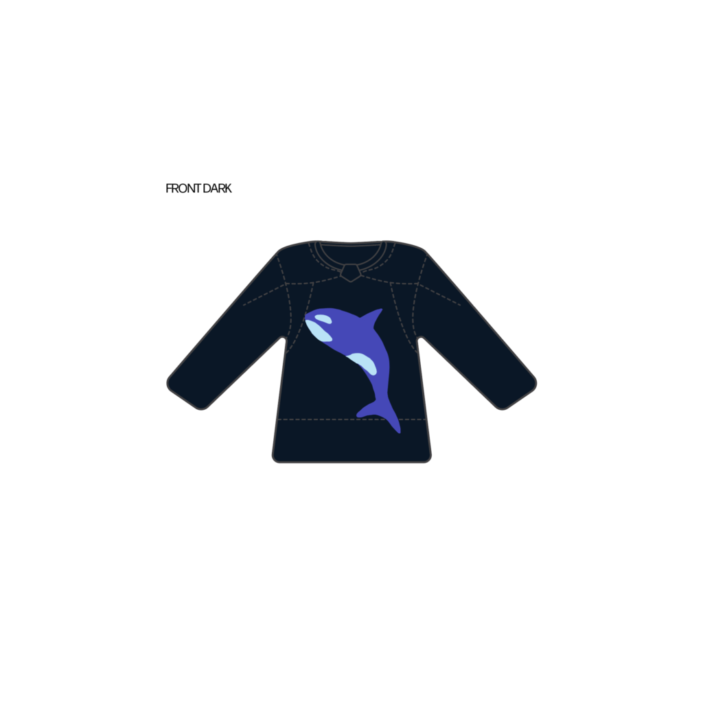
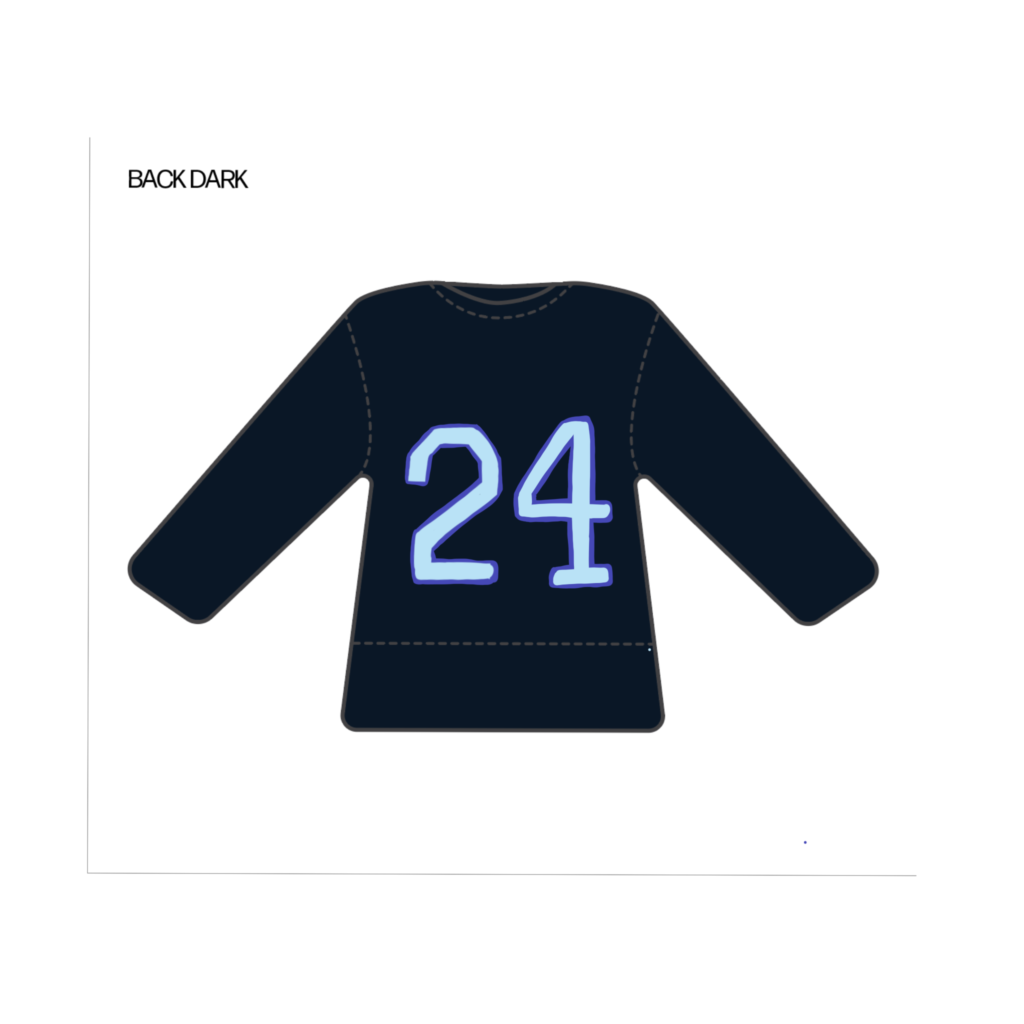
For this blog post I decided to design a jersey for Green Night. I chose the orca whale as a symbol of the importance of legislation and public action to mitigate climate change.


For this week’s blog post, I was inspired by Angelica’s talk to create a mural in the hallway space provided. I drew inspiration from my mom, and from her love for gardening. I was lucky enough to get to enjoy her beautiful garden growing up, and to enjoy a space where I could forge a love for nature and the outdoors. It was also significant as a gathering space for family and friends, and has always been a way that I connect with my mom. I think that a garden is a perfect way to symbolize someone who has been so generous, nurturing and resilient. I chose to include dahlias, my mom’s favorite flowers, in the mural.

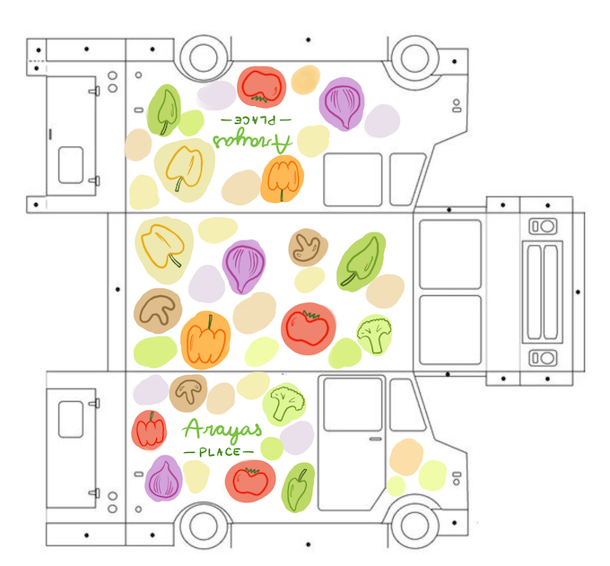
For this project I made a food truck wrap design for one of my favorite Thai restaurants in the University District. Araya’s Place is a vegetarian Thai restaurant that has delicious food with lots of fresh ingredients. Because so much of the menu is vegetarian it also has great vegan options and lots of options for people with food sensitivities. I think that its’ location in the U District, and the relatively quick cooking time of a lot of Thai cuisine means that the restaurant could transition into a food truck. For the food truck wrap I decided to highlight the fresh and colorful quality of Araya’s food and ingredients. I believe that this design is also something that could be appealing to college students who might frequent a food truck if it was on campus.
This project was challenging, but ultimately fun and rewarding, and I am proud of how my group’s project turned out. The initial brainstorming was a little challenging, because we had a hard time getting all of the ingredients for our video to fit together, and we had to go back and forth several times with faculty to get to a place where our idea could be approved. I’m glad that we were able to get to that place though and that the final product felt like it had something to say, and wasn’t just combining the different elements for the sake of finishing the project. It was also interesting to learn more about the process of filming and editing a short video, something that I am not very familiar with. While I’m grateful for the opportunity to experience more of this process, I did also feel that it put quite a bit of pressure on our Visual Media student. As a design student, I knew that my skills wouldn’t be as valuable in this project beyond brainstorming and acting/behind the scenes, but I also didn’t want to make anyone sacrifice the quality of the final product just so I could help out more in the filming and editing process.
This was a fun process, and it was cool to get to work with people who I haven’t before. It was especially fun to film the final video, and I had a good time throwing lots of pancakes on our shoot day. I was also really impressed by the creativity and quality of everyone’s work. It was a lot of work to put all the videos together, but it was very rewarding to get to see everyone’s hard work in the end.
If I were able to donate money to a non profit I think I would start by trying to find a local organization that might be able to impact people and communities near me. I think that it would be meaningful to see changes being made in communities close to home, and it might be more impactful to a smaller organization that may not have the same large pool of resources as a larger organization. I decided that I wanted to choose a non profit that focuses on conservation and environmental stewardship. After researching Seattle based non profits, I landed on Forterra as the non profit that I would like to support. The mission of the organization to promote land conservation and stewardship appealed to me. It was also clear that they have been able to follow through with their projects, having conserved 275,000 acres of land in Washington. I also found Forterra’s current projects of conserving and restoring important wildlife habitat very important. It was also interesting to reflect on how nearby these projects are, for example in Federal Way, or Hood Canal. I think that it can be easy for myself living in a city to think of conservation projects as happening elsewhere, in some untouched wilderness, when really these kinds of projects should be happening everywhere. By conserving and being good stewards of the land around us, we make it possible for future generations to not only be able to enjoy green spaces, but also have cleaner waterways, more stable and healthy soil, and more diverse and healthy ecosystems around them. I don’t think there will ever be a way to reverse the exploitation that has happened to the environment, but preserving what spaces we can, and restoring habitats when we are able, will help mitigate some of the local impacts of environmental damage.
For this assignment to make a mood board for a new Stanley dog bowl, I decided to look at the imagery of the brand, especially some of the older imagery that shows the history of the brand. I chose this route because I feel that the customer for this product is probably someone who camps or hikes a lot and likes to do things outdoors with their dog. This customer is probably a Millennial or Gen X, and probably shops at REI. I focused on photography and colors that reference the history and PNW roots of the brand, and that tie in to the outdoorsy aesthetic that the target demographic would like.

For this blog assignment I looked at the design systems of The Guardian, Mailchimp and Apple. This was a really interesting exerecise to see how all of these companies need to be thinking very intentionally about the same basic elements—like color, grid layouts, and icons—but that across all of the companies specific elements, and reasons they are chosen, are very different. For example, I thought that it was very interesting the way that the same colors could have drastically different significances for each system. Within the design system of Mailchimp, they include red as a core color in their UI, but advise against using it too frequently, because the company does a lot of data visualization and red is often associated with negative feedback within this framework. However the design system of The Guardian also includes red, and it is used much more frequently on the site to indicate news articles (as opposed to opinion pieces, or sports). I think that the use of red is intentional, and a wise application here because it indicates that the articles associated with red are more urgent.
Overall it was interesting to break down the design systems of these companies, and I was to see how important the design systems were to help people navigate and find the information that they need. It’s so easy to overlook how important and essential these systems are, these websites—and in particular the data visualization of Mailchimp—would be completely different without them. It was surprisingly interesting to look at The Guardian’s design system. Until learning more about the conventions of web design and Jakob’s Law, I hadn’t considered why news websites look so different from other types of websites, but it’s clearly a very intentional choice to reference the traditional print layout of a news paper. Many elements of The Guardian’s design system were different from the conventions I’ve been taught so far, and that’s intentional to reference the print component of the newspaper. For example, the design system uses a serif typeface for the body copy, even though the standard for web design is usually a sans serif. I was already aware of how important design systems are for web experiences, and this exercise gives me even more reason to appreciate the hard work that goes into making a website that looks effortless and serves the user and the content.
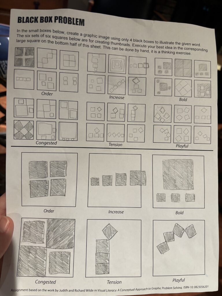
This assignment was more challenging than I expected, and it surprised me how many solutions I could come up with for the same words.
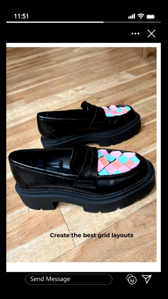
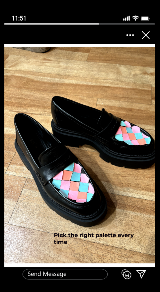
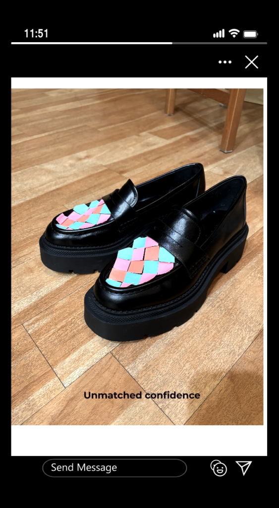
For this assignment, the shoes I have created have the power to help design students master grid layouts. They feature a colorful checkerboard pattern that also helps the wearer choose the best color palette for any project.

For this blog post, I decided to highlight a candle as the product in my still life. With this still life I wanted to highlight the connection between scent and memory, by featuring the scented candle and scented flowers. I chose to highlight daffodils and hyacinths because, to me they are connected to the memory of going for long walks with my mom during the pandemic. We would walk around the neighborhood in early spring when the hyacinths and daffodils were starting to bloom. My mom and I both love gardening, so being able to go for walks and admire other gardens in the neighborhood is a fond memory from a time that was otherwise quite grim. The scent of these flowers now transports me to those memories. The candle in the photo is symbolic of power of scent as a catalyst for memory, as well as the warmth and comfort that this memory provides.
I kept the composition of this photo simple, because after trying to add more elements I felt that the significance of the objects was being lost. I shot the still life from a more top down angle so that the flame of the candle would be visible and so that the negative space between the two groups of flowers would appear to be less.