Categories
Uncategorized

Blog Post: Super Bowl Ads

The ads I watched: T Mobile Jason Momoa ad, Doritos Dinamita ad, Beyonce Verizon ad, Budweiser ad, Christopher Walken BMW ad, Temu ad (unfortunately)

Beyonce Verizon ad: this ad is for Verizon internet, and features Beyonce. The concept of the ad was that celebrities sometimes do things that garner so much attention that they overwhelm social media platforms i.e. they “break the internet”. In this ad, Beyonce’s assistant? PR person? challenges her to try to “break the internet” specifically Verizon. What follows is a series of clips of Beyonce doing increasingly more elaborate things to try to break Verizon internet (including launching “BeyoncAI”), culminating in the first musical performance in space. At the very end of the ad Beyonce is heard saying “ok they’re ready, drop the new music”. I thought that this was a fun way to highlight a celebrity cameo as big as Beyonce, and she had good comedic timing. The concept of the ad was straightforward and worked well in the short time slot available. The fast pace of the ad and cinematic production value would make it exciting even for younger viewers who are used to short form content. I believe that this ad was targeted towards Millennials and possibly Gen X and older Gen Z who might be paying for internet. I think that choosing a celebrity with wide appeal, like Beyonce, means that Verizon’s target demographic for this ad can be larger. However I think that the people who are most hyped about Beyonce are probably Millennials who have seen the progression of Beyonce’s entire career, and who also are paying for internet. Overall I thought this was an enjoyable and well executed ad, although it certainly wasn’t the most creative or original and there were more memorable ads that came from Super Bowl 2024. In my opinion the ad gets bonus points for the new music announcement.

Budweiser ad: This ad had a simple storyline and featured a small town bar somewhere in rural America during a winter storm. When the storm causes the power to go out and the roads to close, how will the Budweiser delivery make it to the rural bar? With the help of Clydesdales of course. Our beer delivery driver hitches up six horses and a cart to haul the Bud to the small town bar. Upon arrival our heroes are greeted by none other than the bar’s resident yellow lab. While this ad had (probably) the exact plot of a Hallmark movie, it was kind of sweet, and I did have a good time watching the animals. I believe that this ad is intended to have mass appeal, although it will probably be most enjoyable for people who are old enough to remember the first Budweiser Clydesdale Super Bowl ads. Although it was a little heavy handed with the nostalgia, it was fun. Who doesn’t like to see animals save the day. This ad also gets bonus points for featuring the song “The Weight” by The Band. A classic.
Categories
Uncategorized

Blog Post: Personal Projects

  • work on illustrations
  • create a display typeface
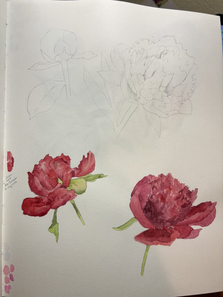
  • keep a sketchbook
  • redesign book & album covers
  • design a wall calendar
  • design a series of packaging for an imaginary company (tea, coffee, cosmetics)
  • design posters for favorite artists
  • create a Pintrest board
  • start journaling
  • rebuild my website

For this blog post, I came up with several ideas of ways that I could start a creative practice. Of the ideas that I had there were several creative projects that I have already started in some way (like creating a Pintrest) and there are a couple that I think could be very valuable additions to my creative practice, even as a student. Ultimately, I think that the best type of personal creative project is one that I am excited about, and that I am likely to actually do. For this reason I think that the creative project I would most want to pursue would be starting a sketchbook and making a habit of sketching and generating ideas, even if they seem unrelated to current design projects. I think that this would be a good experience because it would help me to develop ideas and deconstruct visual media. I also think that the practice of keeping a sketchbook would help me start to develop my eye, and develop more of a sense of taste for different design styles. Additionally, keeping a sketchbook would allow me to feel like I have a place to be creative without judgement. I think that it could be a safe space to explore without feeling like there must be an end product.

Something that has continually inspired me about the guest speakers on Fridays is the advice to create the work that you want to make more of. Even though nothing that I make in a sketchbook will ever make it to my portfolio, I think that the routine of keeping a sketchbook would help the process of developing ideas for design. I think that keeping a sketchbook would remind me of what creative things I want to focus on, and help me get started making them a reality.

Categories
Uncategorized

Blog Post – BAR Method

For this blog assignment, I decided to use the BAR method to discuss a project I did for my first quarter at SCCA.

Background: the project was for my History of Design course last quarter. The assignment parameters were to redesign an existing piece of media in the style of a historic design movement. I chose to redesign an existing book cover for the novel Never Let Me Go, by Kazuo Ishiguro, drawing on the historic movement of Bauhaus design. Part of the challenge of this assignment was to create a connection between two things that don’t go together. There’s no apparent relationship between the novel and the Bauhaus design movement, so I had to use elements found in Bauhaus design to highlight the important themes and qualities of the novel.

Action: the process to create a new book jacket design included extensive research into the Bauhaus design movement, as well as a deep understanding of the story and themes of the novel. Having read and loved the book, I knew already that I wanted to highlight themes of loss, specifically the loss of people (characters) but also loss of autonomy and innocence which were present in the novel. After lots of research into the history of the Bauhaus school, its key figures, and the elements that make up Bauhaus design, I understood the kind of visual language I had to work with to translate the key themes of the book. I knew that, because Bauhaus design was an early style of modern design, my book cover would have to be a more abstract representation of loss, and would have to include key details like the distinctive typefaces of the movement, as well as the use of geometric shapes. In addition to the typeface and geometric shapes, my design also paid homage to this historic movement with the use of a grided composition and a color palette inspired by Bauhaus poster art. My final design created space within the words of the title of the novel to portray the separation and alienation that the characters feel in the novel. Additionally I created a simple silhouette illustration of a person. The title and illustration created a critical interaction where the letter O in the last word of the novel’s title is reversed out of the figure, so that it creates a figure ground relationship where part of the person is missing. This alludes abstractly to the themes of loss of autonomy and innocence in the novel. It also represents a major plot point in the story, where the reader finds out that the story does not take place in our world, as we thought, but in a speculative dystopia where all of the characters in the novel are growing up only to have to donate their vital organs. The reader will only find out the significance of the concept of the cover after completing the story.

Results: although I don’t have data to support that this was a successful redesign of a book cover, I feel that it succeeded in the criteria of creating a new book cover, while also integrating design elements of the Bauhaus movement. Additionally I think that the design succeeded in drawing on important themes and plot points present in the story. I believe that it is effective because it reflects the story itself.

Categories
Uncategorized

AR Aero Card

For this assignment I decided to make a card celebrating spring (hopefully) coming soon. I was inspired by how challenging I find this time of year, and I thought it would be fun to remind myself and friends that there’s something to look forward to. I also enjoyed using some of the assets in Adobe Aero during our demo, and I thought it would be fun to create a scene using some of these assets.

I found one asset on Aero that had a cute landscape illustration, so I used that and added elements that went with the style of the illustration, and the theme of my card. I added a couple of elements that I knew I wanted to make interactive, and I also create a type element in Illustrator. For the type element I started with a typeface that I like (Fields display) at a scale that I thought would work for the Aero project. I thought it would be fun to add a gradient to the type to add interest and make it feel more related to the other elements in the composition, but adding a gradient to type in Illustrator is deceptively complicated and involved a lot of googling.

Ultimately I ended up with something I was satisfied with, and made a transparent PNG that I would be able to bring into my Aero project. With the type done I moved on to creating the interactions for the AR experience. I thought it would be fun to highlight the sun by making it spin when a user taps it. I also decided to make an interaction where a user could tap a flower pot shape, and a flower would “bloom” out of the pot. This interaction was a little more tricky, because it needed a series of actions, and careful placement, to work. I started by placing the flower pot in the foreground of my card, and then placed a flower under the pot in the negative quadrant of the Y axis. It was tricky to get this placed correctly in 3 dimensions, but once I had it I was able to move on to create the interaction where the user could tap the flower pot, and the flower would appear to grow out of the pot. I added the action of the flower moving to the trigger of tapping the flower pot, and made the flower move from negative space in the Y axis into, and then out of the flower pot.

This was a fun project overall, and a good way to become more familiar with AR software. I feel like I better understand how to set up AR experiences, and how to create interactions for users. It was also fun to use the Aero app to view my card in my space.

Categories
Uncategorized

Blog Post: Game

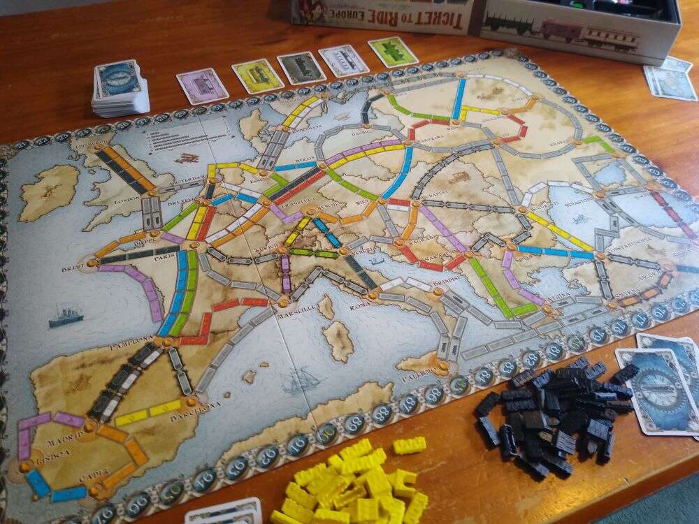
This week I decided to pick the game Ticket to Ride to write about. I don’t know a ton about games, but this is a board game that I really enjoy. It is intended for 2-5 players, and in the game players are trying to build a continuous rail line across a continent (the version I have is Europe).

The board is essentially a map of Europe, and players each start out with a few dozen plastic train components that they use to build their train line. Players have to collect and play cards in order to lay down tracks, and the game starts with players drawing the routes that they are trying to build throughout the game. If two players both need to travel through the same city one of the players will have to play one of only three train station components allocated to them. While building train tracks and placing down the train components earns players points, having to use a train station component will cost the player at the end of the game. Similarly, if a player is unable to successfully build one of the routes that they have selected, this will count against them in the end.

This is a very fun game that involves strategy and is great for a range of ages.

Europe's a busy place...

Ticket to Ride Europe Review, Strategy Tips & FAQ | BoardgamingParent.com
Categories
Uncategorized

AR Blog Post – Panels Project

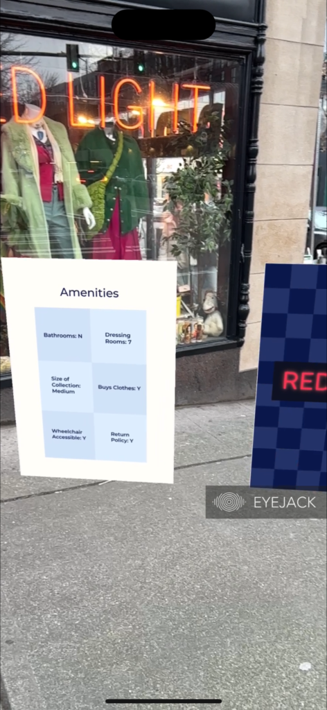
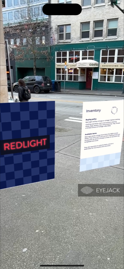
For this AR panel project, Emily, Walker and I chose to use thrift stores around Seattle as out point of interest. We decided to make informational panels in Eyejack to enhance a potential customer or visitor’s experience. This way a viewer of the panels can learn more information about each store through the panels. As a group we decided that we wanted to include important information about each store, like their amenities as well as some information about what the store offers and what makes it unique.

For my panel project i focused on Red Light Vintage on University Way in the U District. This is a unique store that stocks a lot of vintage clothing from the 1920s to the early 2000s. It also stocks vintage inspired clothing, as well as vintage costume pieces and some new items like novelty socks and glasses.

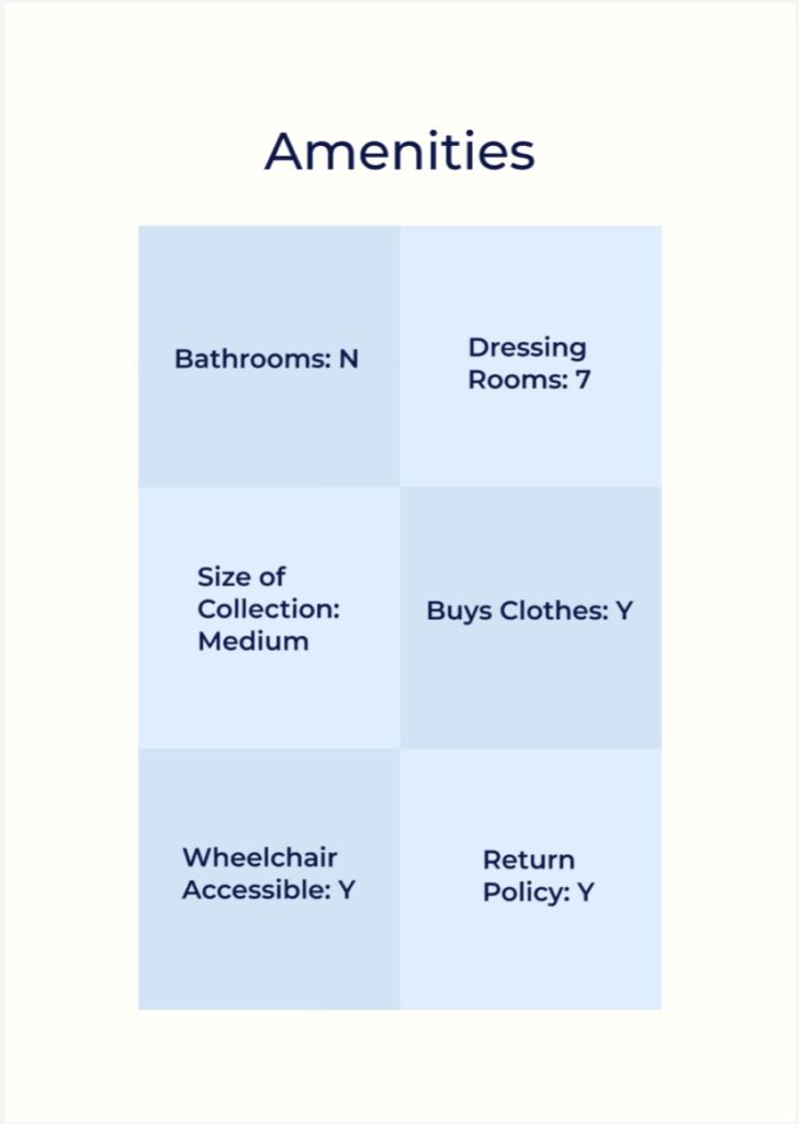
For the first panel, our group decided to focus on 6 amenities that customers might be looking for when they visit the store. These include things like dressing rooms, restrooms and wheel chair accessibility.

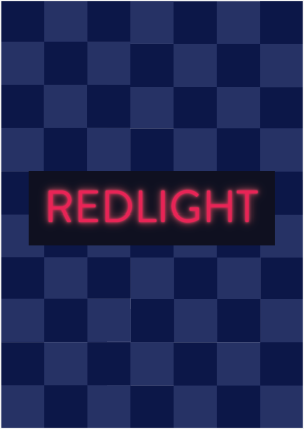
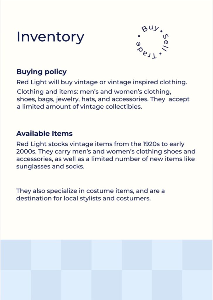
In the middle panel we each created a poster type image with our store’s logo and an animation. For the final panel we decided to include more qualitative information about what kinds of clothing the store stocks, and whether the store will buy or trade customers’ clothing.

To create the project, we created a shared group Figma file where we each created our panels. After creating the informational panels I started to work on creating an animated panel with the Red Light logo. Unfortunately Red Light does not appear to have an official logo, so I decided to take inspiration from the distinctive neon signs in the shop’s window to make a logo. I created a neon type treatment in Illustrator, which was challenging, and only worked on a dark background. For the animation i decided to make several variations of a checkerboard pattern, inspired by the tile floor of the store. I placed the logo in each frame and created the animation in Eyejack. It was fun to go back to Red Light after making the panels to get to see them in action.

Categories
Uncategorized

Blog: Swiss Army Knife

When thinking about myself like a Swiss army knife, I found that there were a couple of skills that I already have, and many that I need to develop. The tools I currently have I would consider to be illustration and creativity. I feel that my previous experience studying fine art gives me many of the skills and experience necessary to create illustrations. This ability is something that I find useful, because I feel that it in turn influences my process as a designer. Having spent time developing illustration skills means that I’ve developed some visual skills and that I have some experience communicating in a visual format. Building my illustration skills, as well as other creative pursuits, has encouraged me to think creatively and take a creative approach to problem solving.

The tools I have that need development: design skills, concepts, writing, typography skills. I know that my design skills are far from where I would like them to be, and I don’t always know the best design approach to communicate the idea or message that I am trying to convey. Likewise I have some conceptual skills from my previous education, but concepts in the world of fine art are very different from design concepts, so I intend to continue to refine these skills in a design space. I would also like to develop my copywriting skills, as I feel that it could be a helpful addition to my skill set as a designer. Additionally, I know that typography, especially text heavy layouts are something that are challenging and unfamiliar to me coming from a more illustration heavy background. Type layout is a skill that I need to develop more.

Tools I do not have that I need to learn: branding design, UI/UX design, building a portfolio, presenting and pitching. I am very interested in branding design, but I understand that I have only just scratched the surface of what there is to know. UI/UX design is also something that I have only just started to learn about, but I think that it will be a valuable skill, and help make me a more versatile and competitive designer. I also still have a lot to learn about what’s needed to put together a successful portfolio for design, and what types of projects to feature for what kinds of jobs. Similarly, I know that presenting my work not only in a portfolio, but also directly to a client in a meeting will be a very important skill that I need to practice much more.

Although I know that I have some skills already, there are many that still need to be developed for me to be a successful designer after my time at SCCA. I’m glad that I can start thinking about these skills now so that I can start to understand what kinds of projects and challenges I need to give myself to continue to grow as a designer.

Categories
Uncategorized

AR Poster

For this assignment I chose to make a poster using a GIF as the AR element. I have been wanting to learn how to use Procreate software to make GIFs of my illustrations, so this seemed like a great opportunity to learn this element of the software.

When I was getting started I knew that it would be a good choice to illustrate something I feel comfortable drawing, and something that would translate well in movement. I had a difficult time picking a concept, and had a lot of ideas that I wouldn’t be able to execute in a week. I decided to choose a concept of creating a poster for a tulip festival, where viewers would be able to use the QR code to see the poster in motion, where the flower starts growing.

This was ultimately a challenging project, and it was difficult to learn how to make GIFs while also designing a poster and using the AR software for the first time. The GIF itself was quite challenging to make because I chose to create and animate an illustration, which required that the GIF be hand drawn frame by frame. Fortunately, Eyejack was very easy to use and it was quick to put together the AR component of this project. It was also so exciting to see the poster come to life!

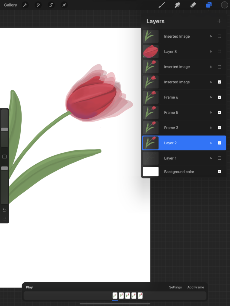
Above is a screenshot of my layers panel in procreate, showing the frames for the GIF. I reused the drawing of the stem and leaves, but had to redraw the flower for each frame. The transparent layers in the main area of the screen shows each frame stacked on top of each other.

In the end I’m happy with how the poster turned out, and I’m excited to use procreate to make more GIFs in the future.

Categories
Uncategorized

AI Image Generation

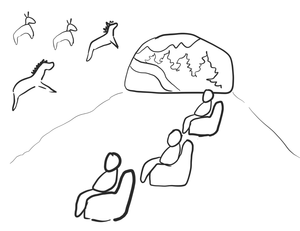
For this assignment I picked the prompt “Stone-age Home Entertainment”. When I think of stone-age I think of cavemen living in caves (not sure if that is accurate to the era), but I thought it would be funny to make an image where cavemen are relaxing in a similar way to how modern humans relax. I started by deciding what I wanted my image to end up being: I would like the image to have 2-4 cavemen in a cave sitting in armchairs made of stone. The cavemen are looking at a wall of the cave which is covered in cave paintings in the style of the Lascaux cave paintings. The wall has drawings of animals in earthy ochre and sienna colors, and the animals in the drawings look like they’re in motion. The cavemen are sitting in front of the cave painting as though they are watching tv.

I also made a sketch of what I wanted the composition to look like roughly.

I used Bing image generator to create my AI images. The first prompt that I used was: cartoon picture of cavemen in a cave sitting and looking at cave paintings

These were the most successful images from this prompt:

cartoon picture of  cavemen in a cave sitting and looking at cave paintings. Image 3 of 4
cartoon picture of  cavemen in a cave sitting and looking at cave paintings. Image 4 of 4

I felt that these were an ok start, but the overall look was not what I wanted. The images were much more cartoony and cutesy than I was looking for, and I didn’t account for the AI image generation software not knowing what a cave painting was (although I thought the easels were funny).

For the next batch of images, I changed my prompt slightly. I was hoping to get a less cartoony style, and a cave art that looks more like an actual cave painting. I also wanted to see if I could get the cavemen sitting in stone armchairs. The prompt I used for the second round was: picture of cavemen in a cave sitting on chairs made of rock and looking at ancient cave paintings.

picture of  cavemen in a cave sitting on chairs made of rock and looking at ancient cave paintings. Image 3 of 4

This round was much more successful. I found that the image looked pretty close to what I had imagined in my sketch! I was still hoping to get closer to what I was imagining, where the cave paintings on the walls looked more like prehistoric cave paintings of animals.

For the final round the prompt I used was: picture of cavemen in a cave sitting on chairs made of rock and looking at ancient cave paintings on a stone wall.

picture of cavemen in a cave sitting on chairs made of rock and looking at ancient cave paintings on a stone wall

This image turned out pretty well, I thought that the way the AI software rendered the painting and the wall of the cave seemed more like an actual cave painting. Although I thought it was funny that the chairs that the cavemen are sitting in look like normal lawn chairs instead of rocks.

Over all this was a fun exercise and I thought that Bing image generator did a pretty good job creating images based on the prompts I gave.

Prompts used:

cartoon picture of cavemen in a cave sitting and looking at cave paintings

picture of cavemen in a cave sitting on chairs made of rock and looking at ancient cave paintings

picture of cavemen in a cave sitting on chairs made of rock and looking at ancient cave paintings on a stone wall

Categories
Uncategorized

AR App Review: SolAR

By Ellery Lloyd

For this app review project I chose to download and review an augmented reality app called SolAR. This app allows users to view planets in the solar system in 3D. It also has an AR feature where users can view a planet transposed into their surroundings. Both the 3D and AR features allow users to pan around the planet and view it from different angles, as well as as a video feature where users can view days simulated on the planet.

The app has easy to use menus that allow users to make changes to the scale of the planet, as well as view facts about each planet. The option to scale the planets is particularly useful so that the user can choose to see the scale of the planet in realistic proportion to a moon (or moons), or view the planet and surrounding moon(s) at a scale that is easier to see.

The main downside to this app experience is that, while the app is free to use, it requires a paid version to view any planets beyond mars in our solar system.

Another potential pitfall to this app is that I found that viewing planets in AR didn’t really bring any new information or experience that wasn’t already present in the 3D simulation. However I can see why the AR simulation would be engaging for children, and could potentially increase interest in learning about space.

Additionally, I felt that there could have been more UX interactions to allow users to find more facts and information about the planet. For example if users could tap on features of the planet to learn what they are called or what substance they are made of.

Overall this app was very well designed, thought out and simple to use. The AR simulation was seamless, because the planets are floating and solid they lend themselves well to being transposed into a users surroundings. This was a fun app to use and I could see it being useful as an educational tool to help students engage with planets in the solar system.