AR Dragon IOS App
I decided to explore the capabilities of the AR Dragon IOS App. Similar to pet simulators like Tamagotchi, you hatch and raise a dragon, interact with it in various ways, and gain crystals to spend to unlock features. The app is free on the Apple IOS store but offers in-game purchases to unlock extra features sooner.
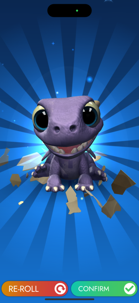
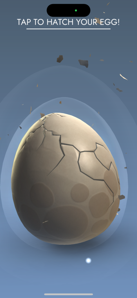
To get started, you are given an initial dragon egg to crack open, which reveals the first dragon you may raise. You then click a button to randomly generate a type of crystal that is imbedded in their forehead.

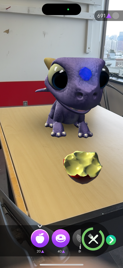
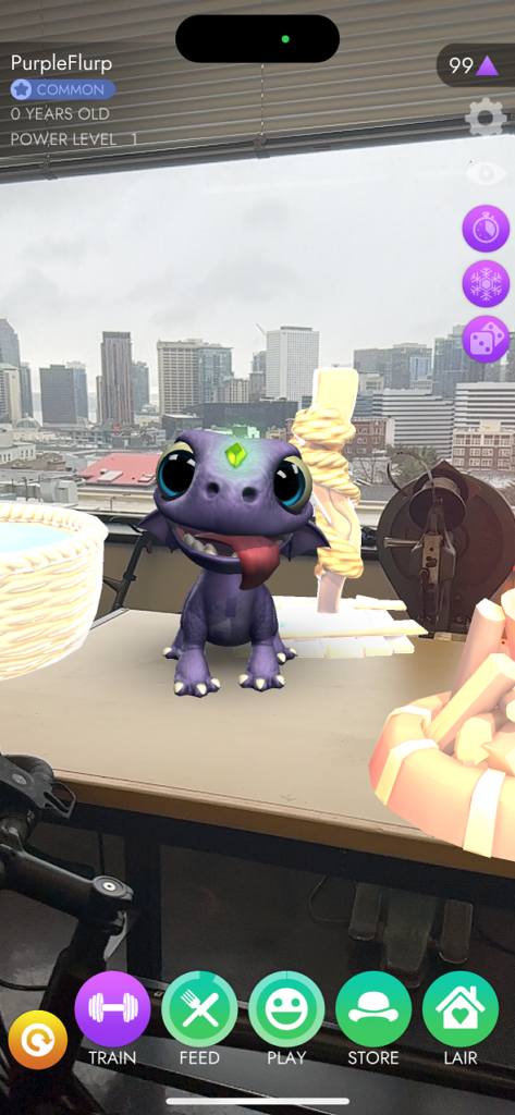
Once your dragon has been revealed, it takes you to the AR home screen where you must detect a surface in order to place the 3d model of the dragon in your environment. When the dragon is placed you can choose to interact with it in a variety of ways. You can feed the dragon (the dragon has a meter that shows how hungry they are). You must log in each day to feed your dragon or you risk it “flying away”.

You can also play with a dragon, train the dragon, purchase clothing and accessories for your dragon, and decorate a dragon “lair” for it. All of these features can be accessed by the buttons on the bar at the bottom of the screen. Each activity has a different icon to hint at the functionality. It’s a little difficult to navigate.

To improve the UI I would recommend choosing a color that is the “theme” of each activity to choose from, rather than making each activity green (apart from training). The icons are incredibly basic, and the magic dragon theme is not communicated at all in the UI design. I appreciate that on the home screen, the name of each activity is listed but this pattern does not continue once clicking on a category. This is a big accessibility miss for the game. I would choose a different font that communicates a more clear artistic style.
Another feature of the game is that you must regularly keep up with feeding and playing with your dragon in order for it to level up. There is a faint bar around the “feed” and “play” buttons that are meant to show how satisfied the dragon is, but the bar is difficult to see. I would use green, yellow, and red once certain amounts of time have passed to provide more tangible feedback to the user and motivate them to log in more frequently.
Overall, I think that the game is cute and a fun way to have a little AR experience throughout your day, but there are many improvements to the gameplay and UI design that would vastly improve the experience.