Background
For this piece, we were tasked with creating our own visual interpretation of a plant or animal using only the letters in the name, in a font of our choice. We were not allowed to distort the original shape of the letters, though we could change the scale, rotate, combine and layer letters in any way we wanted. We could use effects to add texture, gradients, and distort shapes that were made out of multiple letter forms combined. We had freedom to create in any style, blend the letter forms completely, or use them as defining stand-alone features.
Actions
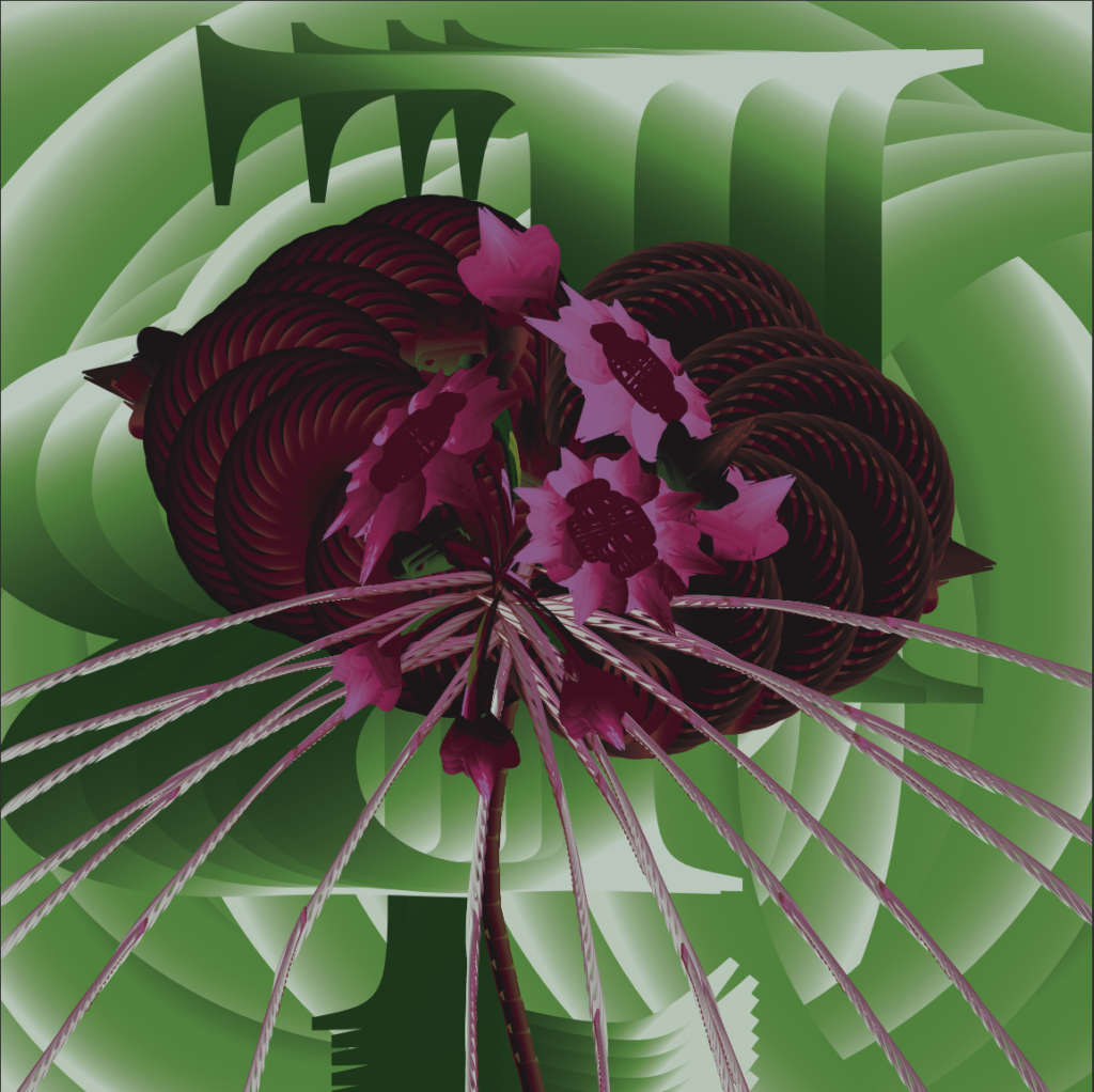
The first step was research. I did some quick googling to learn about more unusual plants and flowers that would make an interesting subject. As I researched, I kept in mind the shapes that the letters of the plant names would lend me to work with. Coming across photos of the Black Bat Flower, I found a very unusual and dynamic subject with a dark and mysterious color palette I loved. I could roughly imagine using the “l” to create the long whiskers, the “O” to form the petals, and the rounded edges of the “B” to form the bulbs.
After choosing the flower, I spent some time picking out the font. We were asked to submit six examples of fonts that we thought were appropriate for the subject we chose. Knowing that the Black Bat Flower is sometimes called the “devil’s flower” and has been associated with the theme of death, many of the fonts I chose were inspired by gothic typography, harkening back to the church during medieval times.
Next, I saved a variety of example images of Black Bat Flowers to use as a reference while building my own design. I decided on the orientation of the flower and the single subject from looking at a couple of specific reference photos. The idea for a light and shadow heavy blurred-effect on the background came from dramatically focused photography shot of a single flower with a completely blurred background. I pulled color palettes from photos, focusing on a variety of options light -dark, muted – vivid.
Then I relied on experimentation. Knowing the rules I had to work within, I started playing around with different ways to combine letters to create totally new shapes. Once I was happy with each shape I layered most on top of each other, like creating a piece of art out of collage. I relied a lot on color to slightly correct shapes and imply dimension where I needed to. I ended up settling on using mostly gradients after seeing its effect on the petals.
I went through a few rounds of feedback with my teacher, sending in updates as frequently as I could. Ultimately, I made most of the major changes myself. There was a point where I felt like I had layered too many shapes on top of the petals and ended up losing the striation I was looking to create, so I decided to remove most of the shapes I spent hours trying to perfect – and it was just what I needed!
Results
What I appreciate about this piece is that it required so much experimentation that there wasn’t a way to plan it out completely from the beginning. From concept to execution, it developed organically from much trial and error. I ended up, unintentionally, with a hyper-realistic impressionist style piece that played up the textures and light/dark contrast way more than the inspiration photographs ever did.