I’ve been working on this coffee cup project for a while, so I already had drawn sketches on my mockup dummies before continuing to apply the designs in an illustrator file. The most challenging part was working with a warped checkerboard pattern – making sure that each side lined up perfectly when glued together. I ended up having to print and piece together five different cups before arriving at the final design.
I decided to explore the capabilities of the AR Dragon IOS App. Similar to pet simulators like Tamagotchi, you hatch and raise a dragon, interact with it in various ways, and gain crystals to spend to unlock features. The app is free on the Apple IOS store but offers in-game purchases to unlock extra features sooner.
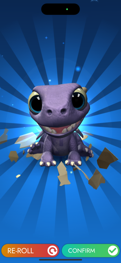
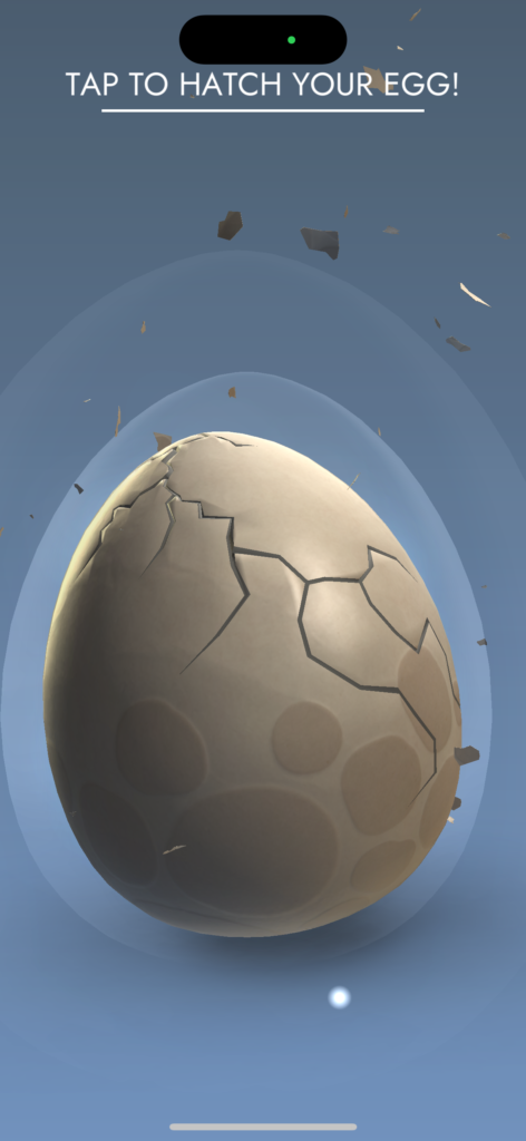
To get started, you are given an initial dragon egg to crack open, which reveals the first dragon you may raise. You then click a button to randomly generate a type of crystal that is imbedded in their forehead.
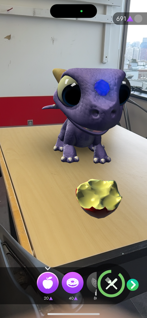
Once your dragon has been revealed, it takes you to the AR home screen where you must detect a surface in order to place the 3d model of the dragon in your environment. When the dragon is placed you can choose to interact with it in a variety of ways. You can feed the dragon (the dragon has a meter that shows how hungry they are). You must log in each day to feed your dragon or you risk it “flying away”.
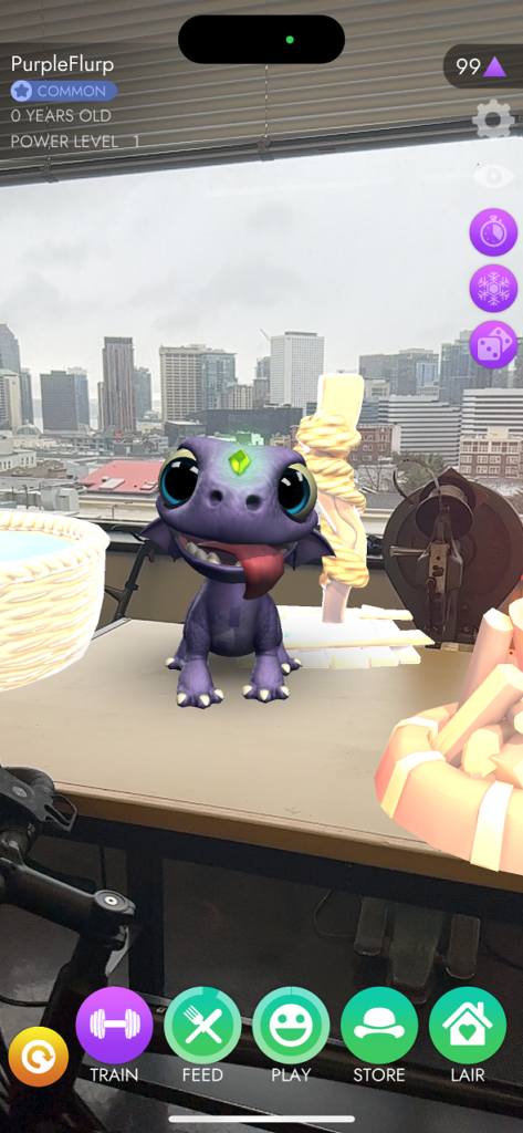
You can also play with a dragon, train the dragon, purchase clothing and accessories for your dragon, and decorate a dragon “lair” for it. All of these features can be accessed by the buttons on the bar at the bottom of the screen. Each activity has a different icon to hint at the functionality. It’s a little difficult to navigate.
To improve the UI I would recommend choosing a color that is the “theme” of each activity to choose from, rather than making each activity green (apart from training). The icons are incredibly basic, and the magic dragon theme is not communicated at all in the UI design. I appreciate that on the home screen, the name of each activity is listed but this pattern does not continue once clicking on a category. This is a big accessibility miss for the game. I would choose a different font that communicates a more clear artistic style.
Another feature of the game is that you must regularly keep up with feeding and playing with your dragon in order for it to level up. There is a faint bar around the “feed” and “play” buttons that are meant to show how satisfied the dragon is, but the bar is difficult to see. I would use green, yellow, and red once certain amounts of time have passed to provide more tangible feedback to the user and motivate them to log in more frequently.
Overall, I think that the game is cute and a fun way to have a little AR experience throughout your day, but there are many improvements to the gameplay and UI design that would vastly improve the experience.
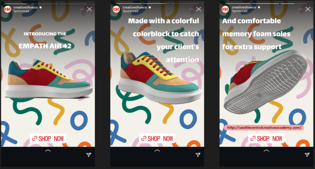
Creative Shoe Co has just announced the release of their new line of shoes made for creatives, called the Empath Air 42. This particular line of sneaker is made for new designers hoping to catch the attention of potential clients or employers to aid them on their creative journey. In addition to the eye catching color block color scheme, the shoe includes real cork board on the toe and heel – representing designer’s brainstorming skills and idea generation. These shoes do not just support feet, they support your ability to design with empathy. Studies show that while designers wear the Empath Air 42’s, they are 35% more likely to recall their own memories that connect with their client’s story, creating a deeper connection with the work they are creating. Shop now through their Instagram shop for 15% off while sales last.
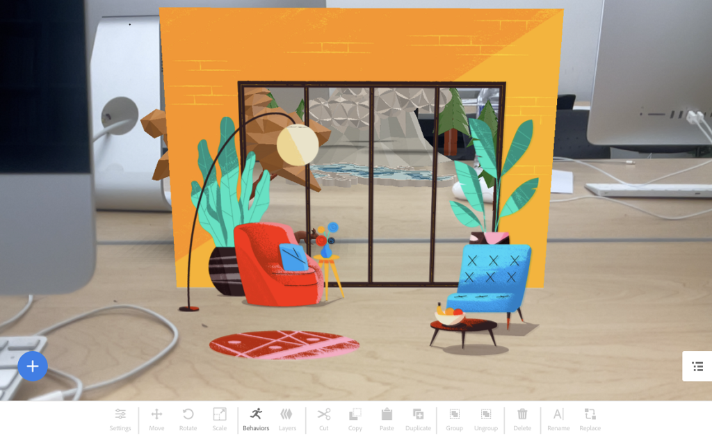
For my second project I created a Happy Birthday card for my stepsister who lives in Wisconsin, and often misses the land and nature here in the Pacific Northwest. Looking at the assets in Adobe’s Aero program, I found that many of them would work well to create a nature scene. I wanted to re-create the experience of gazing out the window to stare at what is outside, and in this case, it’s a Pacific Northwest themed naturescape!
I found the wall with the window first and made sure to position it closer to me since the user would need to get close enough to see what is outside without looking around the wall.
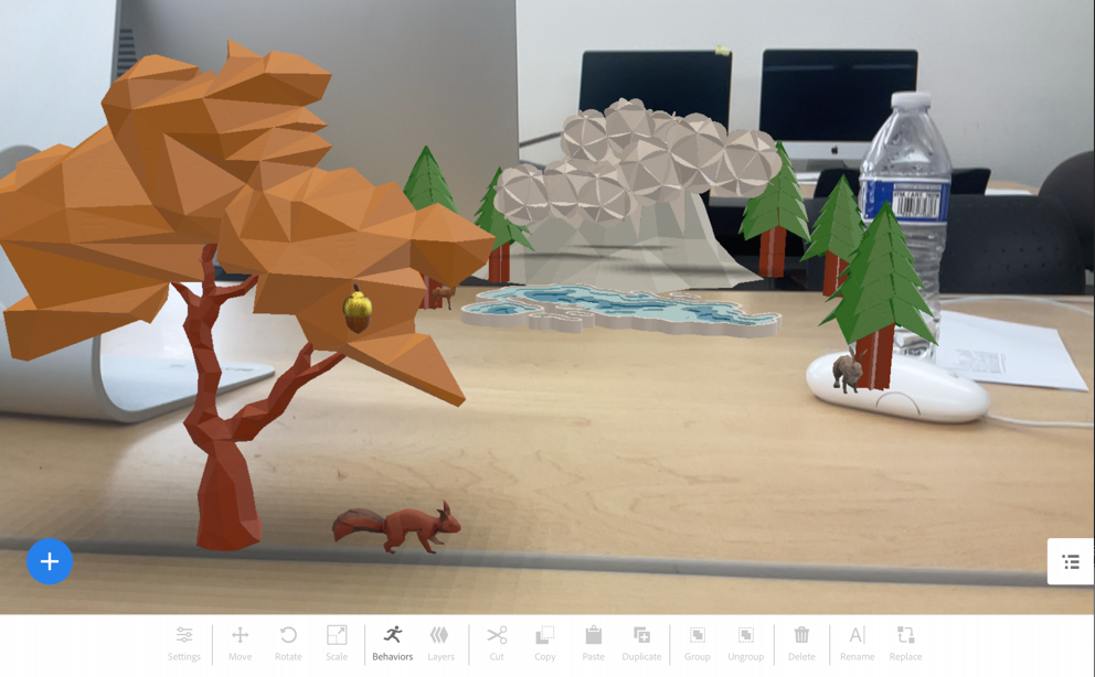
Then I chose assets that are classic PNW: The mountain, lake, trees, and animals. I loved the idea of floating clouds that part to reveal something beautiful behind, just like how in Washington, the mountain tops are often obscured until the sun comes out.
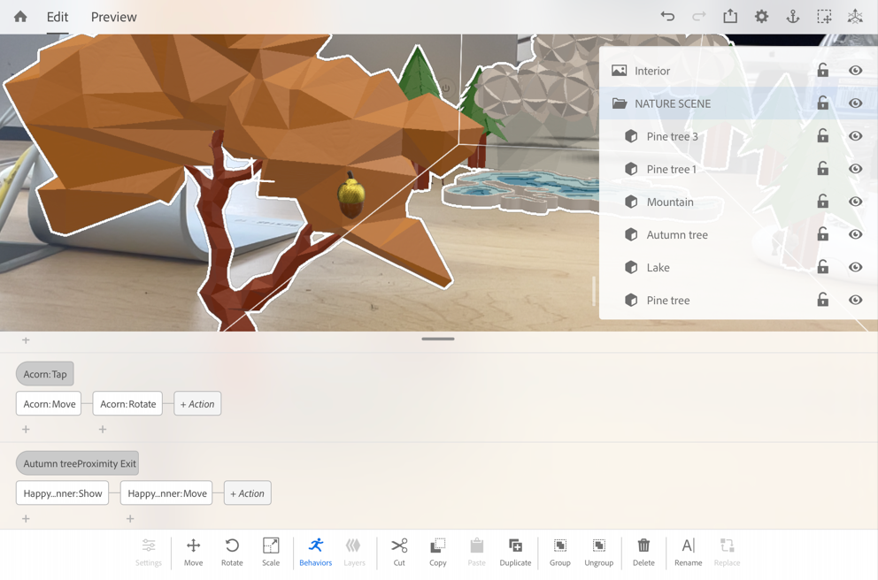
I used proximity and tap as triggers. I used proximity:enter to set the animal’s animations, tap to trigger the clouds and the acorn on the tree, and proximity:exit to trigger the Happy Birthday banner that floats down the wall as you exit the space.
I found that this program reminds me a lot of working with video software, especially Adobe Aftereffects, so I found it to be fairly intuitive. Obviously at this point, there is a lot of improvements, bugs to fix and new developments to be made with the program. For example, initially I added an asset that was called a “directable character”. I assumed that this human character would have a variety of animations available – I thought maybe a little wave would be nice. But after some trial and error, and some research, I learned that in a more recent Adobe Aero update, the animations for these characters were not longer available, so I just had to remove them altogether.
I’m looking forward to seeing how this technology continues to develop, I thought that this project was fun! It was interesting to get some experience working within a 3d design space.
Ash Wand from Olivander’s (The Wizarding World of Harry Potter)
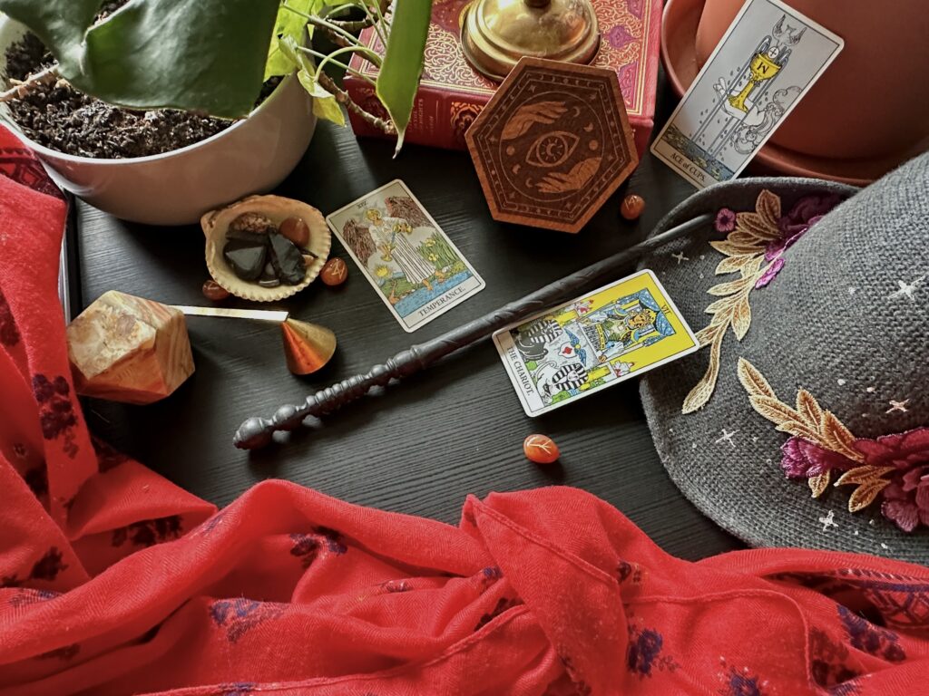
This scene tells the story of a young urban witch, setting the tools of her craft and items for ritual on an alter table in her bedroom. Of her magical possessions she owns, the most cherished is the wand that chose her; made of ash and unyielding like herself. The wand is her instrument for directing energy and indicating a sacred safe space around her. She comes to this alter every day to pray, cast spells, practice divination, and rituals that remind her of the power she has to enact change in the world and in her life. She finds comfort in her sense of agency and that there are tools such as these that help support her through life’s challenges.
To supplement the wand, I chose to include a set of crystals, a tarot deck, rune stones, and a book – all tools that those who practice witchcraft use regularly in their practice. Added pieces like the scarf, the hat, the plants, and the globe bring color and focus to the composition – surrounding the hero item in this story, the wand, at the center. Typically those who practice modern witchcraft will have an alter set up in their home that houses objects such as these, and will be laid out in a specific way for each season through the wheel of the year. The placement and choice of items corresponds with the themes from nature each month, or each season, of each year.
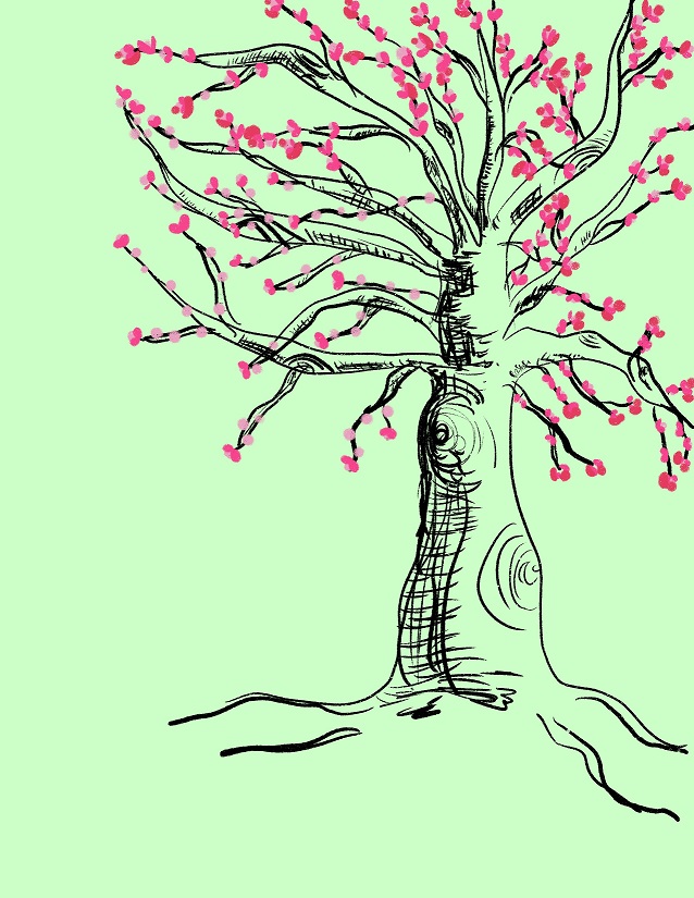
The other day I noticed that the cherry blossom trees are already starting to bloom. I thought, “It’s mid February and we are still getting freezing temperatures! I wonder if they will survive the cold?” Driving up and down the Main Street by my house, I realized that it is completely lined with these trees – which I hadn’t seen since moving to the area this past summer. Instantly I pictured how beautiful the street will be in the middle of March when it’s starting to warm up and the street will be filled with petals flowing in the wind, streaks of pink and white passing by.
I felt a moment of hope and excitement picturing what is to come, after the long wait of winter. I thought of this image when thinking of what to draw to create a gif of my poster.
I’d seen some designers on social media show short tutorials of using the Procreate app on their iPad to create short animations, but I had never tried myself. I started by sketching the barren tree on a layer itself. I wanted to create a simple, organic ink drawn image, slightly referencing Japanese calligraphy since cherry blossom trees grow rampantly there.
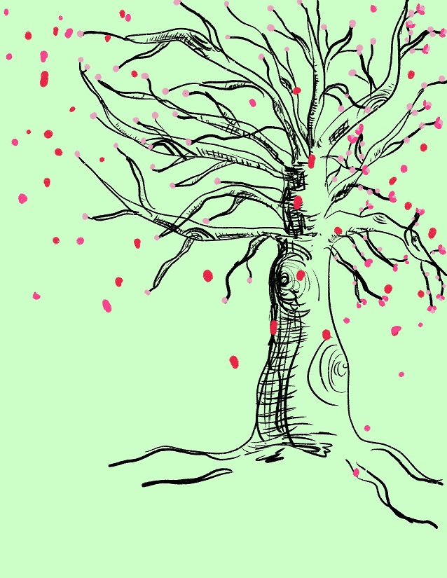
From there I worked as I usually do, creating new layers to add more features to the image. I thought it would work nicely to find a way to show the tree growing the buds of the flowers, then the flowers being swept away with the wind – signaling the short lived lives of cherry blossoms and the full onset of Springtime.
I knew that each layer would be processed as it’s own image, then played in a sequence to create the gif, so I used a process of duplicating images and adding an element, and repeating the pattern.
Once I reached the height of the tree’s blooms, I backtracked and made duplicates of previous versions, then drew some of the petals gently wafting away as the tree lost more and more flowers.
After the tree lost it’s flowers I had to finish the story by showing what comes next, so I made the new base composition a version of the tree full of green leaves. Layer by layer, I added in each letter to the phrase “Spring Has Sprung”, then create an ending, exploding with the colors of the season.
I knew that there was a way to export the layers as a GIF and had a classmate with some experience with Procreate show me a few tips. I exported all of my layers as an “Animated GIF” and it allowed me to adjust the frame rate down to the optimal speed. It was easy to save to my iPad as it’s own file and airdrop to the computer.
Challenges I faced were having to imagine how much of a jump should be made between each layer or “frame” in the GIF. I have no experience creating art that would be animated so it was mostly guesswork. When I was already almost finished with my drawings my classmate shared with me that Procreate has an animation “helper” tool that allows you to create small changes and watch back what you added in real time as you go. That would have been helpful if I had known about that feature from the start, but I was so close to being done already, I had to finish the final layers and hope it turned out okay. Thankfully, it did!
Sir Patrick Stewart Throws a Hail Arnold (Paramount+)
The “DunKings” (Duncan Donuts)
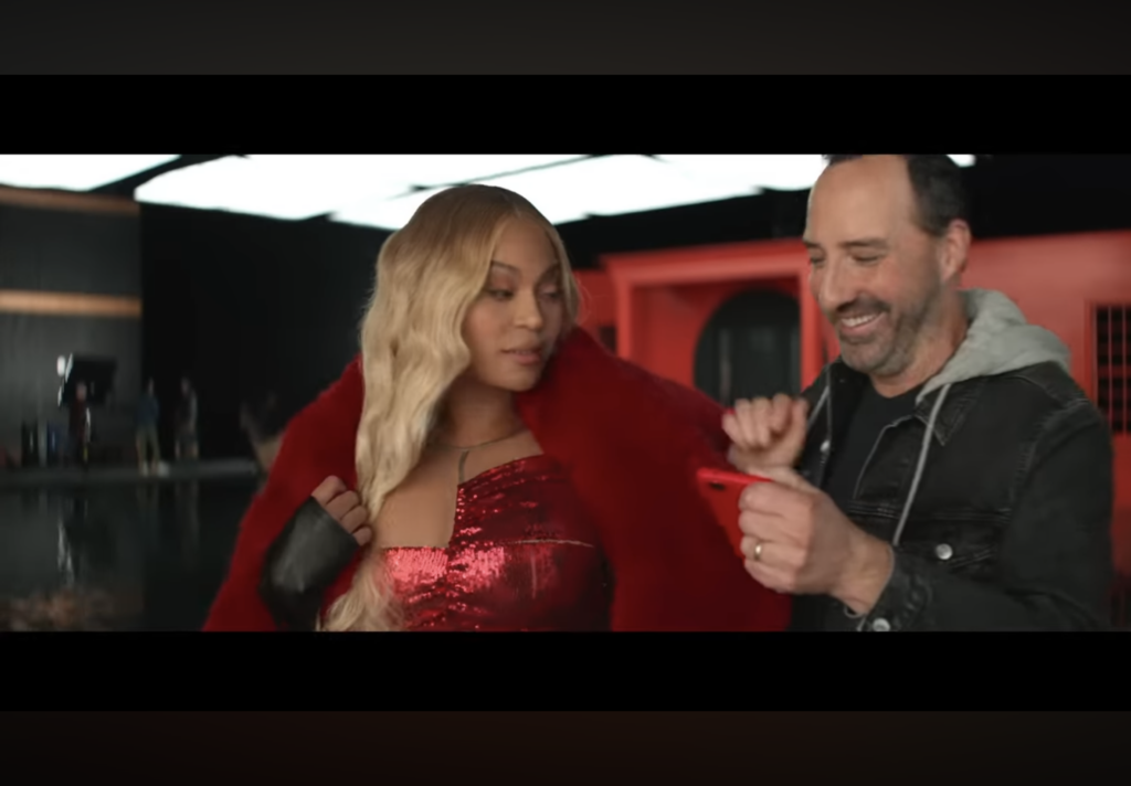
Can’t B Broken
“Okay, they ready, drop the new music”.
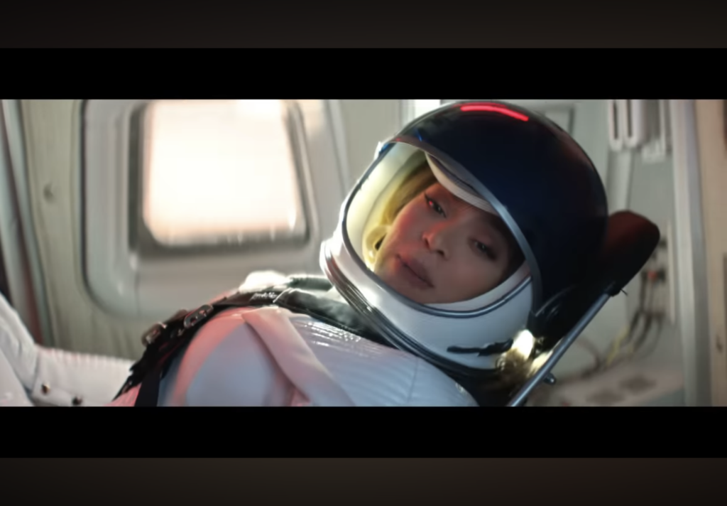
In this Super Bowl ad, Beyonce is trying to do anything she can to break Verizon’s internet service, by doing something so crazy, new, innovative, or unexpected. In the end, she is pictured in a rocket headed to space to be the first woman to drop new music from space. Not only was this a nod to her level of fame and influence she has on the world, but was also a way to advertise the actual release of a couple of new singles that she dropped shortly after this commercial aired.
Pros:
Lots of variety in the scenes, imagery, references, costume and set design. Fast paced movement between settings keeps up engagement.
Maintaining just enough consistency by keeping Beyonce and the “nameless Verizon store worker” the central focus of each shot.
Cons:
Sometimes scenes move so quickly it’s hard to track what is going on and really understand each of the references made.
A little bit overwhelming to watch – but maybe that is a purposeful choice?
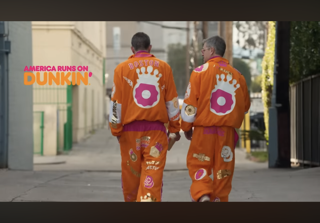
The DunKings
In this commercial, Ben Affleck and Jennifer Lopez create a hilarious, silly situation in what otherwise would be a very normal day at work for Jennifer. Jennifer sits in her recording studio along with the producers and techs preparing to record or listening back to the music they are working on. Meanwhile, Ben and his crew of other extremely famous men like Matt Damon, Tom Brady and more, crash her recording session posing as the musical group the “DunKings” in hopes to record themselves in her album. The “DunKings” wear full-body Dunkin’ Donuts themed outfits, all have short hair and sneakers. Jennifer knows exactly what stunt they are trying to pull as they break into the studio to perform their short act.
Pros:
Cast is made up of a bunch of recognizable, very famous actors
Turns an ordinary situation into something comical
Cons:
Also moves incredibly fast from shot to shot, not giving enough time for your brain to track what’s going on.
Could have integrated the color scheme and branding more into the whole story, setting, props…etc.
My technical drawing skills are not, what I would consider, the strongest. It has come up fairly consistently as an area that I feel needs to grow in order to improve as a designer. I’ve never learned how to draw people, and have had little experience drawing in a variety of styles. Taking to time to follow some character drawing tutorials and starting to work on these skills would help improve my ability to create what I imagine in my mind.
For example, when sketching concepts that will later be designed digitally, I often feel that I cannot accurately portray what I am trying to capture. I know what I am imagining in my head, but if I consider bringing these sketches to future clients for them to view and interpret, I would want to bring something to them that I feel accurately depicts the ideas. It is also appropriate to hand draw designs as well.
Learning resources
To work on this project I would probably start with some tutorials and instructional videos on YouTube and Linkedin Learning. Jumping in without any context, experience, or guidance to me is a recipe for frustration. First, I have to learn and practice the basics.
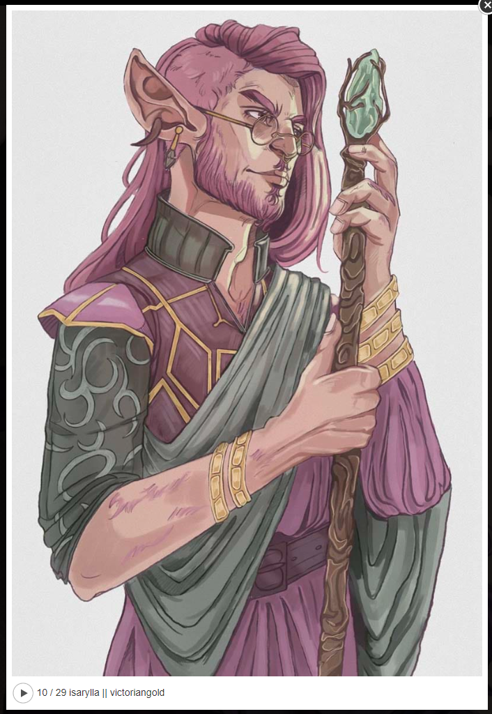
D&D Character Design Inspo
My hope is to work on developing an artistic style, learn how to draw figures in a variety of poses, learn how to draw faces, hair…etc. Not only could I use the character designs in my D&D campaigns, but practicing my illustration skills will help me as a designer.
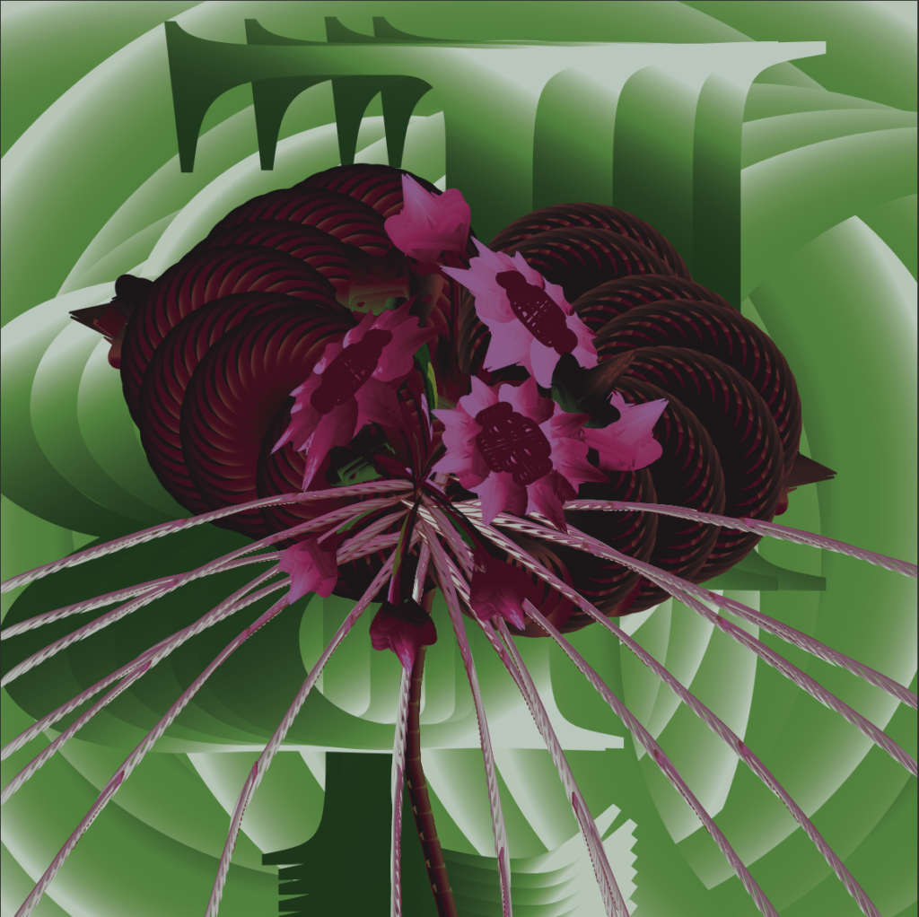
Typographical Interpretation of a Black Bat Flower
Background
For this piece, we were tasked with creating our own visual interpretation of a plant or animal using only the letters in the name, in a font of our choice. We were not allowed to distort the original shape of the letters, though we could change the scale, rotate, combine and layer letters in any way we wanted. We could use effects to add texture, gradients, and distort shapes that were made out of multiple letter forms combined. We had freedom to create in any style, blend the letter forms completely, or use them as defining stand-alone features.
Actions
The first step was research. I did some quick googling to learn about more unusual plants and flowers that would make an interesting subject. As I researched, I kept in mind the shapes that the letters of the plant names would lend me to work with. Coming across photos of the Black Bat Flower, I found a very unusual and dynamic subject with a dark and mysterious color palette I loved. I could roughly imagine using the “l” to create the long whiskers, the “O” to form the petals, and the rounded edges of the “B” to form the bulbs.
After choosing the flower, I spent some time picking out the font. We were asked to submit six examples of fonts that we thought were appropriate for the subject we chose. Knowing that the Black Bat Flower is sometimes called the “devil’s flower” and has been associated with the theme of death, many of the fonts I chose were inspired by gothic typography, harkening back to the church during medieval times.
Next, I saved a variety of example images of Black Bat Flowers to use as a reference while building my own design. I decided on the orientation of the flower and the single subject from looking at a couple of specific reference photos. The idea for a light and shadow heavy blurred-effect on the background came from dramatically focused photography shot of a single flower with a completely blurred background. I pulled color palettes from photos, focusing on a variety of options light -dark, muted – vivid.
Then I relied on experimentation. Knowing the rules I had to work within, I started playing around with different ways to combine letters to create totally new shapes. Once I was happy with each shape I layered most on top of each other, like creating a piece of art out of collage. I relied a lot on color to slightly correct shapes and imply dimension where I needed to. I ended up settling on using mostly gradients after seeing its effect on the petals.
I went through a few rounds of feedback with my teacher, sending in updates as frequently as I could. Ultimately, I made most of the major changes myself. There was a point where I felt like I had layered too many shapes on top of the petals and ended up losing the striation I was looking to create, so I decided to remove most of the shapes I spent hours trying to perfect – and it was just what I needed!
Results
What I appreciate about this piece is that it required so much experimentation that there wasn’t a way to plan it out completely from the beginning. From concept to execution, it developed organically from much trial and error. I ended up, unintentionally, with a hyper-realistic impressionist style piece that played up the textures and light/dark contrast way more than the inspiration photographs ever did.
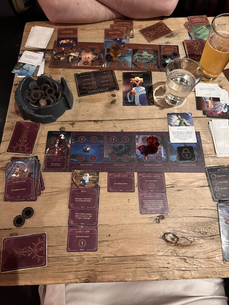
Villainous is a story based game that allows you to play as one of the famous Disney villains to complete a character – specific challenge to win the game. It is Disney’s answer to a more adult-oriented board game for their longstanding fans. In a way you are playing against yourself as much as you are playing against opponents. The starter version of the game can be played with 2-4 players but there are multiple expansions that have come out over the years that allow for many more players to participate.
To set up the game, players choose a villain and find their associated story board, card decks, villain guide, and miniature. Players can play cards each turn from their villain deck while opponents play from their fate deck in order to challenge each other or prevent actions from taking place.
With each players turn, they have a chance to receive power, place an ally, battle a hero, pick a card from an opponent’s fate deck, or move cards around. The first player to fulfill their villain’s goal is the winner.
I really enjoyed this game. I played through with one other person which was great for the first time. I only had to focus on two strategies, thought I think that it would be very fun to play with more people because it would add more variety. The game had a lot of replay-ability, as you can choose to play as a variety of characters who all require different strategies. I could see myself purchasing the base game to play with my family and teach my nieces how to play. Then maybe collect some expansion packs over time.