Blog Post #2 Winter Quarter

When I think about my future as a graphic designer, it feels fuzzy. I still haven’t explored all of the possible pathways, so I don’t know what will really strike my interest in the end. It is also possible for me to receive opportunities to do things that I couldn’t even have imagined, so planning how to be versatile “enough” is hard. As of this VERY early stage, my interests are Branding and Identity, Packaging, Environmental, and UX/UI design (especially in the gaming industry). There are so many skills that are incredibly valuable in all of these niches. And many more I won’t even know I need until I have experience working in the field. To prepare myself for a variety of possibilities, I am going to focus on these skills in my “toolkit”.

#1 Communication

It doesn’t matter where I go or what I choose to do, working with people is guaranteed. Valuing relationships, keeping an open mind, approaching conversations with curiosity first, and contributing are (in my opinion) the most important ways to practice good communication. When working in group projects for instance, I make a point to ask questions or engage in conversation casually, 0ff-topic. Learning about the people you are working with makes the process of designing more meaningful, and more fun. I remind myself to keep an open mind to other’s ideas that may or may not be wildly different from my own. Together you can create things that are better than one could do together. With that, asking meaningful questions, clarifying, and trying to understand the deeper meaning behind issues help to keep the conversation productive. Doing my part – keeping up with the responsibilities I have and what I owe to the people I work with will always be a value I hold. In my six years of teaching, I had a wide variety of good and very bad communication experiences. I feel much more prepared for work in Graphic Design because this is a skill I have already have a lot of experience working on.

#2 Self Confidence

This is a skill that I think I will be working on for the rest of my life. Art is extremely vulnerable, and its so easy to take things personally. A huge part of the curriculum here at SCCA is about learning how to give and receive constructive feedback, and use it to improve our work. Training our brains to think of criticism and feedback as useful will make our work stronger.

#3 Time/Project Management

I know that our time will be structured differently when we are working designers. We will balance multiple projects at once and likely will have to prioritize how we break up our time to work on each element of the project. We will be working with timelines that we did not set, but that are not that flexible with our clients. For me, I am learning a lot about time expectations. Some activities naturally take me longer than others. Some stages of graphic design work require multiple days of coming back and re-working, re-iterating, or waiting on feedback from clients. There has to be a balance of good prioritization skills and flexibility to make it work without becoming a headache.

#4 Know the rules in order to break them

Truly creative, innovative design comes from finding new ways of doing things. Most of the time, people who come up with extremely creative ideas have also spent a lot of time learning their tools and the “rules” that go with them. Learning how to use the design software and having the technical skills gives you a creative playground to start trying out ideas to see what works. I am still very much learning these programs and find it difficult to dream up the possibilities when I am still so new to the software.

#5 Empathy

This is a skill I’ve been practicing my whole life. I also am a naturally empathetic person. Practicing empathy in a more intentional way goes so far when it comes to working with others. When working with clients, I plan to ask deeper questions to get to the root of their vision and needs. Considering the needs of those other than myself when designing (ex. designing for accessibility) will be a cornerstone. With co-workers or supervisors, approaching conflict or problems with good questions, curiosity, and an open mind are important. Showing good active listening is something that I do all of the time now, very intentionally.

#6 Hobbies & outside interests

What I’m learning is that a lot of good ideas come from things you’ve “technically” seen before, in some way or form. Prioritizing experiencing the world creates more jumping-off points for relating ideas from personal experience. When you have experiences that inspire you, you can think of the emotions that come up, imagine the environment, the surroundings. Learning through experiences of new people, places, and things can bring images to your mind that you would never have thought of otherwise. For me it will be important to keep traveling, keep attending art events like concerts and performances, eat food from different cultures, talk to people I don’t already know. Anything that allows me to expand what connections my mind can make.

#7 Zoom out & zoom in

Any type of graphic design work requires both the ability to think metaphorically and conceptually and consider the details that all work together to communicate an idea. A client may need you to design a logo that incorporates an orange. The designer has to ask questions to understand the meaning of the orange, to capture what the client is trying to communicate with it overall. Instead of starting with what the orange will look like, they zoom out to look at the idea itself. Then later after ideating and iterating, and receiving feedback, the designer needs to consider what the smallest details of the image communicates. I tend naturally to think about the larger concepts, the “big ideas” and find it fun to talk about them. Though, I have over the years become great at checking my work and refining on my own.

#8 Working with technology

This one is more self-explanatory, but truly a requirement in the graphic design field. Knowing how to work with different types of printers, lab equipment, computer software, a server or hard drive…etc. The list goes on. Though I have thought of myself as being fairly tech savvy, I’m learning that there are a lot of tech tools I will need to become proficient with that I do not already have experience with as a graphic designer. This definitely feels intimidating. I know that we will have some instruction, but in this case really, practice makes perfect.
Blog Post #1 Winter Quarter

Iconic

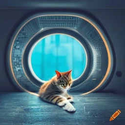
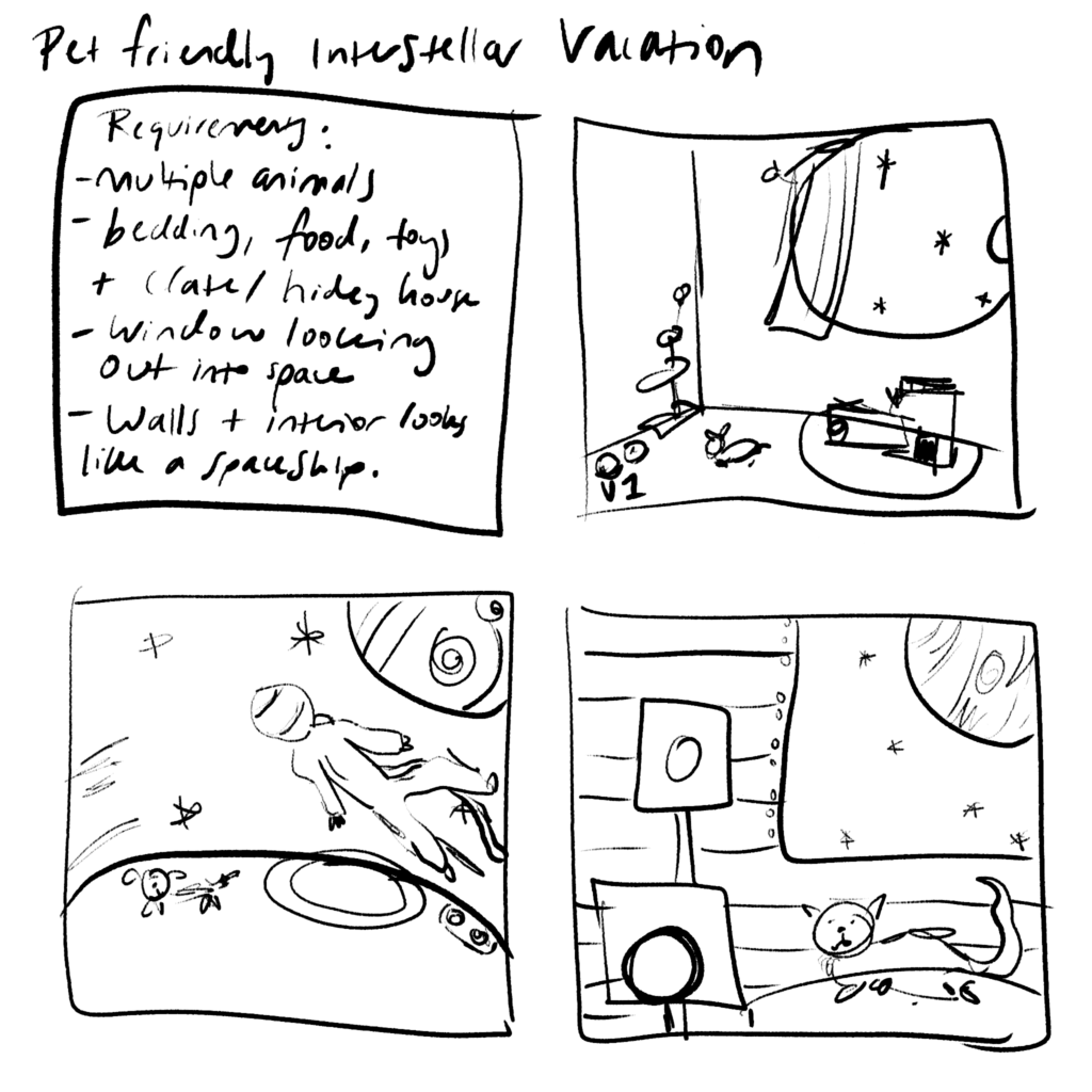
Our current progress in the development of AI Image Generation tools seems slow, and the mistakes: hilarious. I don’t find it to be a useful tool in creating finished compositions that would be used as-is, but is a great way to continue experimenting with and iterating on ideas. Taking the prompt “pet friendly interstellar vacation”, I mapped out some of the requirements for the image and sketched a few examples of ideas.

Query #1

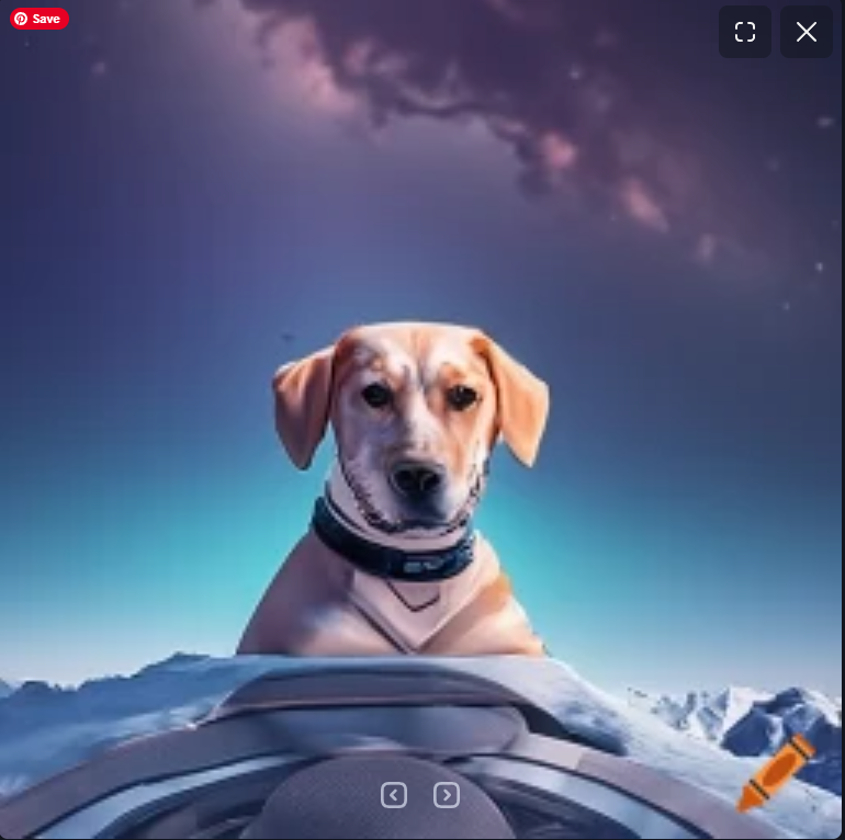
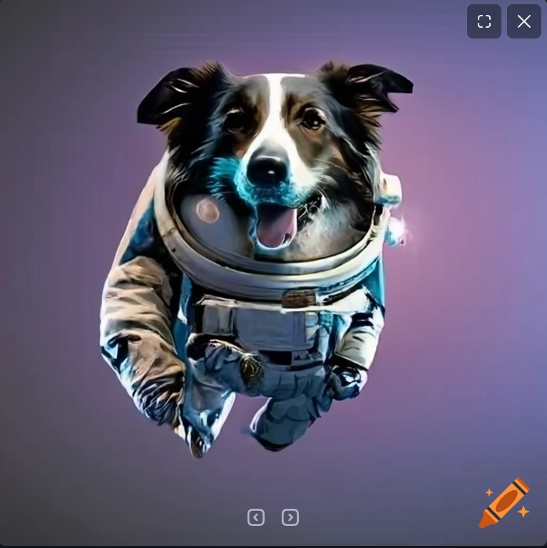
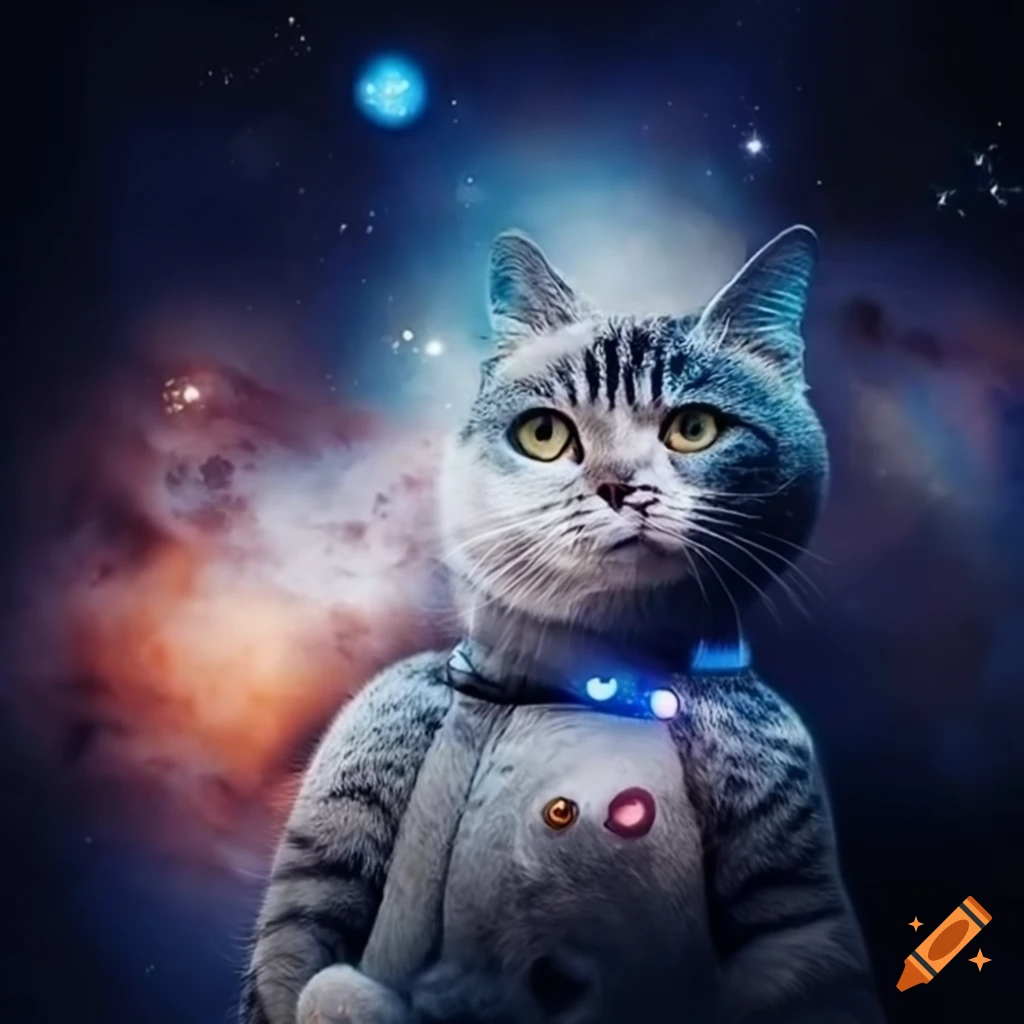
Using the prompt as-is in the free AI Image generator Craiyon, I received these initial images. I need to add more specific descriptors to get something closer to the sketches. The dachshund in its custom-fit space suit is pretty cute though.

Query #2

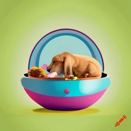
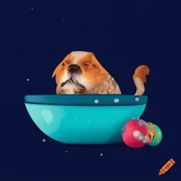
I laughed as soon as I saw these images. Though Craiyon did try to include food and toys that look relatively like they should, they put the animal in a tiny toy spaceship that looks more like the pod baby Yoda floats around in in The Mandalorian. I also need to specify what kind of pet because none of these images look like one type of animal.

Query #3

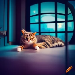
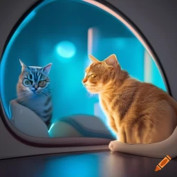
Now we have a cat that looks like a cat, and a window, and a futuristic style room. It’s not clear that outside the window is space, and the photo did not include toys as I had requested.

Final Query

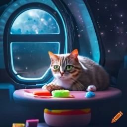
After adding in a few more specific details to the description, I was able to get a photo that meets a more significant number of my requirements. The downside is that the quality of the cat image is less than the previous version, and I’m not quite sure why. At least in these images it’s clear that the cat is indoors, somewhere in space, with some of it’s necessities to live nearby. Overall, I would not call this experimentation successful. None of these are photos I could use as an end-product, but I could use it as inspiration when creating my own version of the image. I wonder if other image generation software (especially those with a paywall) are going to be more advanced. I would be curious to compare across software.

Blog Post #7

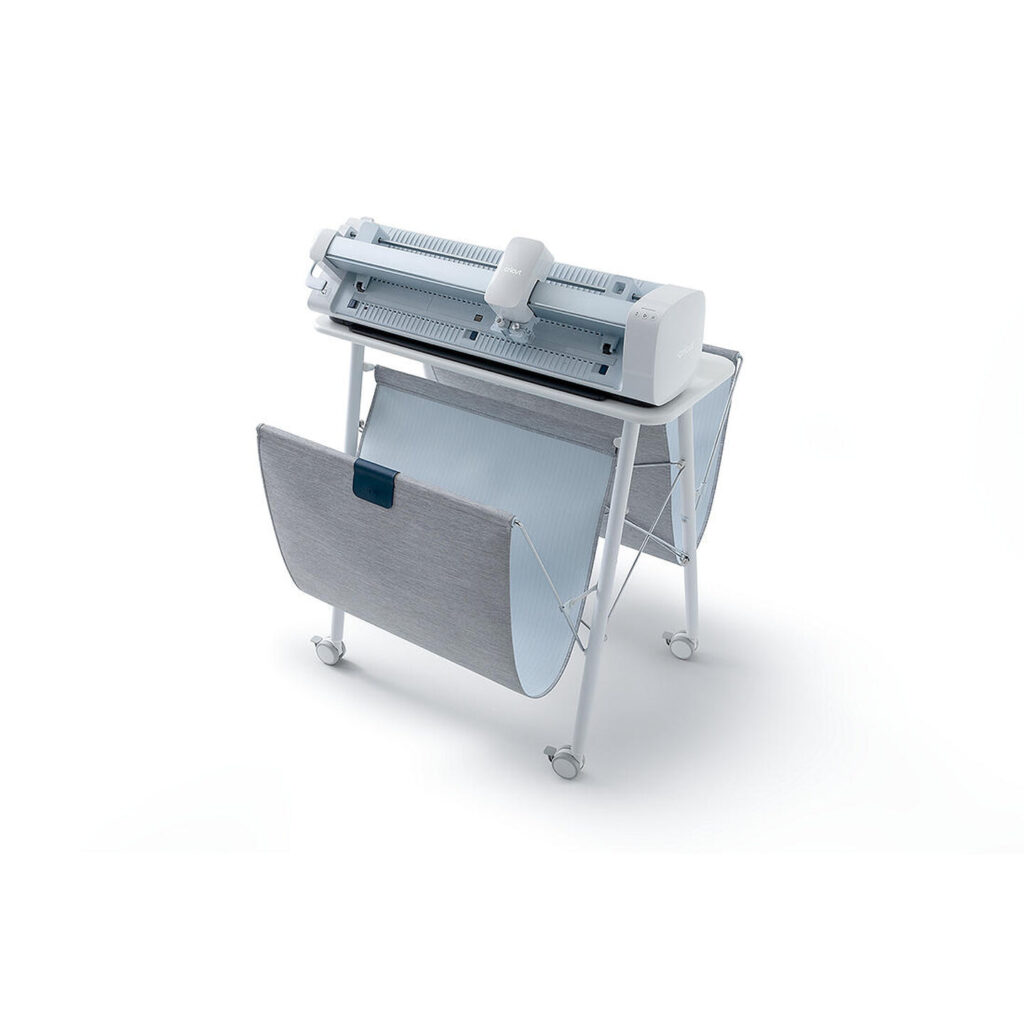
Cricut Venture Plus Stand

I am interested in purchasing a Cricut machine for my professional and personal design practice. There are multiple models of the machine that have been produced to serve a variety of cutting needs. Each model ranges includes a variety of features that are shared, such as bluetooth technology for wireless cutting, use of the easy Cricut DesignSpace Software, and work with a variety of popular materials such as paper, vinyl, iron-ons, plastics, bonded fabric, poster board, and cardstock. Most include print and cut capabilities, can perform foil transfer for metallic embellishments, embossing, and the ability to print and cut an expanded list of materials.

The Cricut Venture is the commercial model of the Cricut line machines. It can print, cut, score, emboss, write, and foil up to 75ft and is incredibly speedy (25.4 in/sec). Adding a machine like this to the SCCA Production Lab would allow students to create more realistic examples of their mockups – printing stickers that may be adhered to cups for a cafe brand design project, printing a tee shirt design for a merchandise project, or embossing a logo on a print piece for a sophisticated client.

Personally, if I were to purchase a machine I could see myself using it for freelance projects for clients, or to create and sell my own merchandise as a side business. I’ve been interested in learning how to make and print stickers to see on an online shop, but have not spent time researching the technology that I would need to invest in to get started.

The reviews for this tool are raving. I see users creating vinyl wall decals, coloring pages, paper sculpture art, and cut designs to adhear to merchandise they sell. One issue that users mentioned more frequently was having to use vinyl no wider or smaller than 25inches. Apparently most vinyl that is sold commercially is wider or smaller, so many purchase their materials directly from Cricut’s website. One of the positive points that is frequently mentioned is how fast the machine works.

The Cricut Venture retails for about $1200 with the stand, and there are bundle deals where you can purchase a starter kit of vinyl and metallic leaf paper to get students started with their project’s needs.

Blog Post #6

How will I will be a disruptor working in Graphic Design?

The journey to deciding to pursue Graphic Design did not come quickly or easily. After continually struggling working as a public school teacher for 6 years, I knew I needed to make a change. I have always loved serving and helping people. This quality that led me to teaching also pushed me towards Graphic Design. Instead of helping my students as a classroom teacher, I imagined another life where I could help businesses and organizations by creating things that they needed.

I’ve started to think more about who exactly, I want to help as a designer. I think that the clientele will be varied and will change throughout my life. I do have personal moral and ethical standards that will dictate who I work for and what I feel happy to design. I care that the companies or businesses that I work with have a mission that is inclusive and important. I would prefer to work with businesses who have published statements regarding equity and inclusivity that are tenants their staff keep in mind when creating the products that are to be sold. I would prefer to work with businesses that have a pulse of the positive and potential negative impacts the business has on the world and who seem to be a force for good. I know that I probably won’t be able to work with businesses that always meet all of these requirements, but I appreciate that I as a designer I will be a part of conversations that may spark new ideas and change.

Parts of my identity that I will be bringing into my designs are being queer, having worked with many students from numerous diverse backgrounds, my belief in constant improvement and progress, my care for social justice issues, and my learning and personal experiences with psychology and mental health. My love and care for people and meaningful relationships will likely translate to deep and meaningful conversations with my clients. Designing with empathy is going to be key for me.

Blog Assignment #4

I would love to find an opportunity to live and work in the United Kingdom at some point in the future. I chose this location because I’ve lived there before and would love to return. When I was a junior at the University of Washington, I decided to take part in a study abroad program that led me to Aberdeen, Scotland for a semester. That being said, I chose to look for graphic design jobs in London. I’ve spent a couple of days in the city but there is so much more to see and experience there.

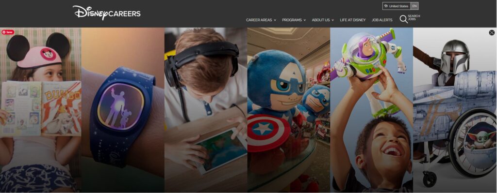
Digital Designer – 12 month FTC
Disney
London
Fixed term contract
Brand & Art Director
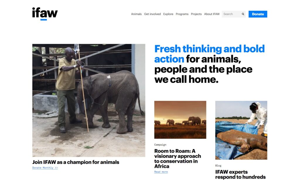
The International Fund for Animal Welfare
London SE1
Hybrid remote
£55,000 – £69,000 a year – Full-time

Out of the job listings I found, I was most interested in two positions. The first was a Digital Designer job working for Disney to provide in-house graphic design expertise as part of the Brand & Image creative team for both shopDisney and digital marketing. As someone who loved Disney’s products, working with their brand would be exciting. Though the posting does not list the salary publicly, It seems likely that the wage would be livable, given the lower cost of living in the United Kingdom.

The average cost of living in London is lower than living in Seattle, and if my family were able to move with me, we would have two working adults in our household to bring in income. According to numbeo.com, this is a comparison of the cost of living in London vs. Seattle:

Summary of cost of living in London, United Kingdom:

A family of four estimated monthly costs are 4,526.3$ (3,732.1£) without rent (using our estimator).
A single person estimated monthly costs are 1,314.5$ (1,083.8£) without rent.
London is 18.7% less expensive than Seattle (without rent, see our cost of living index).
Rent in London is, on average, 6.6% lower than in Seattle.

Given this information, I then narrowed my search to jobs that publicly posted the salary range. I found a senior position as the Brand and Art Director for The International Fund for Animal Welfare. This would be a long-term goal as it is not an entry level position. I love the idea of working for a service organization at some point in my career. I imagine that I will work within different industries throughout my lifetime – it’s hard to imagine doing one thing forever. Working for an organization that serves animals and supports conservation efforts would be an extremely meaningful job. Easily, the income would cover my family’s expenses living in London, especially combined with more than one source of income.

Some factors I took into consideration when making these choices were the housing market and healthcare. On average, the cost of buying a home or renting is lower in London than in Seattle. Since the UK has a universal healthcare system run and provided by the NHS, I know that I would be spending substantially less money on health related expenses. Combine these factors with decent free public schooling, first time home-buyers incentives, low-cost public daycare, and a great public transportation system, it would be easy to live off of a less substantial income and be able to care for mine and my family’s needs.

Blog Assignment #3

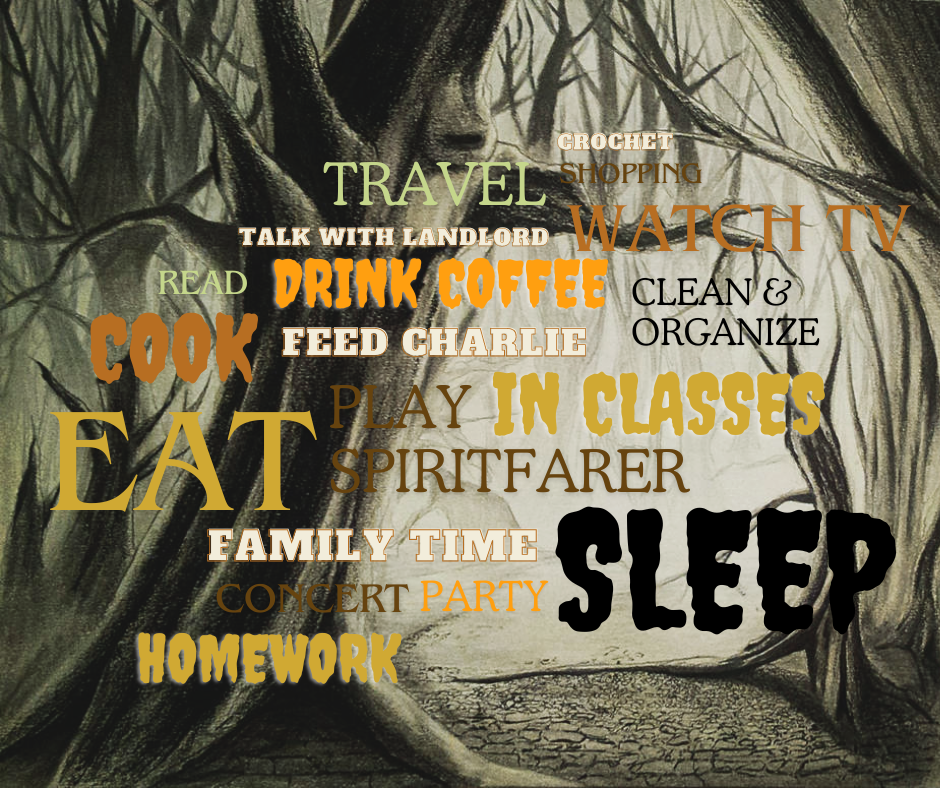
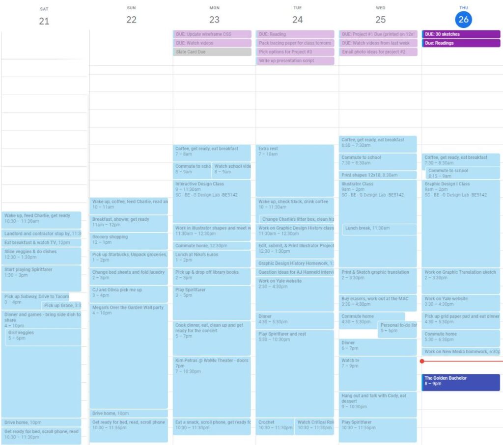
This week I tracked how I spent my time in much more detail then I ever would normally. I used my current method of organizing my time – Google Calendar – to write about how I spent all of my waking hours each day of this assignment. The word cloud graphic above represents the activities that took up more or less of my time. Unsurprisingly, activities that are necessary for survival like eating and sleeping took the most time from my day. Cooking was a close third. I spend about half as much time doing homework as I do in class each day. I’ve been trying to work on homework immediately after the class I take each day, working about a week ahead at a time. For the most part, this works well for me, but I still have to maintain more flexibility for projects that require multiple feedback cycles within a week. I had a number of fun social activities this week that took up a lot of my time. Even though I am working hard to keep up with schoolwork, I still prioritize my experiences with others. Prioritizing life outside of work is vital to doing my best work and thinking creatively. I find a lot of inspiration from experiences, so continuing to make sure I am going places, seeing people, and engaging with art is incredibly important with me. The areas I see for growth are in getting off of technology for at least a half an hour before bed. I would like to spend more time reading. Getting to bed earlier would help me feel more motivated and increase my productivity.

Blog Assignment #1

JAWNY is an American indie/alternative pop band, most known for their 2019 single “Honeypie“. Jacob Lee-Nicholas Sullenger, lead singer, songwriter, and producer is signed with Interscope Records.

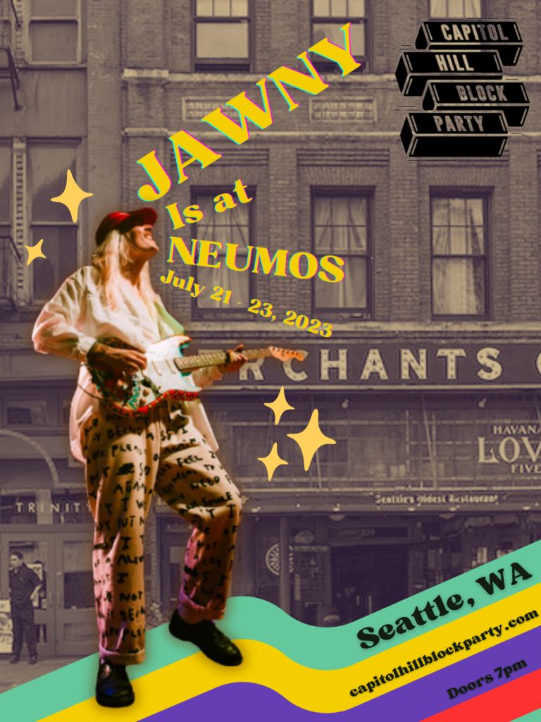
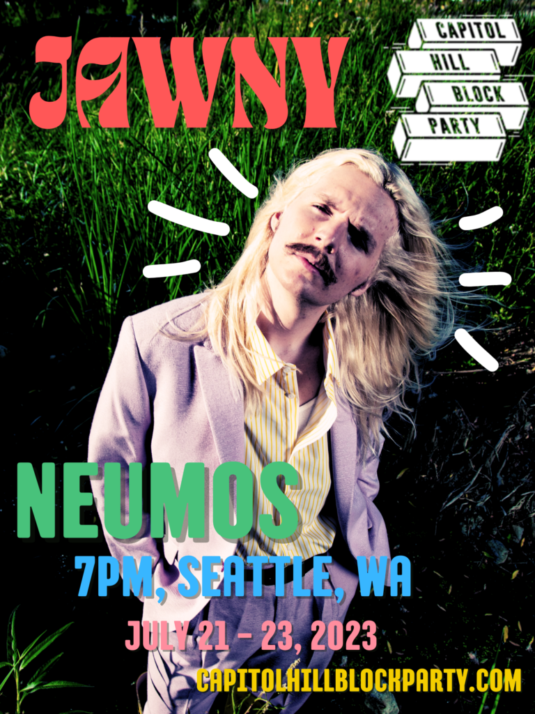
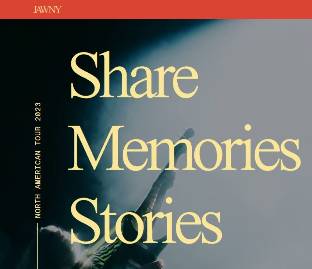
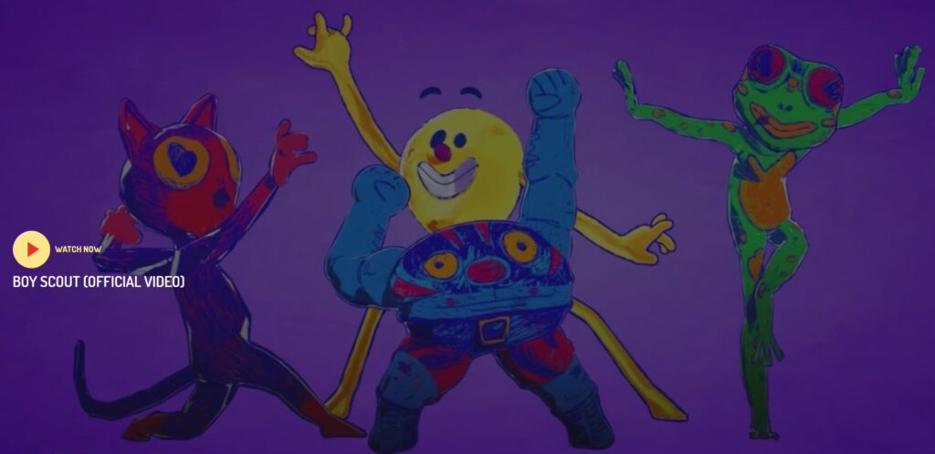
To design a poster advertising a show at this year’s Capitol Hill Block Party, I started with research. I began with listening to a sampling of his music. Though his style has evolved somewhat over the years, consistencies I found were the use of mainly three instruments: drums, bass, and guitar. This is a common setup in the indie pop genre. Melody and vocal arrangements were key. I also noticed a nod to the early pop/rock bands of the 1950’s. I knew that adding vintage style text would be a key element in my poster design. For color scheme I found inspiration from his website, where predominant colors were fairly close to primary and somewhat muted. I scrolled through his Instagram, watched a few music videos, and looked at his Tour Memories page on his website for more ideas.

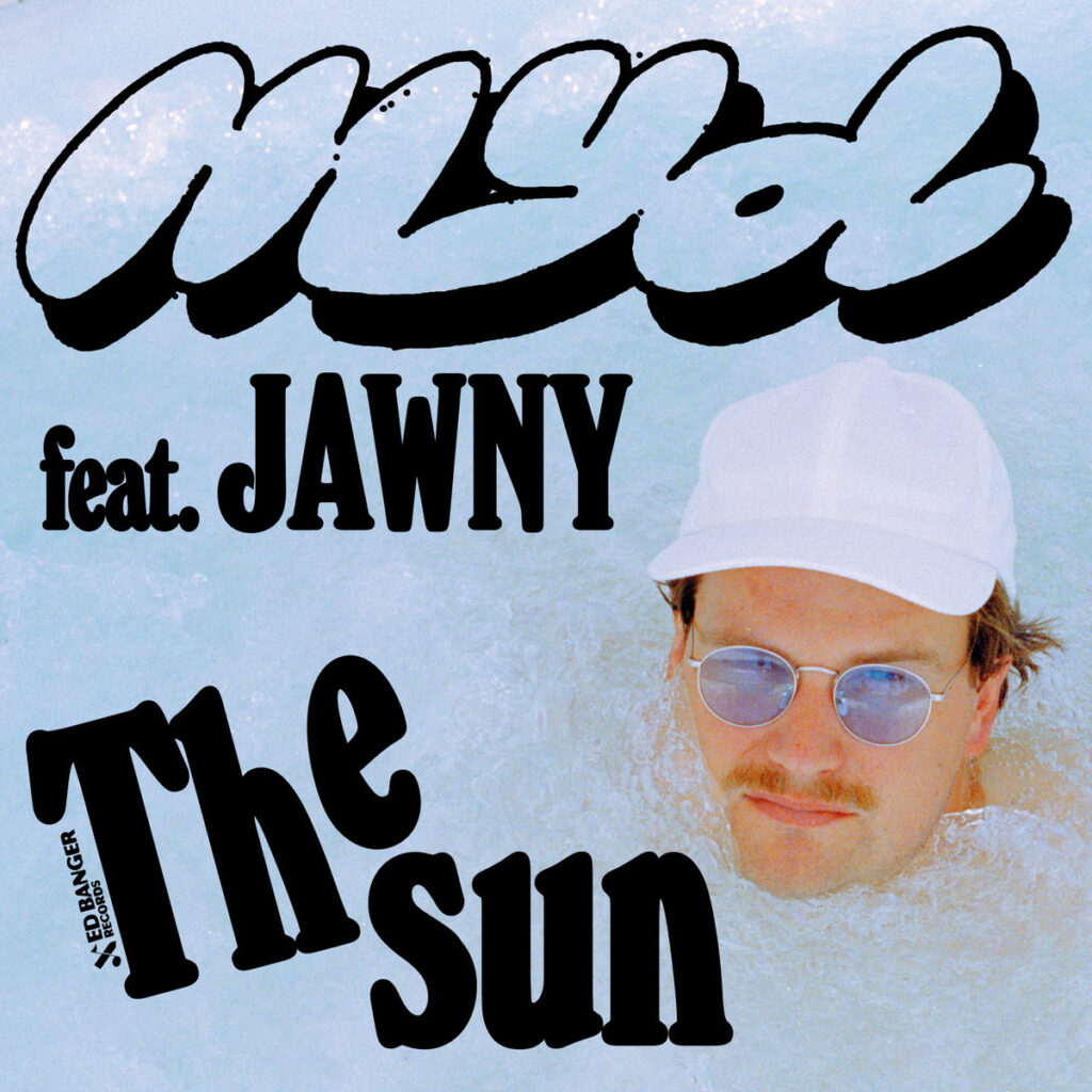
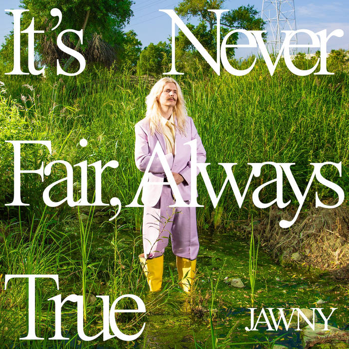
As I looked through a variety of his images posted adverting the project, I saw many different versions of self portraits utilizing photography. This finalized the decision to use a combination of photography and text in the composition. Looking through JAWNY’s discography, I saw a number of images that utilize hand drawn icons, symbols, and text. This communicates a playful attitude. Adding a layer of detail that would be hand drawn felt consistent with his brand.