Blog Assignment #8

Freedom to Express:

For this phrase I would use imagery or footage of someone dressing up or putting on a costume. I would have the camera facing a mirror and behind the person who is looking into the mirror. 

Freedom to Explore:

For freedom to explore I would want something with imagery that shows vast landscapes. This could be a photograph or a painting or video. I also thought of something similar to ispy books or “where’s waldo” where there is a huge composition with tons of little things happening in the picture so you spend a lot of time scanning over the image. 

Freedom from Expectation:

Something that is jarring and completely random. Right now the only thing that comes to my mind is a jack in the box. I think it would be interesting to have a 3d design or animation of something that pops out of a box like a jack in the box.

Kraken Green Night Jersey

Mothers Day Mural

For the mural dedicated to my mommy I decided to play with the concept of the stairs and sound effects traveling up them. When I was growing up my mom had a stay at home job as a courtroom transcriptionist. I would be on the first floor of our house and could always hear her fast and loud typing noises. When I would go up the stairs the sound would get louder and louder the closer to her room/office I would get. I thought this would be an interesting idea for the mural since it involves stairs. She also had a story that sticks in my head of when she was taking the Bar exam in college she brought in a typewriter and it stopped working. She said she found someone in the exam who let her borrow their extra typewriter but that one also broke. Instead of giving up she did everything by hand and passed the bar exam on her first try without letting the initial setbacks stop her. That’s why I decided to have the graphic of the 80s typewriter at the top of the stairs. I love my mom and I wanted to brag about her for a second. 

Kin Len Food Truck

For this assignment, I chose one of my favorite restaurants in Fremont: Kin Len. Kin Len immediately popped into my head because they have strong branding, and I could easily envision what one of their food trucks could look like.

I started my creative process by looking through their website and saving images and elements that I thought would look good on the bus. I got the idea to make little prawns drinking lychee martinis, which is one of my favorite Kin Len cocktails.

At first, I wanted the whole side of the food truck to have the cocktail prawn and a disco ball, but after trying out a couple of different versions of that, I was not happy with how it looked. There is a painting in their restaurant with the two symmetrical tigers, and this inspired me to put the disco ball in between them and then make a fun graphic out of this.

I still really loved the prawns, so I decided to put them in each window on the driver’s seat so it would look like they’re operating the food truck. Inside the Kin Len restaurant, there are a ton of colorful banner flags hanging everywhere, so I wanted to put these on my food truck design also, along with some images of food and drink that are served on their menu on the side of the truck.

Another final idea I had was making the wheels look like tom yum soup in hot pots because they kind of reminded me of wheels. I had a lot of fun working on this assignment, but it also made me very hungry and craving Kin Len Thai food.

Roach Resilience

I had a really great time working on this video assignment. On the first day the three sticky notes that we ended up with said “Owen Wilson” “plastic bug” and “wolves hunt in packs.” At first we were all super stumped and had no idea what direction these prompts would take us in. After sitting at the table with my group we slowly came up with an idea just from talking and throwing different ideas and themes back and forth. We got really excited about the concept of a parody version of Survivor using plastic cockroaches I had at home. I had a lot of plastic bugs lying around my house (don’t ask) so I was really happy that we ended up with that sticky note and we weren’t required to buy any props or supplies for this project.

 After coming up with our concept we ran the idea by Marc and then began writing our treatment and storyboard. The storyboard came together very quickly because we used screenshots from a survivor commercial and just planned on copying most of the sequences. Our next step was building the sets and gathering props, which was a ton of fun. We kept commenting how the day just felt like an arts and crafts day because we were just gluing things together and having fun creating our sets. We began filming almost immediately after creating our sets. We wanted to finish filming as early as possible since we knew that editing was going to be the most time consuming part of this assignment. I had never used premiere pro before so this project was a great introduction to the program. It felt very intuitive compared to other editing programs I’ve used before. Since Diana was leaving for a wedding on Friday she created the slideshow for us which was awesome!

 I felt like our team did a good job dividing the work and using our different strengths and abilities to complete this project. Thank you so much Emily and Daina!

The Vera Project

After doing a bit of thinking on causes that are near and dear to my heart I ended up deciding on The Vera Project. The Vera Project is an all ages nonprofit space that is dedicated to fostering a community that encourages personal and community transformation. They focus on doing this through encouraging youth-driven engagement in the music and art scene in Seattle. VERA has a music venue, screen print shop, recording studio, art gallery and all of these spaces are safe for radical self-expression. The Vera Project often hosts volunteer driven concerts, and art gallery shows. They also have art education classes that include screen printing, live and recorded sound, concert lighting, zine-making, DJing, and more. The Vera Project also advocates for community-centered cultural spaces, the DIY Scene and universal access and opportunity in the arts.

I believe that creating communities around art and creativity is extremely important to a society, especially giving a space for young people to meet and partake in safe and creative activities that expand their horizons and open opportunities. This is why I think that The Vera Project is so important for our community. 

Mood Board

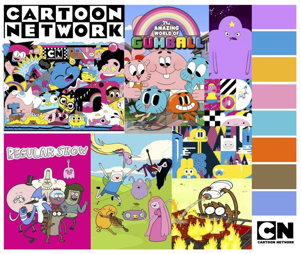
The 32oz Stanley Dog bowl is durable, reliable and stylish featuring a variety of colors and patterns to suit your pets mood. This limited addition collaboration with Cartoon Network contains a variety of color ways that match your favorite characters.

Mood Board

Design Systems

For this assignment I looked at the Design Systems for Mail Chimp, The Guardian, and Audi. I originally tried looking at Ubers design system but they wanted me to sign into my Uber account to do this. (I wonder what their bounce rate is because of this.)

The Guardians Design System site was the most unique compared to Audi and Mail Chimp with images that change as you scroll down the site and headlines that explain each of their decisions. However it was a little overwhelming and I found myself just quickly scrolling through the site without really retaining the explanations behind each decision. 

The Guardian

Audi had a very sleek and simple site that definitely gave me vibes similar to luxury branding. The system was easy to navigate and had a couple sections where you could click in to learn more about their Design Systems. Their website was very reflective of the brand itself and quite successful in my opinion.

Audi

Mailchimps site was definitely the most simple of the 3, it had two different sections for foundations and components and then various sections to click through under these sections. I really like the brand typeface they picked out and being able to see their grid system that they use throughout the site. 

Mailchimp

Blog Assignment #10

This felt similar to Jasons first illustrator assignment!

Process Video

Here is my process for my color theory final!