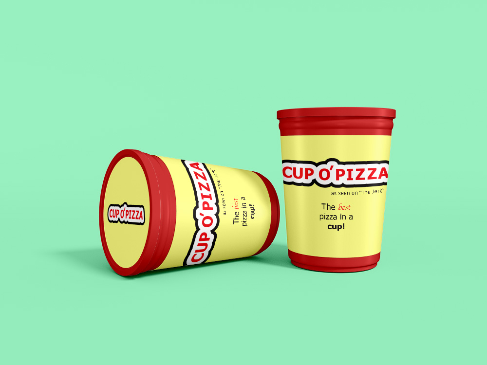
Inspired by The Jerk, I decided to make a marketing piece for Cup O’ Pizza. I haven’t ever worked with mock-ups prior to this so it was fun to figure out how to manipulate all the artwork to fit into a product while emulating how text would physically wrap on a label. I used Illustrator to format the label text elements, and I used Photoshop for the rest. I had fun experimenting with this and am looking forward to delving into more of these kinds of projects to get more detailed package designs.
Edit: Upon trying to upload a higher res image of my mock up, it was far too big to publish in a post. I scaled it down so it could fit but a lot of text elements are now difficult to see. Just wanted to give a heads up!
