Video is not working to upload so I have written a transcript of what my elevator pitch would be.
“Pretty rad riff huh? I got to do the artwork for this bands album! I’ve been doing personal work for album artwork and layout design for the last 7 years as a fun project. In my regular day to day I’m a graphic designer, for fun personal projects I started making artwork for my own band. After that started, more friends commissioned me to do work for them, too. And since I have been a letterpress printer for 13 years, its fun to print my own work for these commissions.”
AR #4 Group Project
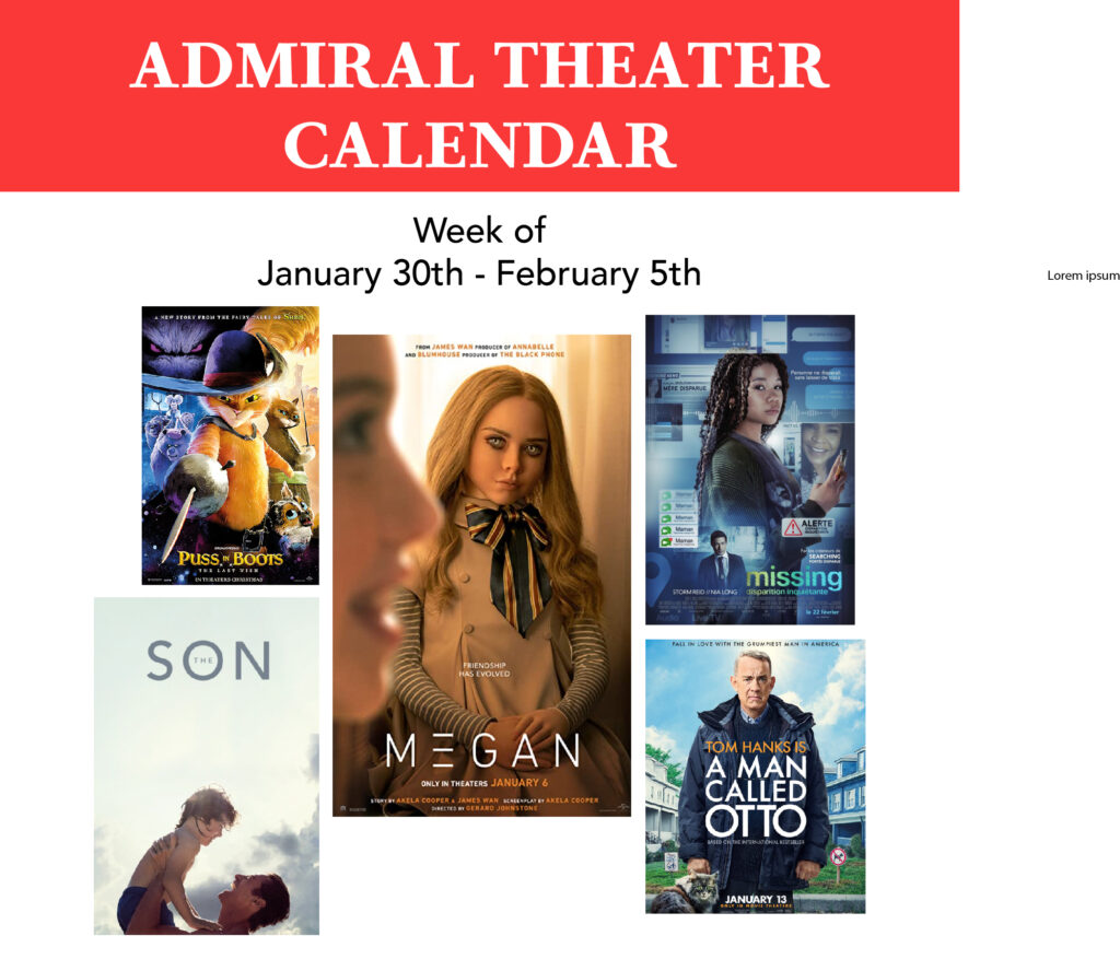
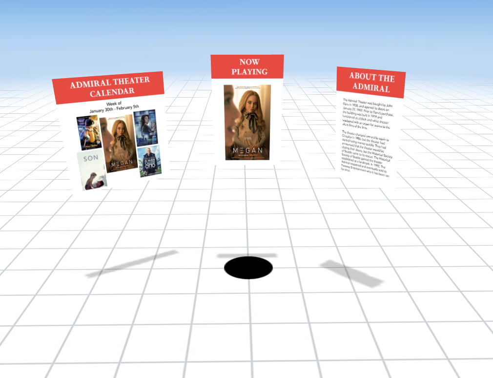
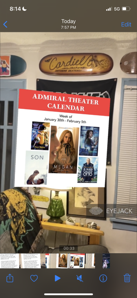
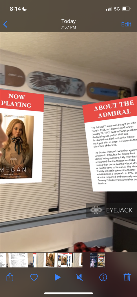
For our group project, we decided on featuring a few of the independent cinemas we have here in Seattle. Each of us chose to represent information in three panels: Now Playing, Weekly Film Calendar and a small page of historical text giving information on the specific theater you are at. My video will not upload of the actual panels in use on the wordpress, but I took a few screen caps for measure.
I created a calendar template for everyone to use and drop their information of the films at their theater into. On these files I worked in Illustrator and exported each panel as a .jpeg file.
AR Project #3
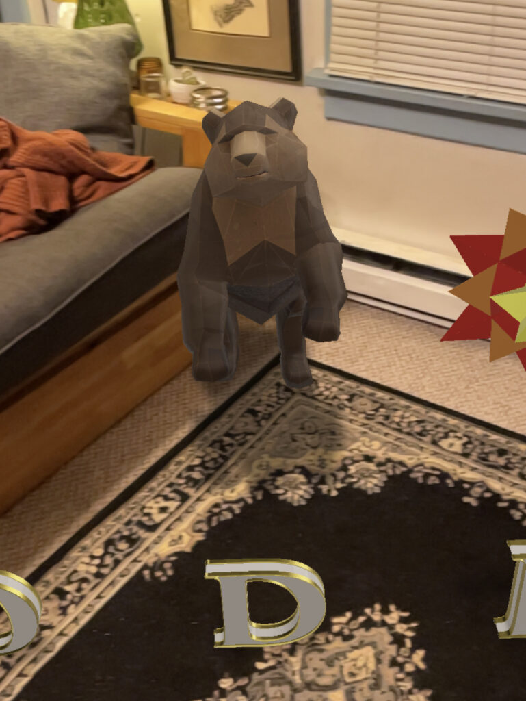
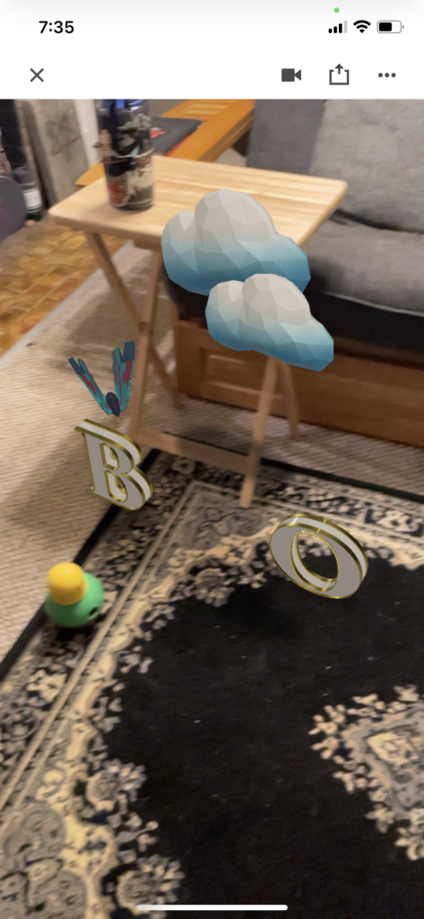
Over holiday break on New Year’s Eve, my brother had his second boy. I have one other nephew named Colin who will be 2 in March. Through photos with his little brother, I can already tell he is so proud and happy to be a big brother. I haven’t had a chance to get home to see them in almost a year, so when we finished our in class assignment last week I recorded a video of the Earth Day scene we built. Apparently Colin made my mother play it a hundred times, because he was obsessed with the fox. Since he liked it so much, I decided it would be fitting to make a little Welcome Bodie (my new nephew) AR greeting.
Most of the project went well with placement, order and actions of things. The one issue I had was for some reason I cannot get my proximity action to trigger on the clouds and sun. They are in my behaviors so I’m stumped on what I did incorrect here (you probably have some good insight for this!) I also seem to have made the scale huge because it anchors at a crazy size when I try and anchor it in my living room. I don’t have much horizontal real estate in my tiny house, so this made it a little difficult to document, but here are some attached screen shots and a screen recording I took of the scene.
Blog #3 – Andrew Nedimyer
I am, admittedly, the worst at doing things for myself.
Here is an example: I absolutely love making music. I have a band I make music with in a collaborative manner. On the side I will occasionally write things on my own, for myself. When it comes to finishing my own solo music? Oh wait, just kidding that never actually happens.
I have unfinished songs from 6 years ago that have been collecting metaphorical dust on the hundreds of shelves in my brain. For some reason when it comes to order of importance of getting things done, personal projects will always be at the bottom of the list. I’m good at generating ideas, and then never fully investing in them. Maybe because there are too many ideas and I can’t sort out which are of any value and which will equate to time wasted. It’s paralyzing.
I think in all reality, pursuing a personal project that I would follow through with would have to be accessible on a day to day basis to do whenever I find myself with down time. I have had this idea of getting better at hand lettering and testing myself with making different alphabets with an overarching theme for each of the letters. I started sketching this idea a few years ago, but I haven’t given it time since a few rough sketch ideas. The central theme was called “Alphabet of Atrocities” and each letter had a corresponding creepy noun. For example: “A” is for Amphisbaena. A two headed snake, with its body forming the strokes of the letter.
If I were to carry out this project, it would not be too expensive to create and it wouldn’t require a lot of resources. Ideally, I would do some research on how hand-type designers manipulate text and embellish, what programs are best to render hand-type, and best practices for creating a cohesive body of work.
For resources, I could buy a Skillshare subscription and take masterclasses from people like Jessica Hische and other hand-type professionals. It would also be beneficial to some YouTube searching for different effects and how to execute them via tutorials of my design programs. Alternatively, I could check with my professors for resource recommendations.
To continue advancing my skills with other Adobe software, I don’t have to limit myself to designing hand rendered type solely in Illustrator. I could experiment with these letterforms becoming graphic animations, design them to be used in AR, create an entire book or zine based off of the rendered type, the list could go on and on. This project could have many legs and help me develop skills in many different areas of design.
As for the timeline, pragmatically I would focus on one central theme and develop the full alphabet as graphic renderings first. Considering my tendency for putting my personal projects on the end of the list, I would allow myself the timeline of a year to get this done. From research, skill development, concept development and physically producing the work (while also juggling life’s other many busy facets) I think this would be a realistic timeline. From there I would give myself extended time to develop animated graphics from the designed letterforms, and probably cherry pick my favorite pieces to build into animations.
The monetary investment is very low. A few payments to subscriptions for a year would likely be under $200 to produce. If I made a physical item of the work (ie: a book or zine) I would probably add another $800-1,000 for budgeting. Luckily, since I am a printer I could save some money on paying for labor and just pay for materials needed for printing and binding. Love me a thrifty project I can create from beginning to end with my own hands!
Winter Blog #2
In Q1, we had an assignment assigned to create from scratch an icon library for a graphic recipe. It was a 3 week long assignment as it was fairly extensive in workload. I likely put in 16+ hours into it, and was very proud of the work I had done.
Due to school not being open on Saturday’s to access the print lab, I did one round of initial printing a draft and stopped into a Kinkos to make sure the sizing and line quality were good for print. Everything checked out pretty well upon the test print, so I continued working to finish.
Since I needed the whole next week after printing to finish my assignment and would not have access to the school lab for printing over the weekend, I decided I would go into campus very early that Monday of class and print. Our professor had spoken with us he would be at campus by 7 am so there would be enough time for everyone to get final drafts printed. I was the first one there and printed a draft, and my colors, though saying they were the exact same value in my Illustrator file, were printing just slightly different. A few pieces on my recipe were printing a cool gray, where others were printing warm. It wasn’t ideal, but I luckily planned to give myself a few hours of time before class to address any last minute issues that would arise. I eventually was able to get the color discrepancy fixed on time. I learned it is a good idea to give yourself a good window of time for these sorts of circumstances.
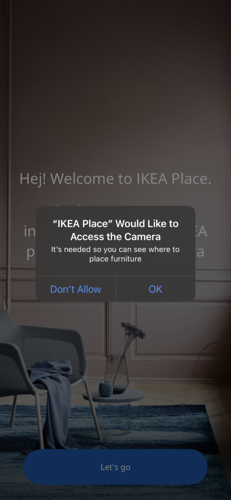
AR Review- IKEA Place
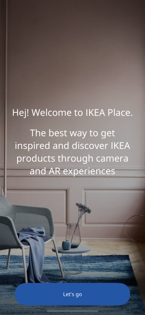
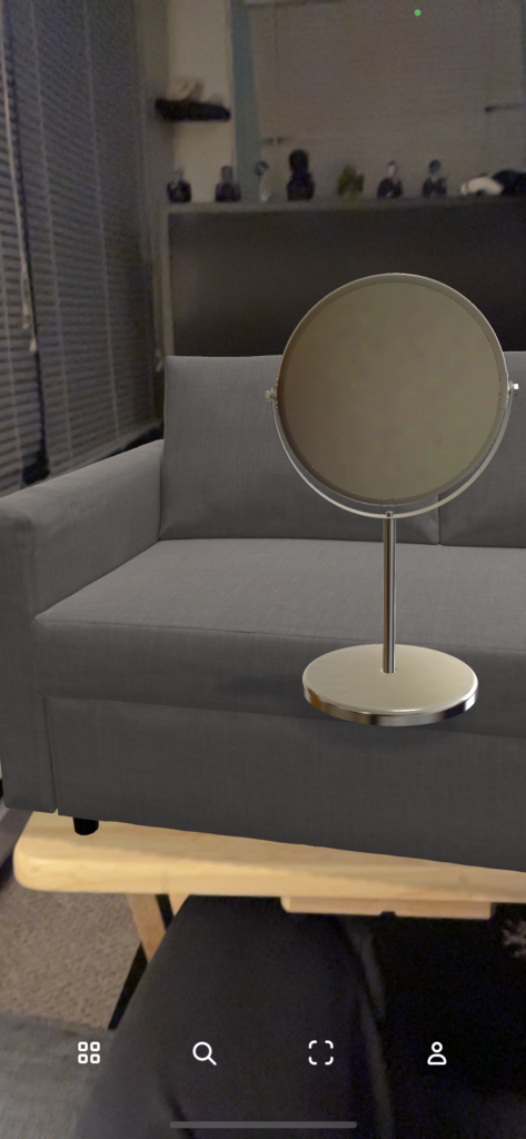
IKEA built an augmented reality application to help customers with visualizing how a piece of furniture would fit in their space. They wanted to create an easier shopping experience that minimizes the stress of purchasing new home items and realizing they are not the right fit for the space.
Overall I enjoy this use of augmented reality. It quickly can filter out things that would not work in a space and the concept is sound. At this point, my suggestions for improvement on the app is quality based. First issue is some pieces of furniture tended to “float” in the phone’s frame rather than being fully static while others seemed fine. While it is mostly intuitive to use, a “how to” guide for users could be very beneficial as there is no direction on how to use each function in the app. Lastly, if the frame is interrupted the images corrupt or distort a bit. But aside from that I think it’s a useful tool for a furniture company to use, especially in the world of online shopping.
Winter Blog Post #1
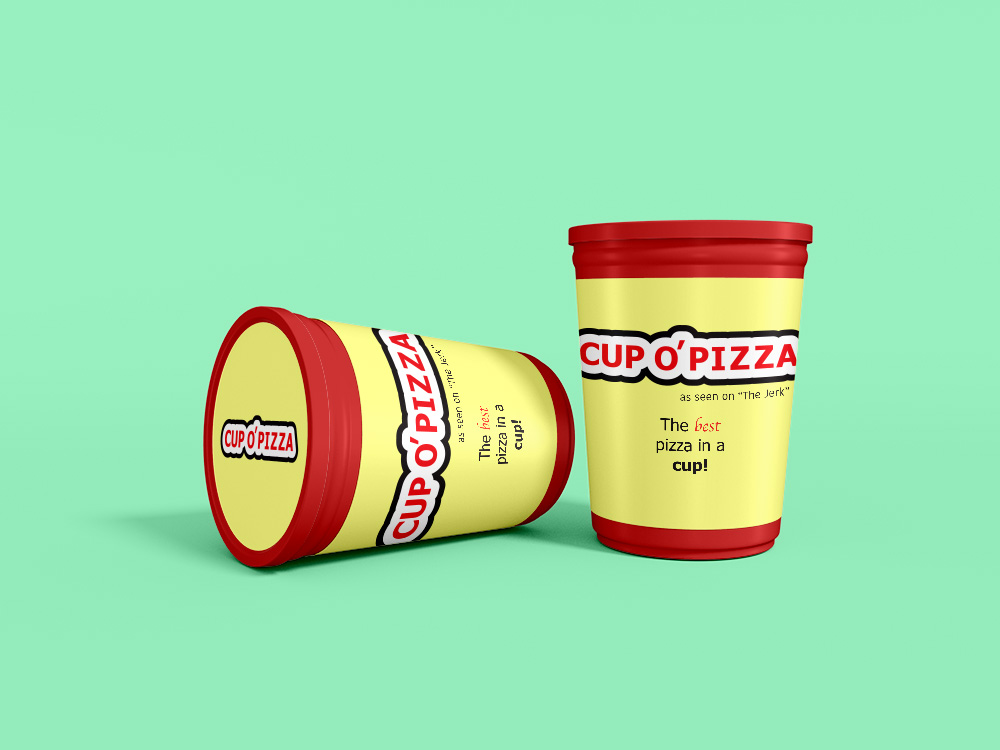
Inspired by The Jerk, I decided to make a marketing piece for Cup O’ Pizza. I haven’t ever worked with mock-ups prior to this so it was fun to figure out how to manipulate all the artwork to fit into a product while emulating how text would physically wrap on a label. I used Illustrator to format the label text elements, and I used Photoshop for the rest. I had fun experimenting with this and am looking forward to delving into more of these kinds of projects to get more detailed package designs.
Edit: Upon trying to upload a higher res image of my mock up, it was far too big to publish in a post. I scaled it down so it could fit but a lot of text elements are now difficult to see. Just wanted to give a heads up!
AR Project #1 Eyejack
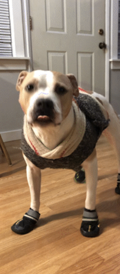
The idea was honestly just inspired by how entertaining it had been to see my dog Spot be put in shoes for the first time, and him trying to figure it out. I turned some of his shoe-wearing spins into a gif, because I knew he wanted the world to see his cool new kicks. I used Adobe Express to create the gif, and Adobe Illustrator to create the poster artwork. The first time I created the EyeJack file, I could not for the life of me get the audio to upload properly with it. So I exited the application and remade the file, which seemed to do the trick. The audio was much needed added comedy, so I would have been disappointed if I could not get the audio upload to work.
Blog #6: Environmental Design
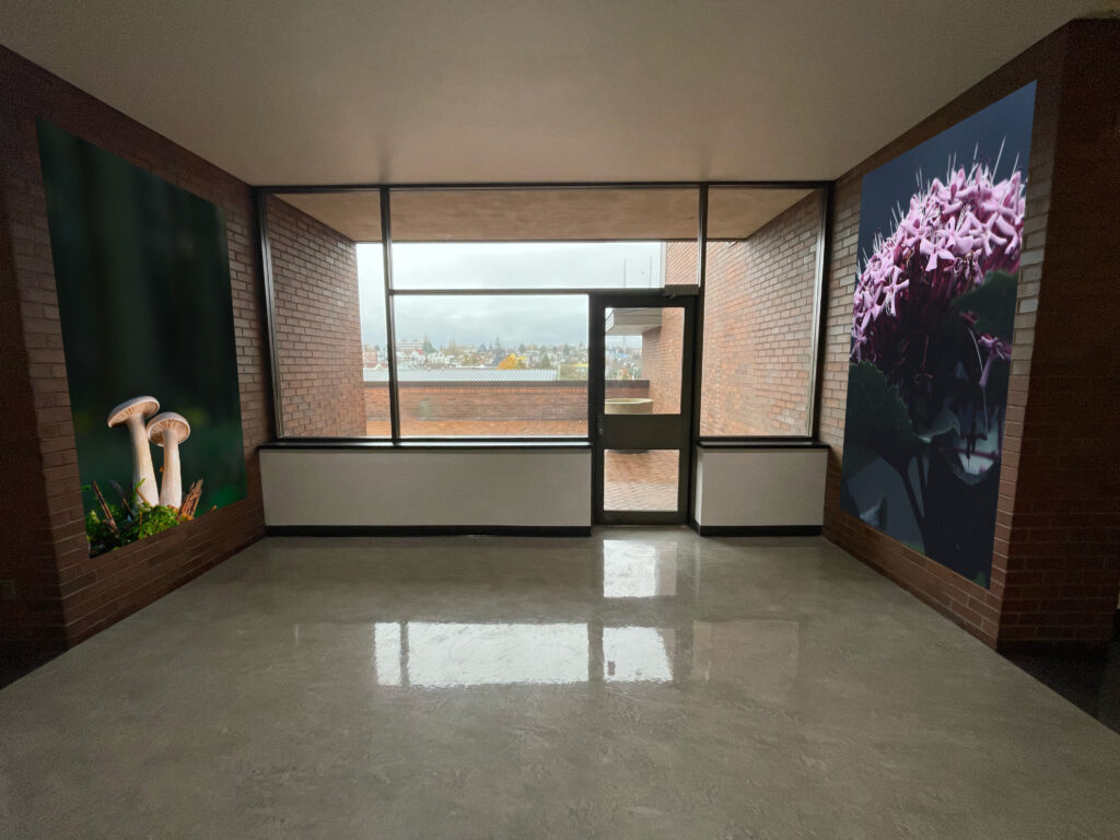
I did not have the time to try and learn how to create in perspective on top of all the other things going on for finals week. We have not yet covered using photoshop in any coursework and I had time to just barely get myself taught how to use the vanishing point filter. This is something I would take a lot of interest in for the future when I am given the time and resources to design it cohesively. Specifically interested in how you can import green screen elements into perspective as I think moving images installed where the photos in the image are placed would be interactive and engaging.
Blog #5 – Working Together
So far, I have been introduced to video in the two modules in New Media: narrative filmmaking and after effects. In narrative filmmaking we covered the flow of a story, different camera angles to convey importance and tone in a shot, and different types of cuts. Of all the things that tie together between the design world and the film industry, I found the methods of organization pretty similar. In filmmaking, you start a story off with story boarding what is important to show and how to show it. Likewise, in design you start off organizing important information into a wireframe. Both of these foundational aspects cover the importance of organization and intent in content you are creating.
Despite only having completed one week of after effects, paying attention to how video moves and what core content is most important to be seen in a frame is a connection that I am finding with video and design. If you’re making a title package for clips, making tiny edits to the layout of your template is important. Working closely with the filmmakers and effector communicating to know what can and can’t be covered by text, banners or graphics will help expedite the work flow and the amount of time put in for a project.
While I feel like the beginnings of this course has been pretty vague in how we work together as I have not had any specific projects pairing design students and new media students together (besides just being in the same modules), I’m looking forward to having it unfold further and see how those connections form.
