The ask – inspired by stills taken from Christina Wu’s work, we were asked to describe how we would depict each of these concepts: “Freedom to Express, Freedom to Explore, and Freedom from Expectation.”
Let’s start with the second one, to already break away from the perhaps expected course of starting with the first option.
I would depict Freedom to Explore with a mini set of mold weaving in and around a skyscraper, breaking it apart on its journey to free itself of its concrete cage and also find the best way to sustain itself. This would commemorate an experiment in which mold, specifically slime mold, was used to find more efficient routes for train systems in Japan. According to what I grabbed off Google, “ Slime molds first “forage” broadly over an area, then refine their tubular network to optimize for transport of the nutrients. Now, researchers believe the slime mold’s efficient organic structure could provide a model for optimizing other networks—including those designed to move people and goods around a city”
I would depict Freedom to Express with a drawing of someone painting an abstract painting with the paint splattered with reckless abandon. I imagine them smiling with joy as we see the frozen, blurred motion of their arm as they throw the paint. Their clothes are also bright and colorful, showing their bravery to express themselves freely.
For Freedom of Expectation I wanted to write something that perhaps doesn’t count as a poem but I wanted to try something different for each one of the prompts.
Freedom from Expectation:
I am the exception of expectation.
I am the unexpected
This doesn’t even have to rhyme.
I am unpredictable in all ways
I am made of ever changing matter
I decide when to rhyme,
When to claim what is mine.
I decide that this is when I do something different.
I’ll tell a story through my words, not my camera.
(That’s a quote from Toy Story, sorry if that spooked you if you didn’t get the reference haha)
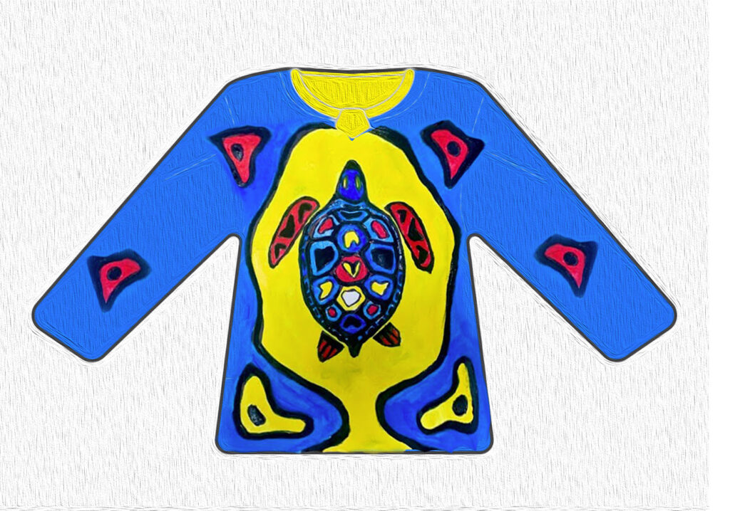
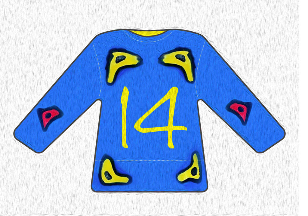
The ask – to design a hockey jersey, like the ones we saw from the Kraken designers.
I did this one rather quickly but I did have fun playing around with tools in Photoshop (us Visual Media students haven’t been taught Illustrator before so I had to flee to the comfort of the old PS haha).\
Technical difficulties aside, I choose Indigenous People’s Day to create a jersey for. I was rather hesitant to design for this day as I feel I’m probably not the most qualified person to be designing for this day being a white person with not a drop of Indigenous heritage.
That said, I had the idea for the turtle because I remembered hearing the true name for the USA that First People call it – Turtle Island. How disrespectful is that to not only take someone’s land (not to mention cultures, and lives, and a very very long list of colonizer’s wrongdoings) but also take it’s name and give it something as boring and bland as the United States of America?
I heard this term used first from the people I did my first documentary on many months ago in Fall and it’s stuck with me since.
I will be fully transparent – this isn’t my art! It was from a YouTube tutorial with a coloring page to celebrate Indigenous People’s day by Izabella Orzelski. Just wanted to give credit where it’s due, I wish I could’ve picked something by someone who I knew for sure was an Indigenous artist but I had to move quick to finish for the deadline.
The 14 is for October 14th, which is Indigenous People’s day
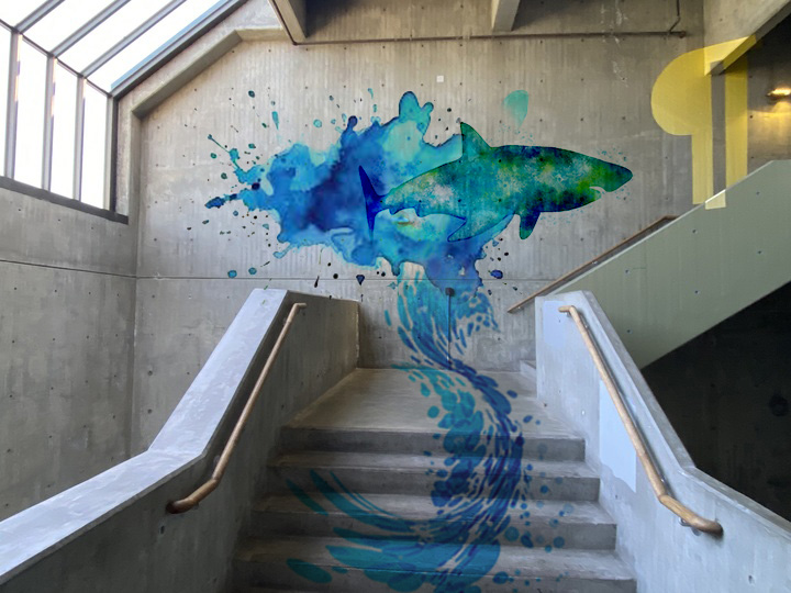
The ask: to create a piece for the egg drop stairwell – the most arguably gorgeous stairway in the school just for how perfect the sun hits that window in the morning. Chon (never heard of them? plz look them up! so fun to listen to) plus a quick dancey dancey in that stairwell can make even the most stressful of mornings so much better.
Angelina Villalobos was one of the best speakers we’ve had in my opinion! I wanted to tell her that she’s definitely very charismatic and approachable when she said her sister is more of those than her. Although I completely understand how we feel that way about our older sisters haha – my own older sister was always someone who I thought was more talented, outgoing, confident, and beautiful than myself. What a beautiful thing it is to grow up and out of that phase in your life and discover you also have those qualities in yourself – although my sister is definitely still one of the most beautiful people I know so that hasn’t changed haha. It’s torturous that she can’t be here to model hahaa – she feels the same lol.
Speaking of the women in my life, I made this mural for my bonus mom who is one of the most badass woman I have ever had in my life. Watching the way she handles situations with such a level-headed attitude and how she sees the world and effortlessly lives so much in the PRESENT! Something I admire and wish I could be better at. You can bet there’s been many phone calls mid-quarter with the usual tears and I can’t do this-es and she always brings her calm presence and guidance. One of my favorite quotes from her:
“If it won’t matter in five years, don’t spend more than five minutes worrying about it.”
Sometimes I actually follow this advice haha.
This mural is inspired by her past career as a Marine Biologist as the non profit Save the Bay in California where she was their main scientist. She’s dove with sharks and has put an impressive amount of energy into advocating for this often demonized beings and climate change.
She taught me how to surf while I was still in California and it was a very scary but exhilarating experience. I didn’t really catch many waves but I did get both feet on the board for about 2 seconds so I’m happy enough with that hehe.
Very proud to celebrate her this Mother’s Day! Thank you for your wisdom and being such a good example just to simply witness. How lucky am I to have you in my life. <3
Her favorite color is dark teal/blue – I’m happy this mural has those colors in it!
The ask – design a food truck for a restaurant and construct the finished piece with our own wee hands. An idea inspired by the one and only Yadesa Bojia, who was one of my favorite guest speakers this quarter actually – was awesome to hear a sort of heart to heart with a fellow artist, less talk of corporate stuff. Although, I totally see the value in hearing about the more material world as well.
At first I thought I’d pick an existing restaurant but my first idea wasn’t panning out. All I could think about was sleep when brainstorming (brainslogging more like it) ideas for this (I wonder why I think to myself as I write this at 1:37am).
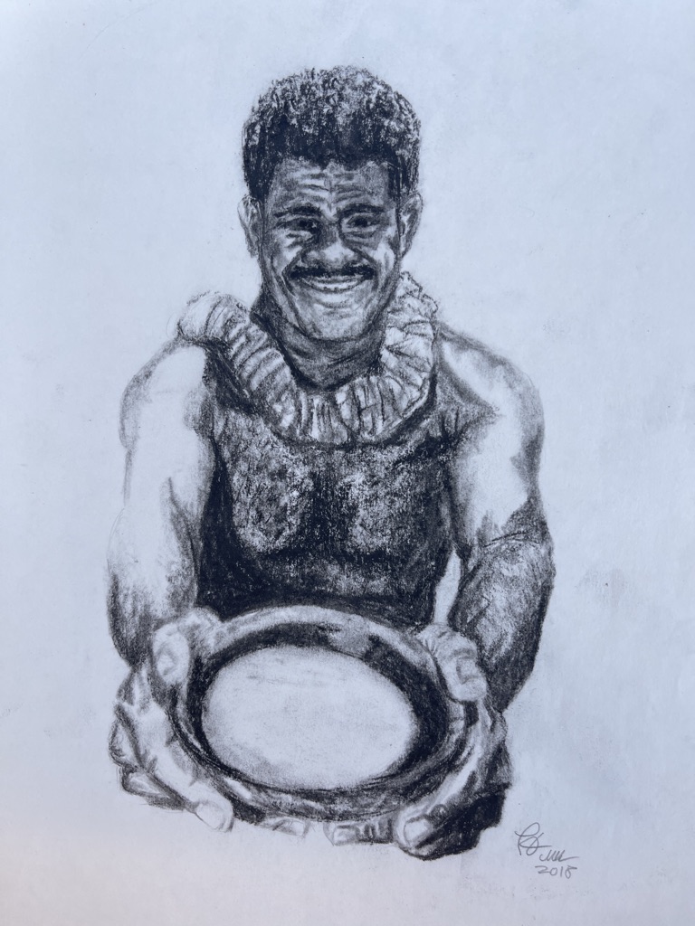
Irony aside, I originally wanted to do a food truck for Kava, which is a drink I enjoyed during my time living in Fiji – it’s a root plant which tastes like soapy dish water to some and bitter herbiness to others with a distinct numbing sensation. Besides all that, it’s THE social drink in Fiji and there’s no social gathering you’d find without it.
A drawing I made a couple years back (omg, make that 6 years ago) while still in Fiji – an offering of Kava in a coconut shell and a warm smile
The reason I was thinking about it is because one of the side effects of kava is a sort of sleepy, calm vibe (no it’s not a drug of any kind, more like a very strong camomile tea effect) and I made the mistake of drinking some once before doing an assignment in the evening and could barely keep my eyes open. Which was probably attributed more to the 4-ish hours of sleep I was rocking that night than the kava tbh.
So yes, it would be awesome for sleep, only if I had the time for that. Hehe.
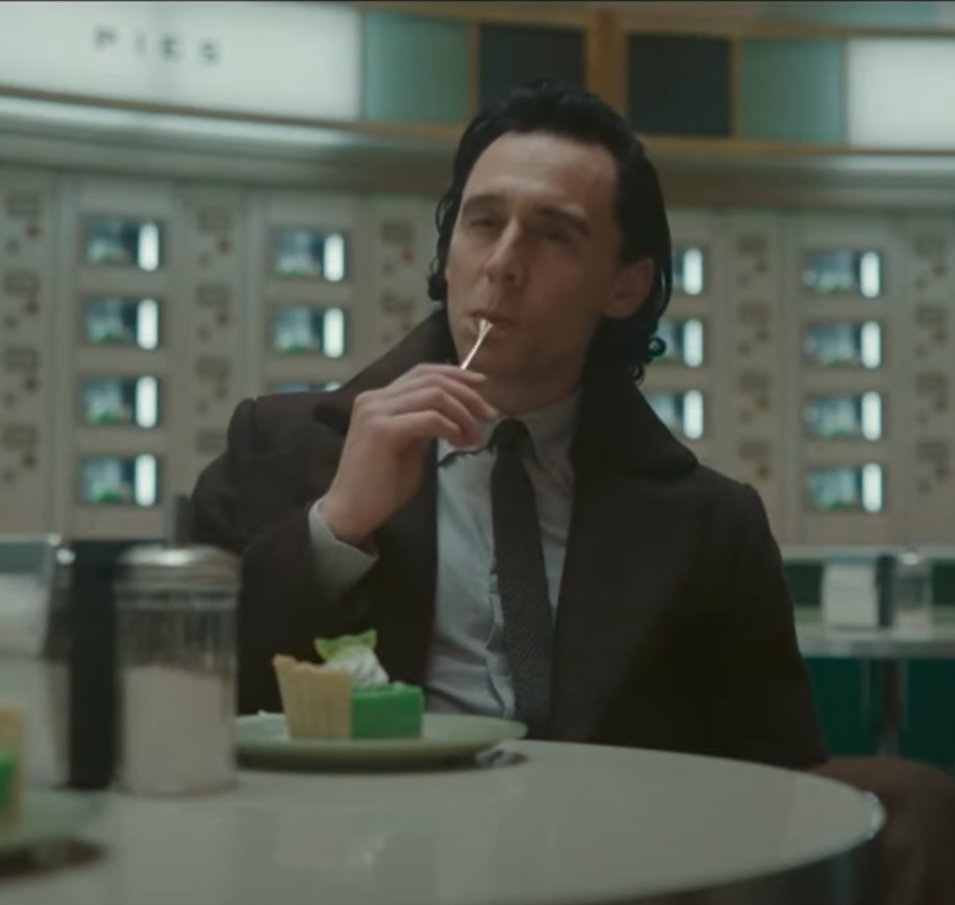
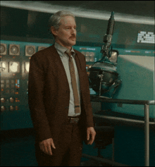
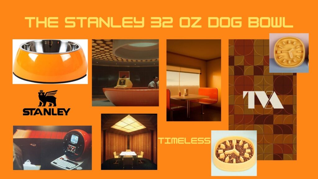
But, without finding any restaurants or kava bars in Seattle, I had the sudden idea to go right off track and go with something else close to my heart – Loki, or more specifically the “Loki” TV series.
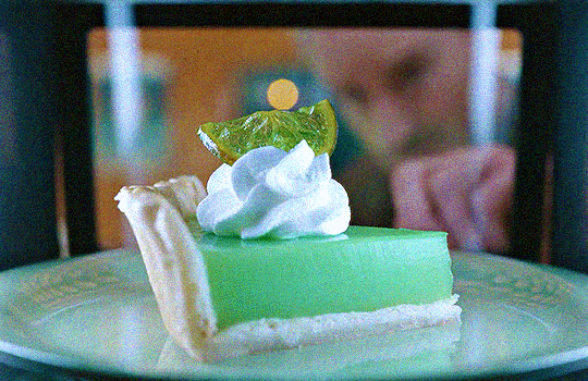
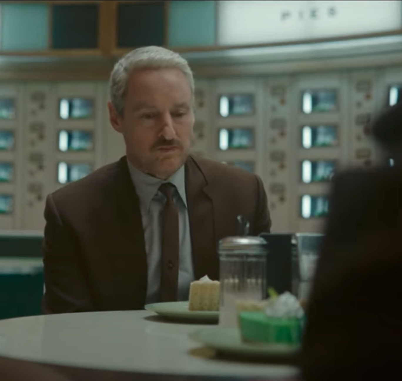
I CANNOT get over the color scheme of this show and this one scene with these super vibrant turquoise key lime pies has stuck with me. Although, I’m not sure how appetizing they look – aesthetically though they’re fire.
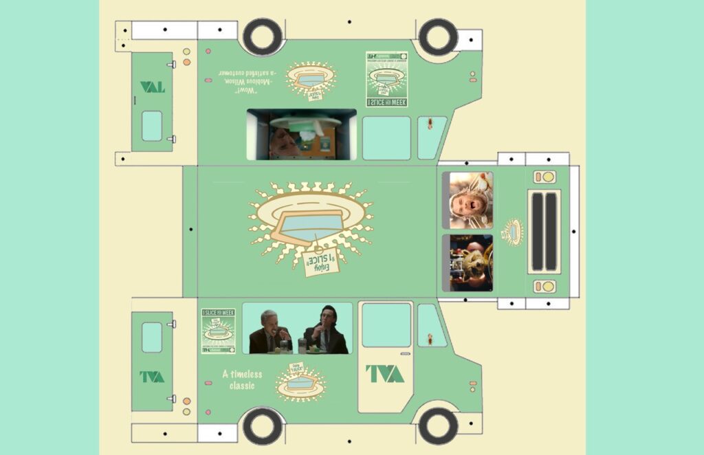
So I rolled with that idea and this is the result!
Here, if they don’t eat the entire supply, multiverse migrants Loki and Mobious serve up these citrusy treats with Thor and Rocket at the wheel, one of which seems to be having a bad case of Road Rage. The colors of the truck were grabbed from the pie posters, which I was super stoked to find ready for me to steal (fair use for education, c’mon!) from the web.
This was good practice on masking with shapes, which I did to color in the side windows and also round the edges of the screen grabs of Thor and Rocket! It was also my first time using the paint bucket tool which was an absolute god send for this assignment.
Would you eat a slice of this timeless and also terribly vibrant key lime pie?
Well, no matter what your answer was, there’s probably a variant of you in the multiverse who would say “hell yes.” XD
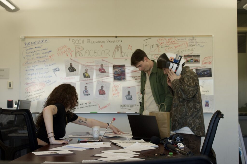
The ask – write a Yelp review of your teammates from the Blender project. Ok ok, not that exactly of course lol – how was it collaborating, to put it in the “official” term.
One word – fun! So fun – I had never chatted with Dan or Alyssa (my teammates for this project) before this – Alyssa briefly though I think while talking to Clayton – and I was excited for the chance to work with people I didn’t know. The ideas started flowing instantly and even though Dan was unfortunately sick during the first few days of the project, I got the chance to get to work with Alyssa closer. Within the first brainstorm we had, I really appreciated how she would check in to make sure I felt my ideas were being heard and I tried to do the same for her – it was interesting to get to know people’s interests from scratch to see what we’d all find fun to work on – it’s not often you’re thrown into such a deep project with people you don’t know! So the first part I felt was kinda gauging what people liked and were willing to try and everyone was really good at hearing out other’s thoughts and ideas.
I could see that people really used their strengths well but also were willing to try things that were new to them! I’m so used to doing all the steps of video making by myself – story concept, storyboarding, shooting, editing, etc etc so to lean on others skills like Dan’s experience in theater and stories as well as Alyssa’s in writing and acting (And organization skills, I feel she really embodied her mockumentary role of director hahaa – I was really appreciative of the shot list she always had on hand) was a really good experience for me. And whenever I needed a hand with the camera they were both down to operate it as well as doing the sound!
Brains storming
Shout out to Shayne! Was awesome to see him again
Gosh I wish I remembered to include the shot we had of this in the video XD
Good sticks (heard that on a film set where I was slating and the director would say that sometimes after I marked scenes – Idk exactly what it means but I hope it meant I was doing my job right hahaa)
It felt like a tight-knit experience! We had a zoom call to bounce ideas and I felt everyone really cared about this project which made me really happy – the enthusiasm to do the best job we could while also having fun made it a great experience.
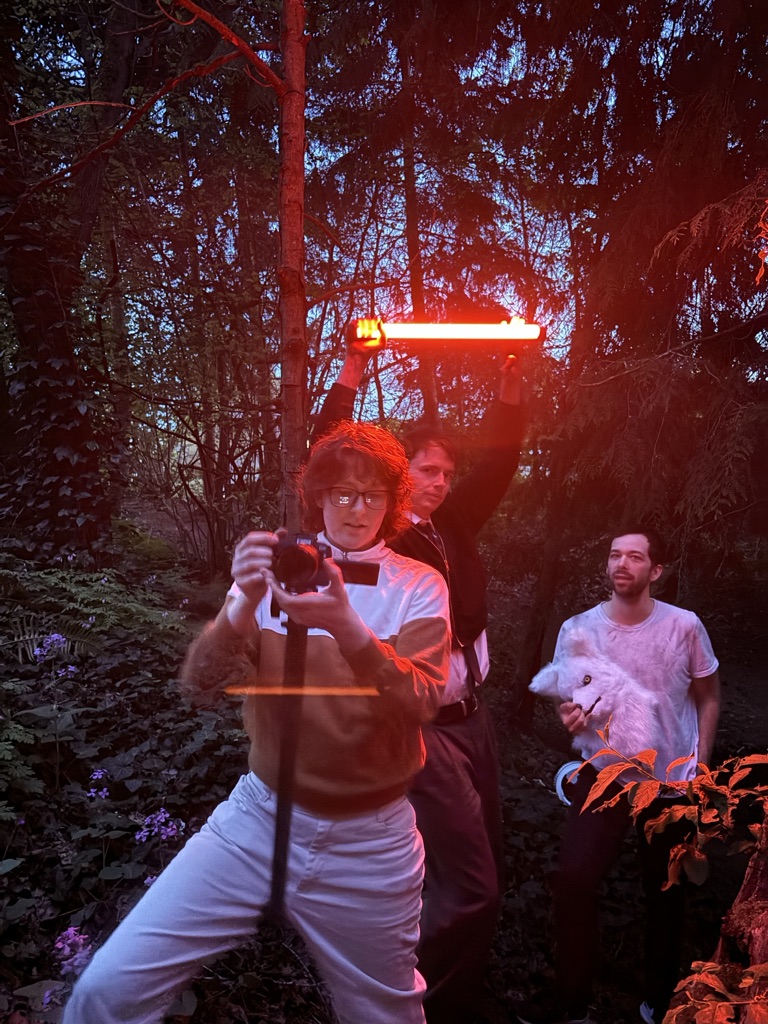
And omg, I can’t get over Dan’s acting – I very much regret forgetting to vote since I was 1000% going to put in my vote for him as best actor – I learned pretty quickly just to keep the camera rolling since he would improv into a deeper and deeper spiral and I’d just be behind the camera grinning like the Wonderland cat and trying my best not to laugh and interrupt his monologues. At one point he literally rolled around in the dirt on the school balcony to get ready for his in-the-woods wolf character – the commitment of this man! XD
He did indeed go “Full Leto.”
And as I said in our presentation, I felt very supported by my teammates – I was racing the clock editing the day before the due date and everyone had to go home – but they were both there on Slack replying in a matter of minutes whenever I had questions and that was sooo reassuring to me – teamwork until the end!
If it hasn’t been clear already, I really really loved working with Dan and Alyssa and I was sad when the project was over! But I’m super happy to have had the time I did with them, and also having the fun of doing my first off-school shoot in the woods – that was so incredibly fun! Hope to have more stuff like this in the future!
Love everything about this photo XD
And one final thought, I can’t wait for when I have time to make a blooper reel of this project hahaa! There’s a lot of gems for sure!
The ask: Write about a nonprofit which you would donate $25,000 to (assuming you wouldn’t take it for yourself…)
What is a non profit? Google says they’re “a group organized for purposes other than generating profit and in which no part of the organization’s income is distributed to its members, directors, or officers.”
Why is it that the causes with the best intentions are so commonly for the best interests for everyone are always underfunded? Why does money take the path it usually does? To the rich and non-empathetic?
It’s a little too late in the night to start a silent philosophical debate with myself and this computer screen.
Let’s address the task at hand – What would you do with $25,000 besides buying every favorite lens you’ve laid eyes on, and even better a tethering cable of your own.
Causes that are dear to my heart:
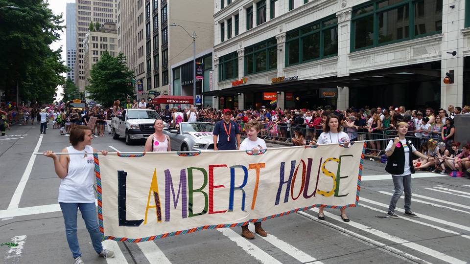
Queer rights/human rights. While gathering footage for my documentary this quarter, I learned from one of my subjects that there’s actually a bill in WA that says that teachers are required to report to the parents of any kid that comes to them and shares about their queerness. In Washington?? I was shocked and appalled to say the least. No state is perfect apparently but also I thought we were better than that. : (
So that’s why I wanted to focus on organizations that support queer folks, and specifically children since it’s getting simultaneously better and worse to exist as a queer person/child these days.
That’s why I chose Lambert House as my non profit of choice for donations. They describe themselves in this way: Lambert House is a safe place for lesbian, gay, bisexual, transgender, and questioning (LGBTQ+) youth ages 10-22. Our calendar is packed with fun activities, dinners, support groups, planning meetings, dances, and other events. Lambert House is where LGBTQ+ youth make life better for each other.
And apparently Wizards of the Coast have run charities for this organization in the past!
I chose this non profit since they focus specially on queer youth, where depression, anxiety, and a feeling of being an outcast all run rampant.
Also, I thought it was pretty hilarious to see this certain review on Yelp when I went to see what people had to say about the organization that said that the person wished there were more places like Lambert House on the east side and that’s literally where the person I’m interviewing set up their drag workshop – there weren’t enough queer spaces in the area to go to so they made on themself.
Design Systems – Figma forced me to know about them.
I can explain the title. XD This assignment gave me flashbacks to when we were in New Media II in the notorious UX/UI class – which I heard was highly unrecommended for taking along with finals and that was certainly an experience to… experience. This assignment reminded me of late nights spent working in Figma (of which I was a complete beginner) trying to create buttons and components that looked at least somewhat aesthetically pleasing. But, even if I was relatively satisfied with my work, come Friday morning when me and my teammates – blurry-eyed from another late Thursday night that had at that point become a ritual of sorts – realized that really wasn’t much cohesion. In Courtney’s words, it looked like each flow had been designed by a different person. This was why. And it looked like that pattern was going to continue as working shoulder to shoulder just wasn’t an option for me and my teammates with conflicting schedules and the other demanding assignments crying for attention.
That is, until my designer teammates put together their own beautiful buttons, icons, and components in a neat little box in our Figma doc ( Side note, does anyone else feel like Figma docs are like the universe and our projects are little galaxies within it? There’s been a couple times where I’ve become untethered from my spaceship so to speak and will literally feel like I’m lost in deep space when zooming in and out and left right, up down, until I catch the edge of that little nebula of a project and then I can finally take a deep breath knowing I don’t need to conserve oxygen anymore. I had to take a mandatory deep breath of The Cage air just now, that metaphor was a little too immersive for me XD ). Little did I know, we had created our own mini design system so I feel better knowing that I’m not walking into this completely clueless.
Ok, TANGENT ASIDE, these are the 3 sites that I visited:
Microsoft, Mailchimp, and Audi
Starting with Der Schnelle – The Fast One.
AUDI
Audio had a fun not-so-little video on their site with a deep dive into their redesign (I would take better notes but you can’t scroll back through the video! Maybe that should’ve been been part of their rebrand haha.)/
Anyways, the first (checks notes) of the specific three things that I noticed was…
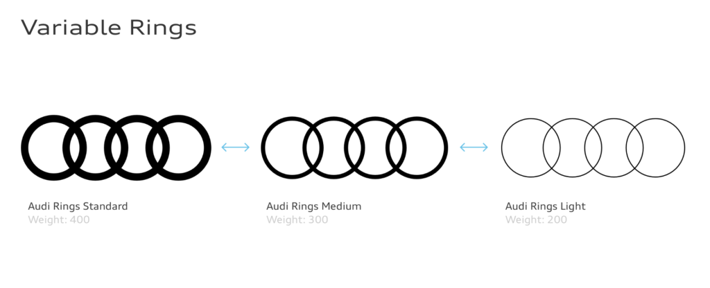
ONE: The weight of the rings seemed to relate to the overall busyness of the rest of the image. Thinner rings are used to take up less space in more complex compositions while thicker ones are for the opposite.
TWO: The second thing I noticed (which was hard to miss since they repeated it quite often) was that there were some keywords they focused on, including Passion, Precision, and Perfection. Their site is cleeeean. I think it’s a good reflection of them as a business since you would hope that the metal vessel you’ll be hurtling down the Autobahn with was made with at least a decent amount of care and exactness.
THREE: The third thing I noticed was that they clearly want to be seen as a modern, sleek, and classy brand. They did this through simple fonts and a small color range (only 4 were listed in their rebrand). They even have a section devoted to diving into their “cast” (models) explaining what they hope to convey with this. These were the words to describe them: confident | diverse | cultured | understated. They also explained that their lighting choices lean towards natural light to create a grounded, natural feel. Another word I think they found important was “Authentic”. They want to show that they understand you.
Now, on to the next one!
Bill Gate’s baby, eenie meenie miney…
MICROSOFT
I remember a guest speaker from last quarter dove into the redesign of Microsoft – was it Joe Hallock? Honestly I would’ve liked to have just watched more of the videos showing the clear, gummy type buttons and icons – they looked like jelly cubes and looked like they wouldn’t taste half bad…
Ok, ANOTHER tangent aside, the three things I noticed were..
ONE: They seemed to be focused on collaboration and making this a better experience for the designers rather than focusing on the consumer like Audi’s redesign was. Of course, better design from the creators will make better experiences for users, but that was just something I specifically noticed. The redesign was pretty explaining how to use the components, spacing, etc.
TWO: Interestingly, it seems that they did something that goes against the very small amount of design knowledge I have and that was using neutrals to draw attention to spaces rather than color. (Correct me if I’m wrong if there’s any designers reading this haha, but I was under the impression that people gravitate towards colorful buttons? Or wait does the color not matter? Wait, maybe I dreamt that during another Fuzzy Friday..). Anyways, here’s what I copied from their page so they can explain themselves:
Visual hierarchy using neutrals
Use lighter neutrals on surfaces to highlight areas of primary focus and create a sense of hierarchy. This ensures a person’s eye is drawn to the areas of an interface that need the most attention or that will be most useful to them.
I suppose Microsoft knows something I don’t – or maybe I never knew, I’m not sure anymore. XD
THREE: Motion is a large part of Microsoft’s design. They said that consistent motion can show continuity for the users and make a better flow, whether it’s scrolling or tabs being opened, there was this push and pull feel to it all. Motion is also used by Miniplush to the opposite effect like showing user’s there’ll be a change and show them the next step.
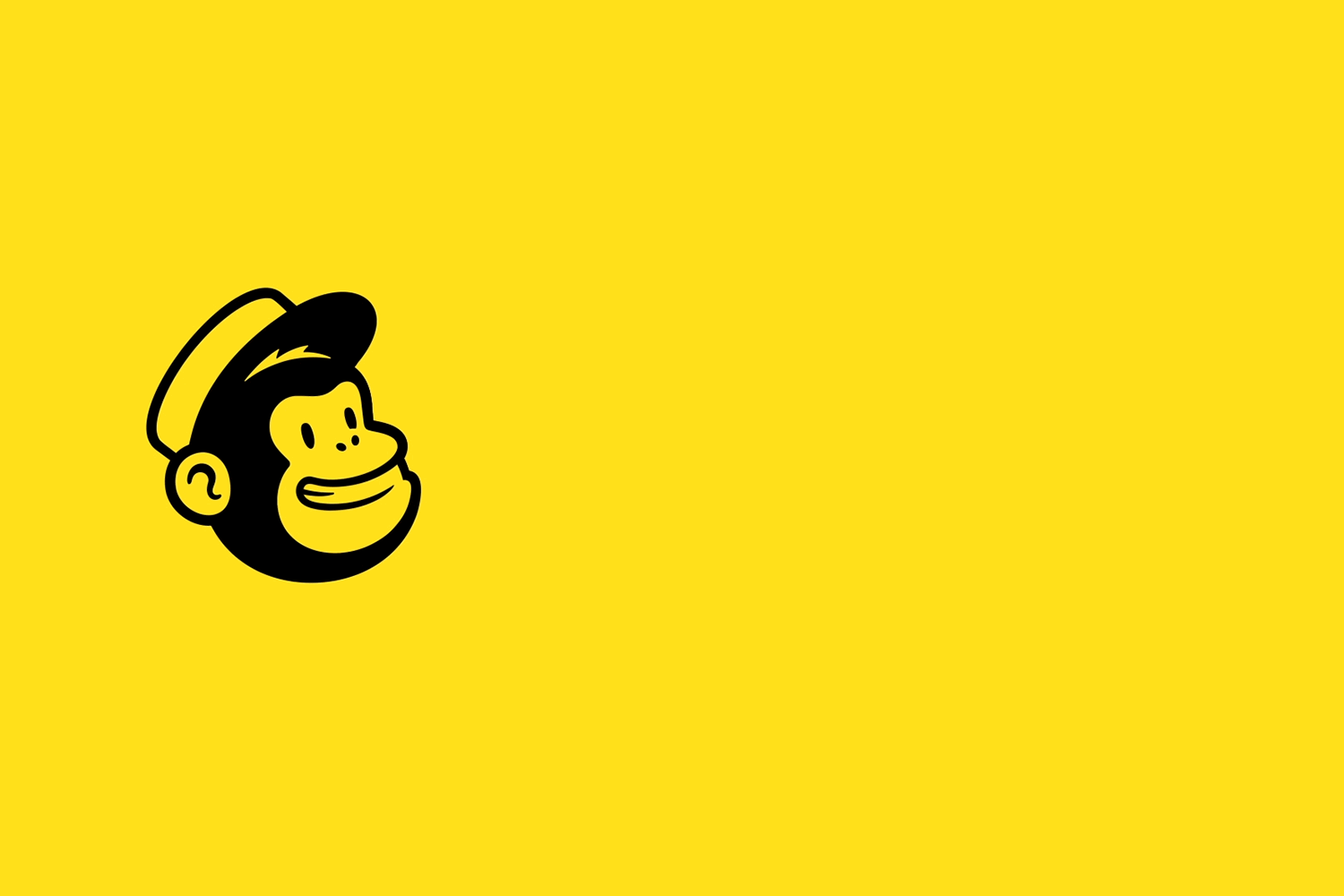
Finally, last but not least ( I was tempted to say time to stop monkeying around but I actually physically recoiled so let’s scrape that) the monkey of this business (oh god that was even worse):
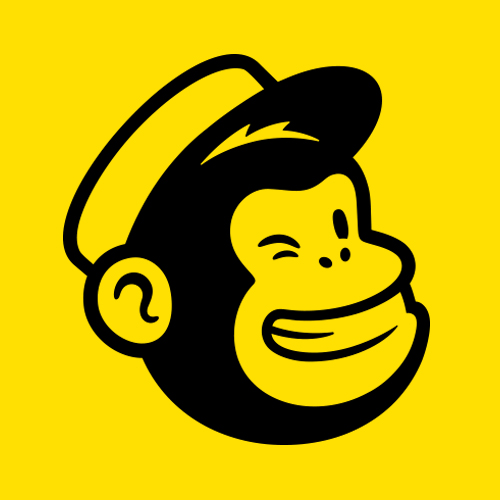
MAILCHIMP
What is Mailchimp you might ask? Funny you should because I have no clue. Well, had. Apparently it’s a is a marketing automation platform and email marketing service. At least that’s the generic description of it swiped from Google – it looked to me at first like Gmail but you have to pay for it but seems it has other functions like having templates for surveys and campaigns so it actually is probably pretty useful for companies.
We all know the drill at this point so let’s get down to business (I swear if anyone says monkey business–!)
ONE: They changed the c in their name to a lowercase one. They pointed this out specifically with these words: “We’ve also evolved from “MailChimp” to “Mailchimp” with a lowercase c.” And that was it. No further elaboration needed I guess. (I need further elaboration!) Although I do think, from a non-designer’s POV, that all lowercase does tend to look more modern to me so maybe that’s why they chose to do that?
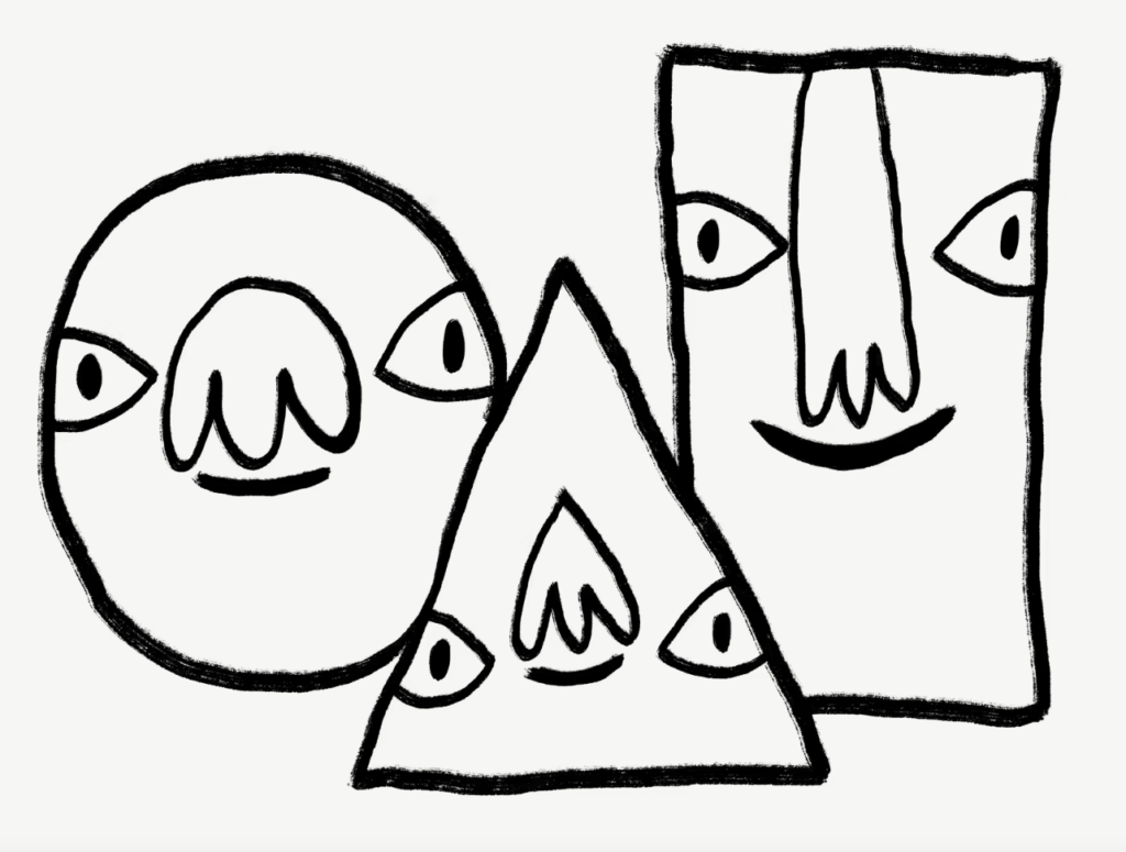
TWO: They integrated illustrations and animations into their design to make it seem more playful and expressive, emphasizing that they’re a creative business. I must say, this swayed me a little – the sketchy doodles combined with the cheery color seemed very grounded to me, making this seem less like some faceless corporation and give it some character. This aligns well with what they were aiming for actually since they literally used the words “consistent and grounded” to describe the vibe they were going for with these illustrations.
THREE:
Now, throwing away all of that consistency we were just talking about is their logo. Is so clean – too clean! They said they refined it but I feel like it has much less character than the illustrations.
I feel like this belongs to a roadside burger joint which probably has an epic banana milkshake, but I don’t feel like it belongs with these three kooky dudes I found on their rebranded website. The inconsistency makes me sad almost because I really like the direction they were going with using the doodles and vibrant colors.
However, I looked up the old Mailchimp (or should I say MailChimp – still waiting to know why they de-capped that c!) thinking that they must have modernized it too much but boy am I glad they did what they did at least because this seems even more dated than the last.
I feel like I’m being pretty negative about this company but that could also be because I tend to be really suspicious of any mailing company which isn’t Gmail or Outlook (like yahoo, it’s on the same wavelength as bing in my opinion) so perhaps I’m just biased.
Anyways, I think I feel a cold coming on so it’s time to stop this madness and call it a night! Until next time!
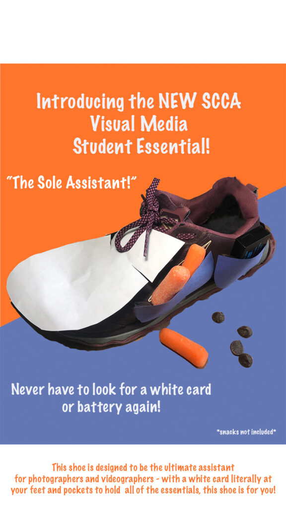
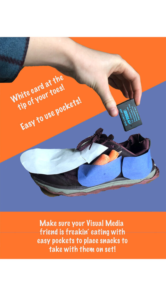
This week (kinda next week haha since we got an extension – thank you Marc!) we were tasked with modifying a shot which could have one superpower that would help us students on the mysterious 5th Floor.
When I first read the assignment I wasn’t aware that we had to modify an actual shoe and my ideas were a lot more fantastical since I thought that I could draw them – one idea was a shoe with springs which would launch us up from the ground floor to the 5th floor balcony to avoid the elevators where students will take it from first to second while you’re silently screaming because you literally have 2 minutes until class.
I also thought of shoes with a device which would direct your steps before 1PM every Friday and walk you down to the Buzz to ensure you get your place in line for the sale – maybe you could even get out of class early that way haha, just say your shoes made you do it and that would actually be the truth.
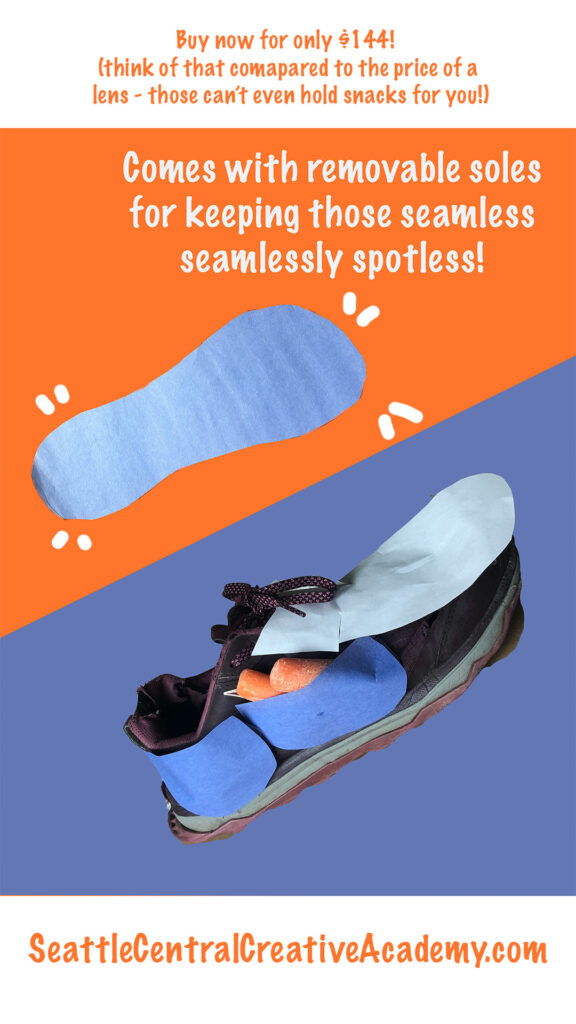
All that said, I did what I could with my existing pair of shoes which have seen better days – I had to clone stamp the back of them because the lining was just atrocious – I’m not sure if I did it for every shoe slide though so I apologize in advance for making you look at my shredded shoes. : )
I made these with the intention of being like a little assistant for us Visual Media students when we’re on set – the white card being on the top of the shoe was inspired by a real world instance when I was out taking street photography with my classmates and one of them fixed his white balance by taking a picture of his white shoes, which apparently stuck with me (you know who you are XD ) – the pockets are for holding snacks and batteries or whatever knick knacks you might need while on a shoot. I chose snacks because I know from personal experience that we can get so caught up in shoots and assignments and etc etc that we can forget to take even a quick bite.
So here they are! The “Sole” Assistant, meaning the only assistant you’ll need on your shoot – and probably will make you a solo photographer once other people see what’s on your feet (jk XD )
I agree Shuri XD
(Also, how do you like my chocolate carrot combo? Don’t knock it till you try it!)