The Band
I was given the task to make a fictitious poster for the band Louis the Child, a band which I hadn’t heard of until getting this assignment. However, I’m glad I was introduced to them as I like EDM, which is their main musical focus.
While their greatest hit is “Better Not” featuring Wafia, with the music video garnering 10M (!) views on YouTube, I was drawn to their song “Free” because of the song itself but especially because of the visuals in its music video. The journey from dull and drab grays to an explosion of color drew me into the story, and the spiraling movements of the camera emphasized that sort of “drawing in”, like the pull of a whirlpool.
The Look
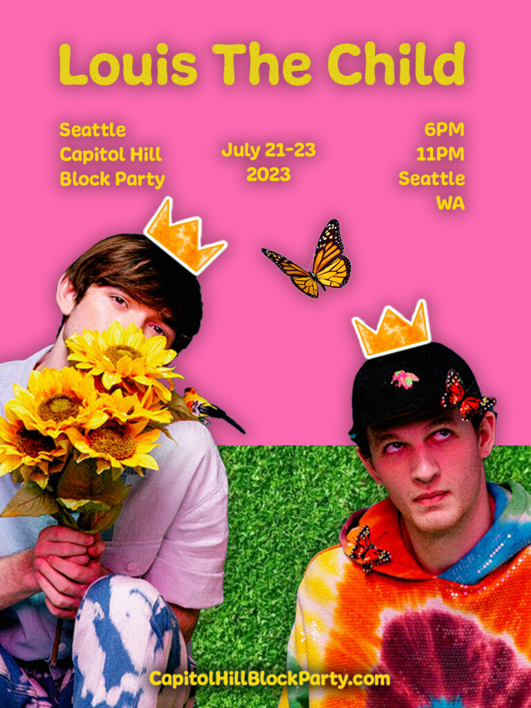
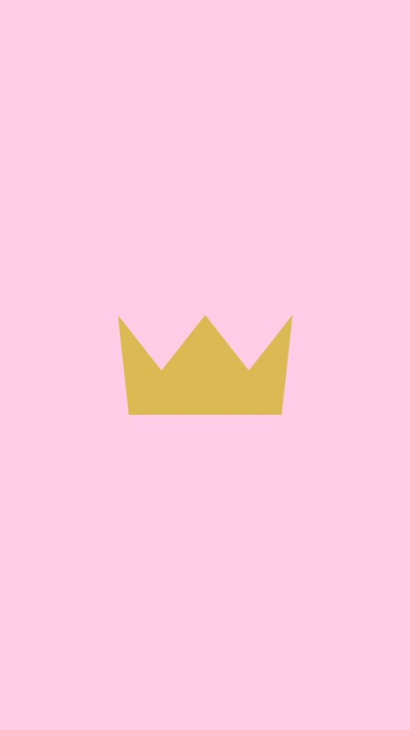
What caught my eye first when I looked up the band to begin figuring out their general aesthetic was the color pink. When I saw the logo on the left, I was excited since it would be an easy element to incorporate in the poster.
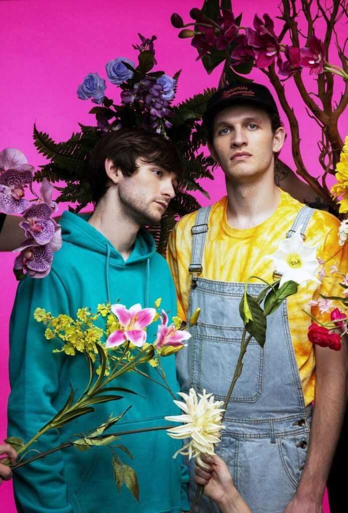
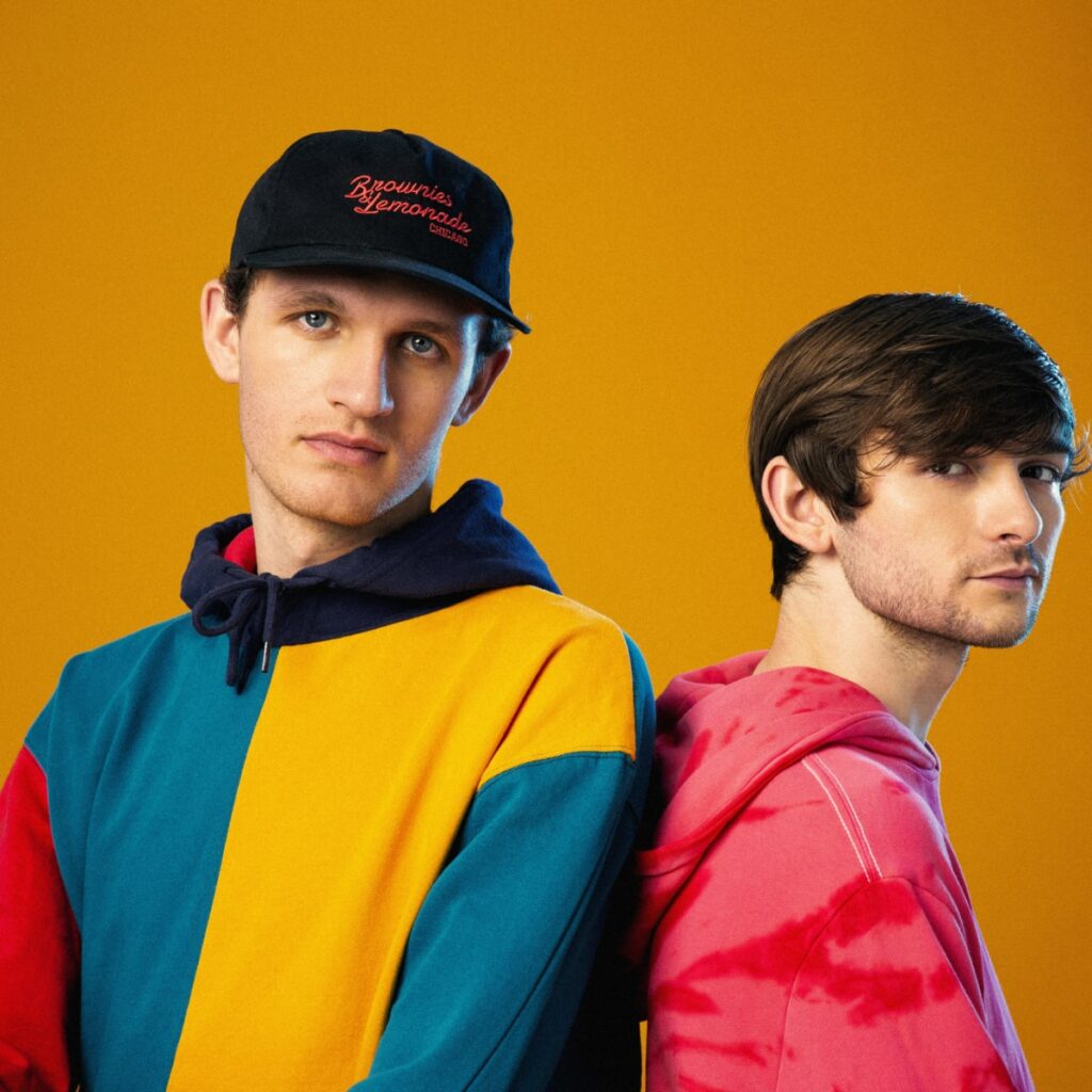
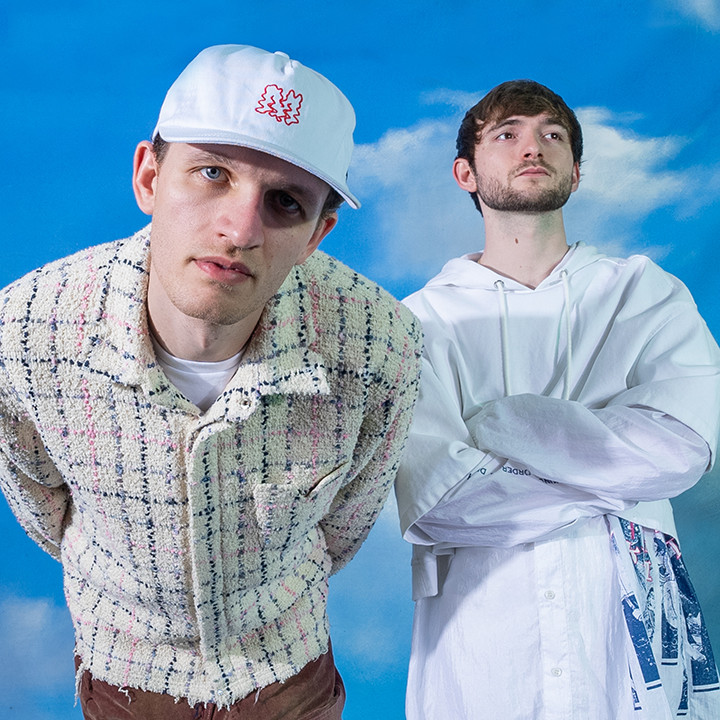
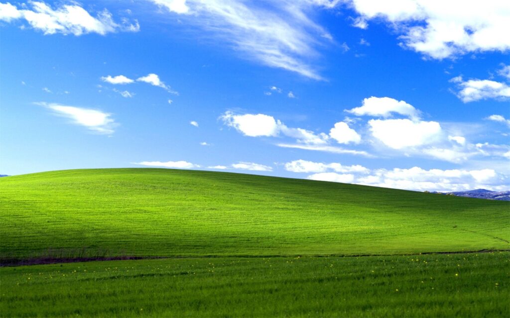
I was also drawn to the bright colors the artists Robby Hauldren and Frederic J. Kennet were wearing and wanted to be sure to use plenty of color in my poster. And the cloud background seen in their second picture reminded me of the now-nostalgic Windows wallpaper from the early 2000s. I was aiming for a poster which was obviously pieced together and a little messy, almost like a collage since the band seems to shy away from formality.
I used the one tool on Photoshop I know how to use, the object selection tool, to create transparent images of the photo of the duo on the left below, which I chose partly because of the flowers and butterflies, which I thought would be perfect for the playful look of the poster, and because of the punch of color from their clothes.
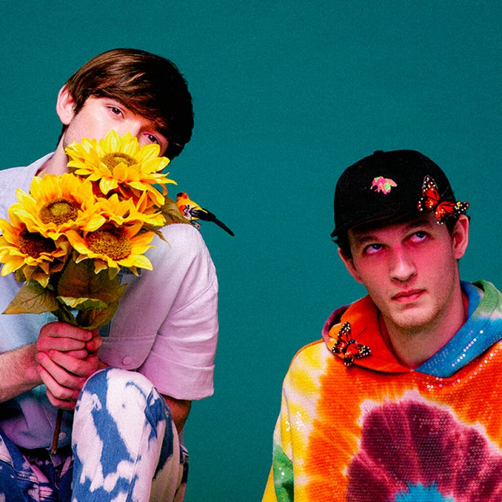
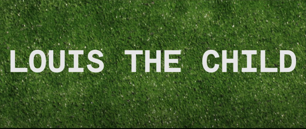
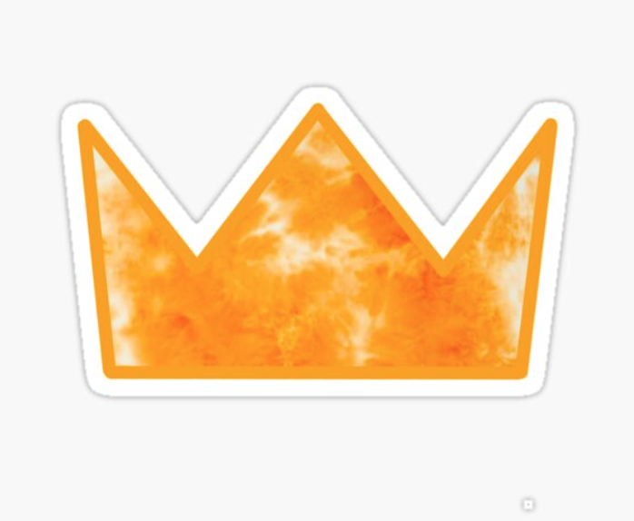
I also chose to incorporate the artificial grass as a nod to their hit “Better Not”. I added an additional butterfly to fill in the empty space between them, while the crowns were both a way to add in their logo and to add a touch of humor since they are so obviously “placed” on their heads. The font I used was inspired by an official poster of theirs, and I tried to match the bubbly look of the text, but was unfortunately limited with what I could find for free in photoshop (there’s probably a way to get that look somewhere, I just don’t know how to do it lol – yet).

The Result
On of my teachers recommended resisting the temptation of prefacing work as he pointed out it’s usually the creator’s way of excusing what they don’t like about their creation without giving the viewer a chance to form their own ideas about it, so I’m going to only say that while I’m no graphic designer (couldn’t help putting in just a lil prefacing haha), I actually had fun making this and wouldn’t have thought of doing a project like this without it being an assignment so I’m happy we were given it! I’m looking forward to seeing the posters everyone else created to see their creative processes and results!