Design Systems – Figma forced me to know about them.
I can explain the title. XD This assignment gave me flashbacks to when we were in New Media II in the notorious UX/UI class – which I heard was highly unrecommended for taking along with finals and that was certainly an experience to… experience. This assignment reminded me of late nights spent working in Figma (of which I was a complete beginner) trying to create buttons and components that looked at least somewhat aesthetically pleasing. But, even if I was relatively satisfied with my work, come Friday morning when me and my teammates – blurry-eyed from another late Thursday night that had at that point become a ritual of sorts – realized that really wasn’t much cohesion. In Courtney’s words, it looked like each flow had been designed by a different person. This was why. And it looked like that pattern was going to continue as working shoulder to shoulder just wasn’t an option for me and my teammates with conflicting schedules and the other demanding assignments crying for attention.
That is, until my designer teammates put together their own beautiful buttons, icons, and components in a neat little box in our Figma doc ( Side note, does anyone else feel like Figma docs are like the universe and our projects are little galaxies within it? There’s been a couple times where I’ve become untethered from my spaceship so to speak and will literally feel like I’m lost in deep space when zooming in and out and left right, up down, until I catch the edge of that little nebula of a project and then I can finally take a deep breath knowing I don’t need to conserve oxygen anymore. I had to take a mandatory deep breath of The Cage air just now, that metaphor was a little too immersive for me XD ). Little did I know, we had created our own mini design system so I feel better knowing that I’m not walking into this completely clueless.
Ok, TANGENT ASIDE, these are the 3 sites that I visited:


Starting with Der Schnelle – The Fast One.
AUDI
Audio had a fun not-so-little video on their site with a deep dive into their redesign (I would take better notes but you can’t scroll back through the video! Maybe that should’ve been been part of their rebrand haha.)/
Anyways, the first (checks notes) of the specific three things that I noticed was…
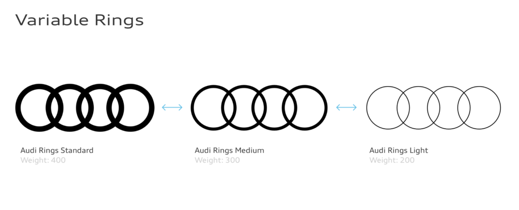
ONE: The weight of the rings seemed to relate to the overall busyness of the rest of the image. Thinner rings are used to take up less space in more complex compositions while thicker ones are for the opposite.
TWO: The second thing I noticed (which was hard to miss since they repeated it quite often) was that there were some keywords they focused on, including Passion, Precision, and Perfection. Their site is cleeeean. I think it’s a good reflection of them as a business since you would hope that the metal vessel you’ll be hurtling down the Autobahn with was made with at least a decent amount of care and exactness.
THREE: The third thing I noticed was that they clearly want to be seen as a modern, sleek, and classy brand. They did this through simple fonts and a small color range (only 4 were listed in their rebrand). They even have a section devoted to diving into their “cast” (models) explaining what they hope to convey with this. These were the words to describe them: confident | diverse | cultured | understated. They also explained that their lighting choices lean towards natural light to create a grounded, natural feel. Another word I think they found important was “Authentic”. They want to show that they understand you.
Now, on to the next one!
Bill Gate’s baby, eenie meenie miney…
MICROSOFT
I remember a guest speaker from last quarter dove into the redesign of Microsoft – was it Joe Hallock? Honestly I would’ve liked to have just watched more of the videos showing the clear, gummy type buttons and icons – they looked like jelly cubes and looked like they wouldn’t taste half bad…
Ok, ANOTHER tangent aside, the three things I noticed were..
ONE: They seemed to be focused on collaboration and making this a better experience for the designers rather than focusing on the consumer like Audi’s redesign was. Of course, better design from the creators will make better experiences for users, but that was just something I specifically noticed. The redesign was pretty explaining how to use the components, spacing, etc.
TWO: Interestingly, it seems that they did something that goes against the very small amount of design knowledge I have and that was using neutrals to draw attention to spaces rather than color. (Correct me if I’m wrong if there’s any designers reading this haha, but I was under the impression that people gravitate towards colorful buttons? Or wait does the color not matter? Wait, maybe I dreamt that during another Fuzzy Friday..). Anyways, here’s what I copied from their page so they can explain themselves:
Visual hierarchy using neutrals
Use lighter neutrals on surfaces to highlight areas of primary focus and create a sense of hierarchy. This ensures a person’s eye is drawn to the areas of an interface that need the most attention or that will be most useful to them.
I suppose Microsoft knows something I don’t – or maybe I never knew, I’m not sure anymore. XD
THREE: Motion is a large part of Microsoft’s design. They said that consistent motion can show continuity for the users and make a better flow, whether it’s scrolling or tabs being opened, there was this push and pull feel to it all. Motion is also used by Miniplush to the opposite effect like showing user’s there’ll be a change and show them the next step.

Finally, last but not least ( I was tempted to say time to stop monkeying around but I actually physically recoiled so let’s scrape that) the monkey of this business (oh god that was even worse):
MAILCHIMP
What is Mailchimp you might ask? Funny you should because I have no clue. Well, had. Apparently it’s a is a marketing automation platform and email marketing service. At least that’s the generic description of it swiped from Google – it looked to me at first like Gmail but you have to pay for it but seems it has other functions like having templates for surveys and campaigns so it actually is probably pretty useful for companies.
We all know the drill at this point so let’s get down to business (I swear if anyone says monkey business–!)
ONE: They changed the c in their name to a lowercase one. They pointed this out specifically with these words: “We’ve also evolved from “MailChimp” to “Mailchimp” with a lowercase c.” And that was it. No further elaboration needed I guess. (I need further elaboration!) Although I do think, from a non-designer’s POV, that all lowercase does tend to look more modern to me so maybe that’s why they chose to do that?
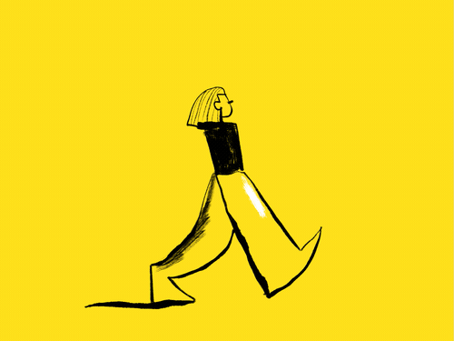
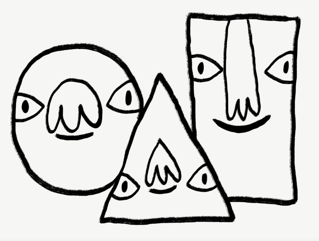
TWO: They integrated illustrations and animations into their design to make it seem more playful and expressive, emphasizing that they’re a creative business. I must say, this swayed me a little – the sketchy doodles combined with the cheery color seemed very grounded to me, making this seem less like some faceless corporation and give it some character. This aligns well with what they were aiming for actually since they literally used the words “consistent and grounded” to describe the vibe they were going for with these illustrations.

THREE:
Now, throwing away all of that consistency we were just talking about is their logo. Is so clean – too clean! They said they refined it but I feel like it has much less character than the illustrations.

I feel like this belongs to a roadside burger joint which probably has an epic banana milkshake, but I don’t feel like it belongs with these three kooky dudes I found on their rebranded website. The inconsistency makes me sad almost because I really like the direction they were going with using the doodles and vibrant colors.
However, I looked up the old Mailchimp (or should I say MailChimp – still waiting to know why they de-capped that c!) thinking that they must have modernized it too much but boy am I glad they did what they did at least because this seems even more dated than the last.
I feel like I’m being pretty negative about this company but that could also be because I tend to be really suspicious of any mailing company which isn’t Gmail or Outlook (like yahoo, it’s on the same wavelength as bing in my opinion) so perhaps I’m just biased.
Anyways, I think I feel a cold coming on so it’s time to stop this madness and call it a night! Until next time!
