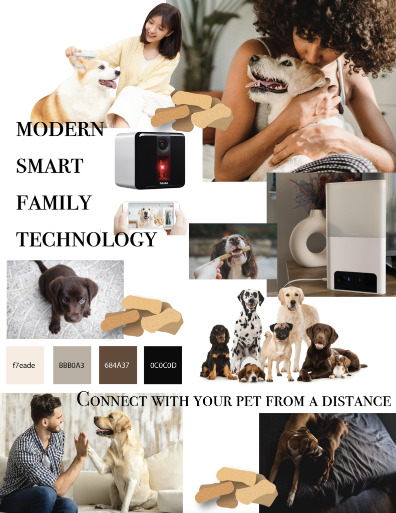
When I first looked at the product I did see much color so I looked at staged product photos and was inspired by the image with the donut shaped vase. I picked the colors from that image and decide the moldboard would resemble that theme. Its clean and modern like the product. The colors are also very calming and neutral so anyone should be drawn to it.
I added also wanted to add many images of dogs and owners because that is the target audience. The images also are in the similar color pallet/vibe to make sure it all goes together.
The last thing I added was some very quick and not greatly made illustrations of piles of dog treats. If I was more invested I would’ve done a better job and or phone and image and photoshopped the background out so it could just overlay on the images like it is now. But you get the idea.