Guest speaker Friday is one of my favorite classes of the week. Being able to learn and glean information from working professionals is extremely helpful. And hearing from people spanning a wide range of fields only further adds to its usefulness to our growth here at the academy . It was a pleasure being able to sit back and listen to Abdul Kassamali talk about his experience in the field. I would like to think that one day, after I’m done with my education (or perhaps during it!), that I’ll be able to marry my passion for photography and film with my career in design.
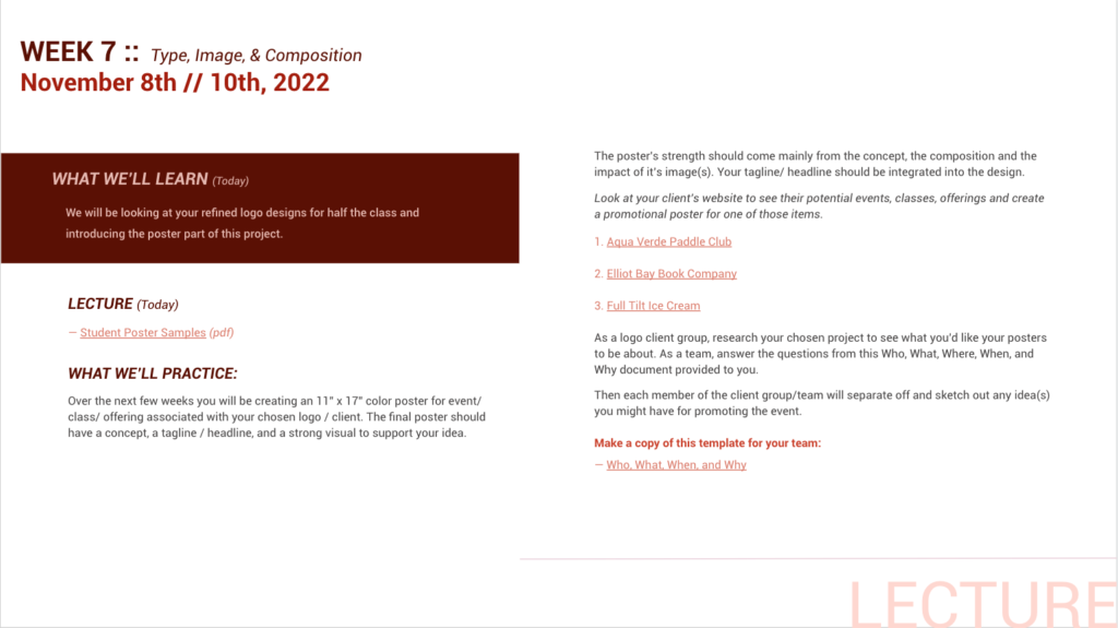
He spoke a lot about the importance of planning, and that at times (many, in fact) we will have to pivot – whether that be in direction, scope, tone, etc. A change to our approach. Although my time at school is only a quarter and some change in, I’ve had a number of opportunities to learn the value of mastering these particular skills. One project that gave me a lot of issues last quarter was my final poster project for Jill’s class. Figure 1 is a description of that project.

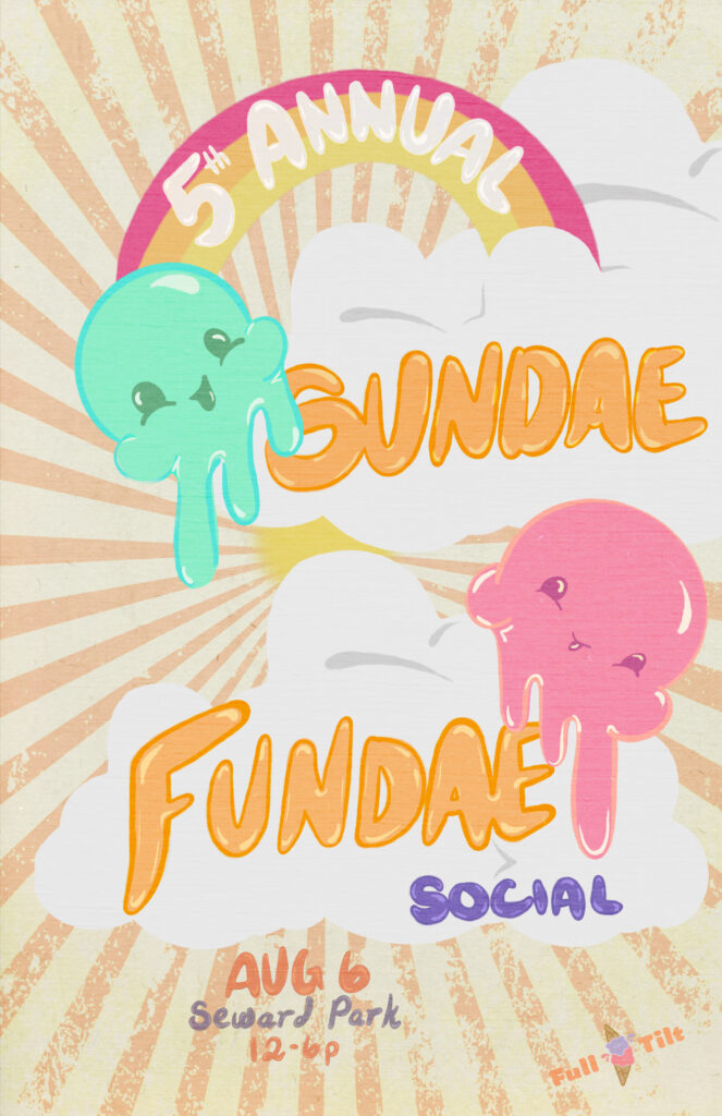
The task of the project was to create a poster that promoted an event for a local business. Jill allowed us to choose which client we wanted to build out our poster idea for. I chose Full Tilt. The poster I was designing would promote their 5th Annual Sunday Fundae Social event.
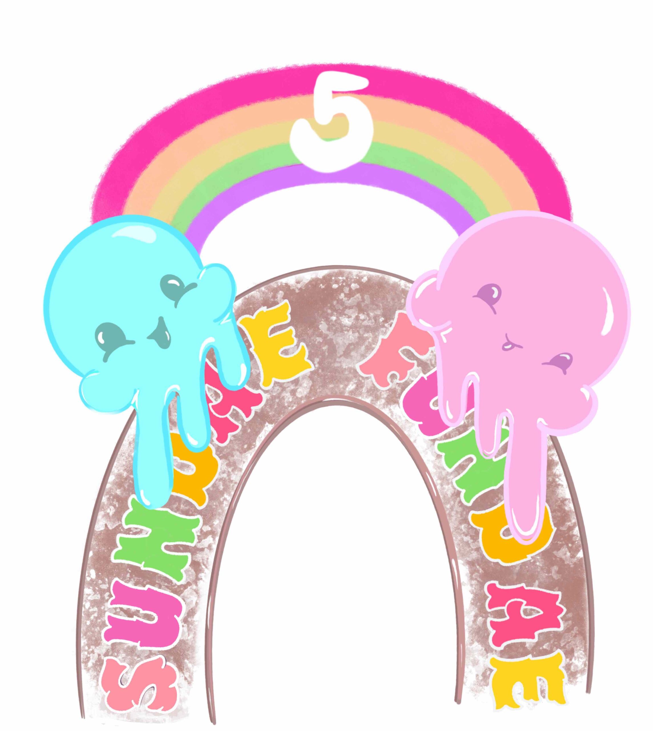
When I first started working on the project, after a couple of iterative rounds of drafting ideas and sketching out possible outcomes, I thought I had a clear understanding of both the brief and the direction that I was taking the poster in. Sketching continues to be a struggle for me, but after putting pencil to paper, I started to feel a bit inspired. I was excited about being in that mode. Maybe realizing that it was possible to learn how to draw after all. Anyhow, this led me down a path that eventually ended up being a sort of rabbit hole for me, and I realized (thankfully not too, too late) that I needed to pivot. I tried everything I could (given the time constraints we were under) to make my initial idea work. But something was off, not connecting. And I soon lost confidence in it. Figure 2 is a screenshot of the last good stage of my initial idea. This is when I decided to take a different approach.

Turns out the arch way was making things more complicated than it needed to be. Same with the font that I was attempting to work with. But because I had at that point been working on this concept for over 3 weeks, I needed to take a stab at a fresh approach to capturing the spirit of the intended poster. I had been looking at the wrong thing for far too long to continue working with those art decisions. New was now in, with only a week left till the final project was due. Jill recommended I rent an iPad from Ed, and attempt to digitally draw my poster. So that’s what I did. Taking away the archway, and hand drawing my main font really helped a lot. In the end, I that my final design piece better captures the essence this particular project. Jill confirmed my choice later, by telling me that she felt the newly designed piece was a lot stronger, with better colors and structural hierarchy. The pivot was scary, with only a week left, but I’m happy I did it, and it taught me a lot about how I would approach future projects. Figure 3 shows my final version. If I had invested the full three weeks on this direction, I believe this final version would actually be even better than it is below. Also, I do wonder what my poster would look like if I had already taken the color theory class. I’m excited to maybe revisit this once I’ve completed that course this quarter. All exciting things I know I will continue to learn here at the academy!
