Night Sky UX/UI Review

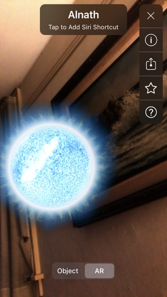
It was the summer before COVID. I remember it clearly. One of my best friends and I went backpacking along the Olympic coast that year. We had just arrived at the halfway mark of our journey, Third Beach. And while sitting amongst the stars, eating our rehydrated meals, we stared up to the sky in quiet wonder. A blanket of stars seemed to envelop us. To warm us against the chill breeze of the coastal night. Prior to the trip, I downloaded the Night Sky app, thinking for sure there’d be no way I’d get to use it, no cell signal and all. But lo and behold, Third Beach turns out to be close enough to commerce that my phone was actually able to locate a cell tower. Pointing my iPhone into the sky, and seeing the systems of stars and planets come to life on the screen of my outdated phone, was in a word mesmerizing. Sipping our cold IPAs, we played games, incorrectly guessing the numerous systems, enjoying the experience of testing and increasing our knowledge of astronomy. A night for the books, to be sure.

Fast forward to today, and still the Night Sky app has this way of making you feel a sense of wonder. I think it’s what the app has going for itself most. Everyone is fascinated by the night sky. The app pulls you in, makes you feel like you’re right up there with the stars themselves. I’m so excited to see how VR develops in the near future. We’re off to a good start, I’d say.

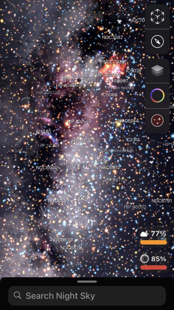
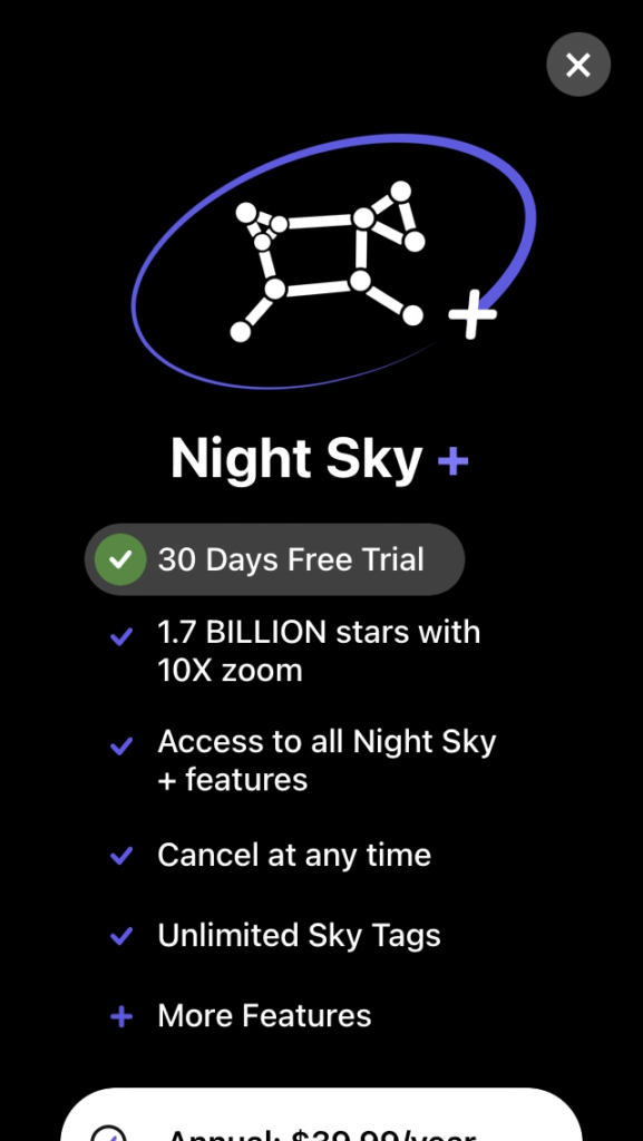
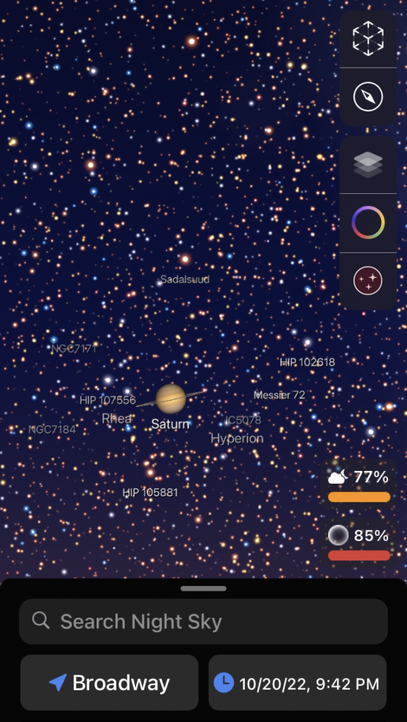
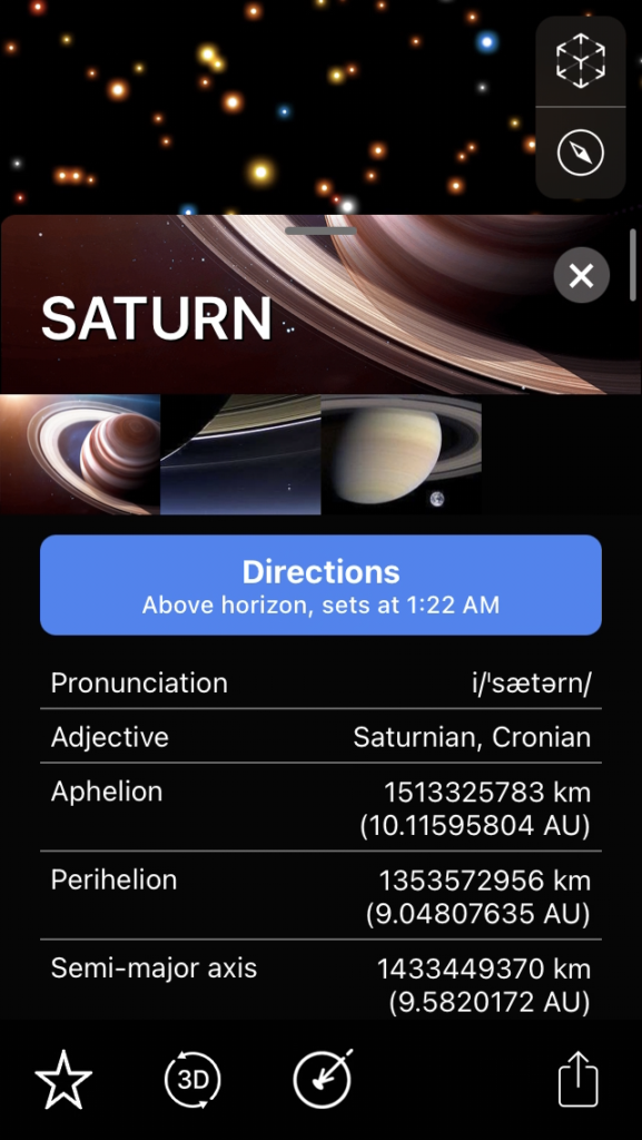
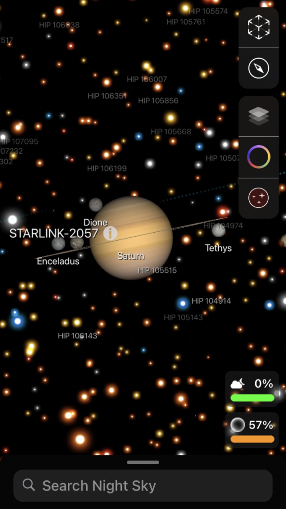
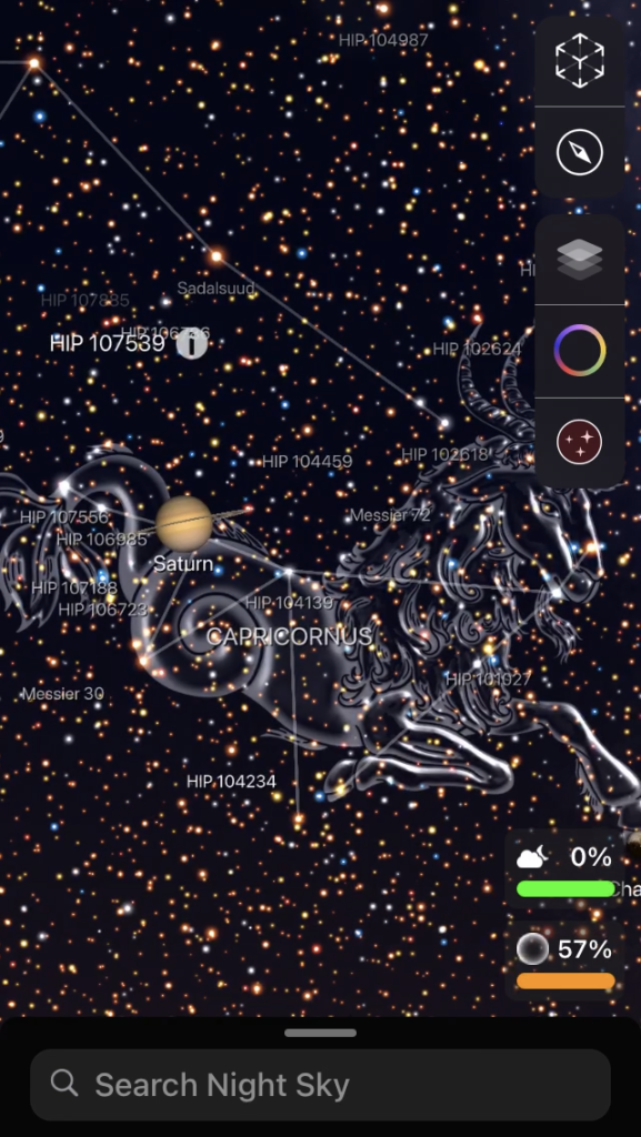
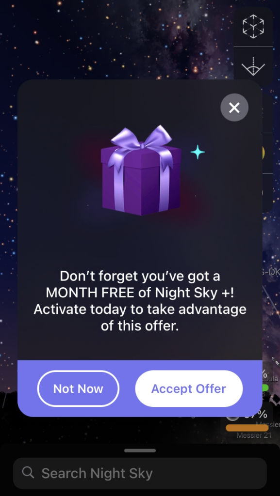
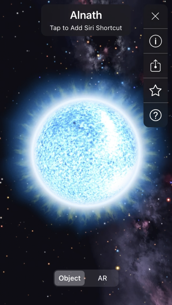
Having said all that, the app isn’t without its obvious issues. Foremost, perhaps, is that the screen is extremely cluttered. It also uses a difficult to read font. Pair that with a lack of contrast between the font used and the background, the user experience can become difficult and frustrating. Another pet peeve of mine is when an app constantly sends your screen a popup reminder to buy its rather expensive premium plan – $40 a year! Ouch. Every time I zoomed in on something I wanted to learn more about, I’d get a pop-up reminder. It would happen sometimes repeatedly on the same object that I was currently reading up on. Needless to say, it was pure annoyance. I also found it difficult to select items on the screen that I wanted learn more about. Not sure how that can easily be addressed as it feels like a hardware issue (maybe?), but perhaps due to the cluttered nature of the screen your interaction with a specific object is hindered.

The good news is that it feels like most of these issues are simple fixes. It’s an app that most definitely feels like it was created by science people, which likely didn’t include much feedback from designers. Decluttering the information, choosing a better font, paying attention to the readability of the screen are all ways that will help to increase the pleasure of the user experience instantly.
Guest Speaker – Joe Hallock

During Joe’s guest speaker session, he spoke about his reasoning behind transitioning from Amazon to Microsoft. Although both companies offer substantial financial gain, that was not at the core of his rationalization for leaving Amazon. It was more about the intrinsic value and meaningfulness behind the work that he was engaged in, sensitive to the purpose and function of his job title. And at Microsoft, they create goods and services that help a person realize their greater potential. That resonated with me.

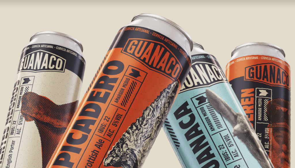
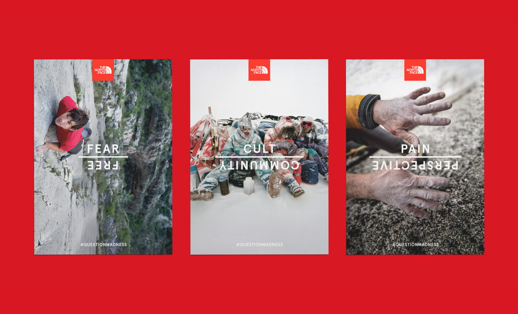
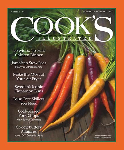
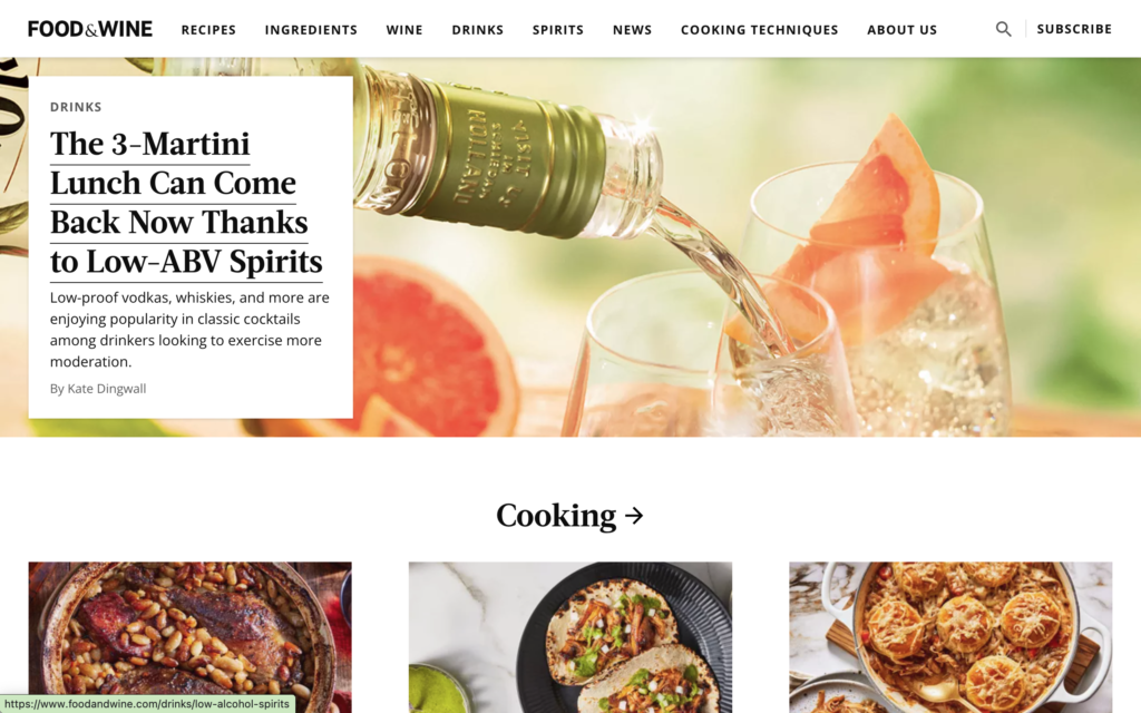
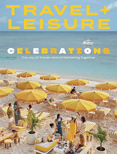
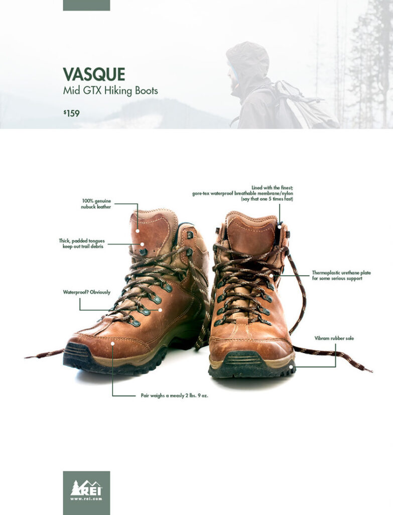
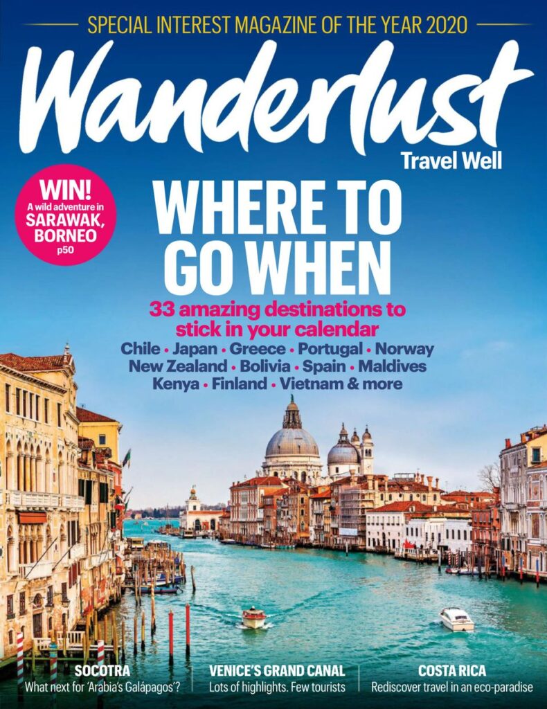
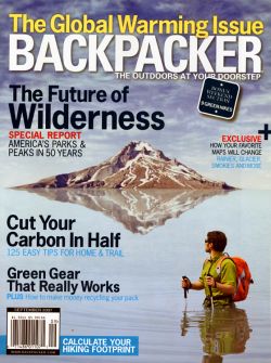
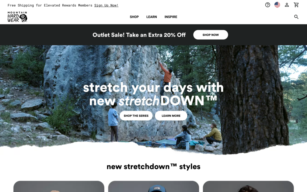
As I develop my skill sets and learn more about my place in the world of graphic design, my sincere hope is that I will be able to focus my efforts in the areas of my life that bring me the most happiness and satisfaction. Aligning those interests with my career development with be paramount. One of the benefits to being a bit older in this program is that I know what I can live with and what I can not live without. Passions matter. For me, that includes food, travel and the great outdoors. Below are examples of the kinds of work I hope to be involved in throughout my career. My guess is that each of these examples fall within the low information density and specific audience quadrant.

Aero AR Project

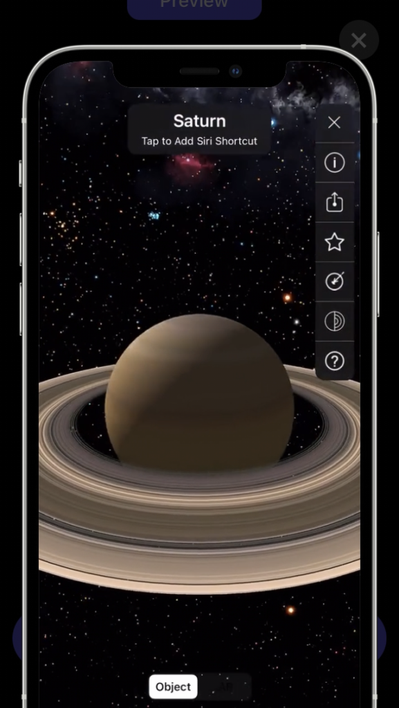
Quicktime screen record – Preview mode

This project took me a bit to figure out. Meant rereading the lecture slides a couple times. But after I played around with Aero a bit more, I think I started to pick up the unique characteristics of this mind bending application. It’s wild seeing how quick technology seems to be moving these days. Frighteningly fast.

As I type, my project is still attempting to load on my phone. I can’t figure out if that’s because I may have made my shapes and characters too large. Oh, scratch that. You just told me it most likely due to my old iPhone 7. Time for an upgrade!

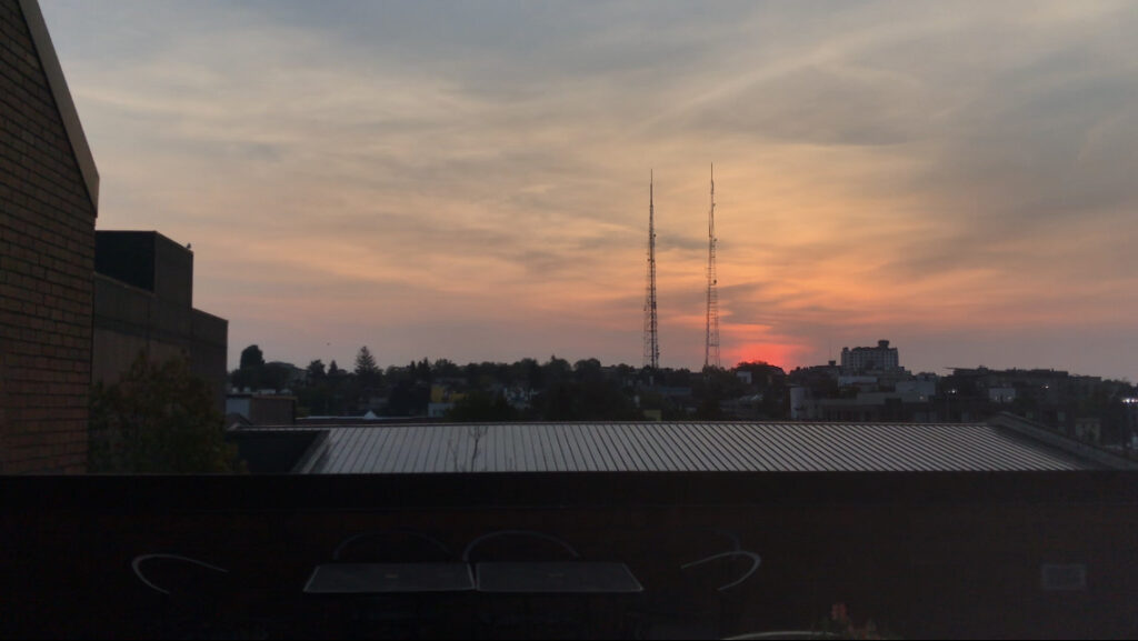
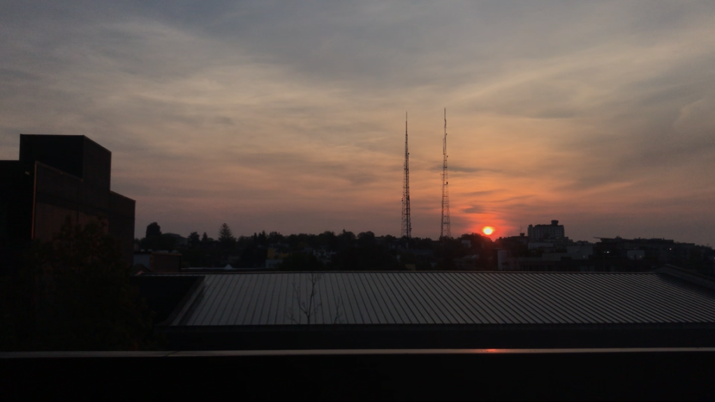
Below are some images I was hoping to use in my iPhone screen recording preview. The sun rise this morning really was beautiful.

No sun
Win sun

The Mashup

This was a challenging assignment. But a lot of fun too. Trying to figure out how to approach the project, and coming up with an idea to work towards, as well as the inevitable hardship of learning new software along the way.

Idea

Bliss asked that we put together a mash up that represented our time thus far in the program. When I think about design school, one thing comes immediately to mind: STUDYING. The sheer amount of work required to not fall behind is intense. And no amount of smart working can eliminate the number of hours one must invest daily to stay afloat. But this is what I signed up for, and I’m dedicated to succeeding no matter what. Habits, the good kind, are absolutely essential.

Process

The video is a compilation of 20 or so clips, taken from a variety of angles, trimmed and then pieced together in Premiere Pro. I gelled a light behind me to give my scene that pinkish hue. During the week I tried to take notice to the music I was listening to, taking screenshots every time a song played that moved me. To start and end the clip, I created a couple design pieces to help with the general flow of the video.

Mediums

This project used several different mediums as well as software. I shot videos, trimmed music files, created the lead and end design elements in Photoshop and Illustrator. Edited the video in Premiere Pro. Uploaded it to Youtube. It’s a short video, but I took me 2 days to finish.

Where to now?

I want to better my working knowledge of Premiere Pro. To be able to create much more beautiful and cinematic footage. Perhaps there are links or videos that my instructors could point me to. I’d also like to know how to create more cinematic footage in general. The process. The approach.

AR Poster / EyeJack

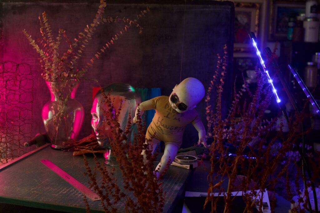
Scene setup

This is my very first blog post in over two decades. I’m excited to monitor my growth as I continue to develop different skill sets throughout the program.

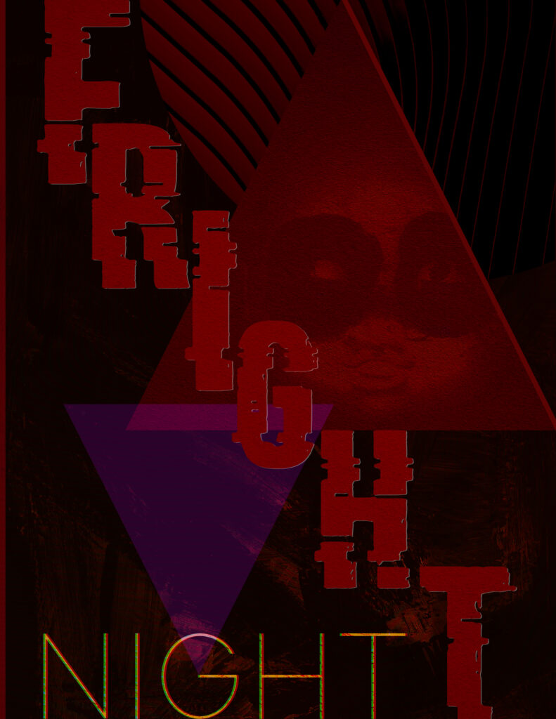
Prior to starting this project, I had no experience in creating a GIF of any kind. And to further complicate matters, I wasn’t entirely sure of the direction I wanted to take. Not having any notable illustrative skills made me have to depend on my photography and videography toolsets.

The challenges

Once I developed a basic concept and a generalized direction, the real difficulties began. How was I going to capture different positions of my doll, with limbs that didn’t help to keep it upright? Did I want to create a backdrop, and if so what would it look like? What layers and textures did I want to include? How would I light the scene? Would I use gels (the answer, it turns out was a big fat YES!)? This part of the project took roughly an entire evening of trial and error, hit and miss. Frustrations eventually leading to triumph and a sense of satisfaction.

At first, I thought I was through the hardest part of the project, that going forward things would be just a matter of following a few directions. Sheesh was I wrong.

As I progressed with the assignment, a few obstacles arose, each requiring further Googling and researching. I had 176 frames that I wanted to combine into my GIF, each PNG roughly 4 MB. Way too large for EyeJack. I had to devise a way (using Automator) to batch reduce the size of each file. Next I had to discover a legitimate way of making an mp3 from a YouTube video, then cropping that mp3 in Quicktime to fit the length of my GIF. That worked, but then the trim in Quicktime created a .mov (not a .mp3). So on to the web again I went, to find a way to convert a .mov into a .mp3. Bingo! Almost there. Even the upload to EyeJack came with its own issues. But eventually I was able to solve each of those issues, and was successful at completing the project. At least, I think I was (despite my thoughts below).

Things to consider

Lacking the necessary skills to adequately translate the fullness of my ideas can be frustrating. Seeing it in my mind, but not knowing how to use the tools properly. Or even what to look for in my research to help me make my vision become a reality. I know that feeling like a fish out of water is part of the process, and I eagerly look forward to a day when that feeling isn’t quite as pronounced. But in the meantime, I most definitely feel a sense of accomplishment in completing this challenging yet ultimately very intriguing assignment.