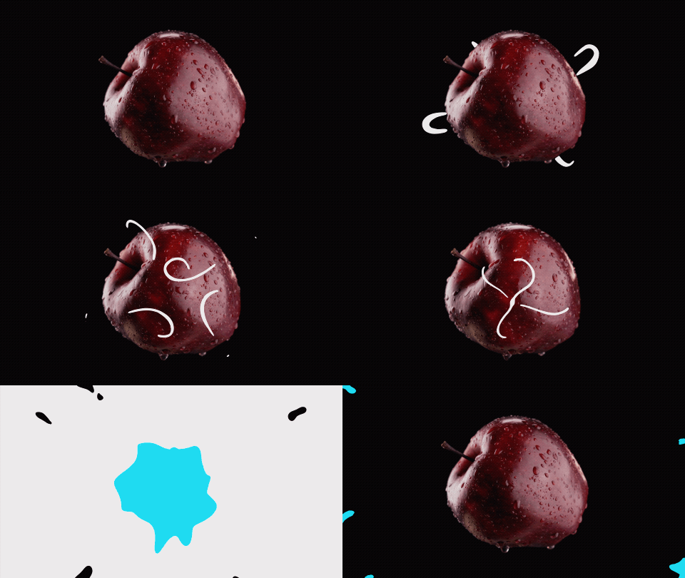
I really struggled with this assignment. I swung wildly from what I thought of making, from packaging to whole brand identities. With the start of the new quarter and struggling to get back into the flow of completing projects for seemingly every class I ended up putting off this particular assignment because it seemed like too much work with everything else that was going on.
Finally, when I made the time to start on this project I decided to create a simple animation using Procreate inspired by the work of Dima Tkachev who does a lot of animations for various brands.
If this had been a more complicated animation I would have begun by storyboarding everything after finding some stock footage. Instead I began by finding the footage I wanted to use and imported it into Procreate. The original clip was 57 seconds long and Procreate automatically cut it down to around 4 seconds with 122 frames at 30 frames per second. I went in and deleted roughly two out of every three frames and reduced the frame rate to 24 frames per second to cut down the amount of illustrating I would have to do. I toyed with the idea of creating multiple layer groups, but when animating something by had I found it was too difficult and time consuming and ended up drawing on top of the existing image.
For the ending splash/wipe I found that using Procreate’s selection too to be a real time saver, especially when combined with it’s color fill mode. Towards the end of the project I realized that I didn’t like how the animation didn’t seem to loop and jumped when it started over. To fix this I duplicated a few of the frames from the beginning of the animating and removed the white lines. After few hours and a few sessions I had something I was pretty happy with. Given more time I would have liked to clean up the animation quite a bit and make the return to start animation smoother. I hope you like my animation as well and that it makes you want to maybe eat an apple.