Categories
Blog

Winter: Week Five

It is a little hard to write about my hard and soft skills because I have conditioned myself to downplay my achievements and abilities. When it comes to the areas where I have hard skills, I believe I am most capable with Adobe Illustrator, motion graphics, and Figma to create interactive prototypes for apps and websites.

With Adobe Illustrator, the best and most recent example of using this skill is from Jason’s second Illustrator assignment during Fall quarter. I really wanted to challenge myself with the project and I believe I did so while producing something visually striking. While going over the final projects in class, Jason suggested that I could even use the assignment as part of my graduation portfolio.

When it comes to motion graphics, I first began developing that skill while working as part of a very small marketing team. Using online tutorials and resources I learned pretty much everything I know now. While working with that marketing team I produced a number of short animations that played in front of various video and social media segments the company produced. I still use those animations in my current personal website/portfolio. While seeking advice from other professional designers, they commented positively on my animations.

I began learning to use Figma towards the beginning of the pandemic after being furloughed. I had already been trying to find a new job and decided that I should learn app and web design to help make me more competitive as I applied for positions (unfortunately I have yet to be able to use Figma in a professional setting). While working in Courtney’s module, my teammates would often ask me questions about prototyping and because of my experience with Figma I ended up taking on the role of design lead for the project we were working on.

With soft skills I like to highlight my creativity, willingness to learn, and ability to problem solve or adapt to most situations.

I think creativity and adaptability are almost one in the same. I’ve heard some writers say that you never figure out how to write a book, you just figure out how to write the book you are currently working on. I feel much the same way when it comes to design. There are a number of different tools and methods that help you figure out how to start or continue a project, but I often am surprised by the solutions I come up with. I think one of the best examples of my creativity is an illustration I did for Street Sense Media’s 2016 election edition newspaper. I took a lot of inspiration from many sources and combined them using my own illustration style. I was really happy with the results and because my illustration was so impressive it got professional graphic designer in the area to volunteer his time with Street Sense when the company eventually went through a rebranding.

When it comes to learning, I find that it is a never ending process. The last job I had before moving back to Seattle ended up teaching me a lot. I worked as part of the embroidery team for a company that produced garments and other items for various companies. I had never worked with digitizing embroidery before and ended up learning quite a lot from the head digitizer at the company. I am always eager to learn any new skill or tool when it comes to design and am always keeping an eye out for different techniques on social media and online that I can incorporate into the work I produce.

I feel like I’ve maybe addressed problem solving a bit already while discussing some of my other soft skills. When prototyping an app or website while using a program like Figma I find that you have to be able to think differently than with other types of design. Deciding which screens and buttons and icons need to connect to other screens or produce various interactions is challenging, but I find the results to be very rewarding.

For hard skills, I would like to work on user research. It’s a super important part of the design and refining process when it comes to user experience design, but it is one area where I feel like I struggle the most. I lean very heavily towards the introvert end of the spectrum and it is exhausting to conduct interviews and compile and analyze the results.

Another area I would like to work on are my presentation skills. Presentations and meetings are some of the least fun parts of working as part of a design team for me. Being able to articulately communicate my ideas and keep my audience engaged would definitely help me develop into the types of positions and roles I hope to obtain after graduation.

As for soft skills, I think my organization could use some work. For example, I fell behind with my blog posts at the beginning of the quarter. If I had been more organized and on top of everything that bombarded me I wouldn’t have missed multiple deadlines, which is bad and even more so when it comes to a work environment.

Additionally, I believe my persuasion skills and ability to take the lead could use work. I have found myself in lead roles while at school, but it’s usually because the position has been place upon me or because I accidentally stumbled into the position. I feel that my level of confidence isn’t where it needs to be, which affects both my ability to persuade and lead others. Because I am one of the older students in the Creative Academy, I think sometimes others might see me as being more experienced and look to me to lead the way on certain projects. Over all these are skills I believe I would benefit from developing more.
Categories
Blog

Winter: Week Four

You can watch my elevator pitch HERE.

For my elevator pitch I wanted to focus on a few main points, making sure to emphasize those areas in particular. I chose to do bullet points rather than write out an actual script hoping that it would make my presentation sound more natural.

The main points I wanted to highlight are:

  • Working in design and/or related field since 2016:
    • I’ve worked in marketing,
    • created social media posts,
    • learned embroidery digitizing.
  • I’m primarily self taught (fortunately, you can learn a lot from YouTube tutorials).
    • I’m back in school now to build up my portfolio and foundations.
  • I have a wide set of skills:
    • branding and logo design,
    • UX/UI,
    • motion design,
    • illustration.
  • Some fun facts about myself:
    • I can solve a Rubik’s cube in under a minute,
    • I was the president of my college’s juggling club for a year,
    • I love board games.

This was a somewhat difficult assignment. I have always found it hard to talk about myself, especially avoiding being too humble and downplaying my abilities. I have struggled with anxiety for a very long time and skew heavily towards introversion. I find the act of networking and interacting with new people very draining. Even when it comes to writing cover letters and applying for jobs I find it incredibly hard to start and follow through.

If anything, the process has gotten harder as I’ve grown older. It is something that I have been trying to work on for a while. I think it will continue to be a struggle moving forward, but at least when it comes to working as a designer, I hope that this program will help boost my confidence, which in turn will make it that much easier to sell myself and my abilities.

You can watch my elevator pitch HERE.

Categories
Blog

Winter: Week One

I really struggled with this assignment. I swung wildly from what I thought of making, from packaging to whole brand identities. With the start of the new quarter and struggling to get back into the flow of completing projects for seemingly every class I ended up putting off this particular assignment because it seemed like too much work with everything else that was going on.

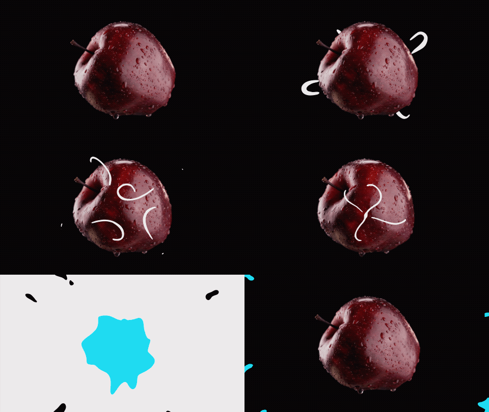
Finally, when I made the time to start on this project I decided to create a simple animation using Procreate inspired by the work of Dima Tkachev who does a lot of animations for various brands.

If this had been a more complicated animation I would have begun by storyboarding everything after finding some stock footage. Instead I began by finding the footage I wanted to use and imported it into Procreate. The original clip was 57 seconds long and Procreate automatically cut it down to around 4 seconds with 122 frames at 30 frames per second. I went in and deleted roughly two out of every three frames and reduced the frame rate to 24 frames per second to cut down the amount of illustrating I would have to do. I toyed with the idea of creating multiple layer groups, but when animating something by had I found it was too difficult and time consuming and ended up drawing on top of the existing image.

For the ending splash/wipe I found that using Procreate’s selection too to be a real time saver, especially when combined with it’s color fill mode. Towards the end of the project I realized that I didn’t like how the animation didn’t seem to loop and jumped when it started over. To fix this I duplicated a few of the frames from the beginning of the animating and removed the white lines. After few hours and a few sessions I had something I was pretty happy with. Given more time I would have liked to clean up the animation quite a bit and make the return to start animation smoother. I hope you like my animation as well and that it makes you want to maybe eat an apple.

Categories
Blog

Winter: Week Three

I like the idea of having personal projects, but the problem I’ve always had is in following through and completing the few projects I manage to start. I have always found it really hard to find or make time for personal projects in the past as I usually feel worn out due to work or other aspects of life and the ever present lack of knowing what exactly I would like to be working on. For as long as I’ve been trying to work as a graphic designer I’ve struggled with my portfolio, I have never known what to make to put in it and no mater how hard I try to think of a drawing, animation, vector image, logo, or whatever I always end up drawing a blank. I’ve used tools like the daily logo challenge to try to spark my imagination, but eventually I run out of steam because of time or energy limitations.

I think the most practical personal project I could start working on is an overhaul of my profile website, but it might be more practical to wait until I am further into my time at the Creative Academy so that I can have some more projects worth showing off. The organization of my current website could use some help. I have once section with a bunch of projects, but it is not clear from the home screen that multiple items can be found by following that link, making my home page look more sparse that it really is.

I would like to revisit the daily logo challenge. The last time I started it I used it as an excuse to get more practice creating motion graphics. I love the process of working with motion design in Adobe After Effects, but the amount of work it takes to create a logo and then find a way to animate it is a lot and I have a hard time imagining being able to find time to work on anything like that around all the projects we have while attending classes for school.

Categories
Blog

Winter: Week Two

When it comes to projects I’ve had to pivot on during my time at the creative academy, I think of my first assignment for the New Media AR/VR module. We were tasked with using the EyeJack app tool for creating interactive experiences by creating a .gif file that would play on your phone after scanning a QR code and then pointing your camera at an anchor image.

I wanted to give myself a challenge for this project. I had started to teach myself to use After Effects in the process of character rigging. I had wanted to explore this skill for some time having had to pass up a potential job offer where it would be necessary. I had begun to work on a project teaching myself to use the Duik plug-in for Adobe After Effects, but had lost momentum and was looking for an excuse to begin working on it again.

It wasn’t until I was most of the way through the process of character rigging that I realized that I had messed up and either needed to go back and start from the beginning with a completely new character or amend what I had envisioned for my animation. Once I had started trying to animate my character I became aware that the advice I had ignored when creating my character, to make them at three-quarters perspective (my character was head on) had been given for a reason. I expect that there is a way to rig a model head on, but as someone going through the process for the first time and using a tutorial that specifically suggested that I create a character a specific way, did not have the resources required to make that work.

I knew I didn’t have enough time to create a new model or edit the one I had created, so the only thing I could change was the animation itself. What I had hoped to make was a woman rollerskating towards the camera, rocking back and forth from skate to skate. The tone was supposed to be relaxed, simple, and elegant.

The tone had to completely change from what I had envisioned my head. I had hoped to learn a new skill and tool, and while I did manage this to a certain extent I think the lesson I came away with is that sometimes it is better to walk before you try to run.

Categories
Blog

Week Eleven

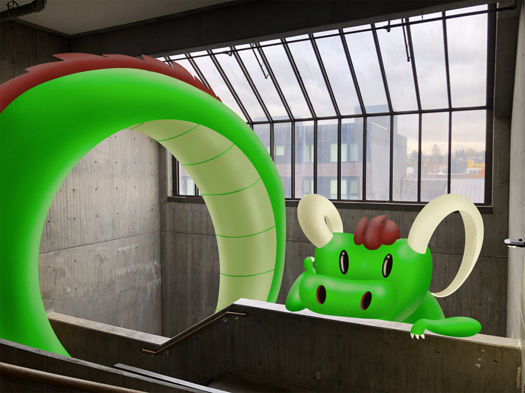
I love the stairways in Seattle Central’s main building, especially the ones with skylights. They have a very industrial look that somehow is still able to be inviting and awe inspiring. I remember seeing printed instructions at the beginning of the quarter saying that students were not allowed to post anything to the walls of the stairways and thought it was a shame.

I chose to add a playful dragon to the space because the long body could span multiple floors and might entice people to venture to the top floor to find it’s head. I think this would work well as a large scale paper mache project or similar material so that light could diffuse through and not make the space too dark.

I’d like to thank the faculty of the New Media class for this quarter. I have learned so much and am excited to learn more in the new year!

Categories
AR

Golden Gardens Beach

Link to video here.

At first I wasn’t sure how I felt about this project. With final projects due for every other class all converging it seemed like one project too many. Lucky for me I had a group that was quick to come up with an idea for our project’s topic: Seattle beaches.

The hardest part of the project was coming up with the copy for my EyeJack panels. It helped that I didn’t have to go too in depth with the subject matter because we were aiming for fun and informative information that might help a user learn more about the beaches they were visiting. I picked the Golden Gardens beach in Ballard mostly because I live an easy biking distance from the park.

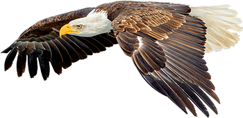
I learned a number of interesting facts about the beach while conducting my research, like how the beach was named and that it was originally intended as a marketing tool for local realtors. There are apparently a number of interesting creatures that have been spotted at the park, including bald eagles, beavers, ducks, and more.

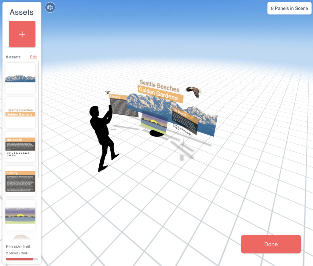
Once my research was done I compiled the information that needed to be in text panels and brainstormed a number of images that would at least hint at some of the other things the park has to offer. I used photoshop to convert the images into transparent .PNGs and Illustrator to make the panels and headline for the completed project

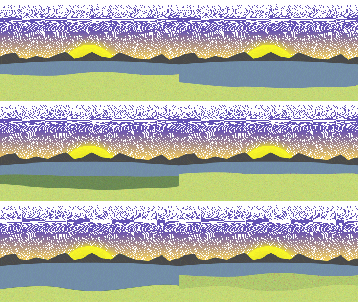
The animation I created as something of an after though. I had forgotten that animation was required for the completed project. I decided on this animation because most my memories growing up and visiting the beaches are punctuated by the waves crashing on the beach and the tide coming in and out.

Here is the QR code for the project. And HERE is a link to the video of me using it while sitting on a bench at Golden Gardens.

Categories
AR

Swift Playgrounds Review

I am a huge fan of Jerome Vogel’s illustrations and style. Somewhat recently he began posting videos of his illustrations that were projected onto his phone or a piece of paper that appeared to be in three dimensional space.

For this project I hoped to follow along with a tutorial Jerome Vogel had produced that walks you though the process of creating one of these pieces.

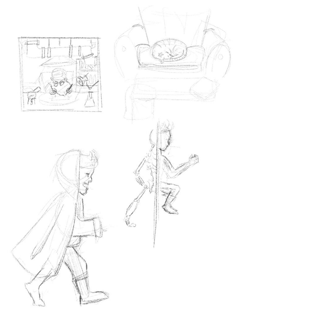
I began with coming up with some ideas for what I was hoping to create.

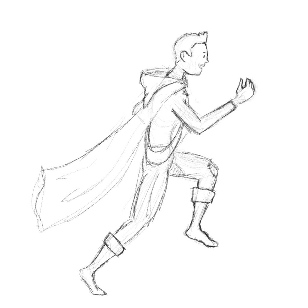
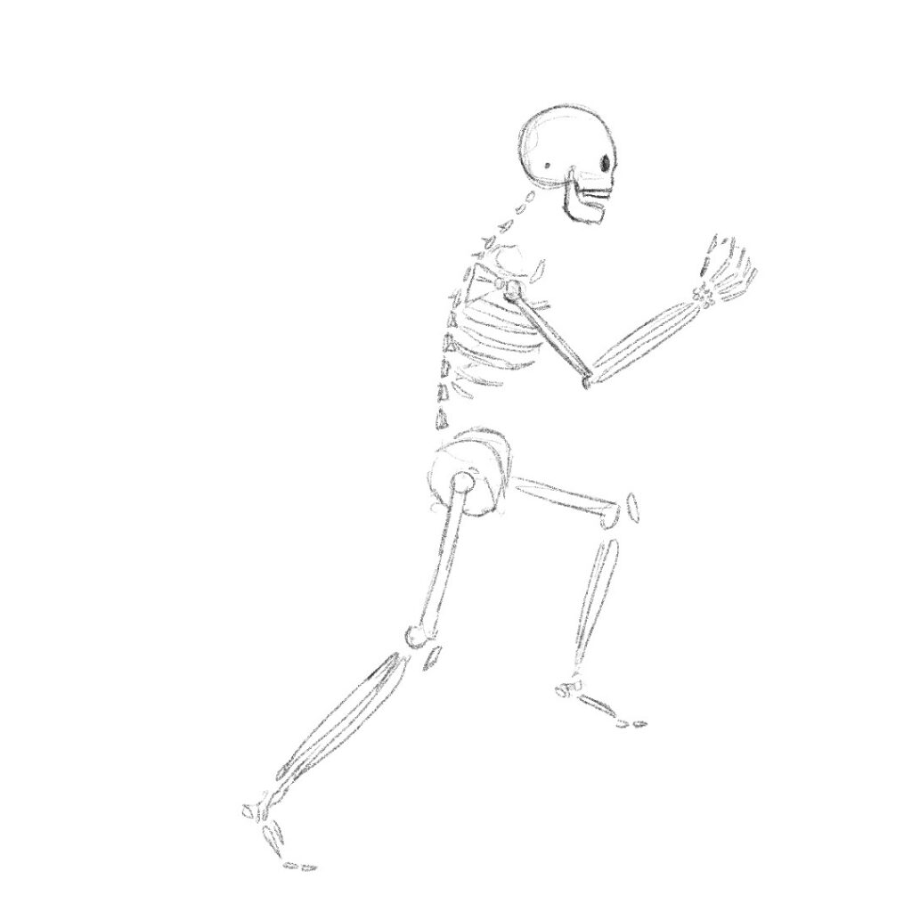
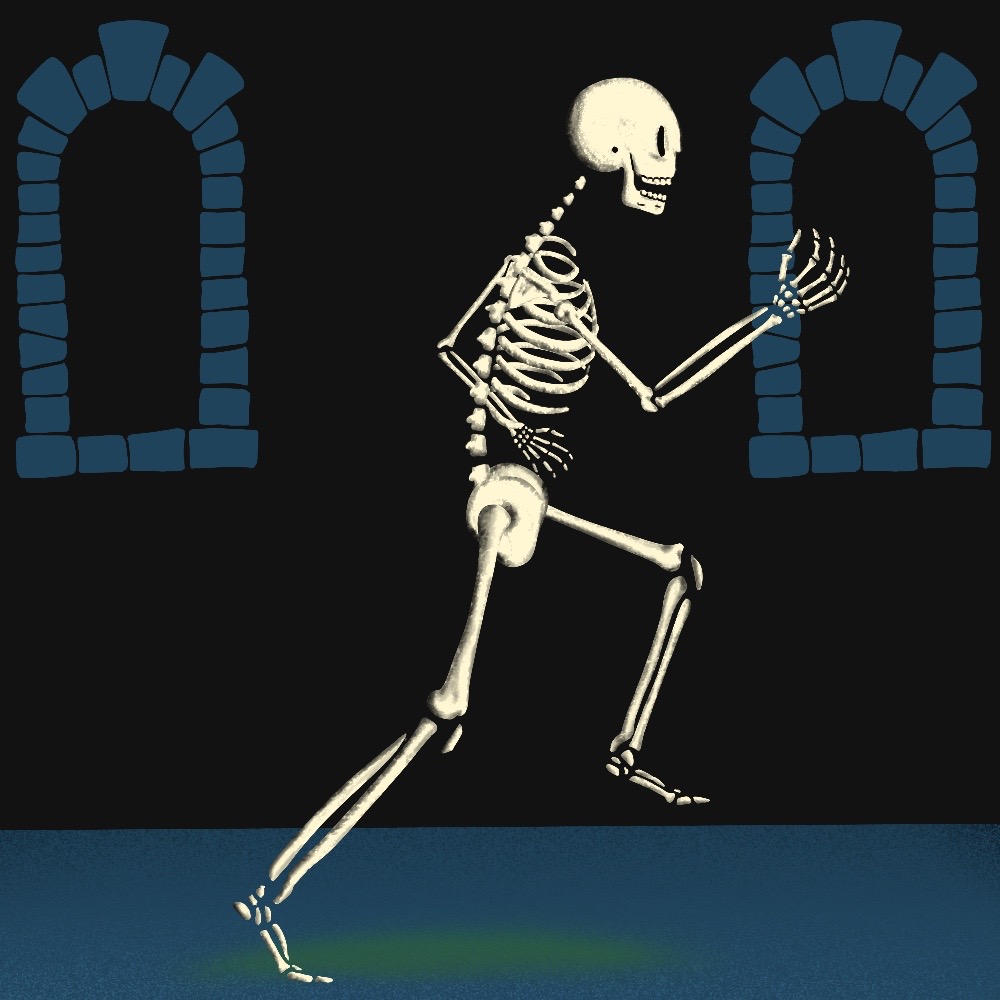
I settled on the idea of a hero running through a portal turning from a skeleton into a human as he ran through. I soon realized that this was too complex a project for my first attempt at this process, so I settled on creating a skeleton running though a castle hallway.

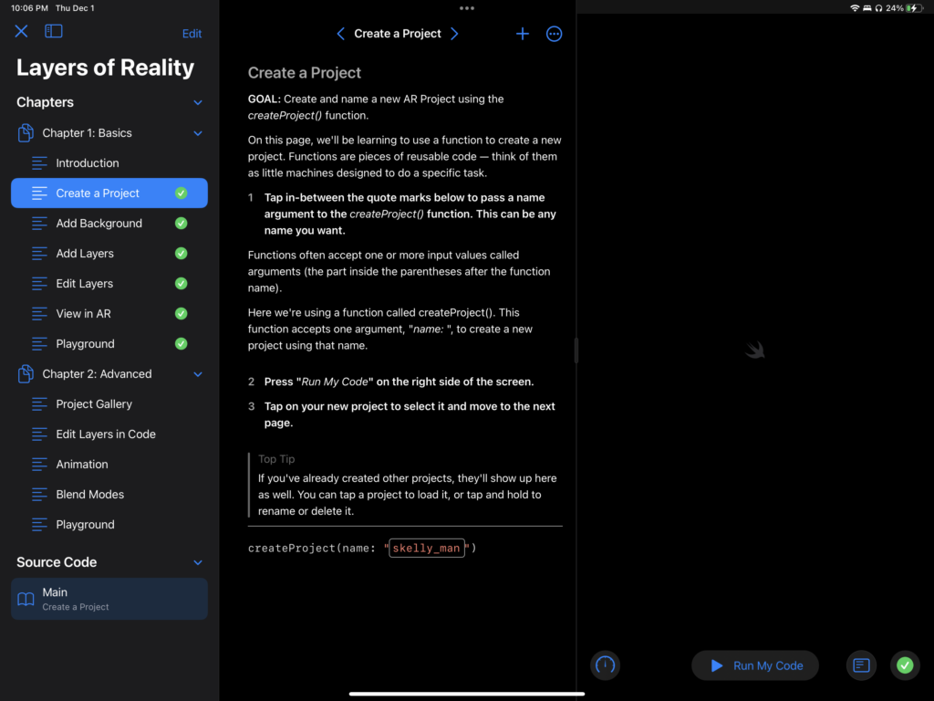
First I had to set up my project.
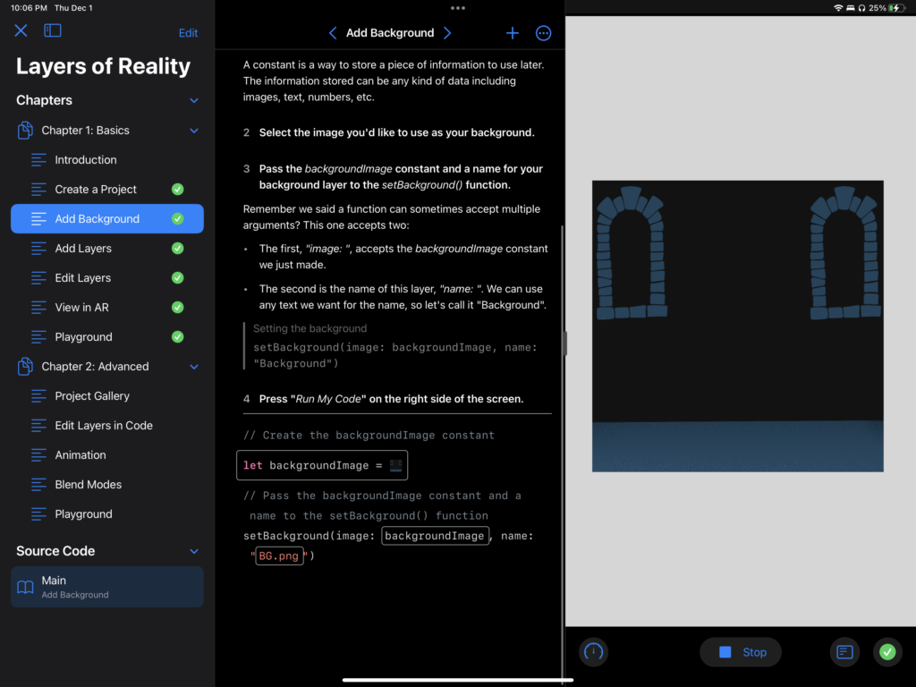
Next came importing the background
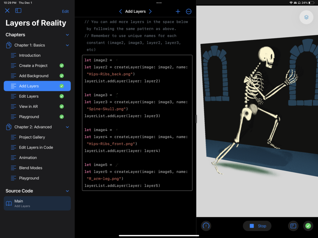
After that I had to import the layers that would be project above the background.
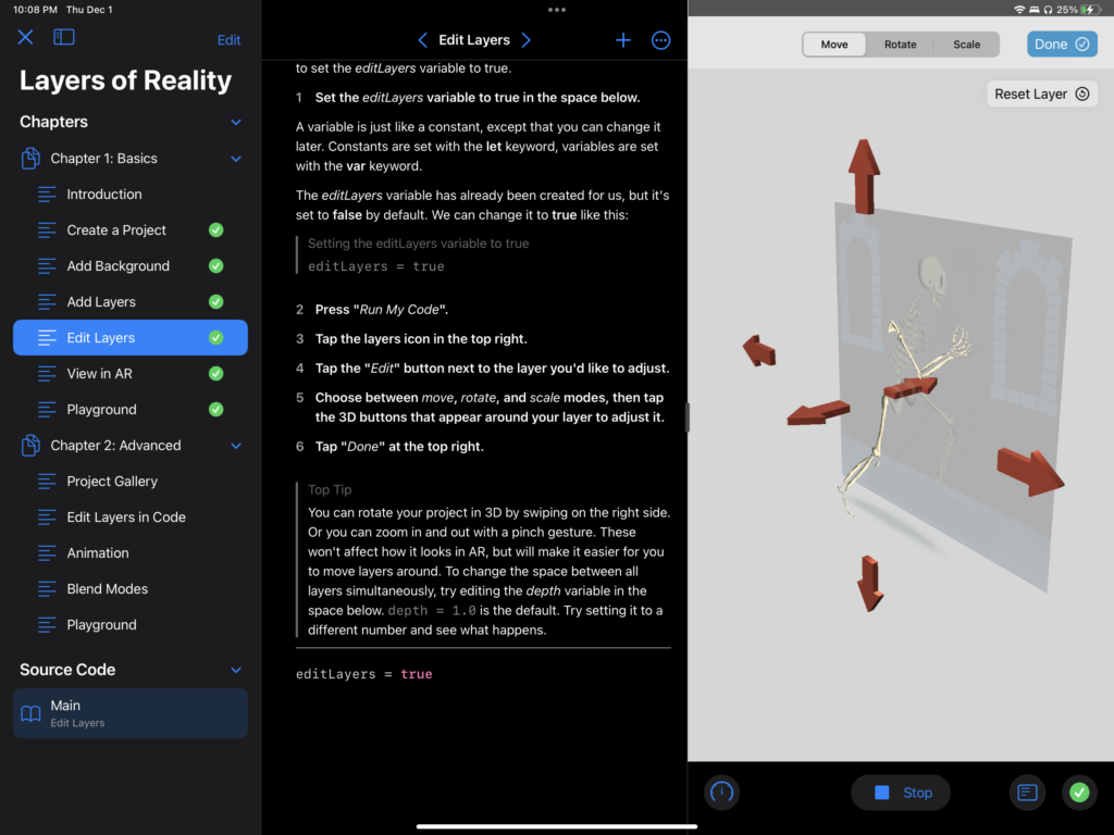
One the layers were in the composition, I then had to adjust them in three dimensional space so they would look good when visualized in AR.

Here is a (link to a) video of the results: https://drive.google.com/file/d/1imgRE6_cfe2Tzeo8-oP9LFNHNfi2Mkjx/view?usp=sharing

Overall this process was much easier than I expected. The guide was pretty simple to follow. I was initially very nervous about the process because it involved coding which I have struggled with in the past.

One big issue I had was with getting my devices camera to work in Swift Playgrounds. After troubleshooting I discovered a message board that pointed out that Playgrounds has an image size limit of 1000 pixels and I had made mine 1080 pixels. One I figured this out the project started working.

There are some issues with the projection stuttering. My guess is that my background image doesn’t have enough contrast so the camera doesn’t know where exactly to place the image in space.

I think my next steps with this project would be to play around with different background images so that the camera has a better anchor point and creates a smoother experience when viewed in AR.

Categories
AR

Adobe Aero Project

You can see the finished project here: https://adobeaero.app.link/pw6ieDKeqvb

Or scan the QR code:

I began this project trying to come up with ideas for what I wanted to do. I initially wanted to be as ambitious as possible and make a series of animations that would then play as the user walks through them. Unfortunately, with the holidays and multiple projects due for other classes I had to compromise.

After much thought I came up with the idea for a book that had graphics appear as you flipped through the pages.

I made the illustrations for each page as complex as I could given the time constraints I found myself working in.

One issue I realized only after completing this project was that the starting rotation for my book was off, so in order to view the book properly you have to walk 90 degrees around the composition.

Video of Aero project in the real world: https://drive.google.com/file/d/1G4TtI-7Thds0Fz2Lop7LdXkTpGjgkmET/view?usp=sharing

Categories
Blog

Week Six/Seven

The first five to six weeks of classes have been a lot (mostly in a good way). I was in Erik’s After Effects class during the first half of this quarter and ended up learning more than I expected, having worked with the program for years for work and my own personal amusement.

In the first two weeks of class we covered motion graphics, which is primarily what I’ve used After Effects for in the past. I’ll be honest, in the first two weeks I had prior knowledge of pretty much everything that we covered. I love making my logos and graphics move, fine tuning and making everything fluid and perfect. I used this time to finish animating a logo I had started for personal use earlier in the year and had lost steam on. I was super happy with the end result.

It was once we started working with masks, green screen, and compositing that I really started learning some of the tricks and tools I was less familiar with in After Effects. For the most part they were features I was aware of, but had very little practical experience with.

When it came to masking I knew you could create a mask and make it move, but I never really understood how or why it would be useful. It wasn’t a technique I ever used or could get to work the ways I wanted it to when creating logos and other animations. The concept makes a lot of sense to me now and I know I’ll feel a lot more comfortable if I ever find myself in a situation where I am working with and having my animations interact with video.

Green screen was also something I had very little experience with. I had used the method once while working on a project for a job, but had not had a reason to revisit it. Again, I feel much more comfortable with it now and feel like I could use it in a professional setting if the need arose. While learning green screen, I gave myself the extra challenge of learning how to use After Effects’ built in tracking features, something I knew was possible, but hadn’t really used before. Erik saw me exploring the tool after class one day and walked me through the tool and some of the best ways and situations where I could use it.

The last thing we covered was compositing, which I only knew about though photoshop and blend modes. I definitely struggled with this more than the previous weeks’ assignments. I initially was trying to use compositing as a substitute for green screen, which I now know is the wrong perspective, at least at the level we were using it. It wasn’t until I realized that that I began to understand which situations and video elements allow the technique to meet its full potential. Compositing is something I would very much like to dive deeper into and learn how and where I can use it to add new dimensions to my work.