Categories
AR

AR Project 1:

For this project I wanted to give myself a challenge. Before starting school I began to teach myself the process of character rigging in After Effects, something I had wanted to learn for some time. I had begun a project, but lost momentum somewhere along the process.
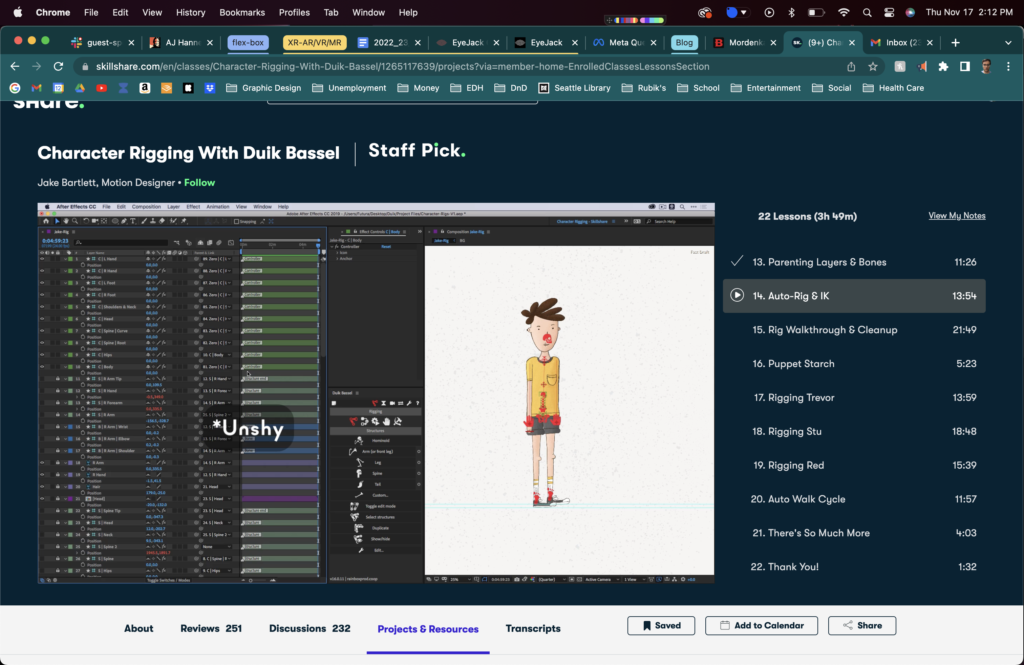
My first step when creating my animation was to learn how exactly to rig a character in After Effects. I used Jake Bartlett’s Skillshare class on using and animating with the Duik plugin.
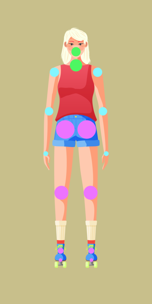
Working though the tutorial, I designed a character. There were a number of problems with the initial build of the character. First, I had way too many layers, which I had started with intentionally because I thought it would give me more control when animating. Additionally, I created my character forward facing when the tutorial had suggested something like three-quarters perspective, which proved to be a problem later on.
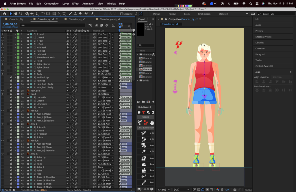
When I had finished creating my character, I began the long and tedious process of rigging everything in After Effects. This part wasn’t too bad, though I did have a number of hiccups when it came to parenting layers.
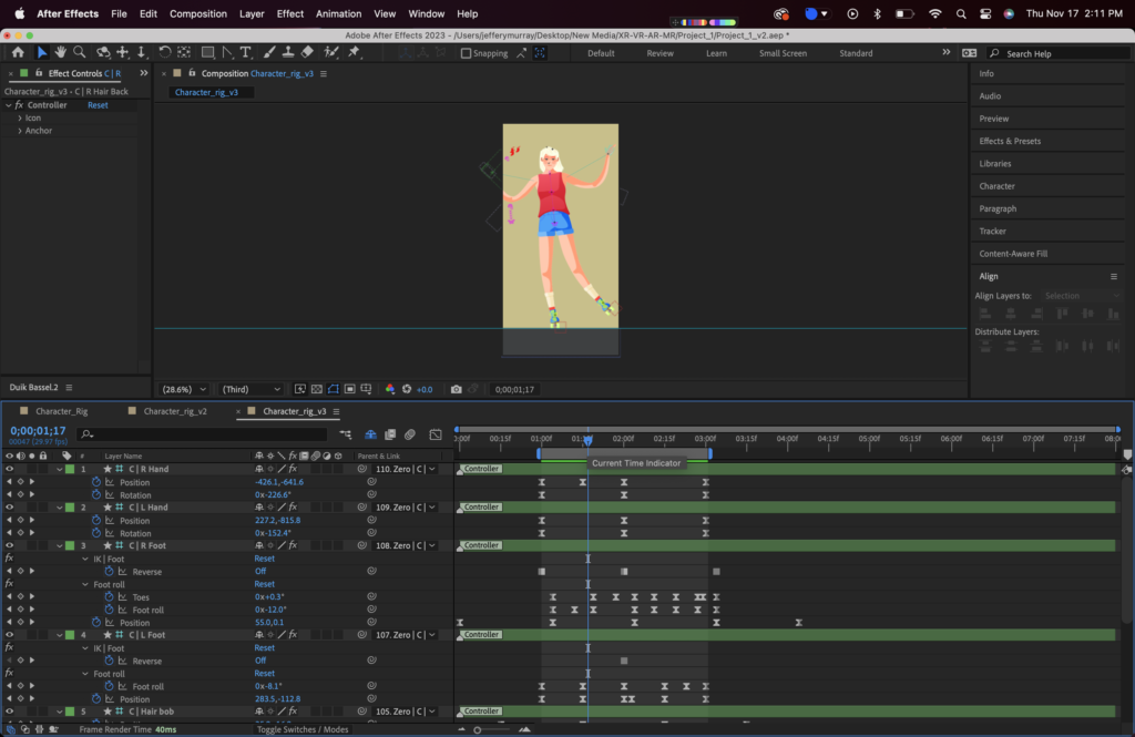
Animating was where I had the most trouble. I had hoped to have my character casually cruising down the street on her roller skates. I eventually realized that this animation was not within my current abilities given the amount of time I had left if I wanted to be able to turn in something complete. I played around and found a way to simplify the animation that worked well enough to my liking and aesthetic.

When I finally exported my animation, I uploaded it into EyeJack. I found this experience to be more or less as simple as when we did it in class.

Here’s what I ended up making. All things considered, I’m pretty proud of it.
Categories
Blog

Week Five

Customer Obsession – In my professional life, I have always been focused on what the people I’m working for need and want. I worked as a massage therapist for around two years in the District of Columbia, a field where the most important things are your clients’ comfort and wellbeing. I was one of the few therapist in my area that addressed issues surrounding TMJ, therapy that requires you to work inside the mouth of your client. Whenever my work called for this, I was always extremely careful to talk my clients through what the session would entail and go out of my way to make sure that they felt comfortable and safe while they were on my table.

Deliver Results – When I worked on as a social media intern for Civic Influencers (formerly Campus Election Engagement Project), I was tasked with coming up with infographics that taught the amendments of the United States Constitution. After coming up with a few ideas I was unhappy with, it occurred to me that motion graphics would work a lot better for what I was trying to convey. I created a concept animation to show my supervisors. They ended up loving the idea and the series became much more informative and engaging as a result.

Learn and Be Curious – I have always enjoyed learning new skills and tricks as an adult. It’s a strength I’ve developed over time and there are definitely a number of caveats when it comes to which subjects I find engaging. Luckily I made the decision to go into graphic design, because the work I get to do, the tools I get to work with, and the seemingly endless amount there is to learn are astounding. For example, I’ve been surprised about how much I enjoy learning how to code in HTML and CSS because when I enrolled in SCC’s design program those were the skills I was (and still am) most trepidatious about learning.

Are Right, A Lot – I feel like I am extremely bad at being right. I will usually defer to someone else’s opinion or judgment. I know that I have a lot to learn still when it comes to design and my professional development, and that as a rule I will probably be wrong about many things for a while to come. In a way I enjoy being wrong because it means that I’m still learning and keeping the feelings and wants of the people I’m working for in the front of my mind.

Categories
Blog

Week Four

The first official graphic design position I was hired for ended up being something of a disaster. About a year before I had decided I wanted to pursue graphic design as a profession, after having wandered down quite a few other roads I was unsatisfied with.

I had quit my job as a massage therapist in order to drive for Uber (which ended up being a huge mistake, but that is an entirely different story), and was beginning to question what I really wanted from a career. I landed on graphic design because I wanted to do something creative, that required problem solving, would pay me a living wage, and would allow me to continue to learn as I evolved. To prepare myself for this new endeavor, I enrolled in two continuing education classes over the summer of 2016, Intro to Photoshop and Digital Tools for Visual Arts, hoping to learn the basics, find an entry level job, and learn everything else I would need as I worked.

Immediately after completing these classes, I managed to land an unpaid internship with Street Sense Media, the District’s local homeless newspaper (similar to Real Change in Seattle). It was liberating and allowed me to have fun and work with the tools I had learned over the summer, but I was no closer to finding paid, permanent work.

After interning at Street Sense, I was offered a low paying job as part of the marketing team for a mortgage lender in Maryland. I was initially very excited about the position because part of the company’s marketing campaign involved working with video, a skill I was passionate about and was hoping to develop further.

There were a number of factors that ended up making the resulting experience unpleasant for me. My supervisor was often exacting in their vision or completely absent, the commute was long and a nightmare, and I, although eager, was not an experienced videographer or graphic designer. I didn’t have a firm grasp of the design process and no one at the company was going to teach it to me. It wasn’t until years and many, many tutorials later that I finally began to learn some of the skills that make for a great designer.

Though this first job was a failure, it did lead to some positive experiences. For example, I end up teaching myself to use After Effects, which is a tool I still use and love to this day.

Categories
Blog

Week Three

Currently, I see myself progressing in one of two ways (potentially more). First, I would like to become a specialist in my field(s). I love to animate in After Effects and have been doing so for a number of years, but have very limited experience with it in a professional setting. I also love to work in Figma developing responsive layouts, interactive prototypes, and really anything to do with user interface and experience design. I have even less professional experience when it comes to working with Figma and similar design tools, but it’s something I hope to remedy in the near future. Whatever I end up specializing in, I hope to become one of the best and be sought after for my work and talents.

The second way I see myself progressing is by becoming something of a Jack-of-all-trades. While there are programs and formats I love to work with, there is always more to learn. In the past I’ve worked on projects for a wide range of needs. I’ve worked with illustrations, animations, photo collage, social media, marketing, and even embroidery, and more, and with each project I get the chance to learn a new tool or method of doing things that changes the way I think about design and how to best achieve the results I’m looking for. While I may not end up specializing in one task, I would be able to achieve more and work in a wider array of fields.

Either way my life and career progress I can see myself landing in almost any spot on the quadrant Joe Hallock spoke about. Much of it depends on where I land after graduation. Both of the options I mentioned have to potential to appeal to a broad or narrow audience or require high or low density of information. I suppose if I had to choose right now, I would lean more towards larger audiences that require a lower density of information because I like the idea and challenge it takes to convey difficult concepts succinctly and successfully.

Categories
Blog

Week One/Two

The first two weeks of the creative academy have been a mix of exciting and exhausting. I have really been enjoying everything so far. Everyone from teachers to staff and the other students have been so friendly and talented. Already I feel myself growing as a designer and see how my ways of thinking are being challenged and molded.

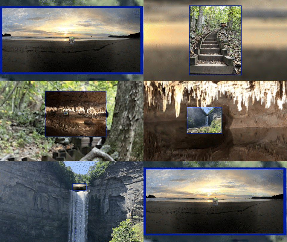
It was hard to find a way that expressed everything that has happened so far, but I eventually took inspiration from Paolo Tossolini’s presentation and work with AR/VR mapping projects that allow users to experience far away places in three dimensions from devices like their phone. 

I used After Effects to create the above looping GIF where the view dives deeper and deeper into each subsequent image. It turned out to be a much more challenging project than I had anticipated. 

The main issue I ran into was in making the last image zoom back into the first original image. I ended up with something that feels imperfect. I originally thought I would be able to use pre-compositions to simplify my workspace and process, but realized that in doing so I removed the parent objects and associated keyframes that would allow everything to scale together. 

My next major challenge came with getting everything to scale together properly. Because the original image is still visible as the view begins to zoom into the next image, I had to create very complicated groups of objects parented to one another so that an image was influenced by the images that came before and after it.

A few days after finishing the animation I thought of a potential solution that might address the issues I had with this project. By merging my initial idea of using pre-compositions with the method I ended up using of complicated parenting stacks, I will hopefully produce a result that I am ultimately happier with.