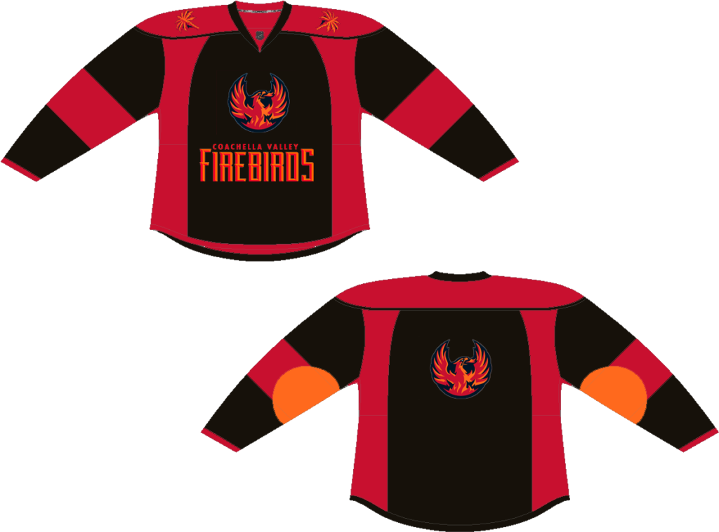
I think this redesign would be a good way to advertise for the festival because of the color palette and iconography. I think it matches the brand as well as shows the beautiful landscape at the festival with it’s semblance of sunsets and blacking out like the party-goers at Coachella. The palm trees on the shoulders are indicative of the California setting as well as the orange circle patch reminding us of the sun and it’s warm essence.
P.S. realized that my post saved only as a draft as I’m working on Week 2’s blog assignment. Sorry for not catching this earlier, but also I understand the penalty for late turn-in. Appreciate y’alls patience with me on this.