Categories
Uncategorized

blog assignment #4

winter 2024

Background

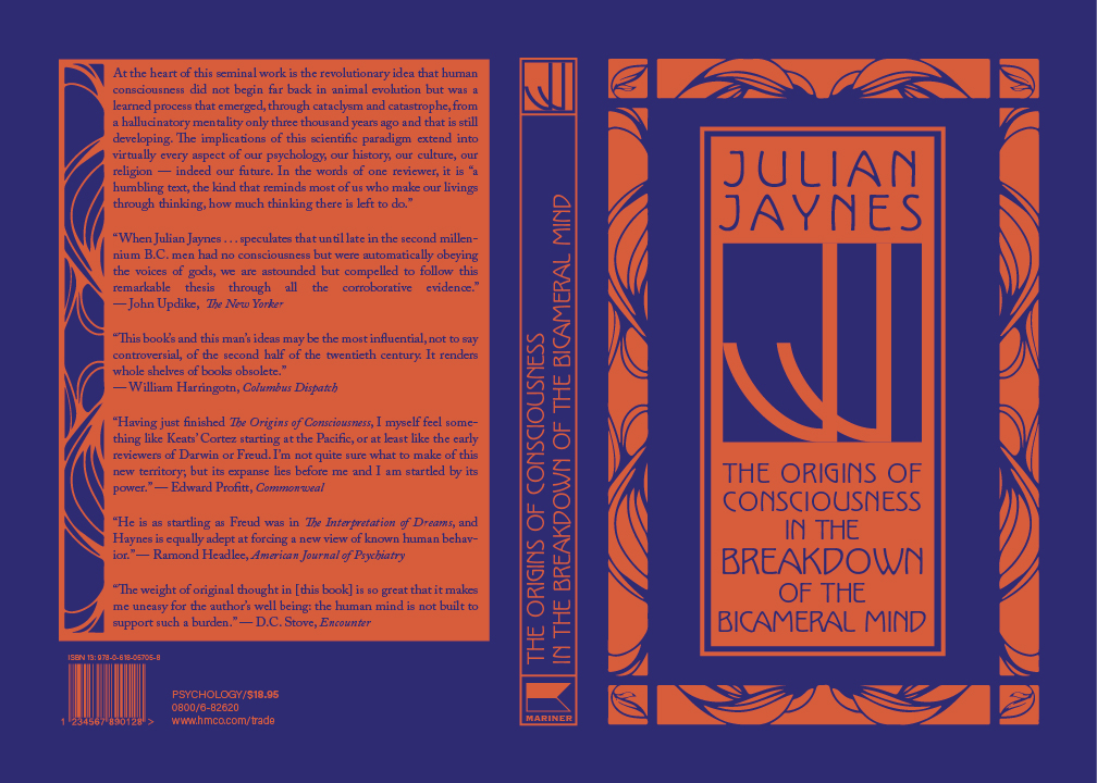
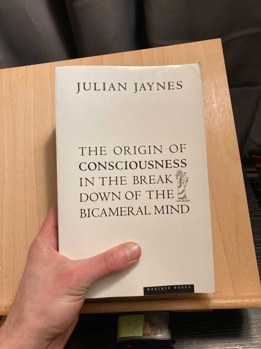
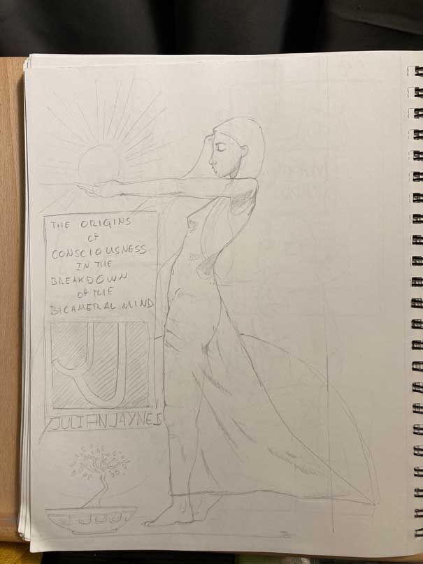
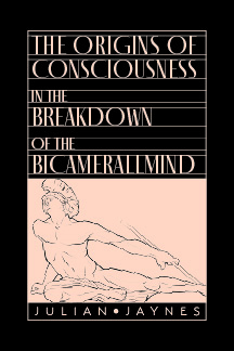
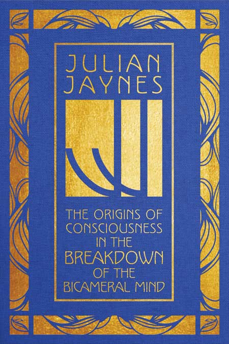
This was an assignment for our History of Design course last quarter. The assignment was to choose either a book cover, album cover, or poster to redesign. I chose to redesign the cover of one of my favorite books, Julian Jaynes’ The Origins of Consciousness in the Breakdown of the Bicameral Mind. The cover design hasn’t been changed since the book was released in 1976. I think that this cover is partly responsible for the book’s general lack of readership.

See what I mean?

What we didn’t know when we chose our media was that we would be redesigning in the theme of an era of design history. The era would be the same one we had studied for a research project earlier in the quarter, which in my case was Art Nouveau.

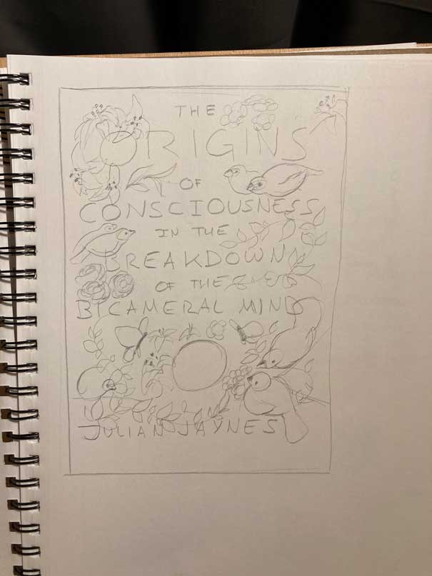
Luckily for me, this book is partly about the ancient Greeks, mythology, and symbolism, all of which heavily influenced Art Nouveau.

Actions

Gabriel explicitly forbade us from doing anything that would require illustration. Of course, my initial sketches were heavily illustrative.

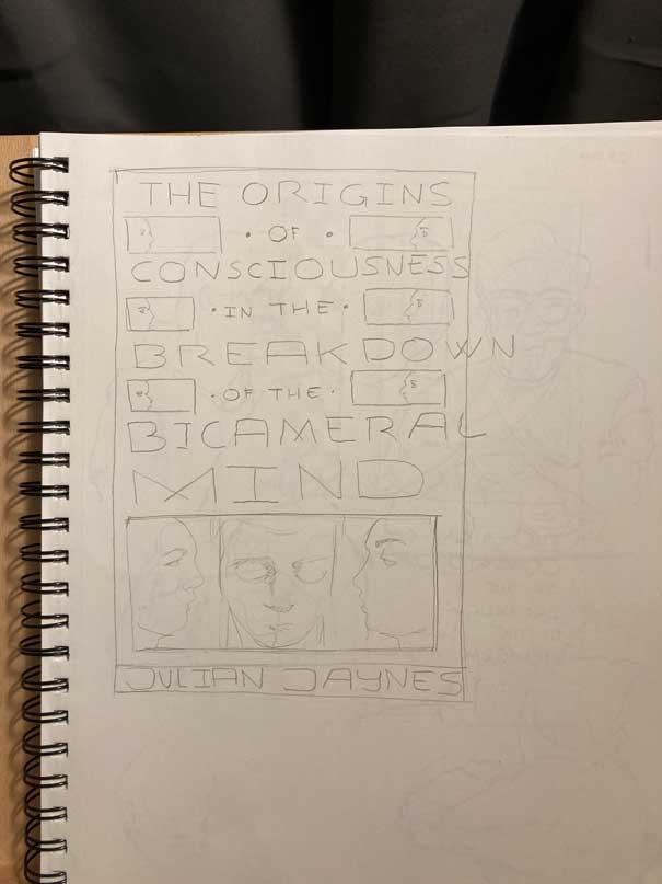
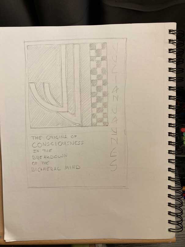
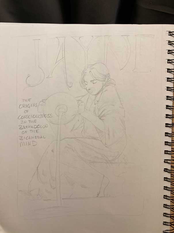
Under the guidance of my peers, I pared back the illustrative elements and aimed for a style more like the Vienna style of Art Nouveau than the Parisian style. My main influences were Koloman Moser, Gustav Klimpt, and the monograms of the Vienna Succession.

Vienna Succession monograms
Poster design by Gustav Klimpt
Book cove design by Koloman Moser

I then started sketching in Illustrator, narrowing down themes and colors.

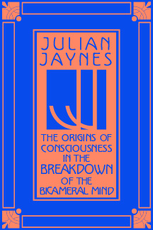
The two options that made the cut were these:

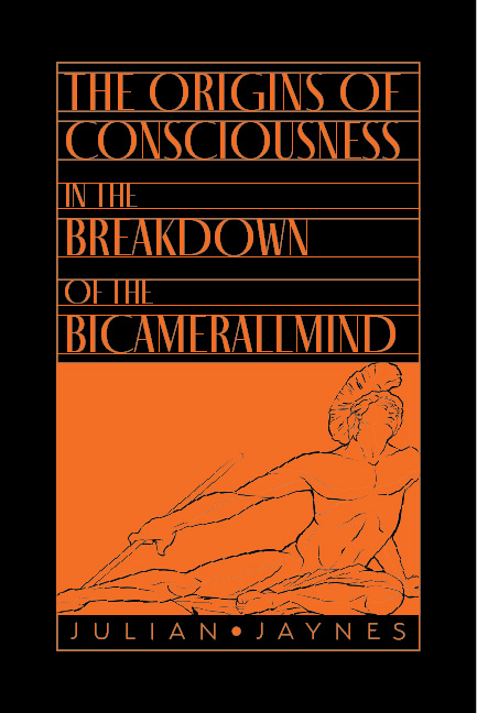
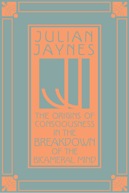
I was really leaning toward the first option, the one with Achilles pulling a spear from his heel. But my classmates and instructor took a vote and the second option won the day. I was a little disappointed by this. I was mad at myself for including the second option at all. But I wanted to treat it like a real job, so I buried my pride and started to work on it. I reworked the colors and experimented with a gold foil option.

Result

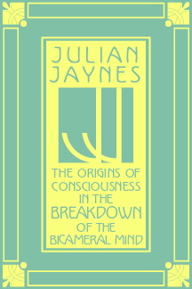
In the end, I preferred the look of flat colors to the gold effect. Here is the final book cover spread. If this had been a real project, I would have sent it to the printer to have it scored, folded, and bound with the guts. But, since it was just a school project, I printed it on 100# card stock, mounted it on black foam core, and handed it in.

Categories
Uncategorized

blog assignment #3

I used to make fun of Settlers of Catan. I called it a “wheat trading” game. I played it once years ago and found it about as fun as actually trading agricultural commodities. So I wasn’t super excited when my roommates invited me to play a game of Catan with them recently. But I decided to give it another shot in the interest of broadening my horizons. Tastes change, and maybe I’d like it better this time around. And it turns out I did.

What did I tell you with the wheat

Oh, and apparently it’s just called “Catan” now.

There is quite a bit of wheat trading in Catan though. The idea is that you and a few of your friends are on this island and you’re each starting a sort of market empire, annexing parts of the island that produce different resources by building roads, towns, and cities. The more resources you produce, the more you can buy and trade. The game is won by accruing a certain amount of victory points, which are earned through different achievements in the game (largest army, longest road, etc.).

Catan is really fun though, once you get into the competitive spirit of the game. The play time is comfortable too; you can get through a campaign in probably about an hour. I lost the campaign against my friends, probably because I was more absorbed in screwing them out of their resources than building up my own assets into cities. The resource gathering element of Catan was way more fun than I had remembered it being; trading resources with other players can be an interesting power trip. And the map is built out of hexagonal tiles and changes with every new game, so it feels like a new experience every time you play.

The bumper sticker that came with our box of Catan exclaims that it’s the “greatest game of our generation.” By “our,” I’m assuming they mean millennials since it came out in 1995. I do think this game will be enjoyed best by older audiences. It’s not quite the party game that Codenames is. I think it’s more at home in the Monopoly-Life-Risk canon of table-top games. It’s sophisticated if subdued.

Here’s an interesting coincidental tid-bit for you: for many years my father worked as on-air talent for RFD Illinois, a down-state AM radio station whose audience consisted mainly of farmers. My father’s job? Reading the price fluctuations of agricultural commodities. Including wheat. Go figure.

Categories
Uncategorized

AR Panels

For this project, my group decided to look at several branches of the Seattle Public Library. Our panels would consist of library information, history, way-finding, events at the library, and characteristics of the neighborhood. Since I live in Fremont, I chose the Fremont Branch.

I started by designing the panels in Adobe Illustrator.

I chose to make my panels look like the library itself, which has a very distinct Mission-style architecture. The windows inspired the info panels.

I made the animation in Procreate. Fremont has many attractions (the troll, the rocket ship, the bridges, etc.) but I wanted to go with a simple Cherry Blossom tree because that’s what I think of when I think of Fremont.

The animation has 37 total frames. It was much easier to animate than the last project. I thought it turned out pretty good.

Then it was time to arrange everything in EyeJack.

And the last step was just to go to the library and film the AR. The librarians weren’t super thrilled about me doing this, but after I convinced them that I wasn’t trying to film people, just the front of the building, they let me do it.

This was an interesting project. I was a little intimidated at first, but once I got started, it really wasn’t so bad.

Categories
Uncategorized

blog assignment #2

winter quarter

Tools I have:

Adobe Illustrator, Photoshop, and InDesign. I was able to develop these skills working at Sky Printing. There’s always more to discover, but I feel pretty confident about them.

Drawing. I love to sketch, and I have a good eye for it. I need to get better at finishing my drawings though.

Work ethic. This is probably the only benefit of being bored by social outings.

Attention. I love to read. I have developed a long attention span by reading books.

Tools that need work:

Motion design: I recently made my first animation in our AR module and I am really bad at it.

Working with groups: This is a tough one for me. On the one hand, I love how huge tasks become manageable in a group. On the other hand, I hate when people change things that I’m proud of.

Finishing stuff: It’s not that I lose interest in things that I start, although that can happen. It’s that I hate the way it looks when I start to refine it. For example, sketches seem so alive in my sketchbook, but as soon as I ink them or try to turn them into a finished thing, they look dead and bad.

Self-confidence: We all lack it.

Tools I don’t have:

Screen printing: I think this is a skill worth developing. Not only is it awesome, but it seems like there will be steady, if moderately-paying, work for screen printers.

3D: I don’t know anything about designing in 3D.

Photo/video: I don’t know anything about taking photos or editing video.

Lettering: This just seems like a fun skill. I know I’d use it in my poster designs.

Painting: I’m trying to find skills that would set me apart from everyone else, and I think the ability to paint would change my skill set for the better. I’m thinking about Andrew Loomis, JC Leyendecker, and Norman Rockwell, those guys were more designers than fine artists. I don’t want to ape their style, I just want to understand form like they did. And it seems like painting is a big part of that.

Social media: I hate social media, but I know that my hatred of it limits my opportunities.

Schmoozing: It embarrasses me to to fawn over people I admire. It embarrasses me because if I were the one being fawned over, I would be embarrassed. So whenever we have guest speakers, I usually don’t go up and talk to them. I imagine that this will also limit my professional opportunities.

Categories
Uncategorized

blog assignment # 1

winter quarter

Playing Frisbee with a cat at a park

That was the one I chose to do. I imagined a low angle shot of a cat leaping up to catch the frisbee. I wanted to capture that sort of whiplashing motion that dogs sometimes do in mid air, and I thought that shape would be a good counter to the shape of the frisbee. I also imagined a person in the background whose pose reflects a just-hurled object. Here’s the sketch I did

I used the Bing Image Creator (which I’m pretty sure is just Dalle 3) and my first prompt was

Cat catching a frisbee on a sunny day, man in the distance throwing; low angle

And here’s what I got:

Not bad except that the cat seems to have two left arms. My second prompt was a little more specific, and I wanted to change the style:

Man and cat playing frisbee in the park on a sunny day; low angle; in the style of 80’s anime; warm color palette

And here’s what that prompt returned:

My final prompt was the most specific of all:

A cat jumping up to catch a frisbee; man in the background who just threw the frisbee; low angle; cat heading towards the camera; sunny day in a park; in the style of 80’s anime; green color palette with blue accents

And this is probably the most engaging image:

I don’t have to point out the technical flaws in this picture. My experience with this image generator is basically the same as my experience with AI more broadly: curiosity followed by absurdity followed by boredom. But after last week’s speaker, I’m starting to come around to how useful AI could be in rendering the more tedious parts of an image-based project. Like let’s say you were designing a wall-paper in the style of William Morris. You could render individual flower bulbs, leaves, geckos or whatever, scan them, and then feed those to an AI saying, “make me a repeated pattern using only these elements on a maroon background; 6 inches by 12 feet.” Or maybe the New York Times commissions you to do an illustration and you think it would be cool to render an areal view of a busy New York street. You could just make and color the background in one file, make a few drawings of people and cars, and tell the AI to populate the street with people in the style of those you already drew. Or even better, the AI could render the building windows, which is always such an ungodly pain in the ass. There are possibilities.

Categories
Uncategorized

AR Poster

I had this idea a while back. I wanted to make a motion-animated GIF of a hand holding a phone and thumb-scrolling across the screen, but the only thing that would change on the screen would be the word “kneel,” which would scroll up over and over again ad nauseam. I was kind of inspired by the John Carpenter classic, “They Live,” in which the protagonist discovers a box full of magical hipster sunglasses that let the wearer see through the colorful veneer of products and advertisements to the raw ideology underneath, which in the movie are subliminal messages hidden there by aliens. Also the sunglasses let you see the aliens.

Here’s what the world looks like to humans in “They Live.”
And here’s what the aliens don’t want us to see.

See how the magazines say “NO THOUGHT” and “SLEEP?” I wanted to do something like that but with a modern spin. So anyway I had the idea last quarter and just sat on it. When we got this assignment, I thought it was the perfect opportunity to dust this idea off and try it.

Ellery graciously let me use her hand and phone as a reference.

I was also going to use this assignment to learn animation in Procreate (the original version, not Procreate Dreams, which I think has a much better animation engine). I ended up also using this assignment to learn how to animate generally, as I’d never animated anything before. It’s really hard. I have a newfound respect for animators.

I used Adobe Illustrator to build the phone. And I used Procreate to draw the hand and fingers for the base layer. I ended up with a 30 frame loop by just animating the thumb.

I think that what I ended up with is pretty cool. But I feel like I did so many things wrong. For some reason, I added the text last and it probably should’ve been the first thing I animated. When I exported it as a set of PNGs, the white background wasn’t included. That wouldn’t have been such problem except that I used white to block out where the phone and text showed through the thumb, so there was this white blotch that was showing up on transparent backgrounds. I had to go back in and merge the base layer with a layer of white. Also the thumb is jumpy and doesn’t really move like a thumb should. I might have to re-do this project when I know After Effects a little better (or at all).

Oh and another thing I got wrong: I couldn’t figure out how to make my animation longer. I wanted more of the music to play (it’s the first 1.5 seconds of “Heartbeats” by The Knife), but I could only get the animation the length of the original 30 frames. I even took it into Photoshop, duplicated the layers a bunch of times, turned them into a frame animation, and tried to export it, but still no dice. I guess I got lucky that that little snippet of music loops well and is kind of in sync with the animation. If it works it works I guess.

Categories
Uncategorized

InkHunter App Review

What is it?

An app that lets you preview tattoos on your body.

How does it work?

You can use one of InkHunter’s free designs and see what it looks like on your own body. First, draw this weird face on yourself.

Then select a design from InkHunter’s library.

Now you can see what it looks like on your body.

You can also use InkHunter’s text editor to make a text tattoo. Or upload one of your own designs for a custom tattoo.

What could be improved

Designs don’t curve with the body, so it doesn’t work with larger designs. It’s also hard to hold the phone and manipulate the screen at the same time, which you might have to do if your tattoo is going on an arm or hand.

What works well

It’s a good concept for an app. I think it will help users avoid a bad decision or encourage them to try something new. It was surprisingly easy to upload my design into the app.