winter 2024
Background
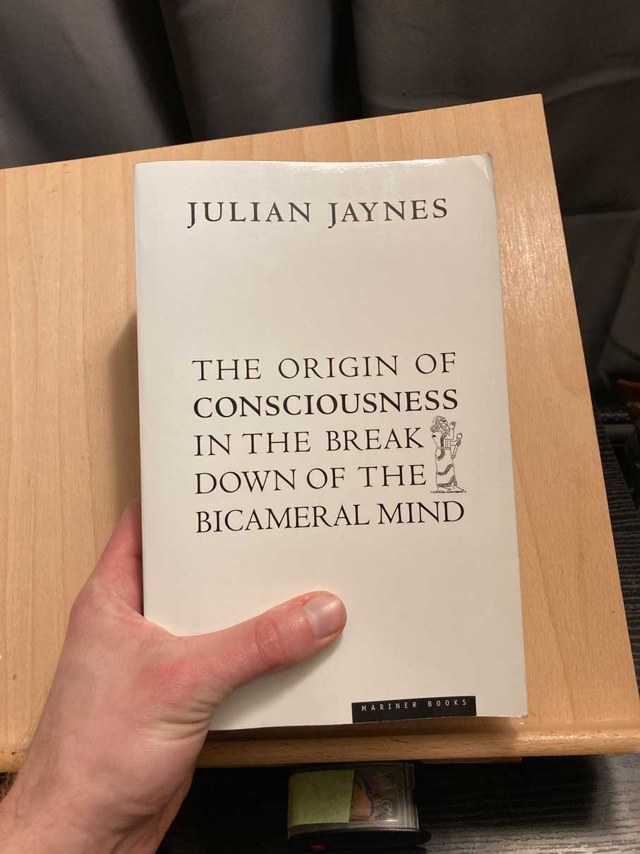
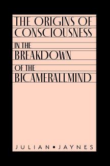
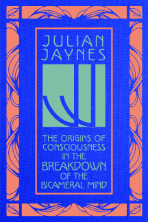
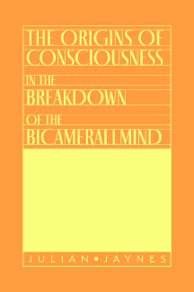
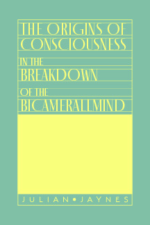
This was an assignment for our History of Design course last quarter. The assignment was to choose either a book cover, album cover, or poster to redesign. I chose to redesign the cover of one of my favorite books, Julian Jaynes’ The Origins of Consciousness in the Breakdown of the Bicameral Mind. The cover design hasn’t been changed since the book was released in 1976. I think that this cover is partly responsible for the book’s general lack of readership.
What we didn’t know when we chose our media was that we would be redesigning in the theme of an era of design history. The era would be the same one we had studied for a research project earlier in the quarter, which in my case was Art Nouveau.
Luckily for me, this book is partly about the ancient Greeks, mythology, and symbolism, all of which heavily influenced Art Nouveau.
Actions
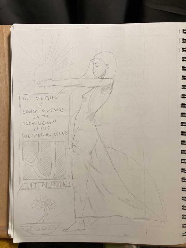
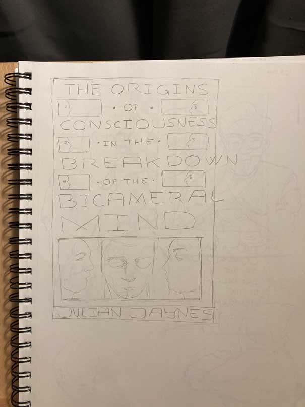
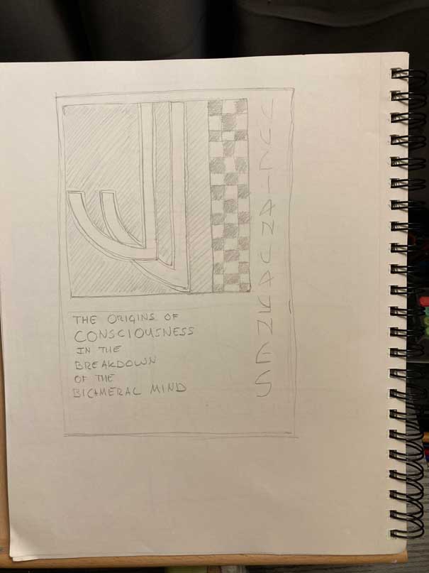
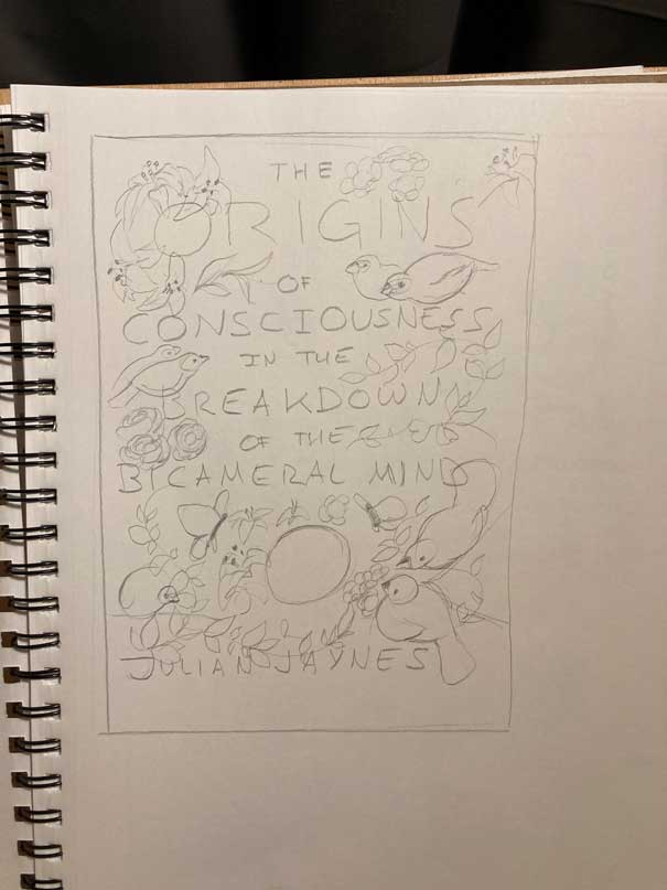
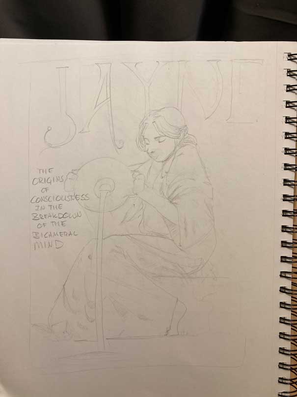
Gabriel explicitly forbade us from doing anything that would require illustration. Of course, my initial sketches were heavily illustrative.
Under the guidance of my peers, I pared back the illustrative elements and aimed for a style more like the Vienna style of Art Nouveau than the Parisian style. My main influences were Koloman Moser, Gustav Klimpt, and the monograms of the Vienna Succession.


I then started sketching in Illustrator, narrowing down themes and colors.
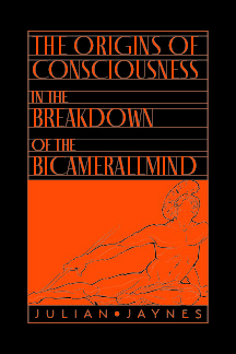
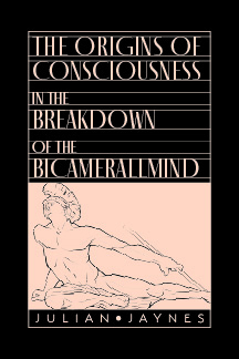
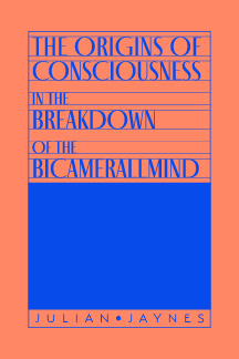
The two options that made the cut were these:
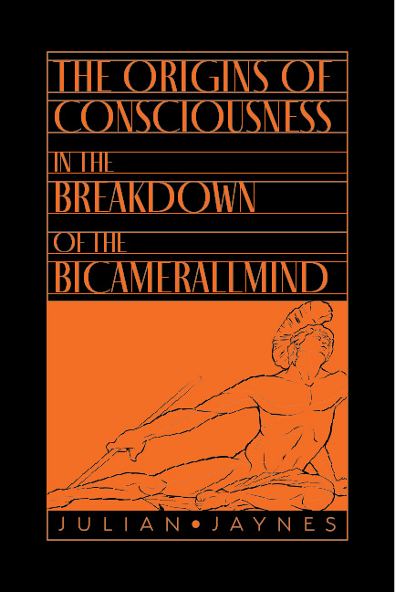
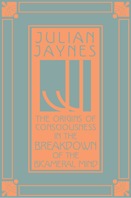
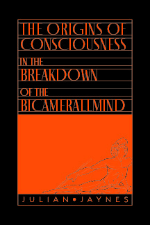
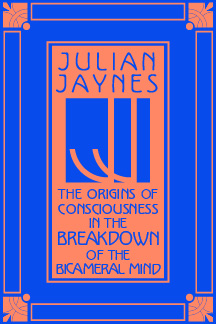
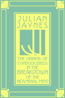
I was really leaning toward the first option, the one with Achilles pulling a spear from his heel. But my classmates and instructor took a vote and the second option won the day. I was a little disappointed by this. I was mad at myself for including the second option at all. But I wanted to treat it like a real job, so I buried my pride and started to work on it. I reworked the colors and experimented with a gold foil option.

Result
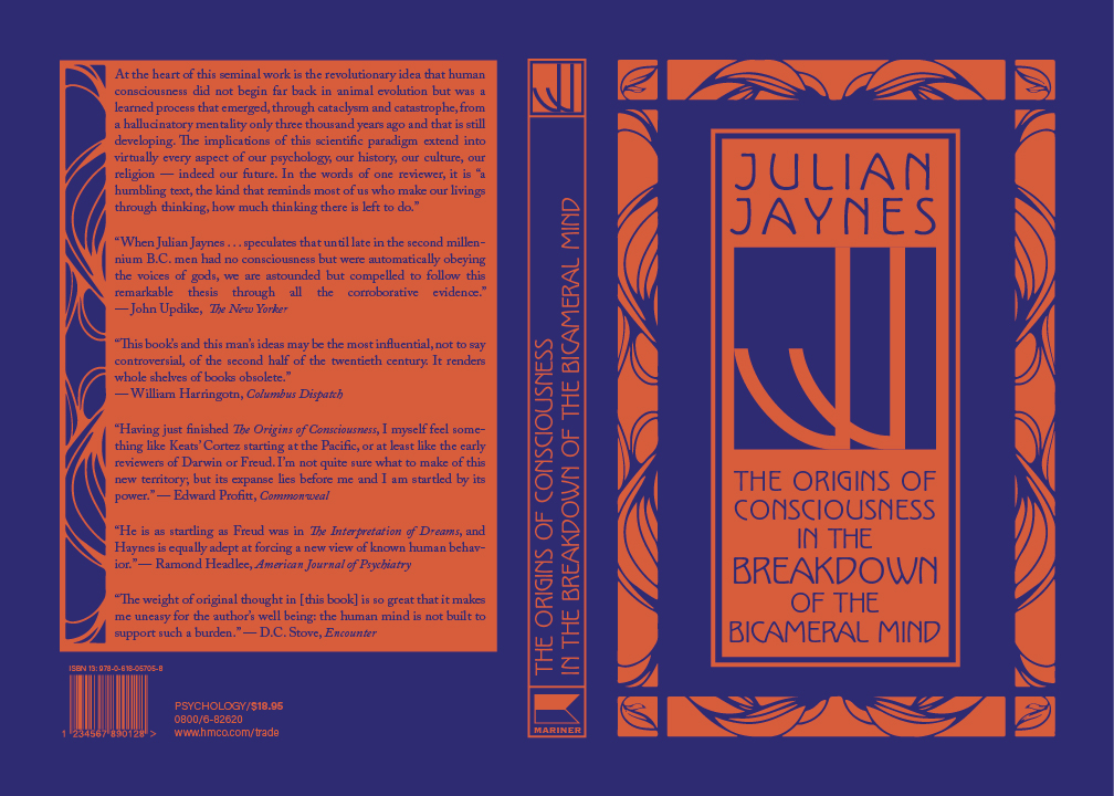
In the end, I preferred the look of flat colors to the gold effect. Here is the final book cover spread. If this had been a real project, I would have sent it to the printer to have it scored, folded, and bound with the guts. But, since it was just a school project, I printed it on 100# card stock, mounted it on black foam core, and handed it in.


One reply on “blog assignment #4”
This is beautiful. Great job!