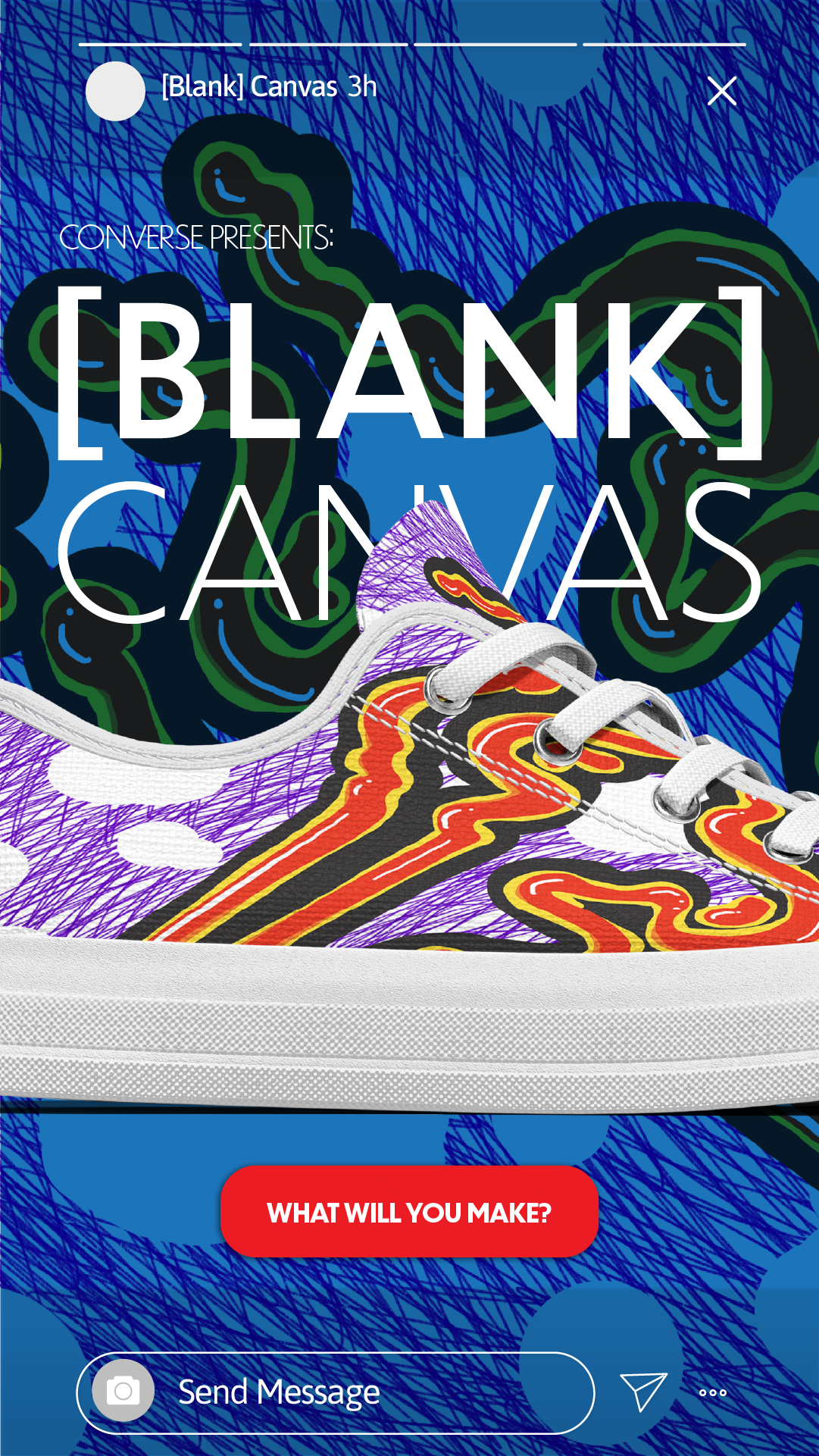
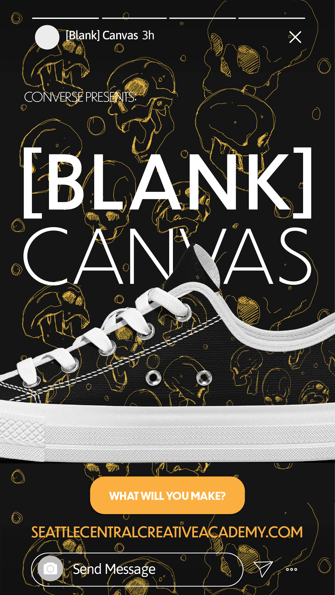
The Converse [Blank] Canvas sneakers make their wearer impervious to creative doubt. As soon as you put them on, you start to believe that you can produce even the most outlandish ideas. Suddenly you’re trying new programs and technologies, anything to realize the images in your head. The shoes are specially tuned filter out nonconstructive criticism, internal or external, replacing it with a fun jingle. Also you can draw on them.
[Blank] Canvas shoes are made of canvas from organic cotton, with recycled rubber soles. They only come in white, so you can decorate them however you want!
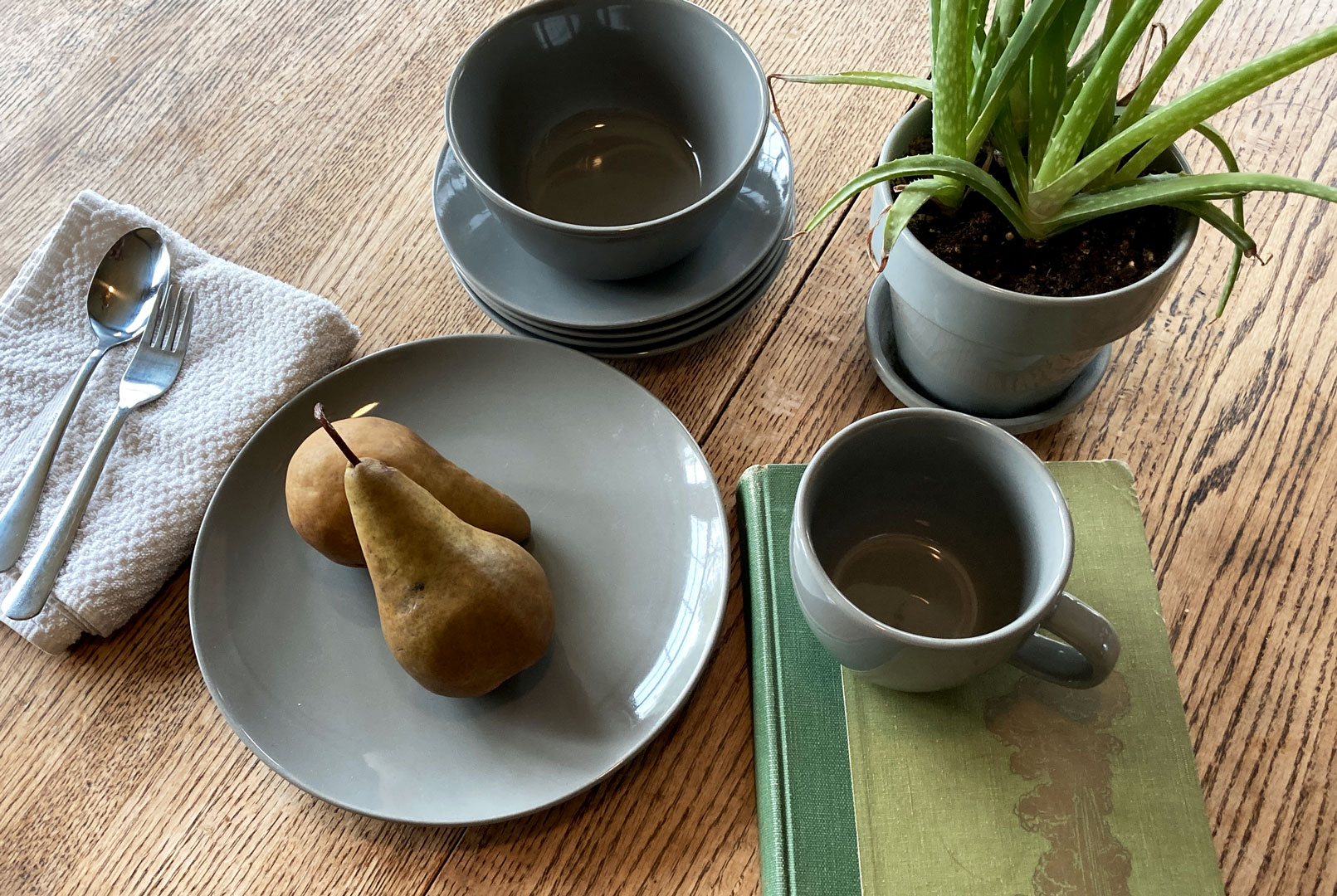
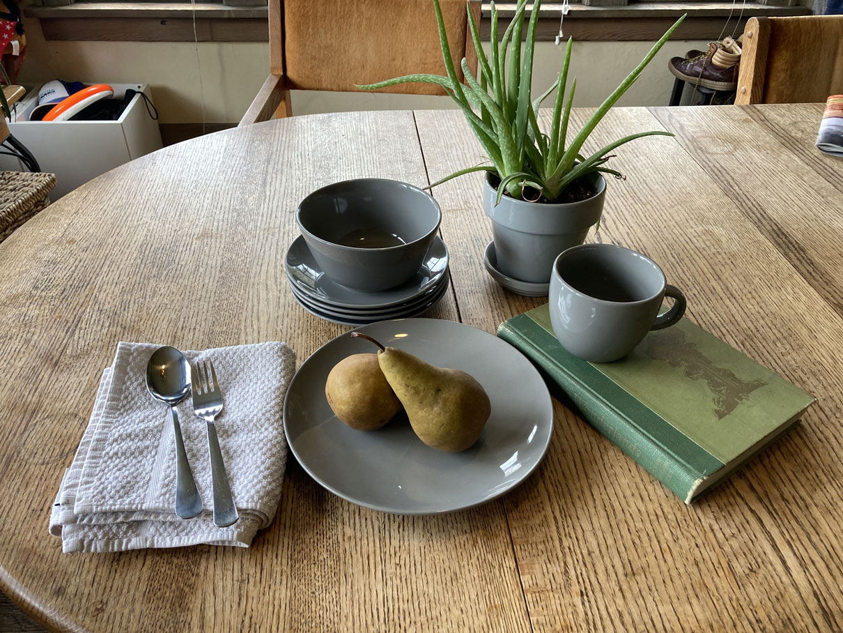
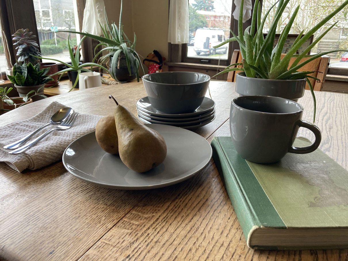
My scene was built around this gray Target stoneware that my apartment has a bizarre abundance of. It’s not like we bought a set. I think that different roommates just happened to buy like one gray plate at a time until a collection was formed. My contribution to this collection is the gray mug on top of the book. I tried to choose a background that would compliment the gray, and our dining table seemed to do the trick. For the other objects, I was mostly looking for pops of color that wouldn’t distract from the dishware. Some Bosc pears, a plant, and an old green felt-bound book seemed to provide a nice harmony. The silver ware and towel were the last additions I made to the comp. It was looking a little low-key to me and I thought I could use an object that was brighter but not necessarily more colorful. The white towel balances the dark book, and the silverware reflects a lot of the natural light coming through our dining room windows.
I suppose I was trying to invoke the feeling of our house, which is homey, relaxed, kind of dirty, but charming. It is exactly the kind of house that would have large sets of ill-matched cookware. I didn’t want it to feel high-end or pretentious. I wanted the product to look affordable, simple, and strong.
I shot a few other angles (with my phone) but I liked the high angle one the best.
They followed a trend: using as many celebs as possible in some zany situation. They made something both expected and novel. This commercial wrung a few genuine chuckles from my cold, cynical lips, though afterwards I did have to bury myself in Nietzsche’s Ecce Homo for an hour just to feel normal again. The pacing was good. I was entertained. I liked seeing Zach Braff and Donald Faison back at it again. Absurdist reference humor seems to be the flavor du jour (or maybe la seul saveur), and T Mobile seems to have endorsed this brand of lazy comedy with both thumbs.
What they could’ve done better:
Well they could’ve made a piece of advertising that didn’t assume its audience was a nation of dumb-fucks who can’t see Aquaman without running off to the nearest strip mall to switch service providers. And what exactly was the message here? What does the cast of Scrubs have to do with Duncan Idaho have to do with a mediocre 80’s dance movie have to do with a second-rate cell carrier? What could they have done better? They could have made some thing interesting. They could have made something beautiful. Instead, they made something that no one would have any problem identifying as an advertisement. They think that we are easily fooled. We are not.
Budweiser, horses, etc.
What they did well:
They cast a black person; albeit in a service position, but still, baby steps. I suppose, judging by the opening shot, that they know who their target audience is (or would like to think of themselves as): small-town American folks living somewhere blighted by the loss of some industry, an industry that’s probably not so dissimilar from the one that Anheuser-Busch operates. You can’t argue with the production quality; these are movie-caliber visuals. And The Band.
What they could’ve done better:
I mean, is anyone still entertained by the Clydesdales? I know it’s tradition. But seriously, who gives a shit? Get a new thing. Year after year they try to tell a new story with these animals and it’s never really new. This was the most narrative-oriented commercial I watched, but there wasn’t a whole lot of tension-and-release action here. There were stages of the story that were meant to add tension, which is admirable. But everything moved so fast that it was all just an emotional blur. Maybe this is expecting too much of a Super Bowl commercial. Maybe we should expect more.
An ad/PSA campaign for the Seattle Public Library, “Read and Be Free”
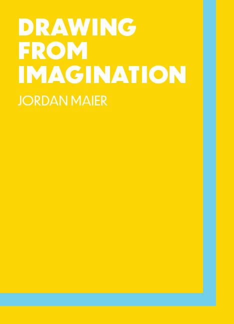
A how-to book about drawing from imagination
A poster campaign for an imagined political movement calling for “Freedom of Attention”
A Bakery Nouveau rebrand (packaging, print, web, business collateral) using Art Nouveau imagery
Learning furniture design, specifically desks, drafting tables, and work surfaces for artists
Character, environment, and accessory designs for an imagined video game
A solo card game for fostering creativity (I already made something like this, but it could be improved)
An Alphonse Mucha inspired poster that illustrates which fruits are in season, with beautiful women symbolizing each of the four seasons (for example, winter would be holding a giant overflowing basket of apples and pears)
Learning to shoot, develop, scan, and touch-up film photography
The idea I chose is:
A how-to book about drawing from imagination
Drawing (or painting, or sculpting, or doing any visually-focused creative work) from imagination is a slippery topic, and one that has fascinated me since I was a kid. Before we can even start talking about putting pencil to paper, we need to clear up what we mean by “imagination,” because neurologists and philosophers agree that there is no such thing as representational imagination in our brains. Yes, it feels like we hold an image of something in our heads. But the fact is that there is no place in your brain where an visual image of a red triangle is stored. Rather, a non-linguistic symbol of a shape is called up by memory and linguistic modifiers like “red,” “shape,” “three sides,” “pointy,” “isosceles,” etc. adorn the symbol until the areas of your brain responsible for processing visual imagery are sufficiently activated and we “see” red triangle. Or something like that happens. I need to do more research. But I think that Dan Dennet has a pretty good idea of what’s going on.
Anyway, I could write about this topic at length, but needless to say it interests me very much. And there aren’t many books out there on how to draw from your imagination, so people might actually want to buy it. But it would also be a great exercise in typesetting and layouts, keeping things consistent between chapters. And I think it would communicate that I’m a designer who prioritizes imaginative work, fostering creativity in himself and others.
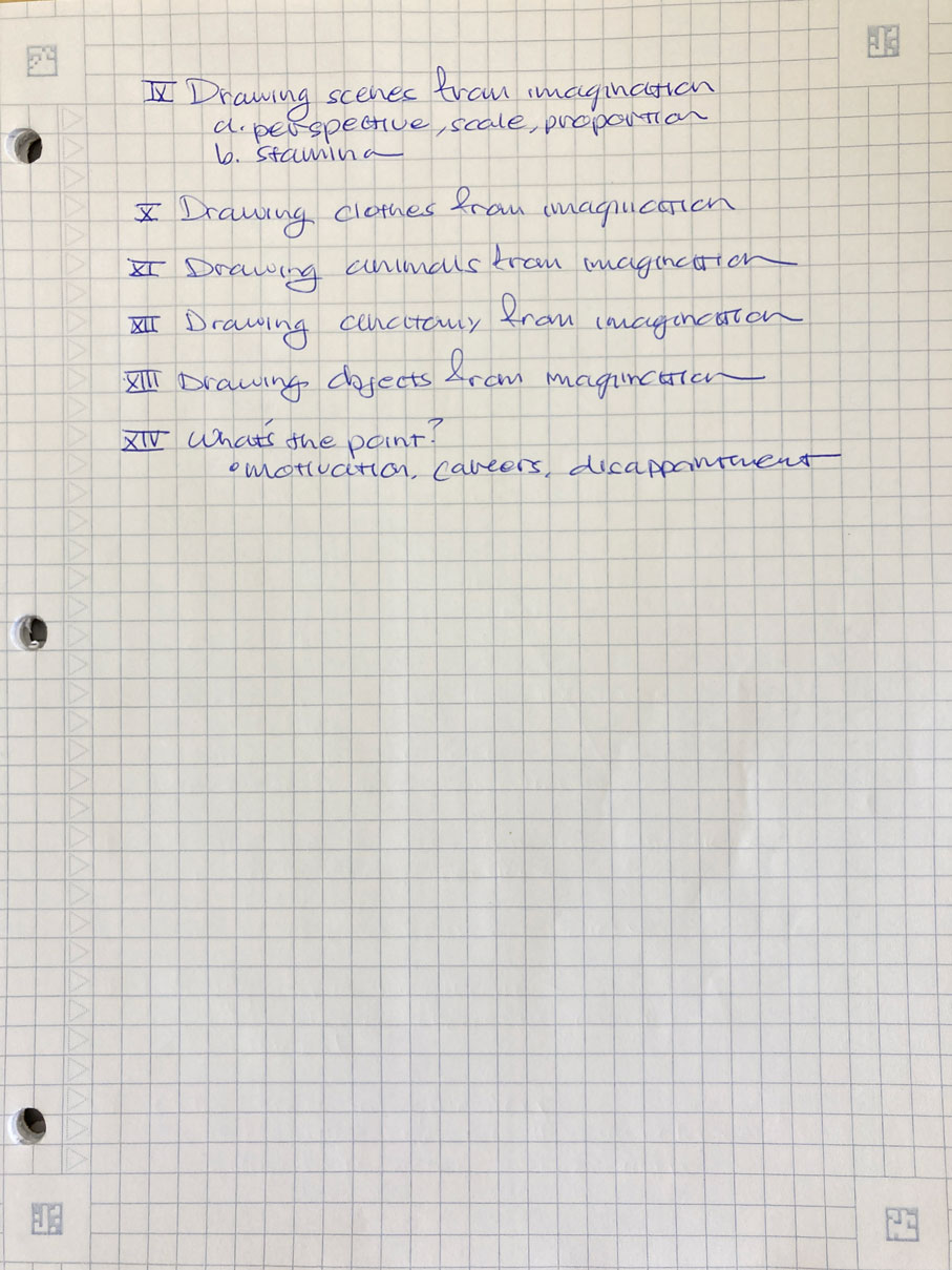
I’ve been thinking about this project for a long time, and the structure I’ve settled on is a sort of workbook, where there are exercises on a specific topic that the student is supposed to practice for a week, followed by a chapter that will explain some neurology and give some tips and tricks for accomplishing the exercises, and then the student will spend another week redoing the exercises. I want the book to be cyclical, and a student finishes it, they can take a break or go through the whole book again. Below is a chapter outline (my proof of concept for this book). I also did a quick cover mock-up (at the top of this blog), for which I used Hokusai’s “Mad About Painting” as inspiration.
I decided to create an immersive scmaltz vortex for Valentine’s Day. I figured the expression of this holiday should be at least as nauseating as the holiday itself. I was inspired by a tunnel-like project I saw on Behance, which had a bunch of rings and circles just kind of whirling around. So I wanted the user to walk through this tunnel and trigger certain elements to tell a story, culminating in the interaction that happens at the end of the scene.
I started by making my assets in Illustrator. I kept everything 2D to minimize stress on my computer.
I had to delete my first attempt at the schmaltz vortex after realizing that it was very small, too small for a human to walk through.
It worked better when I scaled up and simplified everything.
It took me a while to get the hang of thinking in this way. For example, I really wanted the hearts to rise out of the surface when the scene started. So I triggered a “move” action along the Y axis. But this meant I would have to hide the rest of the vortex until the heart opened up. So I thought that I’d do a “move” action on all the rest of the elements. You can probably see where this is headed. That’s why my first attempt failed. I had so many movements that this just kind of got lost. But on my second attempt, things went much more smoothly.
So the idea is that you give your sweetheart this underwhelming card…