Categories
Uncategorized

blog assignment #4

spring 2024

We started off with an idea for a more subdued, drama-driven story-line involving a couple who had recently broken up and were meeting at a park to return things that their ex-partner left at their respective houses. The thumbnail description of this story was enough to sufficiently bum out our teachers, who suggested we work up one of our fall-back ideas: a noir story about a paranoid detective, trying to piece together a case based on the clues given by the post-it notes.
I find that writing within a genre is pretty easy, especially when the genre is as rich with tropes and cliche as film noir seems to be. I was able to hammer out a script over the first weekend, which Jenny edited. The following week, I wrote a treatment and storyboard. Jenny made a mood-board and assembled various printed material for the shoot (pictures on the walls, a newspaper, a name plate, a family photo, and a ransom note). David reserved the studio space and all the equipment and props we needed, and started to plan the shoot in advance. David and I made the shooting schedule and shot list by looking at the script and storyboards and trying to figure out the most efficient way to shoot the film. This turned out to be a huge time-saver for me: I ended up doing a lot of the directing, and having the visual cues of the storyboard frames next to a description of the shots was super helpful in organizing the shoot and keeping things moving. Jenny and David recorded their voice-over parts the day before the shoot.


We only had a few hours on Saturday to get the set ready and shoot. We couldn’t get into the building until about 10:30am, so we were feeling pressed for time. But it wasn’t very stressful. I know that I can rely on Jenny and David to pull their weight; they like to be part of a team and when they see something that needs to be done, they do it. That motivates me in return. David did the lion’s share of the acting, as well as setting up the camera and lighting. We all worked on building and tearing down the set.


This project was way more fun and less stressful than I thought it would be, and I think that’s mostly because I had such awesome teammates.
Categories
Uncategorized

blog assignment #3

spring 2024

If I had $25,000 to just throw around (am I an amphetamine-fueled blue-chip trader in this scenario? I’ll also have to assume here that my possession of this money would be a secret, since if my mom found out that I had dropped 25 G’s in one spot she’d have an seismic conniption), I guess I would throw it into the hands of Abbey Arts, a non-profit that organizes a few events spaces in Seattle and Portland. I also happen to be interning there, so I can tell you unequivocally: they’re pretty rad.

About Abbey Arts

Abbey Arts is a non-profit focused on promoting the arts. This is from the Abbey:


“We aim for Abbey Arts produced events to be focused on the beauty of live music and the arts. Music & arts events help people take time away from the busy distractions of daily life, put down their digital devices, and really engage in an experience. We believe this can help us all grow more empathy and build awareness while connecting more with others in the community.”


This is a critical juncture for live music and the performing arts. Post-COVID surges notwithstanding, I’m not sure the music industry will ever fully recover from the pandemic. Let me be more clear, the music industry as it relates to pop-stars and fans of radio-ready pop music will be just fine. But the music industry as it relates to us is definitely not the same. And it needs all the help it can get. That’s why organizations like Abbey Arts are so special. They’ve made it their mission to “curate welcoming arts & cultural experiences where people of all ages and incomes can explore creativity, enjoy beauty, grow empathy and increase awareness.”


Abbey Arts strives to make its events affordable, accessible, and sustainable. They’re generous to artists and the Seattle Community.

Categories
Uncategorized

blog assignment #2

spring 2024

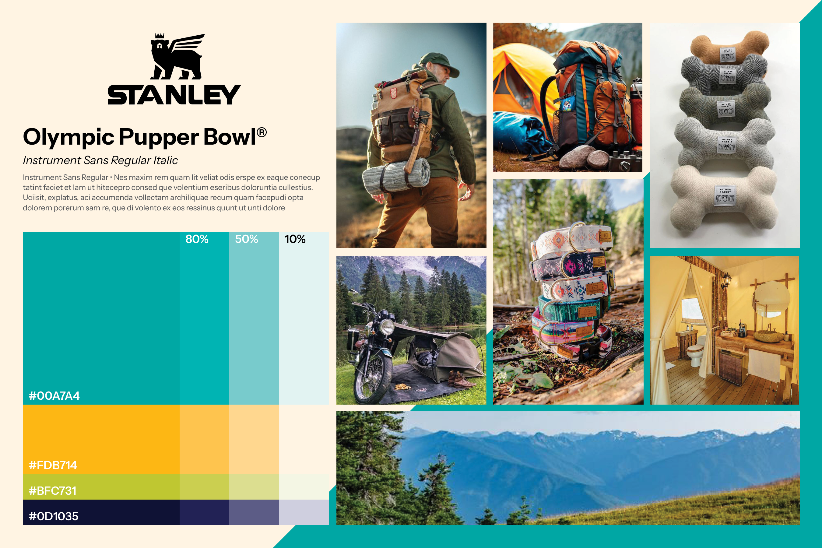
This is the new Stanley 32oz. Olympic Pupper Bowl. Our target demographic for this bowl will be 30-something upwardly-mobile hipsters who say things like “I just thought the universe was telling me to like go for it so I finally just signed up for hot yoga already.” Needless to say, they have some cash on hand. That’s why our bowl is $140.00. Because it’s elevated. The Olympic Pupper Bowl celebrates the beauty and grandeur of Washington’s Olympic National Park, on whose popular day-hikes can be found many puppers indeed. The Olympic Pupper Dog Bowl is super lightweight, so you can easily carry it out on the trails (or in your Range Rover). The marketing for this piece of equipment will include a kind of irreverent irony, and we’re aiming more for the “glamping” crowd than the hard-core campers.

Here is the mood board I designed for this product’s marketing. I chose some bold, vibrant colors that still looked outdoorsey. And the typography is the same as the body copy from Stanley’s website.

Categories
Uncategorized

blog assignment #1

Spring 2024

The design systems websites I visited were:

And here’s what I learned:

1) The Guardian rocks

Both in terms of design system and web design. I learned about design systems through this website, which was built to not only explain the Guardian’s design system and keep it consistent, but to educate the user on what design systems even are. I appreciated the emphasis on typography and layout, which I guess is to be expected form a newspaper company. Still, it was fun to see them putting so much thought into spacing, like the amount of space after a headline or something, as a way to make the content easy to navigate, sure, but also to look good. Very cool. One little tidbit I’ll definitely be stealing in my designs is the Guardian’s approach to highlighting text. I just think it looks rad and serves a good purpose.

2) The whole voice thing

I can’t figure out if it’s creepy or reassuring that mega corporations are crafting a “voice” for themselves that involves grammar choices and humorous restraint. It would seem that all of these companies would like an even, balanced, neutral, accessible tone of voice; one that doesn’t crack wise or use hip lingo and keeps its diction sub-stratospheric. I’m not criticizing this effort to have a voice, I think it’s a good thing. I’m just wondering, given the homogeneity of these voices, why it even needs to be a section in their design system. I kind of assumed that companies large enough to even have a design system would automatically assume this sort of HAL 9000 tone, without having to specify that “ok this is our tone.” Who knows, maybe it’s a tax thing.

3) It’s all about empathy

Which is great, don’t get me wrong. I know I can be a real downer in these blogs, but I’m not about to put empathy on blast (but if you’d like to read something in which empathy is very much on blast, Paul Bloom’s Against Empathy is pretty interesting, also the Dalai Lama has a thing or two to say about empathy and compassion being mutually exclusive). It’s just that this sort of empathy seems to limit design options to just a handful of useful and interesting layouts, components, interactions, etc., and wouldn’t that contribute, like the voice thing, to an ever-increasing homogeneity across platforms? Is this good? I’m asking you because I really don’t know. An unintuitive, hard-to-navigate, inaccessible website or app is a bummer for sure. But what happens when they’re all the same? What will our perceptions be of a company that chooses not to be the same? Is it possible that our awareness of a company’s misdeeds could be overlooked, outweighed, or otherwise mitigated by having a design system that ticks all the correct boxes?