Categories
Uncategorized

blog assignment #8

spring 2024

For this assignment, I decided to do some allegorical drawings that would represent the three ideas. They ended up being fairly gratuitous illustrations of women in various states of undress. What do you want from me.

I drew these from my imagination, i.e. without a model or photo reference. So be kind in your judgments.

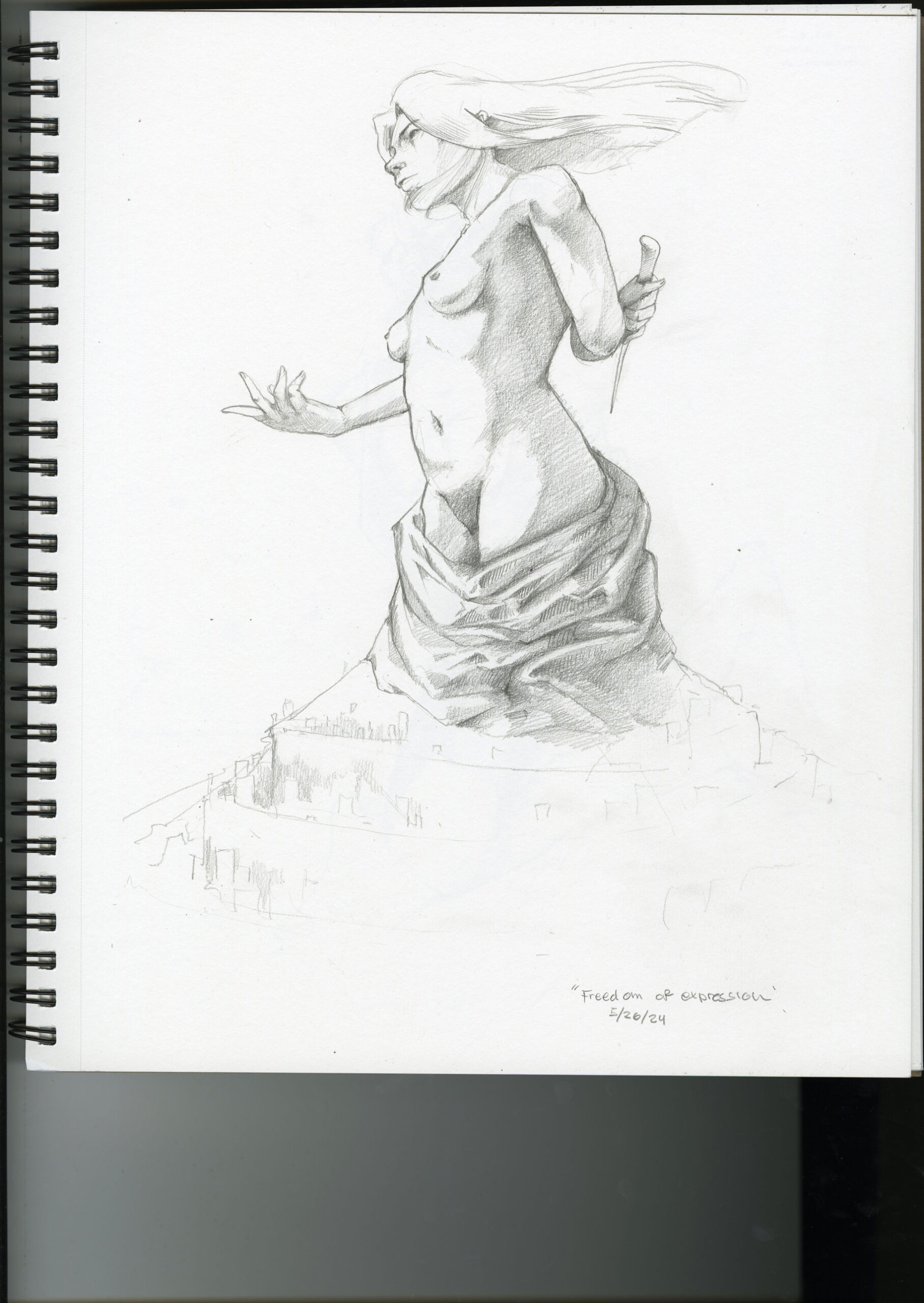
Freedom of Expression is probably the most gratuitous. She’s kind of emerging from a tiered city, I thought she would be an idol for the people who live in this city. She’s welcoming travelers with one hand, and her other hand holds a stiletto. I think that part of what makes self-expression so alluring is its inherent danger: the possibility of saying or doing something gauche maybe, or the always fine line between speaking one’s mind and being hurtful. Etc.

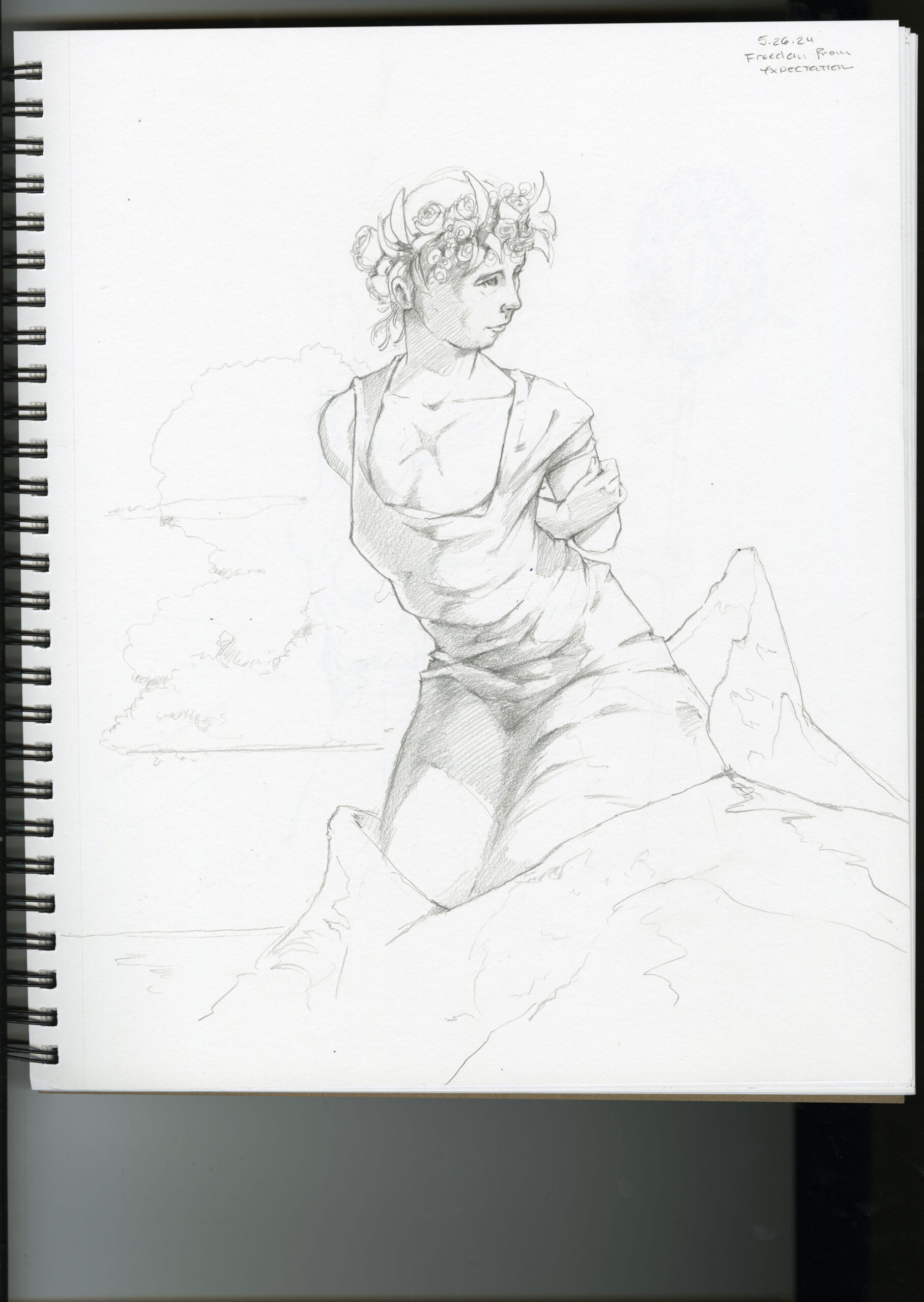
The next one is the least gratuitous: Freedom from Expectation. This figure is coming out of a mountain, which I imagined represents the rigidity of the expectations we strive to live up to. These expectations can be set by others, but the more tyrannical ones we tend to set ourselves. She also has a scar over her heart. It represents a wound or an emptiness that the expectations are meant to fill.

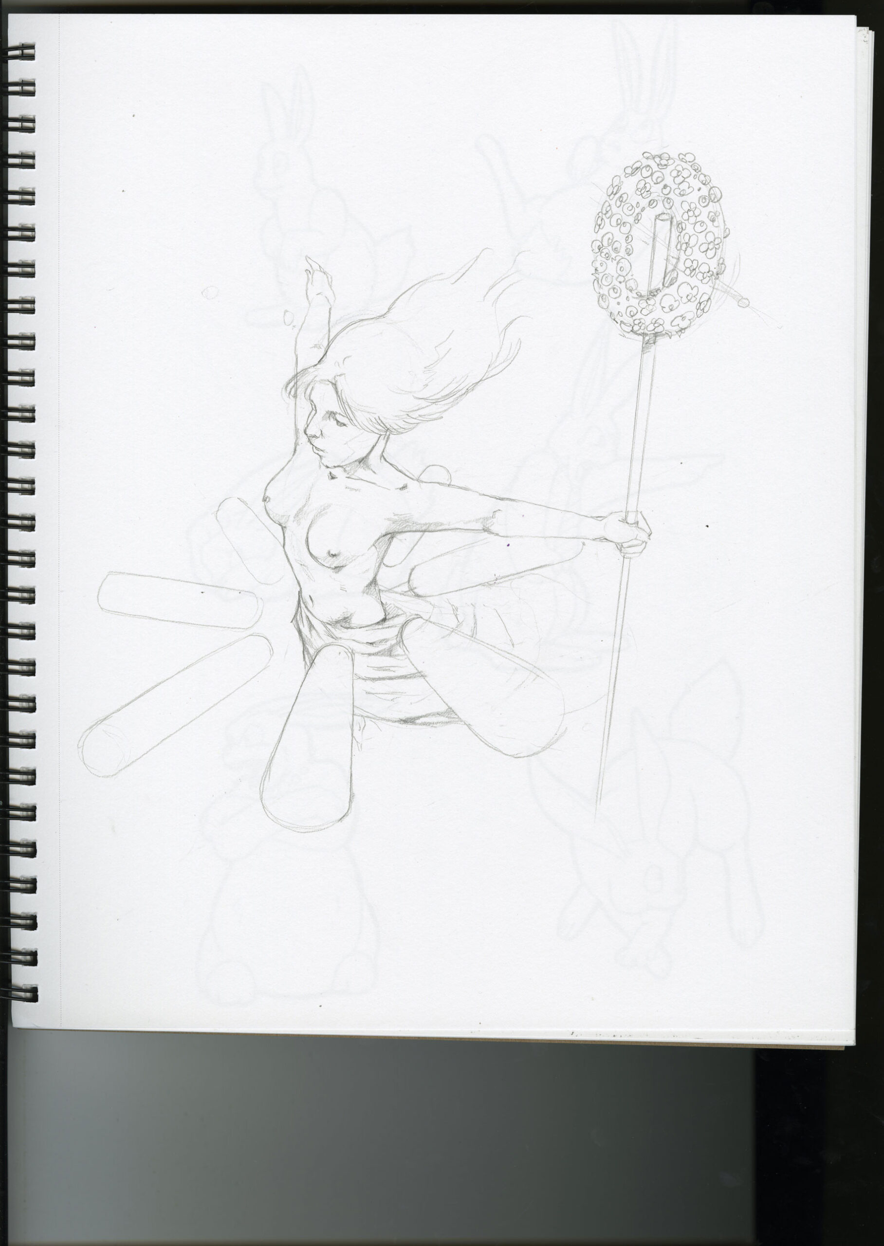
The last is semi-gratuitous. Freedom to Explore is surrounded by a compass that represents the unlimited possibilities etc etc etc. Honestly I kind of ran out of creative juice and just wanted to practice this perspective, which is always a god-awful bastard to try to wrangle. There are rabbit sketches on the opposite page that managed to be scanned through 100lb paper. They represent something.

Categories
Uncategorized

blog assignment #7

spring 2024

For my jersey redesign, I chose to focus on Hispanic Heritage Month. I took inspiration from Oaxacan Alebrijes, which are brightly colored, intricately patterned carvings of animals or sometimes mythical beings. My mom had a couple of these in her art room, and she even taught an Alebrijes inspired project to her students. Here’s an example of what I mean if you’ve never seen one:

The shapes in the patterns have various cultural meanings. I tried my best to recreate the essence of some of these patterns, but to reproduce them exactly made me feel kind of gross. So this is more like a hockey themed interpretation of the Alebrijes.

Categories
Uncategorized

blog assignment #6

spring 2024

I decided to make a mural out of my mom’s colored-pencil drawings. A nice opportunity to practice masking in Photoshop too.

Categories
Uncategorized

blog assignment #5

spring 2024

For this assignment, I chose to do Dick’s, mostly because I like their colors. To be honest, I’ve never eaten at Dick’s. But it does smell very good whenever I walk past one. I’m more of a Culver’s guy. I’m not sure how any other burger joint could really measure up to my beloved Culver’s. My partiality for Culver’s is probably the most midwestern thing about me. That doesn’t mean that I’m not proudly midwestern or that I’m not otherwise that midwestern; I just love Culver’s a whole bunch, so much so that it kind of dwarfs the other things that make me midwestern (droppin my g‘s, for example).

Do you not know what Culver’s is? Culver’s is a regional chain originating in Wisconsin; they’re made famous for the “Butterburger,” which is a bit of a misnomer because they actually butter the bun and then toast it on the griddle. They don’t butter the hamburger, that would be absurd. If I could sum up the midwest in one food item, it would be a Butterburger. I’m deliberately not capitalizing midwest because nobody in the midwest would think it ought to be capitalized, out of modesty.

Actually, now that I think about it, Culver’s and Dick’s branding is kinda similar. Mostly the typography. But damned if that jaunty angle isn’t the exact same for both logos.

Well in any case, Dick’s has the better colors over my dear sweet Culver’s. I like their striped signage too. That was the inspiration for my food truck design. I’m way more likely to eat food-truck food if the food truck itself is pleasantly eye-catching. I like bright, bold colors. But I like to see how few colors I can use in a given design and still make it work.

I thought it would be cool to have the Dick’s logo bleed off the edge of the truck. I also noticed that the truck didn’t have a window for vending, you know, food. So I added one. I did the entire thing in Photoshop to practice my masking and smart-objecting. And here’s the finished piece: