Categories
Uncategorized

AR Poster

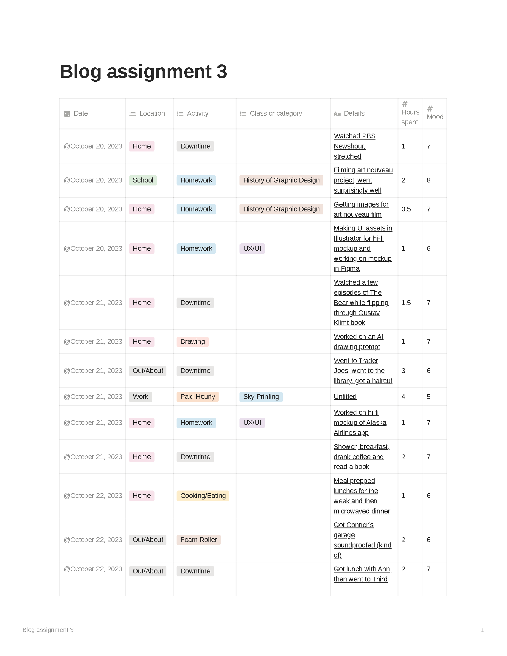
I had this idea a while back. I wanted to make a motion-animated GIF of a hand holding a phone and thumb-scrolling across the screen, but the only thing that would change on the screen would be the word “kneel,” which would scroll up over and over again ad nauseam. I was kind of inspired by the John Carpenter classic, “They Live,” in which the protagonist discovers a box full of magical hipster sunglasses that let the wearer see through the colorful veneer of products and advertisements to the raw ideology underneath, which in the movie are subliminal messages hidden there by aliens. Also the sunglasses let you see the aliens.

Here’s what the world looks like to humans in “They Live.”
And here’s what the aliens don’t want us to see.

See how the magazines say “NO THOUGHT” and “SLEEP?” I wanted to do something like that but with a modern spin. So anyway I had the idea last quarter and just sat on it. When we got this assignment, I thought it was the perfect opportunity to dust this idea off and try it.

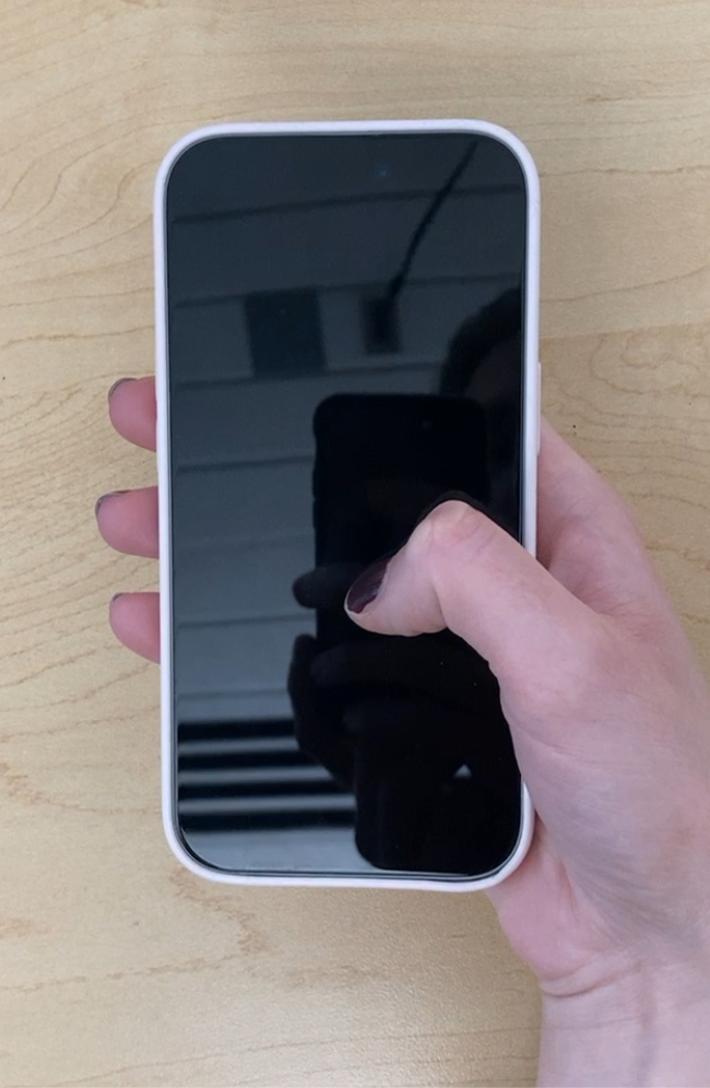
Ellery graciously let me use her hand and phone as a reference.

I was also going to use this assignment to learn animation in Procreate (the original version, not Procreate Dreams, which I think has a much better animation engine). I ended up also using this assignment to learn how to animate generally, as I’d never animated anything before. It’s really hard. I have a newfound respect for animators.

I used Adobe Illustrator to build the phone. And I used Procreate to draw the hand and fingers for the base layer. I ended up with a 30 frame loop by just animating the thumb.

I think that what I ended up with is pretty cool. But I feel like I did so many things wrong. For some reason, I added the text last and it probably should’ve been the first thing I animated. When I exported it as a set of PNGs, the white background wasn’t included. That wouldn’t have been such problem except that I used white to block out where the phone and text showed through the thumb, so there was this white blotch that was showing up on transparent backgrounds. I had to go back in and merge the base layer with a layer of white. Also the thumb is jumpy and doesn’t really move like a thumb should. I might have to re-do this project when I know After Effects a little better (or at all).

Oh and another thing I got wrong: I couldn’t figure out how to make my animation longer. I wanted more of the music to play (it’s the first 1.5 seconds of “Heartbeats” by The Knife), but I could only get the animation the length of the original 30 frames. I even took it into Photoshop, duplicated the layers a bunch of times, turned them into a frame animation, and tried to export it, but still no dice. I guess I got lucky that that little snippet of music loops well and is kind of in sync with the animation. If it works it works I guess.

Categories
Uncategorized

InkHunter App Review

What is it?

An app that lets you preview tattoos on your body.

How does it work?

You can use one of InkHunter’s free designs and see what it looks like on your own body. First, draw this weird face on yourself.

Then select a design from InkHunter’s library.

Now you can see what it looks like on your body.

You can also use InkHunter’s text editor to make a text tattoo. Or upload one of your own designs for a custom tattoo.

What could be improved

Designs don’t curve with the body, so it doesn’t work with larger designs. It’s also hard to hold the phone and manipulate the screen at the same time, which you might have to do if your tattoo is going on an arm or hand.

What works well

It’s a good concept for an app. I think it will help users avoid a bad decision or encourage them to try something new. It was surprisingly easy to upload my design into the app.

Categories
Uncategorized

blog assignment #7

Direct To Garment printing

What it is

So Direct To Garment printing is pretty cool. DTG printing uses special inks to print right on to a piece of clothing.

Why it’s cool

To my knowledge, there’s three ways of printing on fabric. Ok four if you count just spray painting or air brushing a shirt. But here are the real three:

  1. Heat press: this is just glorified iron-on, and there have been some advancements in heat-pressing in recent years, including some cool self-weeding printable vinyl made for heat press. But I don’t really think it’s a professional product. There’s also sublimation printing, which falls under this header, but I don’t know much about it.
  2. Screen printing: you know what screen printing is. It’s awesome. It’s my favorite thing in the world. But it can get complicated and expensive with lots of colors and it can’t do rasterized images.
  3. And the third is DTG printing.

DTG printing is just like any other CMYK printer, except that it can print on to certain fabrics (treated fabrics, more on that later). With DTG, you can print full color images, including photos, directly on to a piece of fabric. As far as I know, a DTG printed garment will hold up about as well as a screen printed garment.

How it can be more economical than screen printing

It’s kind of a perfect middle ground for small-run projects. Like there’s usually a minimum number of shirts you can screen print if you’re ordering from a shop so that they can offset the cost of labor and materials. But with DTG, a single shirt takes as much labor and material per shirt as 30 shirts. In fact, given the price of DTG inks, it’s actually better to do small-run stuff on a machine like this. And even thought a single piece will probably cost more to print with DTG than a single heat-press shirt, the end product is of substantially higher quality and longevity.

That’s why I thought it might be an interesting prospect for SCCA. I think that most of what we end up printing is small-run stuff, like a single shirt for a portfolio piece or whatever. I don’t imagine this machine would get more use than one of the 3D printers, but maybe its cost could be justified by the quality of the material it turns out.

Also there’s a coolness factor that should be acknowledged.

Some shortcomings

Professional DTG printers are really expensive. There are non-professional DTG printers, but they are very bad.

DTG inks aren’t exactly cheap.

(That’s for one 250ml bottle of Cyan)

Also, the fabrics need to be cured with a pre-treatment machine, which are really expensive.

Conclusion

I think a DTG printer might be a valuable resource, especially if we could maybe print garments for the school or something – like the school might be more willing to foot the bill for this sort of thing if we could defray the cost of outsourcing their garment-printing needs, which is assuming they have any garment-printing needs. If you want to see one of these printers in action, they have one at The Foundry.

Categories
Uncategorized

blog assignment #6

I hate to be a contrarian (actually I love it), but I’m not sure people are the best judges of their own individual uniqueness or value. I say this because I think people, including myself, typically undervalue or totally overlook the things that make them unique. The things that make our perspective singular are often events in our lives that brought on some capital-t Trauma, the kind of thing that can really change a worldview. But it’s a rare individual who’s able to not only identify that they even have a worldview, but to identify the ways that their worldview differs from other normal folk’s worldview (it’s not super hard to identify how our world view differs from Charles Manson’s, hence the “normal folk’s” qualifier above). For example, I was watching a documentary about Noam Chomsky last night (it’s called “Manufacturing Consent” and it’s pretty good for being like 3 hours long) and he relates the following story (I’ll paraphrase):

Once when Noam was in elementary school, there was a kid on the playground who was being picked on by a group of other kids from his class. One of the aggressors went to fetch his older brother, presumably to beat up the helpless kid. Noam knew something needed to be done, so he went and stood next to the picked-on kid. But then he got scared and ran off. He said the shame of that incident is still with him today. And the angle the documentary took was that this incident was the formative event in Noam’s life that made him into the outspoken activist he is today. My contention is that the shame of that incident was a traumatic experience. I’m sure that he regrets the situation, wishes he had stayed with the kid, wishes it had never happened. But if it had never happened, we may never have had the current version of Noam Chomsky – and I think it’s pretty safe to say that the world is better off with the current version of Noam Chomsky in it. But so Noam’s unique perspective is at least partly attributable to an experience that he regrets. And that’s kind of my drift here.

I think the things that really make us unique are the traumatic events that we each experience and process differently. Starting with the trauma of birth, which is a fun one because we all share it. Some people dealt with bullies, some people have to overcome a phobia, some people had hair-raising childhoods, some people have debilitating diseases, etc. These are the things which give color to our expressions of individuality. And I’m not saying that art necessarily focuses itself on sublimating the particular traumas of an artists life, although it certainly can (Lord of the Rings, anyone?). I’m saying that trauma is the lens through which we interpret the world, and our creative output will reflect the little idiosyncrasies of our individual lenses.

What makes me unique? I have a weird disease called Trigeminal Neuralgia, or more commonly cluster headache. I regret having cluster headaches every day. If I could go back and choose my current life with CH or gamble on life without CH but with an uncertain future, I would choose the latter. I like my current life, I’m just being real with you. I hate having this disease. But it has undeniably shaped my life, and thus my perspective, more than any other single thing. I have built my life around having cluster headaches. Cluster headaches have made me who I am: a careful reader, a strong writer, an inquisitive thinker, and a forceful speaker. It has also made me who I am: a person with depression, a cynic filled with suspicions, a sourpuss, and a self-imposed social isolate. But these things that make me me are the things that inform my sense of design. I love to read, I love to draw, I love to make things with my hands, I love to learn new technologies and to use new technologies in the ways they’re not meant to be used.

I also have a hard time working in groups. I have a hard time keeping an emotional distance to criticism. It’s super easy for me to become dejected when something isn’t going according to plan. I often feel like I’m not creative or interesting, that I’m a plagiarist or a fraud.

None of these things are directly or exclusively attributable to cluster headache. But CH has certainly informed my habits as a designer in weird roundabout ways. This is what makes my perspective unique, the good and bad of it.

Categories
Uncategorized

blog assignment #5

My letter was U.

Upside down window of a Chase bank in Wallingford.
The strap of my backpack.
A Staedtler flexible curve.
Some kind of bathroom accessory I found in our house; I’d rather not reflect on it’s exact usage.
Categories
Uncategorized

blog assignment #4

I’ve always wanted to live in Japan. Not just visit. I mean live there. I’m fascinated by Japanese culture and history. In my own work, I’ve appropriated so much from Japanese art that I feel like I owe the country my contribution to the labor pool. I don’t know of any culture so adept at taking pieces of novel things from around the world and turning them in to something original and beautiful. I feel like most creative people are made uncomfortable by influence (Harold Bloom springs to mind) and scorn appropriation. But Japanese artists revel in new artistic discoveries and art forms. They make an art out of absorbing art. Kanji is basically that: Chinese characters that the Japanese adopted for the sake of convenience. But just look at Shodo, or Japanese calligraphy, which is mostly Kanji (sometimes Kana).

Shodo, a kind of meditative calligraphy

Or take a band like Boredoms for example. No, Noise Rock was not invented in Japan. But boy was it ever perfected there.

The main reason I want to live in Japan is the colors. I want to see if the sky is really that Prussian Blue (which the Japanese call Berlin Blue) like it is in Miazaki’s movies. I suppose universal healthcare and the bullet train would be nice too. But those colors, man. I suppose an important datum at this point would be to mention that I’ve never left the country. My family didn’t travel much, so it’s super special to me whenever I get to go somewhere. And Japan tops the list for me.

Look at those blues!

Anyway, there appears to be no shortage of graphic design jobs in Japan, but there’s a big ass caveat. Applicants will need to be bilingual. And learning Japanese is no romp through the heather, especially if you’re 33 and basically never actually hear spoken Japanese, like in a conversation or whatever. After a cursory google search, I found this posting. It’s for a marketing firm in Tokyo. From what I can tell, they need designers who can speak business-level Japanese and English for cosmetics, auto, and event marketing.

Some roadblocks: Well I don’t speak Japanese. Like at all. I tried to learn some during Covid, but it’s really hard. Also finding housing in Tokyo is difficult for life-long residents of Japan; for foreigners it’s even more intimidating. Some Japanese landlords aren’t super hot on renting to people who don’t speak the language, or so I’m told.

Some upsides: The cost of living in Tokyo is apparently 57.2% cheaper than Seattle. See for yourself! Also, Tokyo is so safe that you can sleep on the street and nobody will mess with you. In 2021, the homicide rate in Japan was .7/100,000 people. That’s for the entire country. Compare that to Chicago’s homicide rate, which in 2021 was 29.6/100,000. For Chicagoans like me, neighborhood safety is a bit of a fetish.

Maybe this is all a bit pie-in-the-sky. Maybe if I was a part of an established design firm with a Japanese division and they wanted to, for some reason, send me to live in Japan for a little while to design stuff over there – that I could probably do. Sometimes Nintendo has job postings for bilingual (Japanese/English) graphic designers, but I’m not seeing any on Indeed right now.

Oh well, a guy can dream.

Categories
Uncategorized

blog assignment #3

Categories
blog assignments

new media assignment #2

I’ll be honest, I struggled with this assignment. It wasn’t that the app was hard to use, although I did have a few failed attempts. It’s just that I’m not sure how I can apply this technology creatively.

Categories
blog assignments

new media assignment #1

JUMP TO SOLUTION

The prompt:

Design an 18×24 poster for hip-hop artist Mavi appearing at the Capitol Hill Block Party

To my delight and surprise, I was assigned an artist that I turned out to really dig. I listened to Mavi’s entire discography on my way home from school last Friday and let me tell you, he’s a rapper after my own heart. The line that won me over needs a little context: Mavi is telling a story about a woman who asks him what kind of songs he writes. He replies, “The kind you gotta read, baby.” He’s right.

There’s no way you can absorb Mavi’s entire message just by passively listening to his music. Part of it is his speed. He’s definitely from the Kendrick Lamar school of hip-hop, and not the narcotized mumbly school so much in favor today. But there are also really interesting layers of meaning in his lyrics, layers that can be exposed by actually reading them.

Mavi’s visual aesthetic is earthy and warm. His recent album covers are drawn or painted, so I think he values a sort of arts-and-crafts (in the William Morris way, not the Bob Ross way) approach when it comes to his visuals. That was good for me because I love drawing and whenever I can make drawing my homework, I do. He also has a thing for bees. I kept seeing bees on his Instagram account. So I wanted to get bees in there.

My team in History of Graphic Design is studying Art Nouveau for our end-of-quarter presentation. I’m really digging Alphonse Mucha and Jules Cheret, and my first couple of sketches were my interpretation of their lines.

But it didn’t feel right. It looked way to much like a comic book. I realized that I really need to work on turning my sketches into finished pieces. But by this time it was like Wednesday night and I needed something achievable. So I started thinking about Koloman Moser and the whole Viennese Jugend scene. I have an awesome Moser book from the library, and I came across this fairly iconic cover:

Koloman Moser’s cover for Ver Sacrum magazine, 1899. From the book “Koloman Moser: Master of Viennese Modernism.” Maria Rennhofer.

Here is my solution, inspired by Koloman Moser and Jugendstile:

The reference photo of Mavi that I used to paint his image is was taken by Wyeth Collins for Pitchfork, 2022.