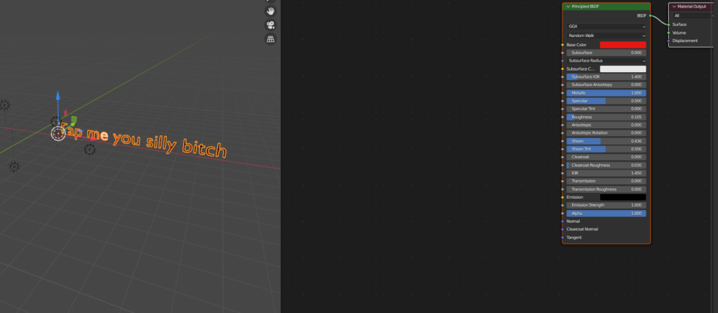
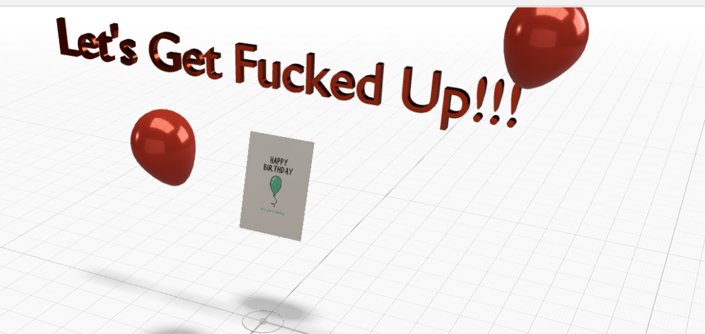
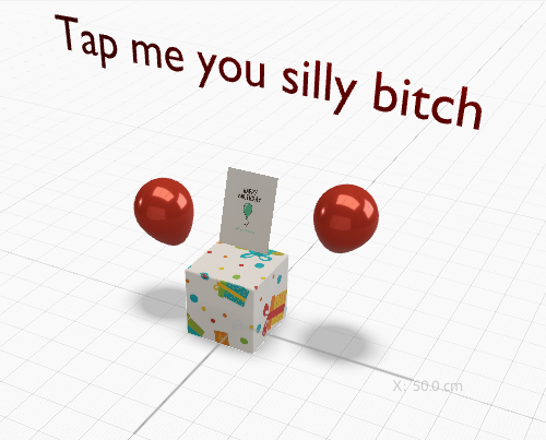
For this process, I though it would be fun to make my own 3D assets in blender and then export them, which was actually surprisingly simple to do. I would create them, export as .glb file, and then simply drag and drop. I just wanted to do something simple, so I went with the given theme of a birthday card. I will say that Aero was fairly easy to work with, and felt intuitive. I struggled at first with the timing of animations, and getting them to follow one another via triggers, but with some playing around I eventually got it. The results were pretty amusing. Below are some screenshots of the process.
Month: January 2023
Blog post 3
Justin Bernardy
This week, we have been asked to write about a personal project we would like to take on, and provide a rough idea of what that process might be like. This is actually something I think about often, because I have a lot of personal creative aspirations. Perhaps the greatest among these is my desire to eventually create my own video game, down to the story, music, art direction, characters, environments and etc. I don’t necessarily hope to gain much from doing this; my main concern isn’t money. Rather, I’d like to create something that can be enjoyed by a wider community. I want to create a narrative that really draws people in and gets them talking. It’s a brand new journey for me, however. I have only recently started learning the basics of 3D modeling, and know very little about game engines, or coding or the like. On that note, this could easily be a project that I learn and develop over the course of the next several years. There is also the concern of ever-developing software to consider. For example, each year, 3d rendering software gets a little more powerful, and high end equipment becomes crucial to ensuring the best possible product, and sometimes even running the software in the first place. Which leads me to my next point. This would be a potentially costly endeavor. When you consider subscriptions or one-time purchases of software (such as Adobe, z-brush, Maya etc.) paired with maintaining the best equipment (graphics cards, CPU, RAM etc.) it becomes apparent pretty quickly that its quite an investment. So to summarize, if this is ever going to happen, it will require a lot of patience, a specific and well thought-out education plan, and a small fortune. All things considered, I think these would be small obstacles to anyone who is passionate about their goals.
AR App review
Justin Bernardy
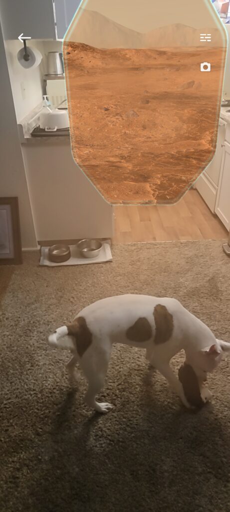
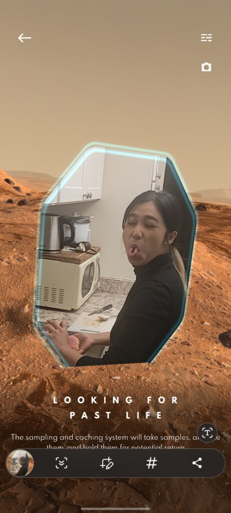
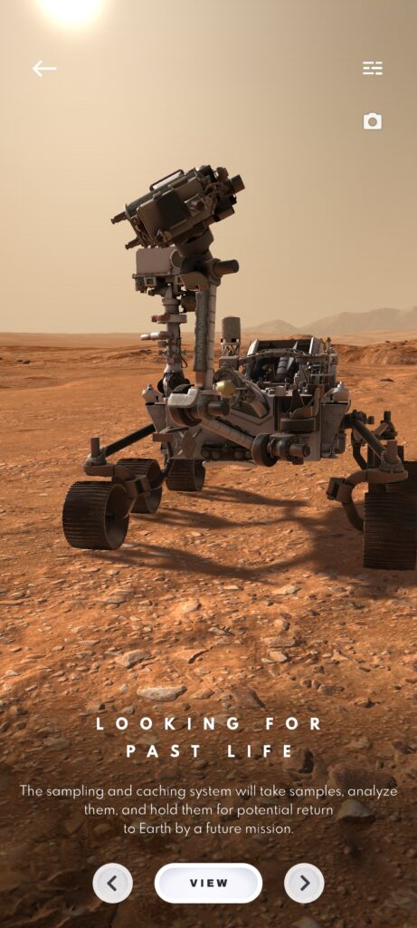
The AR app I chose to review is the Mission to Mars AR app. This app had above average reviews, and I would say that’s warranted. The app aims to give the average person a first hand view of what space exploration looks like. The viewer sees the exploration of Mars conducted by rovers, along with brief, digestible explanations of what you are seeing. It’s an educational experience at its core, paired with pleasant visuals and a smooth, simple UI. However, it’s not without issue. Like several AR experiences; particularly those made for mobile devices; the experience can be somewhat clunky and not fully responsive, and experiences glitches. For instance, the app implements the infamous ‘portal’ that is seen so often in AR. A cool concept to be sure, but it can be aggravating when you are trying to use the app and said portal is moving around the screen to random locations or disappearing entirely. Again, this seems to be kind of inherent to some degree with AR on any mobile device, but overall it isn’t enough to ruin the experience. Below are some screenshots of the app in action.
Blog post 2
Justin Bernardy
Though I have only been a student at the creative academy for a few short months, there have been more than a few instances where I was forced to either abandon, or completely pivot on a project. In fact, this has happened in almost every class I am currently enrolled in, in some way, shape or form. Sometimes, I feel like that might just be an inherent part of the design process, because nothing will ever be perfect, but we will create thousands of iterations of our work to make it as close as possible. Of course, there are deadlines which limit what we can do, and that is where being a perfectionist becomes problematic. Given the sheer number of guest speakers who have already confirmed the infamy of the interactive design course, it is probably no surprise that this is a common issue for that course. To be perfectly clear, this is due in no part to the course itself, or the instructor, both of which are excellent. Rather, this seems to be the nature of interactive design, where your HTML, CSS, and JavaScript need to work together harmoniusly to accomplish your goal.
A more specific example of this, was our first project, in the first quarter. We were tasked with redesigning a cluttered, dysfunctional website, specifically the Yale School of Art site. For most of us, this was our first introduction to the (mostly nightmarish) world of coding. We were tasked with creating a responsive website that solved user stories, such as specific information or functions that were omitted from the original site. This could have been anything from a search bar to dropdown menus with clear-cut options for the user. I easily went through at least four iterations of my code before I was able to even understand how it should all function together. I wrote a lot of code that was clunky, would malfunction at various screen-sizes, and was overall not responsive. By the time we had less than a week to complete the project, I did not have a presentable product, and began to panic. The solution for me was to spend several late nights doing as much research as I could to help myself catch up to the rest of the class. I spent several nights tediously following tutorial after tutorial until finally, the principles behind what we were doing began to stick. I then completely started over with my code, and built it step by step, until I knew that I had made something worth sharing. Overall, I’m glad I initially struggled so much, because I was pushed to study harder and become better at coding.
Blog Post
Justin Bernardy
(1/19/23)
This week’s visitor, Steve Hansen resonated with me in particular. Since the start of winter break I have tried to set aside time to learn 3D modeling and animation, and it has been both very challenging and very rewarding. I’m hoping to add 3D modeling to my skillset and find creative ways to implement it into my designs, and seeing Steve’s work proves that this is a possibility.
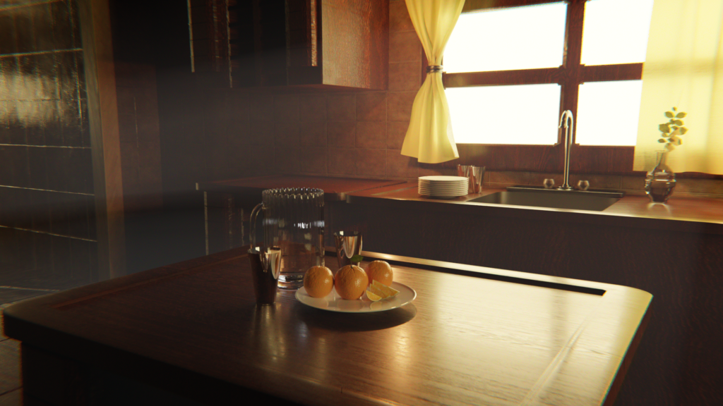
I was also ecstatic when I read the blog assignment and realized that this project would give me a chance to practice 3D as it might pertain to a professional environment. That said, we were tasked with capturing/creating a food item using 3D, photography, or other means. I chose to use Blender, a free software that Steve mentioned a few times. I created a simple morning kitchen scene featuring a pitcher, plates, and a few oranges. To do so, I modeled all of the featured items myself, and also fine tuned the lighting. As an example, the oranges were made by sculpting a 3D sphere, adding imperfections, and then applying a texture to the orange. To create textures, I used my camera and took pictures of textures in real life, and imported them into Blender. I chose oranges, because I associate them with the morning, and being refreshed, and those are the feelings I wanted to evoke here.
AR POSTER
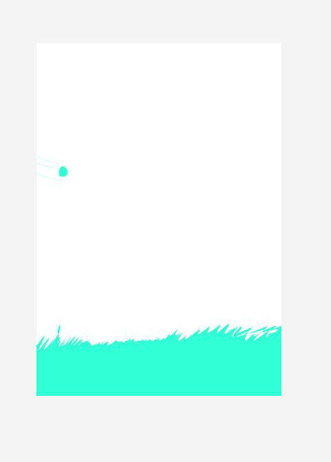
This idea actually came to me a while back when I was first learning animation. I was learning the principles of animation, and did a common animation exercise, a bouncing ball. However, I wanted to try to make it a little more interesting, so I came up with the idea to make the ball explode and reform into a face. To create this animation, I used Procreate. I initially ran into issues with the timing, some parts seemed to lag while others were unnaturally fast. Eventually I learned that for timing, I simply needed to decide how long an action should take in seconds, and multiply that by the frame rate. IE, if I want to perform a 3 second action at 24 fps, then then that action should occupy 72 frames.