Categories
Uncategorized

AR Poster

In our AR module for New Media, were were tasked with creating an animated poster using the EyeJack app. I was familiar with AR/VR through video games ( E.G Oculus Rift ) but I never paid mind to the uses for XR outside of that realm. Once being acquainted with the technology in class, I was excited to see what idea’s I could implement.

My initial design was recycling an animation I made in after effects pictured below.

After adjusting it to fit the dimensions for the project I felt although this could be seen as a cop out, so I scrapped the idea hoping for a better inspiration.

After binging 5 Harry Potter movies back to back, I came across the Daily Prophet newspaper that is heavily featured in the series. This was a eureka moment because the ideas are so similar to one another, on being magic and the other being ” movie magic” of course. The inspiration is pictured below.
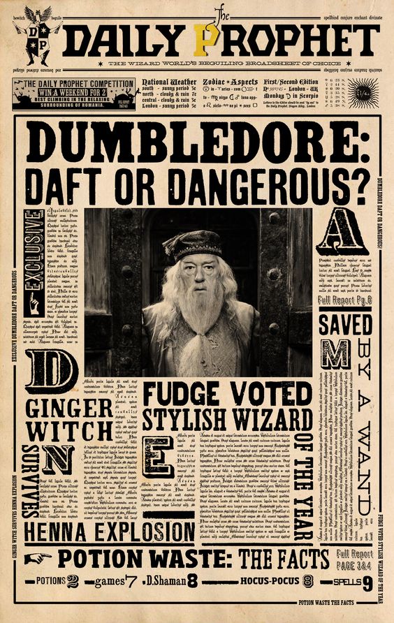
I started off by creating the poster in Adobe Illustrator, that way when I import it into After Effects, I can control certain layers specifically. It was a good exercise in creating things in Illustrator and having something to reference helped the process. The poster I created is shown below.

Once completed, I came up with ways to make the poster come alive. To do this I created, blinking exclusive sections, scrolling breaking news text, and a reveal to the articles as if appearing on the paper.

Finally I found a GIF I thought would add to the experience. I took it into Photoshop to edit the GIF slightly, such as adding grain and adjusting it to grayscale. Taking the first frame of the GIF, I exported it as an image to put for the poster. Here is the final result of the poster:

Overall, I am very happy with the result as Harry Potter is a deep part of my childhood and a fun way to play with all the skills I have learned in the last few weeks.

Categories
Uncategorized

Week 5

AJ Hanneld, a former Creative Academy student visited and talked to us about their career and the myriad of positions she held. There was a lot of crossover between film and design. It was eye opening seeing how much design and other visual media intersect between them.

Overall, my experience with the program has given me a larger perspective on what is available career wise. My idea of graphic design was pretty traditional in that I expected it to be a lot of posters, logo designs, and typography, but with having these speakers come every week to speak on major projects they’ve worked on, I see that is not entirely the case. I never made the connection that design principles are similar throughout any visual process, things like; grids, proportions, etc.

Funny enough, when I was younger I always wanted to work in film in some capacity but that idea never came to fruition. Now I see that adolescent dream might not be too far off. AJ spoke about their projects on conceptualizing visuals for movies and how they incorporated their design process and skills into creating these books to road map the aesthetic. It was really cool seeing the range at which these skills can be utilized.

Furthermore she showed us the book covers she designed. I never considered that working with a publisher could entail design practices. I really enjoyed seeing how the cover was built, layer by layer, because it showed a deconstructed timeline of elements that slowly pieced together what is essentially a graphic design.

In my own personal experience, there have been several projects that overlap graphic design with multimedia. 

The first being my first module in new media. We worked on After Effects compositions. At first I was a little confused on how this would be relevant in my goals as a graphic designer but I started to see the similarities come together when we designed an animated logo. On top of having to design a logo, I had to animate it which gave a revelation that this might be a great tool to have in my wheelhouse. Further into the module we worked on green screen and layering compositions. When working on these projects I found myself incorporating principles I learned in my intro design class such as gestalt principles and, even simpler, the attention to detail on scale and how items should line up.

Finally, for another class we were asked to create a pre- recorded lecture on a historical genre of art. Eager to incorporate my new found animation skills, I animated opening sequences, moving texts, and graphics to give character to our video. I felt really accomplished in doing so. In most learning environments I’ve been in, it felt like I was learning skills to pass a test and dump them the minute they were not relevant for the next test. The contrary is the case in the graphic design program where skills I learn from any class, whether a graphic design or animation segment, can be applied to any project and will likely be utilized in some capacity further along the road.

11NOV2022

Categories
Uncategorized

Week 4: Amazon

    This week we had Margaret Darcher speak to us about the core leadership qualities Amazon workers strive for, some of which being; learn and be curious, insist on the highest standards, and bias for action.

    When starting out in any position in a workplace, I have always tried to be curious in what I am doing. It stems from not wanting to sandbag the team. I want to learn as much as I can so I can contribute to the group. Usually to prove myself I will go the extra mile and find ways to improve any situation I find myself in.

    Working in the Department of Defense, attention to detail is a must. These positions insisted on high standards and I have become adjusted to double checking all the products I submit to make sure they meet or exceed expectations.

    Bias for action to me entails that you are proactive with your work. That you understand the full impact of what you are doing and implement safeguards that ensure the success of the team. Again, working in the Department of Defense, you are encouraged to see the full scope of your work and have the foresight to mitigate any potential technicalities that exist.

    Perhaps a leadership quality I do not have a full grasp on is “ having a backbone”. In the situations I have been in, there is a clear hierarchy of authority. Amongst my peers I have no problem discussing my opinions but when it comes to managers or higher ups, I have trouble speaking up about potential road bumps. Sometimes it is hard to speak out against upper echelon because they may have a perspective that you are unable to see.

3NOV2022