Categories
Uncategorized

AR Panel

This week we learned how to create multiple AR posters and consolidate them into panels that can be displayed in unison. For this project we were split into groups and worked together to form a theme and then execute our own ideas.

Our group chose restaurant and eateries in Capitol Hill. Having worked at Espresso Vivace, I chose to create a poster that mirrored their aesthetic and build a panel that could be displayed outside that would showcase what you may expected.
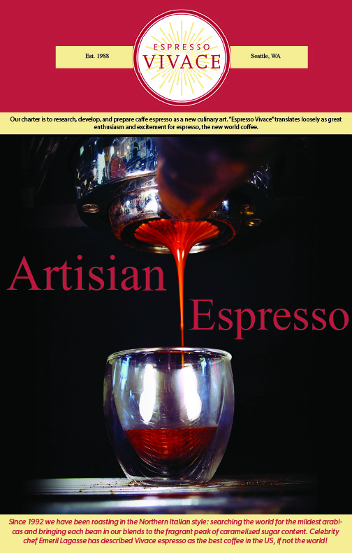
I designed a simple poster using assets that could be found on their website, such as a short description of their mission, logo, and image of their iconic espresso. I added all of the components together in Adobe Illustrator.
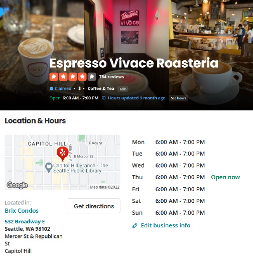
From their I screen grabbed info from their Yelp page to display their hours and rating. I wanted to created a utilitarian aspect to this panel so hypothetically, if a potential customer were to scan the QR code, they would be able to pull up the important info. These are two separate screen grabs I took that I then edited together in Illustrator.

Lastly I added stock footage of a shot being poured that I found on Pexel. Ideally if this were to be used for commercial use, I would want a mini tour of the establishment so customers could preview their experience, but for the sake of time I thought this would work. The stock video was quite long so I trimmed it in Premier Pro to fit the file size limitation of Eyejack.

I am happy with how it turned out. I could definitely see this type of technology being implemented for this type of use.
Categories
Uncategorized

AR Adobe Aero

This week we learned how to use the beta version of Adobe Aero, a program in the Adobe Creative Cloud Suite that makes AR accessible allowing users to created AR scenes with ease. For this project we had to create a card.

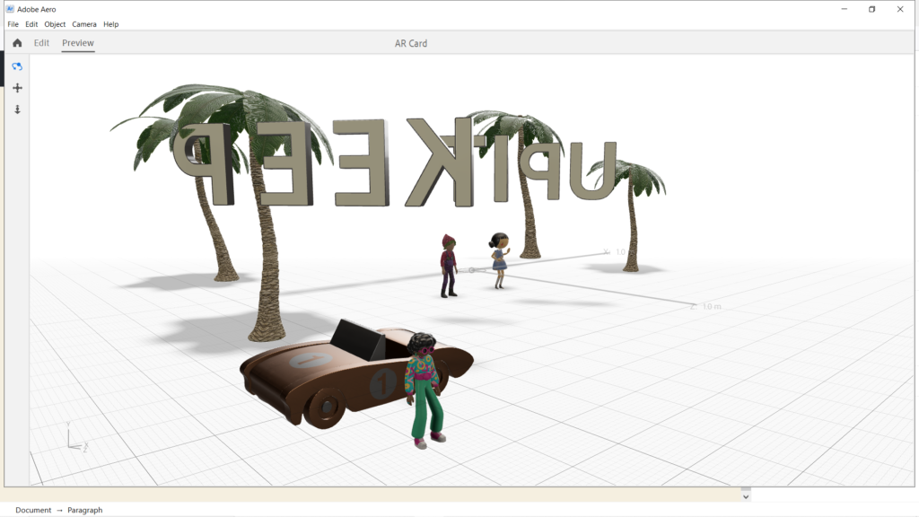
For my card, I decided to create a motivational card. The idea came to me because I wanted to use a phrase that was positive and encouraged me to finish up these last few weeks of the first quarter.

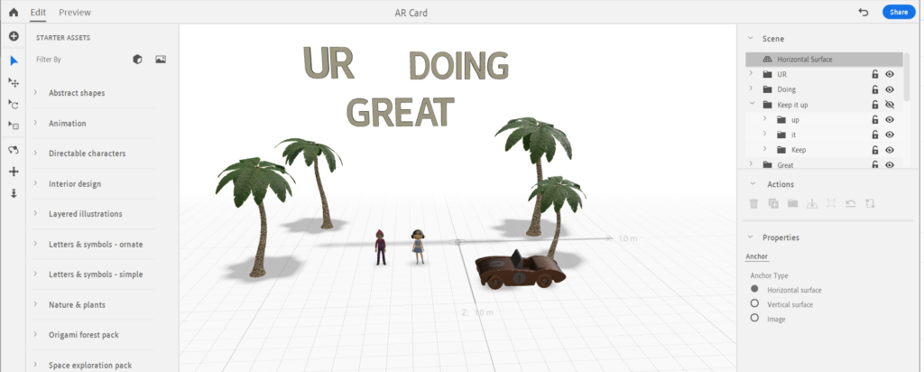
I started with the text and animated them to bounce in the sky to give it a cute feeling. Then I added some interactivity to them, making it so when you tap them they react by spinning.

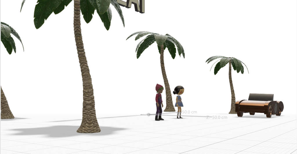
Then I added the people. I though adding characters would make it more reassuring. I made them do a little dance to make it cute then animated them to respond to being tapped to give them more life.

To create a scene I then added the trees and car giving it Miami beach vibe. I thought this would make a feeling of warmth.

To make the scene more dynamic, I added the car and animated it to drop off someone to join the party. They then would reveal the additional text ” keep it up”

Categories
Uncategorized

AR App Review

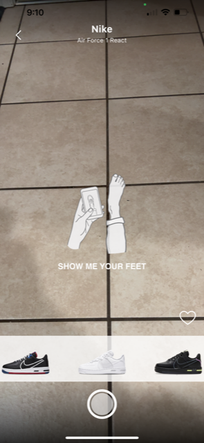
For this presentation we needed to review an app that implements an AR component. I decided to do a review on Wanna Kicks, an app that allows you to try on shoes from a large collection and gives you the option to buy them. I saw this app in the app store and figured I’d give it a shot and in the end was pleasantly surprised with the quality on the program.

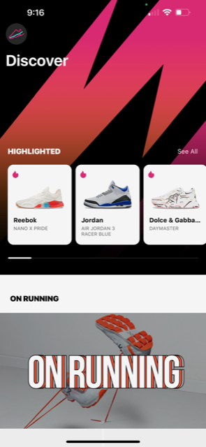
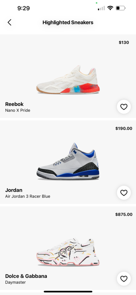
The app upon logging in for the first time doesn’t hold your hand which is very refreshing. No signup, putting in an email, or little tutorials on how to use the app. You can just go straight to shopping and trying on shoes. From there, it will open your camera and let you swipe through the hottest shoes and apply them to your feet. There’s also a home page that allows you to discover more shoes or a search where you can apply filters such as brands, styles, and models.

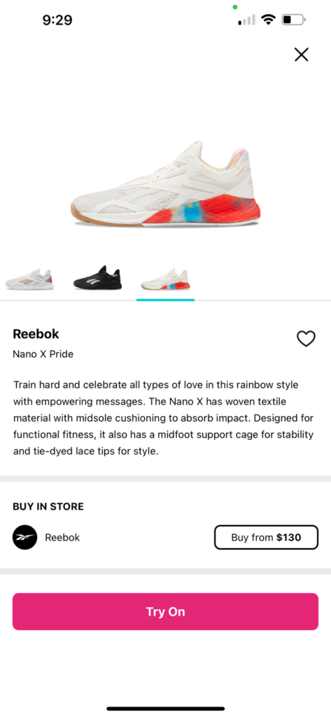
What I think the app does well is how clean it is. It looks like a high quality store app such as Nike or Zara. The UI is also very intuitive and easy to navigate through. There’s also a large catalog or shoes to choose from ranging from Alexander Wang to Carhartt. It’s also nice having a button that allows you to go straight the the website where you can buy it.

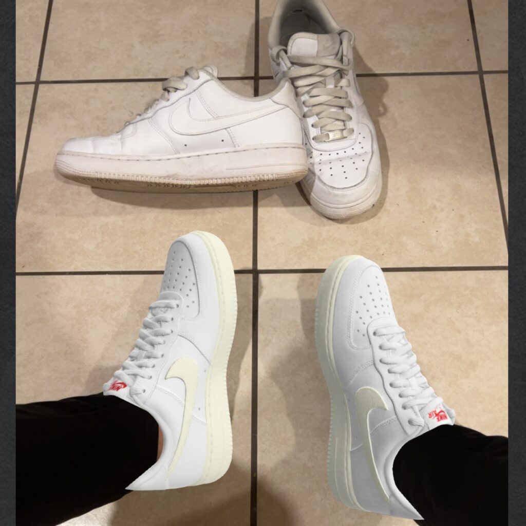
The largest critique I have for the app would be, although the catalog is large, it needs to be way bigger. I think the more shoes they have the more successful it will be. The collection they have now are high price styles and shoes that are pretty common but the range should be filled out. Additionally, some of the shoes don’t have more than one color option. An example is how the only color they have for the Nike Air Force Ones, a shoe that is known for having a lot of customizable options, only comes in a cream color in the app.

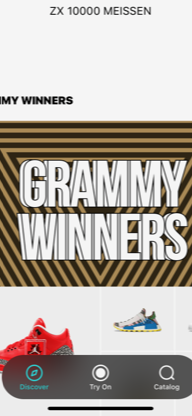
A UX/UI issue I found was on the main explore homepage, there is a navigation bar that hovers at the bottom of the screen. When scrolling to the end of the page, the bar obscures some of the images making it difficult to select those options.

Over all I think its a great app and honestly will probably keep it on my phone.