Last week we had the opportunity to speak with Drew Hamlet, a designer for the Seattle Krakens. It was really cool seeing yet another facet of design I’ve never thought of and what really goes into creating a cohesive brand. One of the subjects he talked about was the “Hockey is For Everyone” events they put on where artists create jerseys to bring awareness to campaigns such as Black History Month and Pride.
We were tasked with creating our own for the minor league team, the Choachella Valley Fire Birds, and the theme be Coachella Art and Music Festival.
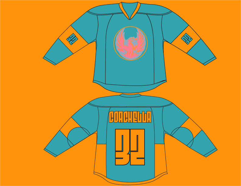
I started off by going to the festival website and see what color palette they were using. As you would expect they ended up going with a sunny orange and sky blue. This makes sense because its a summer event and the two colors work well together to create that feeling. Keeping that in mind, I took the team logo into Photoshop and changed the colors to match the theme closer.
Then I experimented with changing the panels colors and placement to see what would make for a good ration. Because the blue is more calming and less aggressive than the orange, I decided to make that the primary color and have the orange be an accent. After picking the color placement, next was the font that would be used. I decided to go with Condensed Fit as it is trendy and modern creating for a bold and unique style.
I like how the design turned out. I think it is very eye catching, chic, and something I would wear myself.