During our sit down with Joe Hallock from Microsoft, he introduced the idea of information quantity and audience specificity. Whatever project you are working on you will have to take into account the density of information being provided and how broad or specific the target audience is. A couple examples he provided include; a high information density/ specific audience student portal; a low information/ broad audience airport sign; and, a museum exhibit which would close to the center on either axis. Dividing work into sections like this provides a great visual understanding of what the final product should be and gives a clear vision from the beginning.
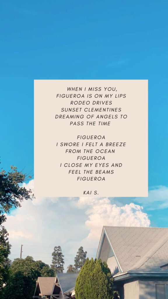
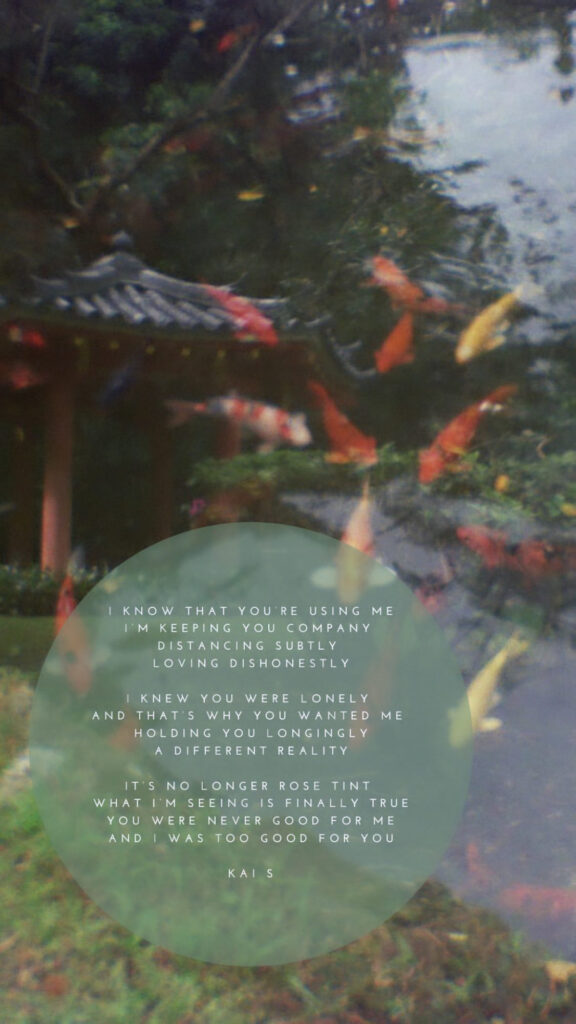
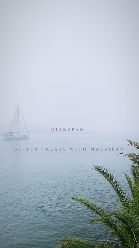
Currently I would say that the projects I work on during my free time would exist low to medium information density and for a broader audience. I enjoy combining multiple mediums into a singular project, oftentimes in the form of e-zines. These include photos I have taken, journal entries, videos, and other projects I have been working on. Because most of the content is visual, the information provided is through graphics. I also try to tell a story this way, which to be effective, has to be relatable to a broad audience.


Although this is the type of work I currently do, I would like to step out of my wheel house and have a position where I am working on higher information content while being even broader. I would love to work in print media, working on magazines and books. Although this is certainly similar to what I already do, working on projects that are totally mine makes it feel more as a puzzle as it presents more of a problem/ solution feel to the process. Additionally, the higher information content would provide a larger challenge for visual hierarchy, order of information, blocking and overall changes how you would go about the design process.
14OCT2022