Categories
Uncategorized

The Power of Personal Projects

Last week Andrew Nedimyer came and talked to us about how personal projects can impact our professional lives. Personal projects are important for a multitude of reasons ranging from sharpening our skills to having something new and fresh to add to our portfolio.

I have had the idea for a while now to create a zine that would explore the ideas of masculinity, sexuality, and what it means to be a man in the modern age. It would include photos, personal entries, and interviews with people who break the norms of the traditional narrative.I think this would be a great project to improve all of my skills and hone in on what i’m learning now. It would definitely take a lot of creative writing, interesting imagery, and know-how with Indesign.

I’ve never been great with creating timelines and adhering to them for projects. Usually I obsess over a project for a month and once the momentum leaves me, the project is scrapped. Ideally though, if I were to create a stricter timeline, like one we would use for a class project, I could get it done. I could see the project going through 4 distinct phases, planning content, gathering content, assembling content, then finalizing the package. The first two could easily be done within a month. Because my knowledge of Indesign is limited I feel as though the third phase may be the hardest and inturn, the most time consuming so I would give myself a month to complete that. For finalizing the project I would need to choose materials such as book binding, paper weight, printers, things like that. I have no experience in actually publishing a physical copy of my work so I can see it being 2-3 weeks of talking with people to figure out how I would want the look and feel to be.

Technically I have everything I need to complete phases 1-3. I have my trusty cameras, word processor and notepads, and adobe products. The only thing I would need would be content and people to speak to. This would be easy though as part of the experience is listening to people’s stories and I consider myself a social butterfly. I would just need time and people to complete these phases. For the final phase of the project, I would need to work with a printer to get the finalized feel and look of the package together.

Like I said before, I have never made a zine physically and I know the project can range from something super cheap, to something very pricey. Ideally I would want to go medium-low for my first physical project. I would have to get a quote from local print shops and test out the feel from a few locations. Then with packaging, I have a few ideas for some low key solutions such as translucent bubble wrap to saran wrapping and adding heat. I would want this last part to be something I could do myself to cut costs and have the product feel like this is a personal project. Depending on how well the design looks I would probably be willing to shell out around $250 dollars for a limited print.
Categories
Uncategorized

“…Plans are useless, but planning is indispensable”

This week we had Abdul Kassamali come and talk to us about his media production team. It was really interesting seeing how he went from a completely different career field, to entering another with little to no experience. That being said, his work is super clean and professional which only goes to say that if you are willing to put in the work, you can achieve anything.

Abdul talked a lot about how flexible you need to be when filming. Although you can plan everything down to each minute, there will always be some unexpected variable to overcome. An example he gave was when shooting for a REI promotion. The team planned extensively but had no idea what was to come. From lost luggage to the cast getting Covid, they had a myriad of issues to overcome.

His presentation was reminiscent of a similar experience I had here while in the Creative Academy. Funny enough, I also ran into issues when trying to film a video for a project. 

The project was supposed to be a 15 minute video detailing the history of Ukiyo-e and its implications to western art and graphic design. The first three weeks were spent researching the subject. We wanted to be as thorough as possible just to make sure when we go to film, we would not have any hiccups.

The last week we spent filming and editing. We decided to film at the Seattle Art Museum. We had seen online that they had many Ukiyo-e prints and it would perfectly fit the theme of the project. We decided to get there right as they opened just to be sure to not run into crowds. 

The first issue we ran into was the fact no Ukiyo-e prints were on display. After talking to one of the museum members, we found out that they were all at the Seattle Asian Art Museum. This was a big let down and fumble. Luckily though we all had experience with Adobe Aftereffects so we could go in and add whatever image we chose in post production.

The second issue we ran into was how busy it turned out to be, even in the morning. The crowds were not so much the issue but more so the audio quality of people talking. To Overcome this I used a trick I learned from Tik-Tok where an interviewer uses their iPhone as a microphone while another records. 

Overall, the project went really well. I am happy with how it turned out and I learned a valuable lesson on how to be flexible with my projects.

Categories
Uncategorized

AESTHETICALLY AND GUSTATORILY PLEASING

To create my aesthetically and gustatorily please foo picture I decided to go for this cat foam latte from Leon Coffee House. I like to roam around Seattle and find fun places to relax and enjoy a cup of coffee. To start, I made sure I was sitting close enough to the window to catch the sun but not so close that the image would be harsh or washed out. Then I framed it to give it S or C shape composition to make it more interesting. Finally in Adobe Lightroom, I adjusted the light curve, making sure there was no pure black or pure white, giving a faded soft feeling. 
I wanted to make the image as bright and soft as possible so I went through the lighting options in Lightroom and lowered the contrast and  bumped everything else up. Finally to give it a cozier aesthetic, I de-saturated the photo and increased the vibrancy to add further to the effect I was going for.
Categories
Uncategorized

AR Panel

This week we learned how to create multiple AR posters and consolidate them into panels that can be displayed in unison. For this project we were split into groups and worked together to form a theme and then execute our own ideas.

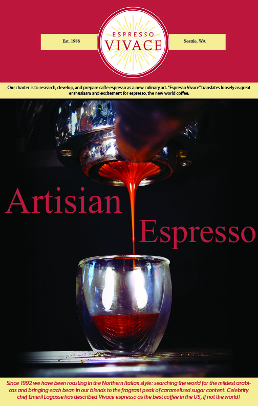
Our group chose restaurant and eateries in Capitol Hill. Having worked at Espresso Vivace, I chose to create a poster that mirrored their aesthetic and build a panel that could be displayed outside that would showcase what you may expected.

I designed a simple poster using assets that could be found on their website, such as a short description of their mission, logo, and image of their iconic espresso. I added all of the components together in Adobe Illustrator.

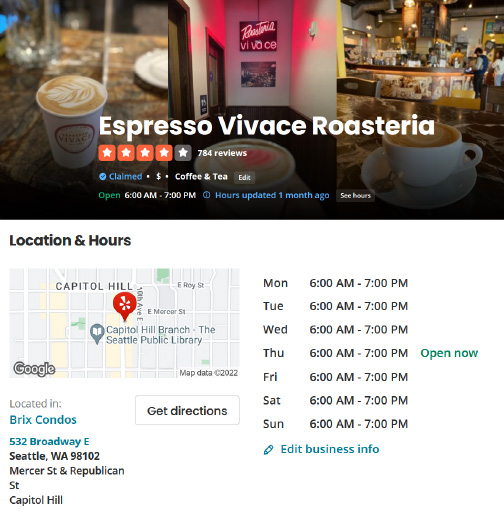
From their I screen grabbed info from their Yelp page to display their hours and rating. I wanted to created a utilitarian aspect to this panel so hypothetically, if a potential customer were to scan the QR code, they would be able to pull up the important info. These are two separate screen grabs I took that I then edited together in Illustrator.

Lastly I added stock footage of a shot being poured that I found on Pexel. Ideally if this were to be used for commercial use, I would want a mini tour of the establishment so customers could preview their experience, but for the sake of time I thought this would work. The stock video was quite long so I trimmed it in Premier Pro to fit the file size limitation of Eyejack.

I am happy with how it turned out. I could definitely see this type of technology being implemented for this type of use.

Categories
Uncategorized

AR Adobe Aero

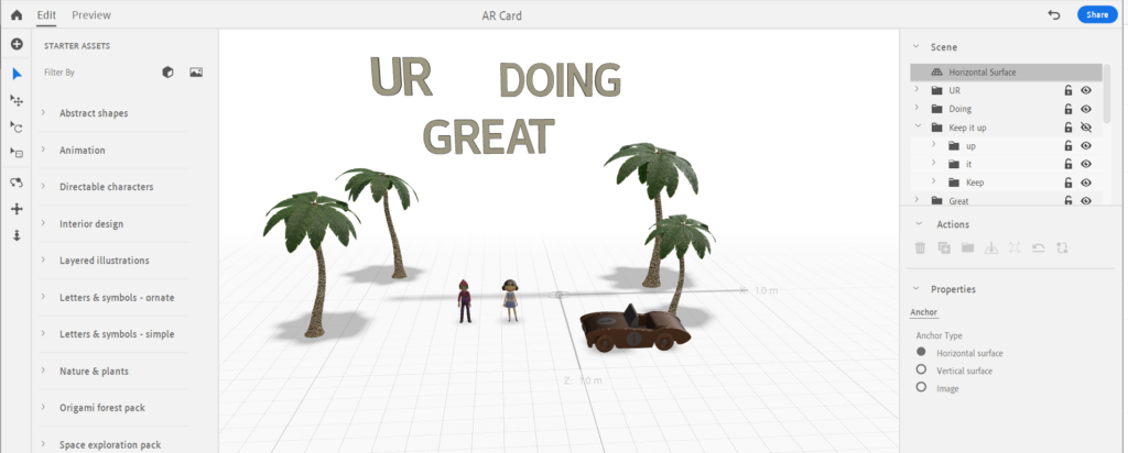
This week we learned how to use the beta version of Adobe Aero, a program in the Adobe Creative Cloud Suite that makes AR accessible allowing users to created AR scenes with ease. For this project we had to create a card.

For my card, I decided to create a motivational card. The idea came to me because I wanted to use a phrase that was positive and encouraged me to finish up these last few weeks of the first quarter.

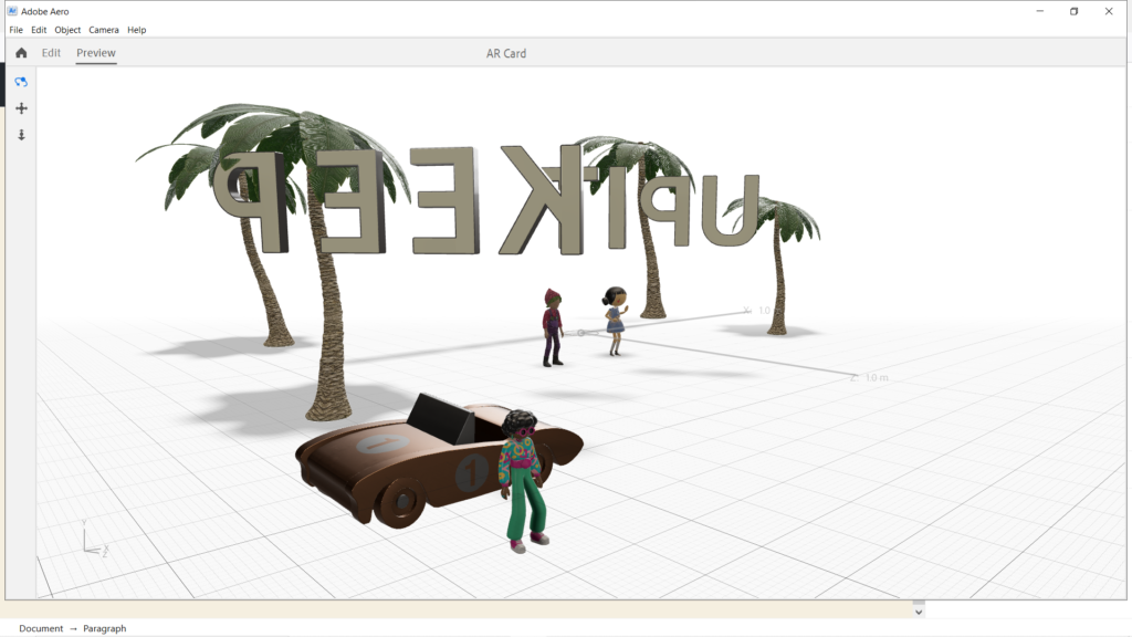
I started with the text and animated them to bounce in the sky to give it a cute feeling. Then I added some interactivity to them, making it so when you tap them they react by spinning.

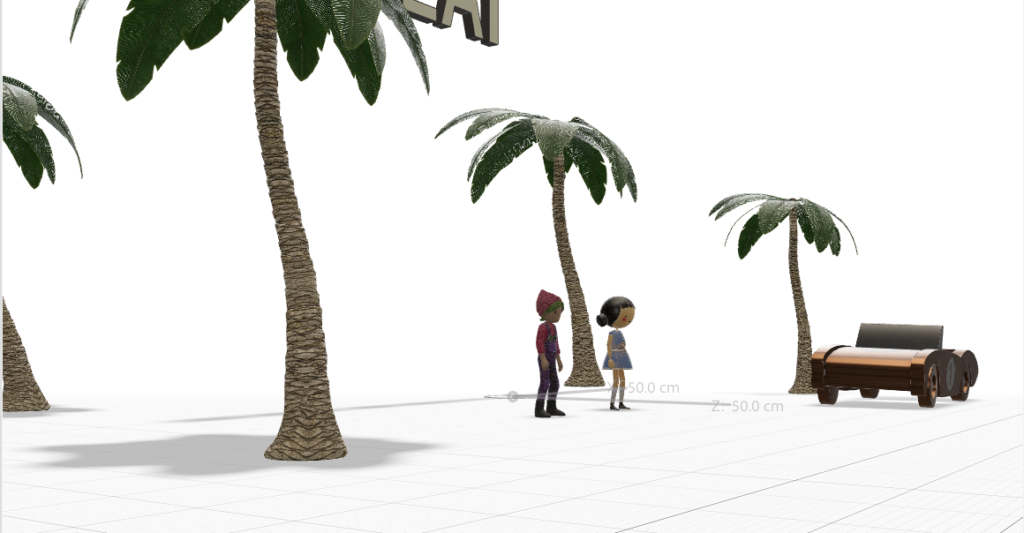
Then I added the people. I though adding characters would make it more reassuring. I made them do a little dance to make it cute then animated them to respond to being tapped to give them more life.

To create a scene I then added the trees and car giving it Miami beach vibe. I thought this would make a feeling of warmth.

To make the scene more dynamic, I added the car and animated it to drop off someone to join the party. They then would reveal the additional text ” keep it up”

Categories
Uncategorized

AR App Review

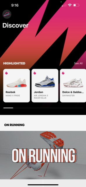
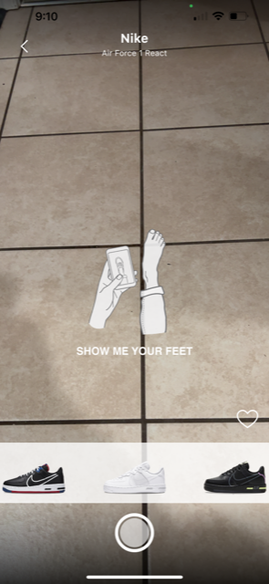
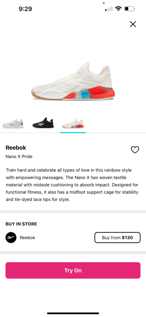
For this presentation we needed to review an app that implements an AR component. I decided to do a review on Wanna Kicks, an app that allows you to try on shoes from a large collection and gives you the option to buy them. I saw this app in the app store and figured I’d give it a shot and in the end was pleasantly surprised with the quality on the program.

The app upon logging in for the first time doesn’t hold your hand which is very refreshing. No signup, putting in an email, or little tutorials on how to use the app. You can just go straight to shopping and trying on shoes. From there, it will open your camera and let you swipe through the hottest shoes and apply them to your feet. There’s also a home page that allows you to discover more shoes or a search where you can apply filters such as brands, styles, and models.

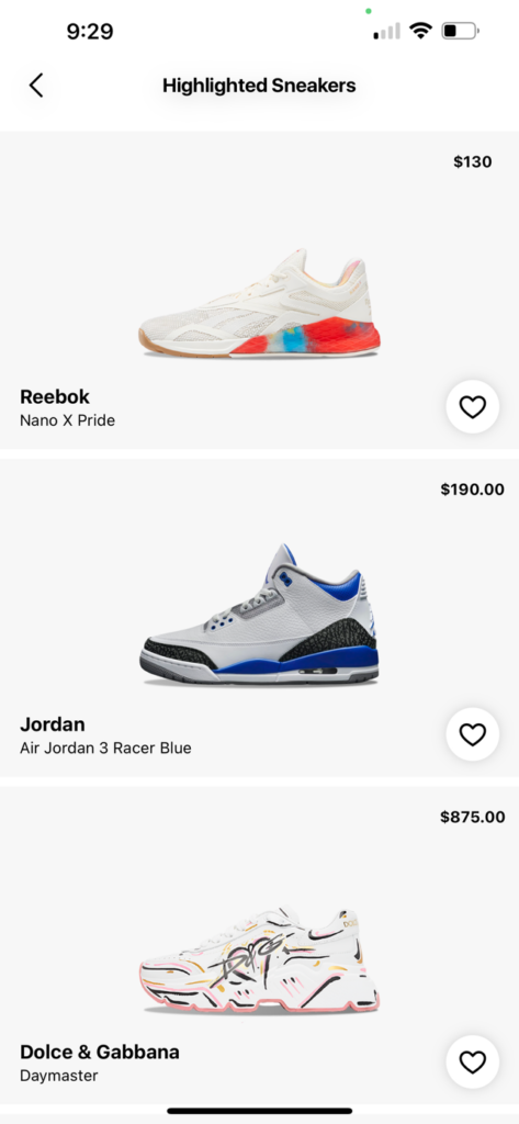
What I think the app does well is how clean it is. It looks like a high quality store app such as Nike or Zara. The UI is also very intuitive and easy to navigate through. There’s also a large catalog or shoes to choose from ranging from Alexander Wang to Carhartt. It’s also nice having a button that allows you to go straight the the website where you can buy it.

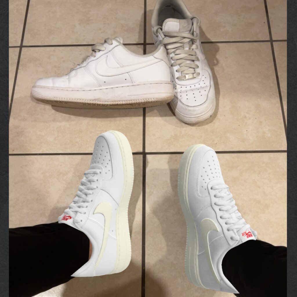
The largest critique I have for the app would be, although the catalog is large, it needs to be way bigger. I think the more shoes they have the more successful it will be. The collection they have now are high price styles and shoes that are pretty common but the range should be filled out. Additionally, some of the shoes don’t have more than one color option. An example is how the only color they have for the Nike Air Force Ones, a shoe that is known for having a lot of customizable options, only comes in a cream color in the app.

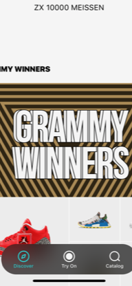
A UX/UI issue I found was on the main explore homepage, there is a navigation bar that hovers at the bottom of the screen. When scrolling to the end of the page, the bar obscures some of the images making it difficult to select those options.

Over all I think its a great app and honestly will probably keep it on my phone.

Categories
Uncategorized

AR Poster

In our AR module for New Media, were were tasked with creating an animated poster using the EyeJack app. I was familiar with AR/VR through video games ( E.G Oculus Rift ) but I never paid mind to the uses for XR outside of that realm. Once being acquainted with the technology in class, I was excited to see what idea’s I could implement.

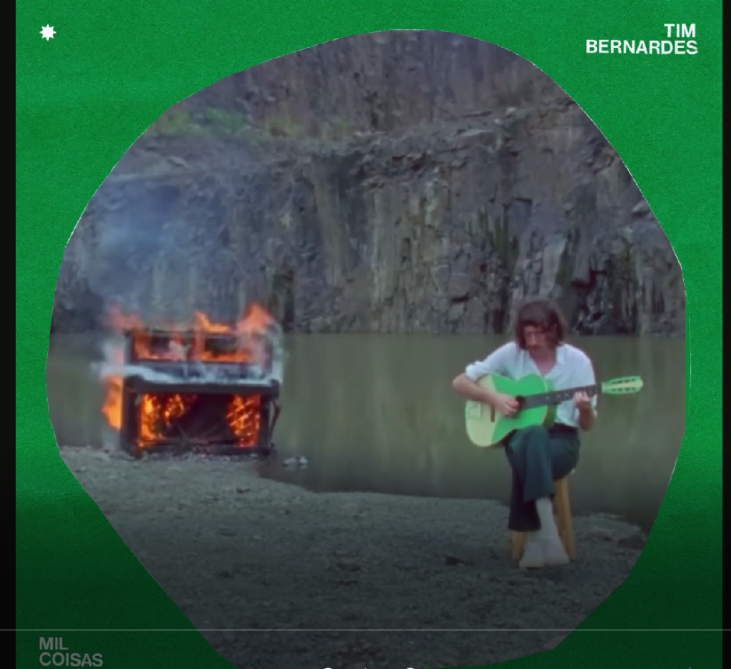
My initial design was recycling an animation I made in after effects pictured below.

After adjusting it to fit the dimensions for the project I felt although this could be seen as a cop out, so I scrapped the idea hoping for a better inspiration.

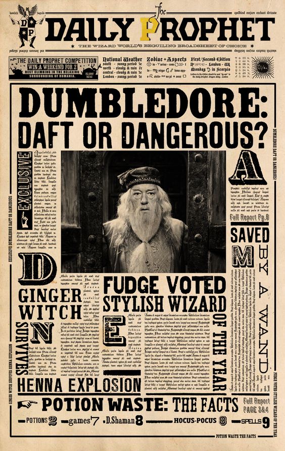
After binging 5 Harry Potter movies back to back, I came across the Daily Prophet newspaper that is heavily featured in the series. This was a eureka moment because the ideas are so similar to one another, on being magic and the other being ” movie magic” of course. The inspiration is pictured below.

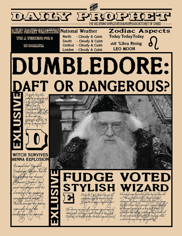
I started off by creating the poster in Adobe Illustrator, that way when I import it into After Effects, I can control certain layers specifically. It was a good exercise in creating things in Illustrator and having something to reference helped the process. The poster I created is shown below.

Once completed, I came up with ways to make the poster come alive. To do this I created, blinking exclusive sections, scrolling breaking news text, and a reveal to the articles as if appearing on the paper.

Finally I found a GIF I thought would add to the experience. I took it into Photoshop to edit the GIF slightly, such as adding grain and adjusting it to grayscale. Taking the first frame of the GIF, I exported it as an image to put for the poster. Here is the final result of the poster:

Overall, I am very happy with the result as Harry Potter is a deep part of my childhood and a fun way to play with all the skills I have learned in the last few weeks.

Categories
Uncategorized

Week 5

AJ Hanneld, a former Creative Academy student visited and talked to us about their career and the myriad of positions she held. There was a lot of crossover between film and design. It was eye opening seeing how much design and other visual media intersect between them.

Overall, my experience with the program has given me a larger perspective on what is available career wise. My idea of graphic design was pretty traditional in that I expected it to be a lot of posters, logo designs, and typography, but with having these speakers come every week to speak on major projects they’ve worked on, I see that is not entirely the case. I never made the connection that design principles are similar throughout any visual process, things like; grids, proportions, etc.

Funny enough, when I was younger I always wanted to work in film in some capacity but that idea never came to fruition. Now I see that adolescent dream might not be too far off. AJ spoke about their projects on conceptualizing visuals for movies and how they incorporated their design process and skills into creating these books to road map the aesthetic. It was really cool seeing the range at which these skills can be utilized.

Furthermore she showed us the book covers she designed. I never considered that working with a publisher could entail design practices. I really enjoyed seeing how the cover was built, layer by layer, because it showed a deconstructed timeline of elements that slowly pieced together what is essentially a graphic design.

In my own personal experience, there have been several projects that overlap graphic design with multimedia. 

The first being my first module in new media. We worked on After Effects compositions. At first I was a little confused on how this would be relevant in my goals as a graphic designer but I started to see the similarities come together when we designed an animated logo. On top of having to design a logo, I had to animate it which gave a revelation that this might be a great tool to have in my wheelhouse. Further into the module we worked on green screen and layering compositions. When working on these projects I found myself incorporating principles I learned in my intro design class such as gestalt principles and, even simpler, the attention to detail on scale and how items should line up.

Finally, for another class we were asked to create a pre- recorded lecture on a historical genre of art. Eager to incorporate my new found animation skills, I animated opening sequences, moving texts, and graphics to give character to our video. I felt really accomplished in doing so. In most learning environments I’ve been in, it felt like I was learning skills to pass a test and dump them the minute they were not relevant for the next test. The contrary is the case in the graphic design program where skills I learn from any class, whether a graphic design or animation segment, can be applied to any project and will likely be utilized in some capacity further along the road.

11NOV2022

Categories
Uncategorized

Week 4: Amazon

    This week we had Margaret Darcher speak to us about the core leadership qualities Amazon workers strive for, some of which being; learn and be curious, insist on the highest standards, and bias for action.

    When starting out in any position in a workplace, I have always tried to be curious in what I am doing. It stems from not wanting to sandbag the team. I want to learn as much as I can so I can contribute to the group. Usually to prove myself I will go the extra mile and find ways to improve any situation I find myself in.

    Working in the Department of Defense, attention to detail is a must. These positions insisted on high standards and I have become adjusted to double checking all the products I submit to make sure they meet or exceed expectations.

    Bias for action to me entails that you are proactive with your work. That you understand the full impact of what you are doing and implement safeguards that ensure the success of the team. Again, working in the Department of Defense, you are encouraged to see the full scope of your work and have the foresight to mitigate any potential technicalities that exist.

    Perhaps a leadership quality I do not have a full grasp on is “ having a backbone”. In the situations I have been in, there is a clear hierarchy of authority. Amongst my peers I have no problem discussing my opinions but when it comes to managers or higher ups, I have trouble speaking up about potential road bumps. Sometimes it is hard to speak out against upper echelon because they may have a perspective that you are unable to see.

3NOV2022

Categories
Uncategorized

Week 3: saying yes

This week we had the pleasure of having Jessica Aceti provide us with a pep talk on saying yes to opportunities, collaboration with fellow artists, and experiencing all aspects of your field. The talk was quite informative and reaffirmed the thoughts I already had on how I should be spending my time and creative outlook. I hope to carry this with me throughout my time here and into my career.

I do consider myself somewhat of a yes man. I am a social butterfly and enjoy going out with friends, so when invited to do so, I rarely miss the opportunity. That being said, on a more professional front, I tend to shy away from taking those chances. I believe this stems from an insecurity of my ability to preform. I tend to minimize myself and what I am capable of, so when presented with an opportunity I feel although I will be a hindrance.

Deciding to enter school for graphic design exemplifies this tendency but my perseverance to go and get what I want. I hesitated going back to school for a few years, constantly switching back and forth what would suit me the best. Graphic design was always on the forefront of my mind but I would compare myself to other creatives I know and often times felt out of their league and incapable of what they could ever do. What I never took into account was all the years of hard work they put into their craft, whereas, I am relatively new and still discovering what I enjoy doing.

The more time I spent around these creative though, the more I saw their journey and how they got to where they are today. This demystified my perception and encouraged me to follow through with my plans to enter the design program. I’ve learned to give myself space to grown and be alright with where I am at but have confidence in what I have already accomplished. It honestly feels like a ball rolling down hill and there is only more momentum to come. 

I hope to carry this confidence with me the next time I am offered a project from my friends or, better yet, an internship where I can incorporate what I’ve been learning towards real projects.

27OCT22