Blog Assignment #8

Freedom to Express: For “Freedom to Express”, I would make a colorful abstract painting. Bright colors would be splashed and dripped all over the canvas in a wild, messy way. But within the mess, you would be able to see shapes and forms – maybe a face looking out or a figure with arms wide open.

Freedom to Explore: For “Freedom to Explore”, it would be a story showing a young person’s journey of self-discovery. At first they would feel trapped, hemmed in by pressures from society and what’s expected of them. But then something sparks their curiosity about the great big world out there. They break free wildly – you’d see images of vast landscapes, new cultures, and mind-opening experiences flashing by quickly.

Freedom from Expectation: For “Freedom from Expectation”, I imagine an animated character trapped inside a box (representing others’ expectations). But then the box breaks apart, and the character keeps shedding fake identities forced on them, until they reach their true, authentic self. Their true self is shown as a simple, glowing orb that floats free of any expectations, changing shape freely based on its own nature.

Spring Blog assignment #6

Sunday is Mother’s Day. For this week’s blog assignment, you need to design something that is inspired by your mother, that would be installed in the central staircase. You have the entire staircase, but do not need to use the entire staircase. It could be a mural, but it does not need to be a mural. You need to work with the existing structure and lighting.


For my installation I propose creating a large-scale, uncolored picture by number. This interactive piece would pay homage to the artistic talents of my mother.

Students and visitors could be invited to color in the numbered sections of the design, gradually revealing a stunning visual representation of the bond between a mother and child. As each person contributes their unique touch, the artwork will come to life, symbolizing the nurturing and creative guidance that mothers provide, much like the process of coloring within the lines.

Food Truck Design

IKEA logo made "future proof" in subtle redesign by Seventy ...

IKEA Swedish Bistro

Swing by the Swedish Bistro for a quick, convenient snack after checking out! You’ll find hot dogs, ice cream, pizza and more delicious bites your entire family will love.

IKEA is a beloved global brand known for its affordable, functional home furnishings with a distinctive Scandinavian design aesthetic. Founded in Sweden in 1943, IK

EA has grown into a household name with stores in over 50 countries worldwide. At the core of IKEA’s philosophy is democratic design – creating simple, innovative products at prices so low that as many people as possible can afford them.


The IKEA Swedish Bistro food truck brings the beloved taste of Sweden directly to neighborhoods and events in a compact, functional, and sustainable mobile design. Drawing inspiration from IKEA’s signature minimalist Scandinavian style, the exterior features a bold blue and yellow color scheme with the iconic brand logo prominently displayed. Playful graphic illustrations of classic Swedish dishes like meatballs and princess cake adorn the truck, creating an inviting

and mouthwatering backdrop.

Key Design Solutions

Brand:

  • IKEA brand language of minimalism, function, sustainability and a casual vibe
  • Vibrant colors and patterns create an energetic, cheerful atmosphere

Exterior Design:

  • Bold blue and yellow color scheme reminiscent of the IKEA brand
  • Large graphic branding area for the IKEA logo and playful illustrations of Swedish foods
  • Service window on one side for ordering and pick up

Sustainability:

  • Eco-friendly construction using renewable/recyclable materials
  • Energy-efficient appliances and lighting to reduce environmental impact

Sustainability is at the core of the design, reflecting IKEA’s commitment to environmental responsibility. The truck’s construction utilizes eco-friendly, renewable, and recyclable materials wherever possible. Energy-efficient appliances and lighting reduce its environmental impact, while comprehensive waste management systems allow for composting and recycling.

Throughout, the Swedish Bistro truck embodies the IKEA brand experience – a minimalist yet vibrant aesthetic, a focus on functionality and efficiency, and an inviting atmosphere that encourages community and socializing. From the ordering process to the dining area, every touchpoint aligns with IKEA’s design principles, creating a truly authentic and memorable Swedish culinary adventure on wheels.

Spring Blog Assignment #4. Blender Collaboration

You all recently screened your Blender Project videos, and all us readers instructors feel that collectively they were among the strongest sets of videos we’ve seen for this project.


Please write about your collaborations, and especially focus on what went WELL. This is your chance to pat your teammates (and yourselves) on the back!

For the movie project, I worked in a group with Erik and Julian. Despite it being our first time collaborating together, I’m happy to say it was several weeks of very comfortable teamwork.

Right from the start, we were on the same wavelength. Finding a common language and brainstorming ideas came easily. We meshed well by utilizing each other’s strengths. Julian helped ] by cleaning up the script and providing valued insights into the production process. Erik is a masterful writer who contributed greatly to making our script feel realistic.

The movie wouldn’t have been possible without the incredible help from our classmates. Sergio was our second lead actor, impressively performing in two films back-to-back that day. Leigha assisted Julian with sound direction. I like to think I played a vital role as the on-set project manager.

When we nearly lost our shooting location, Cedar went above and beyond by sacrificing her space for us and another group to use. That selfless act really exemplified the collaborative spirit of our class.

It’s always a challenge working with new people, but I’m so grateful to Erik and Julian for being such respectful and responsible partners. We meshed well right away by finding common ground, utilizing each other’s talents, and leveraging the skills of our classmates. Despite being thrown together, the collaboration flowed smoothly from script writing through production.

The entire experience was a testament to how a dedicated team can produce great work even when joining forces for the first time. Being receptive to new ideas, dividing up responsibilities based on strengths, and drawing on the full talents of the group allowed us to thrive.

Spring Blog Assignment #3. You have $25,000 …

You have $25,000 of spare cash on hand. You can choose ONE Seattle-area non-profit to donate the money to.

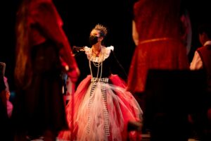
Every month I volunteer in a local children non-profit theater. If I had $25,000 I would like to donate it there. This place is so important for kids, especially teens. 

The Bellevue Youth Theatre (BYT)
is dedicated to providing theater arts opportunities for all young people, regardless of income or ability. The Theatre stages quality productions that are both entertaining and socially relevant.

With $25,000, the theater could give money to help pay for kids from poorer families to join the programs. For some children, this may be their only chance to try theater and to spend time in a warm company with other kids. Getting involved could change their lives by giving them confidence and creative skills.

The money could also go towards putting on bigger and better theater shows for the kids to perform. With more funds, they could have nicer costumes, better sets and stage equipment. This would make the experience of being in a play even more exciting and rewarding.

Part of the $25,000 could be used to hire more teachers too. With more teachers, the theater could offer more classes like acting, writing plays, working on sets, and running the tech stuff. More classes means more opportunities for kids to discover what they love about theater.

The donation is also helpful for just keeping the theater running day-to-day. The money ensures they can pay rent, utilities, and general expenses. This allows the theater to keep going for a long time and keep serving kids.

Kids who get involved with theater grow so much. It boosts their creativity, communication skills, and self-confidence. Giving $25,000 to this local theater means giving back to the community. It directly benefits underprivileged kids by opening up new artistic experiences. Overall, this donation creates invaluable creative opportunities for children.

Photo credits: Kate Rumyantseva


Spring Blog Assignment #2. Moodboard

The Stanley 32 oz Dog bowl

The Stanley Dog Bowl keeps your adventurous pup hydrated on every outdoor excursion. Crafted from durable, insulated stainless steel, it keeps water cool for hours and won’t tip over. The built-in handle makes it easy to carry, wherever your adventures take you and your friend.

Stanley Signature

Primary Color: Stanley’s classic green (Pantone 349 C or similar)

Spring Blog Assignment #1. Design systems

A design system is a collection of reusable components and assets, guided by clear standards of use. It provides resources, guidelines, and a shared language for anyone involved in designing and building a product or brand. Within a design system, you can find both a style guide and a pattern library.

Seneca Harper personal website

  1. Typography: The site uses a clean, modern typography system with a primary sans-serif font for headings and a serif font for body text. They are well-balanced and create a consistent hierarchy.
  2. Color Palette: The color palette is quite minimal, primarily using a neutral grayscale with accents of a deep navy blue. This palette helps create a calm and focused atmosphere.
  3. Interaction and Animations: hover effects, smooth transitions and parallax scrolling made in one style and added a sense of interactivity.

Holland America Line

  1. Typography: A good combination of a sans-serif font for headings and a more traditional serif font for body copy. The font sizes, weights, and spacing create a clear hierarchy and readability.
  2. Color Palette: The color palette is primarily based on the Holland America brand colors – navy blue and various shades of blue and gray. These colors are used consistently across the website.
  3. Accessibility: As Seneca mentioned their design system  have been developed with accessibility standards, with appropriate color contrasts, clear labeling, and keyboard navigation support.

IBM Carbon Design System

Carbon is IBM’s open source design system for products and digital experiences. With the IBM Design Language as its foundation, the system consists of working code, design tools and resources, human interface guidelines, and a vibrant community of contributors.

  1. Interactions and Animations: hover effects, transitions, and micro-interactions provide responsive user experience.
  2. Typography: The site utilizes the IBM Plex family of fonts, including IBM Plex Sans and IBM Plex Serif, for headings, body text, and UI elements.
  3. Color Palette: The color palette is centered around IBM’s  blue shades, complemented by a neutral grayscale and accents of green, red, and other supporting colors. The color usage aligns with the Carbon color guidelines.

My creative process


Your blog assignment this week is to use video to document the creative process of one assignment you have to complete for another class.

Watch online

Illusion helps create cool visual tricks that grab people’s attention. One illusion is cutting the sides of shoes in special ways. This gives them more depth and makes them look like they are moving, or not. Illusion isn’t just a cheap trick. It allows you to try new things, break the rules, and make a work that excite people’s imaginations.