Categories
New Media

Blog Assignment #4 – International Work Opportunity

For this assignment, I was tasked with thinking of a country that I would like to work in, while considering the circumstances and challenges that come with moving there.

I chose Hong Kong, a special administrative region (SAR) of China because of my heritage, and my interest to return there for a visit one day. Being a graphic design student, I scouted for jobs relating to graphic/motion design on Google, and selected a few that I had notable opinions about.
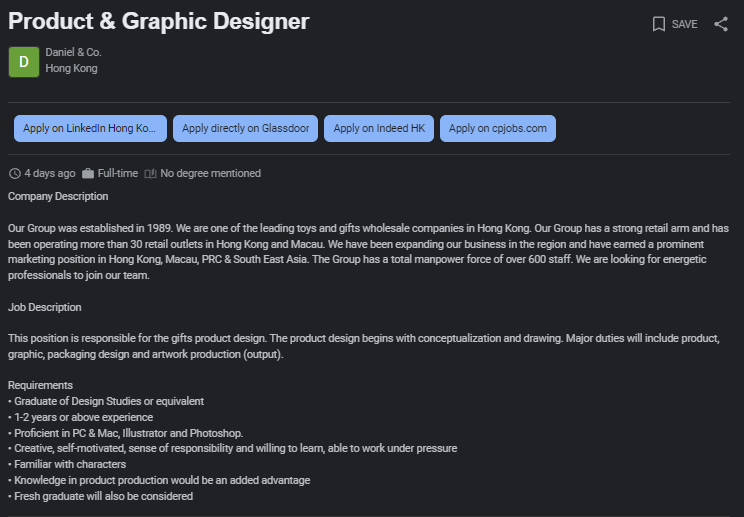
This one has many expectations, probably wishing for a unicorn.
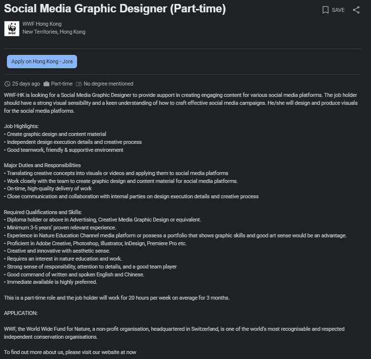
This one is more reasonable, lists relevant software skills and some work experience.
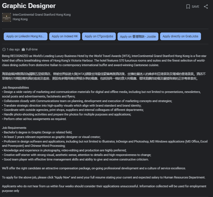
Requirements are up to interpretation on what responsibilities an applicant should possess.
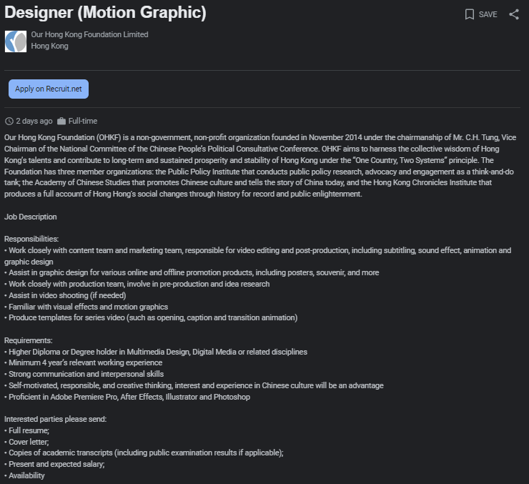
Reasonable requirements, lacks any mention of benefits

These were all mid-level to senior-level positions; I couldn’t find any junior ones or any internships, which is unfortunate for new designers looking to step foot in the industry.

I’d like to claim that the market for a graphic designer in Hong Kong isn’t as large as it is here, which is probably true considering the high unemployment rate among young generations, popularity of social media tools, and advancement of AI services.

The cost of living in Hong Kong is extremely high – most people there only have enough for an extremely small, single-room apartment to live in. I highly doubt that a single mid-level graphic designer’s salary is enough for purchase anything more than that, which is unfortunate.

Overall, I would need to consider more factors such as culture, different climate, language barriers, and other variables in order to fully decide whether I would actually accept an to opportunity to work there.
Categories
New Media

Blog Assignment #3 – Time Management

For this week’s assignment, I was tasked with tracking what I did during the week. I kept track of everything by creating a series of tables for each day of the week and sorting each task by the time of day and wither it was school related, or personal.

While I already keep track of my school-related tasks using this table system, I don’t see myself keeping track of my personal tasks moving forward because they don’t have a set due date, and instead can be completed interchangeably throughout the week.

Saturday 10/21:
MorningAfternoonEveningNight
School:NothingUpdate HTML DocumentStart on New Media BlogNothing
Personal:Cook breakfastOrganize foldersPlay some gamesSleep
Sunday 10/22:
MorningAfternoonEveningNight
School:NothingWatch Illustrator tutorialsConcepting for New Media ProjectCreate mockups for New Media
Personal:NothingRead book from librarySort Youtube PlaylistSleep
Monday 10/23:
MorningAfternoonEveningNight
School:Present HTML MockupRead HTML articlesWork on presentation slidesFinish shape sketches
Personal:NothingRead book from libraryFinish Reading bookMeal prep
Tuesday 10/24:
MorningAfternoonEveningNight
School:Listen to lectureWork on presentation slidesFinish Illustrator projectNothing
Personal:NothingWatch Youtube VideosLearn new recipeSleep
Wednesday 10/25:
MorningAfternoonEveningNight
School:Print out and present Illustrator posterListen to line/width tool tutorialFinish logo conceptsNothing
Personal:NothingVisit a grocery storeWatch Youtube VideosSleep
Thursday 10/26:
MorningAfternoonEveningNight
School:Share logo conceptsImplement feedbackDraw in IllustratorMockups for New Media
Personal:NothingRead books in school libraryCreate social media postersSleep
Friday 10/27:
MorningAfternoonEveningNight
School:Attend PresentationFinish New Media Remix AssignmentRefine HTML documentNothing
Personal:Create shopping listVisit LibraryWatch Youtube VideosOrganize Images
Categories
Weekly Assignments

Blog Assignment #2 – Fish Out of Water

For this assignment, I downloaded the Polycam app on my phone and scanned a plushie of a Pokémon to created a 3D model ready for AR use. It took around 50 images to create a model that had acceptable captures at all angles. I realized after filming that some of the fins and lower body were cut off while I was cropping, which could’ve prevented by placing the plushie on an elevated platform while taking pictures.

Next, I thought about where I should record the AR video. I decided to venture out to the fountain at Cal Anderson Park because of the shallow and flat body of water that is both conveniently easy to film at, and close to campus.

Unfortunately, I was unable to place the model on the water (I don’t think Polycam can support placing objects on anything other than solid ground). Instead, I placed the model on the rim of the fountain, which wasn’t quite what I had in mind for, but close enough. I noticed that the AR camera feature also buggy and user-unfriendly while recording; the buttons were very small, and had to be pressed on a few times to get a response, and the model disappeared at some angles.

The original video was too large to upload to this blog, so I had to compromise on the resolution, length, and framerate by editing it in Premiere Pro, and reducing the file size with HandBrake afterwards, which was a hassle.

Anyways, this is the (f)in(ish)ed video of a fish out of water. Enjoy?

Categories
Weekly Assignments

Blog Assignment #1 – Music Poster

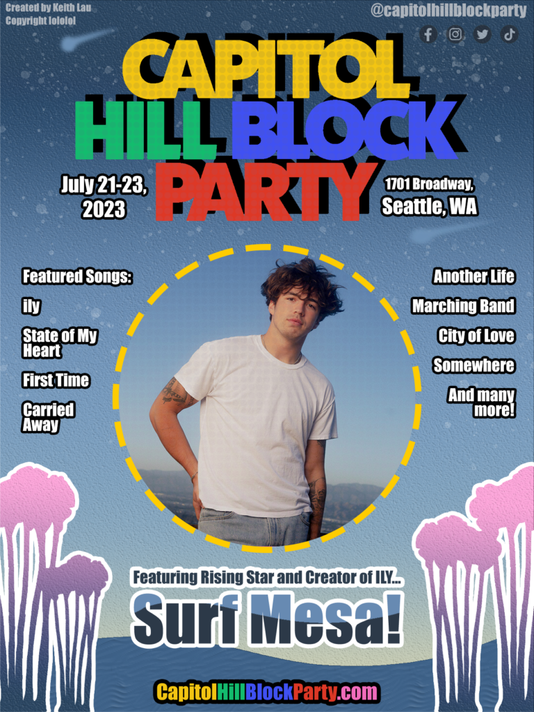
I was tasked with creating a fictional promotional poster for CapitolHillBlockParty (a music festival located in Capitol Hill that hosts local celebrities in their events) featuring Powell Aguirre, more famously known as Surf Mesa. He creates electronic music videos with relaxing, and somewhat nostalgic visuals that pairs well with the simple and relatable lyrics of his songs. I decided to create the poster with a visual style poster that’s easy on the eyes, and provides enough charm to get current and potential viewers hyped about attending.

With these details in mind, I created this poster in Photoshop that I believe would fit in perfectly with capitolhillblockparty’s previous line-up of posters.

I wanted to reflect the vibrant visuals featured in his music videos and the cover photo in the poster with a starry sky aesthetic that is easy on the eyes, and provides a high contrasting background with the other assets and information.

The color scheme features a dark to light blue gradient, with a subtle tint of yellow on the bottom with various “stars” in the sky to imitate a beautiful evening sky that evokes feelings of tranquility as an eventful day ends with an exciting concert that will soon begin.

The poster doesn’t compromise on providing relevant information by placing it easily-seen areas that don’t overcrowd the poster, which leaves enough space for every piece of information that doesn’t obstruct or distract from the main focus of the poster.

For instance, the trees in the foreground are a reference to his most famous music video, ily (YouTube) for fans of his music to associate with his image. They were placed in the corners to add a visual flair that doesn’t detract from the information for non-listeners to learn more about his music and the event.

A list of songs are listed on the sides of the cover photo to provide an easy to see list for current followers to be excited about.

A link to the festival’s website in bright, brand-themed colors, active social media links, the venue address, and event time are provided in case the viewer is interested in attending, learning more about the festival itself on their own time, or sharing the event details with their peers.

Overall, I believe that my solution is successful in translating the visual style of Surf Mesa’s image to a physical poster that covers every piece of information that both gets current fans interested in attending, while encouraging curious viewers into learning about or participating in the event.

Categories
New Media

Hello world!

Welcome to New Media . This is your first post. Edit or delete it, then start blogging!