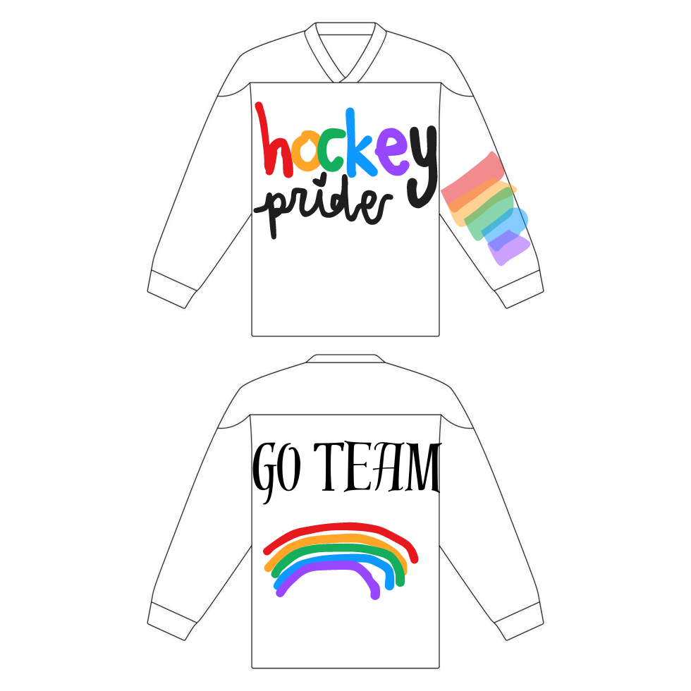
this is my hockey jersey which I did on Canva instead, because I have no idea how to use illustrator, I’m sorry.

this is my hockey jersey which I did on Canva instead, because I have no idea how to use illustrator, I’m sorry.

Freedom to Express:
To depict “Freedom to Express,” I envision a vibrant, bustling city street during an art festival. Artists of all kinds line the sidewalks, each showcasing their unique talents. A muralist paints a large, colorful wall with abstract designs, while a musician plays soulful tunes on the corner. Poets recite their work to an engaged crowd, and dancers perform in the middle of the street, moving freely to the beat of drums. This scene captures the essence of self-expression, where creativity is unbound, and individuals feel empowered to share their innermost thoughts and emotions with the world.
Freedom to Explore:
“Freedom to Explore” could be illustrated through a narrative story of a young woman traveling solo across different landscapes. Starting in a dense, mysterious forest, she hikes through towering trees, discovering hidden waterfalls and rare wildlife. She then moves to a vast desert, riding a camel and marveling at the endless dunes. Her journey continues to snowy mountains, where she skis down pristine slopes and camps under a sky filled with the Northern Lights. Each environment she explores brings new challenges and wonders, symbolizing the limitless possibilities and the joy of discovering the unknown.
Freedom from Expectation:
For “Freedom from Expectation,” imagine a graphic design featuring a person standing at a crossroads with multiple paths branching out in different directions. Each path is marked with signs of societal expectations—career, family, education, and more. However, the individual is depicted stepping off the main road, walking confidently into an open field of wildflowers. Above them, the sky is clear and expansive, representing endless opportunities. This image signifies breaking free from the pressure of conforming to others’ expectations and choosing a path that feels true to oneself, embracing the freedom to live authentically.

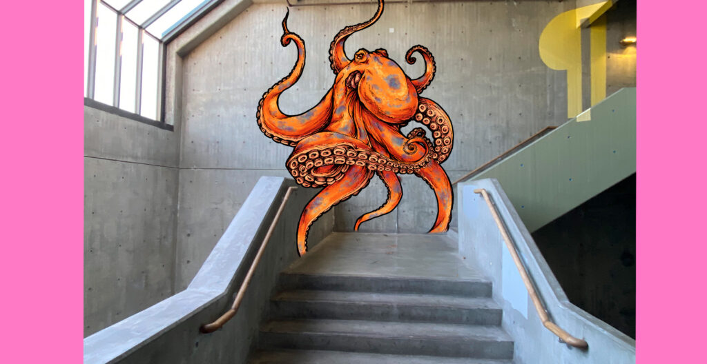
I chose to make an octopus mural for my mother because she loves octopi.
So, Taco Tango is this cool food truck idea I have. Basically, it’s all about making tacos but with flavors from different parts of the world. You know, like combining Mexican food with other stuff. We’d have things like Korean BBQ tacos and Mediterranean falafel tacos. It’s like a dance of flavors, get it?
Design and Aesthetics:
The truck would look super colorful with big, bright paintings all over it. There’d be pictures of dancers from different countries, all holding tacos. The logo would be a dancing taco. It’s supposed to be fun and exciting so people notice us.
Menu:
The menu would have different kinds of tacos. Here’s some ideas:
We’d make the tortillas fresh and have gluten-free options too. For sides, we’d have stuff like street corn and churros. And for drinks, aguas frescas.
Sustainability Efforts:
We’d try to be eco-friendly by using packaging that doesn’t hurt the environment and buying from local farms. We’d also take part in community events to support local stuff.
I came up with the idea for Taco Tango during a late-night food craving session with my friends. We were talking about how cool it would be to have tacos with different international flavors. Someone mentioned how awesome it would be to have a Korean BBQ taco, and then we started thinking about other combinations, like Indian and Mediterranean. The idea of blending different cuisines into tacos seemed fun and unique. Plus, tacos are always a hit, so why not mix it up and make it even more exciting? That’s how Taco Tango was born—just friends brainstorming over food.
Reflecting on our last project, I think one of the best parts was the group I was placed in. Despite the challenging prompts we received, we had a lot of fun brainstorming and collaborating on ideas. At first, it was quite a struggle—there was a four-hour stretch where we couldn’t find our footing—but once we landed on a concept, everything started to flow.
Being the only visual media student in my group was a bit daunting at first. I felt like I had to carry a lot of the technical work, which made me anxious. It didn’t help that I was put in charge of the camera and microphone, and given my limited experience, I felt somewhat underqualified. Thankfully, my group decided to use an iPhone for filming, which took some pressure off me. It was a relief to work with technology that we were all familiar with, and it made the process smoother.
Filming turned out to be a blast. We laughed so hard that another group actually yelled at us for being too loud, but I think that’s a sign we were really enjoying ourselves. Figuring out sets and lighting as a group was a fun, collaborative effort. I loved how everyone pitched in, contributing ideas for camera angles and scene setups. It made the whole experience feel more like a creative partnership than a school project.
I was a little disappointed to miss the viewing party where everyone got to see the final projects. I heard it was a great time, and I would’ve loved to see everyone’s reactions to our work. Still, from what I’ve heard, our project went over really well, and I was inspired by the creativity and effort everyone else put into their projects. The experience has definitely given me ideas for future work, and I can’t wait for our next assignment!
I would choose to donate to the Odessa Brown Children’s Clinic (OBCC), a branch of Seattle Children’s Hospital that provides comprehensive medical, dental, and mental health services to children and families, regardless of their ability to pay.
OBCC has been a pillar of the Seattle community for over 50 years, serving families in the Central District and surrounding areas. Its mission aligns with my belief that every child deserves access to quality healthcare, educational support, and community resources to lead a healthy life. The clinic is unique in its approach, offering integrated care to address the holistic needs of its patients. This integration includes medical care, dental services, behavioral health, nutrition guidance, and even legal support through its medical-legal partnership.
One aspect that stands out about OBCC is its focus on addressing health disparities and promoting health equity. The clinic actively works to eliminate barriers to healthcare, such as transportation, language, and cost. It also engages in outreach and education to ensure that families are aware of and can access the services they need.
Donating $25,000 to OBCC would have a meaningful impact, allowing the clinic to expand its programs and reach more families. The funds could be used to support essential services like mental health counseling, dental care, or community outreach. Given the clinic’s commitment to serving low-income and minority populations, this donation could help address long-standing health disparities and contribute to breaking cycles of poverty and inequality.
Another reason for choosing OBCC is its adaptability and resilience, especially during challenging times like the COVID-19 pandemic. The clinic quickly pivoted to telehealth services and implemented safety measures to continue providing care to families in need. This flexibility demonstrates the organization’s commitment to its mission and its ability to respond to changing circumstances.
In summary, I would choose to donate to the Odessa Brown Children’s Clinic because of its dedication to providing comprehensive, accessible healthcare to children and families in the Seattle area. The clinic’s work in promoting health equity, its integrated care approach, and its commitment to the community make it an ideal recipient for a donation that aims to make a positive and lasting impact.

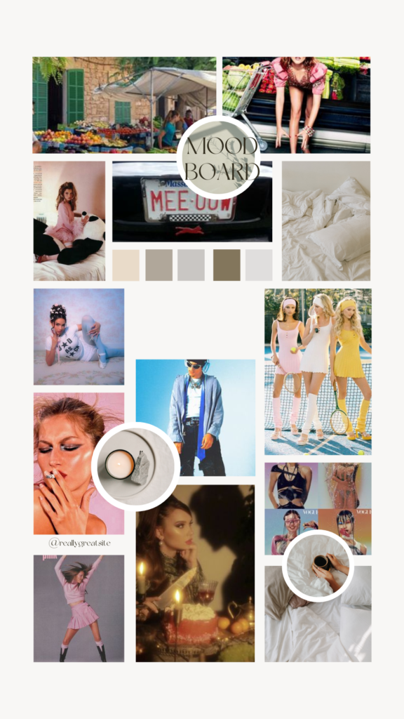
I went to 3 websites to see what I notices.