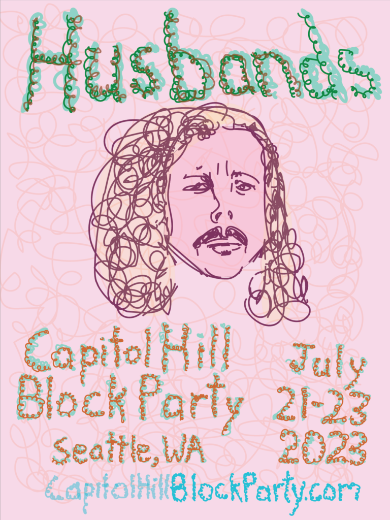
Your blog post must include your poster solution, a written explanation of your concept and a link to at least one of the bands songs.
To begin I surveyed existing art used on the band’s albums and website. There was a wide variety but a common theme was pastel colors, so I tried to incorporate some soft, contrasting colors into my design.
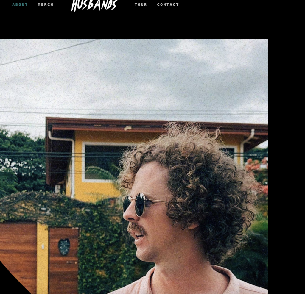
The band’s membership has changed over time, sometimes including four people and sometimes just one. The front runner and only consistent member is Danny Davis. The band’s website features Danny prominently, and some of the album art features just Danny. I decided to focus in on Danny as the front man and symbol of the band and play off his unique look–his curls.
I originally wanted the text to look like it was growing out of his hair but the composition needed more contrast between the type and the background, so I decided to create my own type with a similar stroke as I used for his hair in my drawing of him.
I also experimented with warping circles with the direct selection tool and making them transparent to use as highlight areas.
I approached the whole project nervous about my skills in Illustrator because I haven’t used the program a lot and I didn’t want the poster to look like a bunch of circles and triangles. I ended up using my cursor as a drawing tool, and I like the effect it made. However, I’m looking forward to gaining skills in Illustrator so I can make more advanced forms and not have to rely on drawing.
