Categories
Uncategorized

Non-Profit Donation

If I had $25,000 to donate to a local non-profit, I would give it to Coyote Central.

_MG_9031.jpg

https://coyotecentral.org/

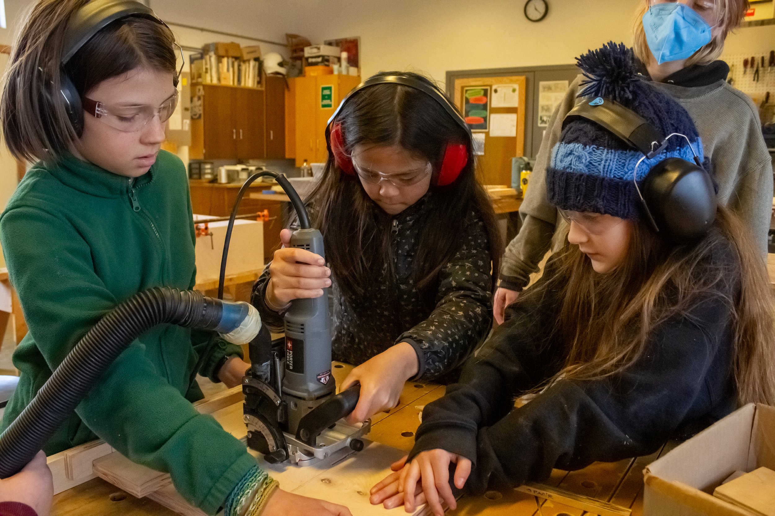
Coyote Central is an arts organization for kids. They run classes and after school/ during break programs for kids and teens year- round.

I think a lot about kids and teens and how they use their free time and what opportunities they have to connect with others. I think after school programs are so important for building connections between kids and give opportunities for kids to have older mentors. They were really important for me growing up. When my family decided I was old enough to stay at home alone and I stopped going to after school programs, I remember it being a really lonely time in my life. Childcare is so expensive, but so important, and organizations like coyote offer kids a third space to make connections and be themselves outside of school and their homes and build individual identities and explore interests. Spaces like this need to be far more accessible for all families. Most Coyote’s programs are “pay what you will,” which allows kids to access their services no matter their economic background. I also am a huge believer in the power of arts to expand minds and help individuals develop into well-rounded human beings.

I had the luck to participate in one coyote workshop as a teen and it was a lot of fun. We all worked on building a treehouse together. We learned carpentry techniques and got to meet a local craftsperson and get to know an elder in our community. It was also a great opportunity to meet other kids from across Seattle of all different backgrounds and work together on a common goal.

A donation of $25,000 would allow Coyote Central to continue offering free and low-cost programs like this to kids in need.

Categories
Uncategorized

Stanley Dog Bowl

Stanley’s Dog bowl branding takes us back to the early days of the brand, which centered the outdoors and natural colors in the design. The brand will also be dog-forward, with lots of compelling pictures of happy, healthy dogs. The outdoors should be featured prominently, but it should be an accessible vision of the outdoors, such as picnicking and car camping–not an elite form of the outdoors, such as climbing or backpacking, so that the brand may evoke a sense of nature and adventure, without being exclusive to people who may be less familiar with outdoor hobbies.

Categories
Uncategorized

Design Systems

Three Design systems I looked at: the Guardian, Audi, and MailChimp.

The Guardian:

https://design.theguardian.com/

This was the first one I checked out. It’s interesting to see what a design system looks like. In Erik’s class we’ve been making our own design systems so its interesting to see what it might look like to have a job somewhere that already has a design system in place.

I enjoy how playful the Guardian’s brand is. They have several colors, which are defined in the design system and have several tints for each. I especially like their use of highlight throughout their site, which they have defined colors for.

I’m surprised at how many variations they have for different cards, fonts, and type sizes. It all still looks cohesive, despite the many options they have to mix and match with their cards.

I also enjoyed the ways they indicate different sections of the paper with different colors for each and different rules styles for each.

I’m also just surprised at how open they are about their design systems–down to the number of pixels used to space things. I guess I’m not sure what the downside of sharing so much would be, but it’s pretty cool that they publish how it’s made.

Audi

https://www.audi.com/ci/en/renewed-brand.html

In contrast to The Guardian’s flexibility, Audi’s design site is excited to announce that now there are 3 options for how to display their iconic rings! Clearly they’re not open to much wiggle room in the expression of their logo. They express the rings should be “plain and simple” and as I looked, I saw they never have dimension, drop shadows, or color. Always flat and white or black. They also have very specific directions on how the logo may be cut off and by how much.

Also in contrast to the Guardian, Audi only has three colors–black, white and red, and does not allow tints of the red.

They only have one font, with three variations. And they don’t allow all caps.

It’s interesting contrasting this brand with the Guardian. They seem to have given themselves far fewer variation possibilities, but the site and brand are still very successful. But I guess that makes sense since the Guardian deals with a ton of words and different types of pictures, whereas Audi has a lot of similar imagery and fewer words.

MailChimp

https://ux.mailchimp.com/patterns/color

MailChimp also uses a lot of colors, which makes sense, since the deal with calendars, emails, and notifications.

I thought it was cool that in their Grid section, MailChimp designers include the code that’s used on the back end of their website to make different types of columnar layouts.

And the more I look through their site, the more I’m realizing that maybe this design system/ brand guideline is for the use of anyone who might work for mailchimp or contracts with them to refer to since there’s a lot of code on here.

They have two typefaces, a “brand typeface” and a “supporting font.”