Categories
Uncategorized

Freedom…

Freedom to Express

Freedom to Express has me thinking about how many nail art influencers instagram has been serving me lately. I’ve gotten really into nail art on instagram, and the algorithm keeps feeding me more of it. I’ve never been one to paint my nails, let alone have glue on acrylics. But I’m starting to really want to buy a set of these over the top nails. Obviously, this is somewhat the opposite of freedom since I’ve been convinced to buy something I never would have seen had instagram not found a way to capture my attention and make money off me…. But…. I’ve been embracing more over the top cutesy, girly stuff. Which is weird for me. I think its partially a teenage rebellion thing that is arriving late. My mom always looked down on women who were overly feminine. I’ve started embracing some of those things that would drive her crazy, like these totally impractical nails. It’s way more fun than never trying these things out. Anyway, I’ll probably buy a set at some point.

Freedom to Explore

Freedom to Explore makes me think of one of my favorite instagram accounts: @letspainttv. John Kilduff is an artist who makes these awesome low-budget multi media videos. They’re usually of him painting while doing other things and saying inspirational things. In this video I took a still from he’s painting, riding a stationary bike, and saying: “Life will work for you. Life will make sense for you. At some point in time, life will make sense. It doesn’t have to make sense now. It will make sense. It will come to you. Keep going. You’ll figure it out.”

I love his message, and I love the way he treats art making. For him, it’s a necessity but he’s not treating it as too precious. And he’s adding as many additional elements to the process as he can: video, riding a bike, giving a speech, sometimes playing a piano (really poorly). To me he embodies the idea of freedom to explore, and his videos, without being explicit about it, give permission to others to explore as well.

Freedom From Expectation

@webelongseattle: Annya

Freedom from Expectation made me think of a recent gallery show I saw. The show featured photographs of AAPI women holding photos of their younger selves. Each photo was accompanied by a story by the woman photographed of her name and what it means to her and how her name has changed or not changed over the years to either escape the expectations of family, or make it easier for English speaking people to pronounce, or embrace their heritage, or try to branch out on their own, or embrace their gender identity. It was a really fascinating an emotional look at what many AAPI women deal with in learning to claim their own identities through family societal pressure. It was a good reminder, for me, that you don’t know all of the pressures people are dealing with internally, and, for many, finding your own identity can be a painful process.

Categories
Uncategorized

Women in Hockey Jersey

Seattle Kraken

Categories
Uncategorized

Mural for My Mother

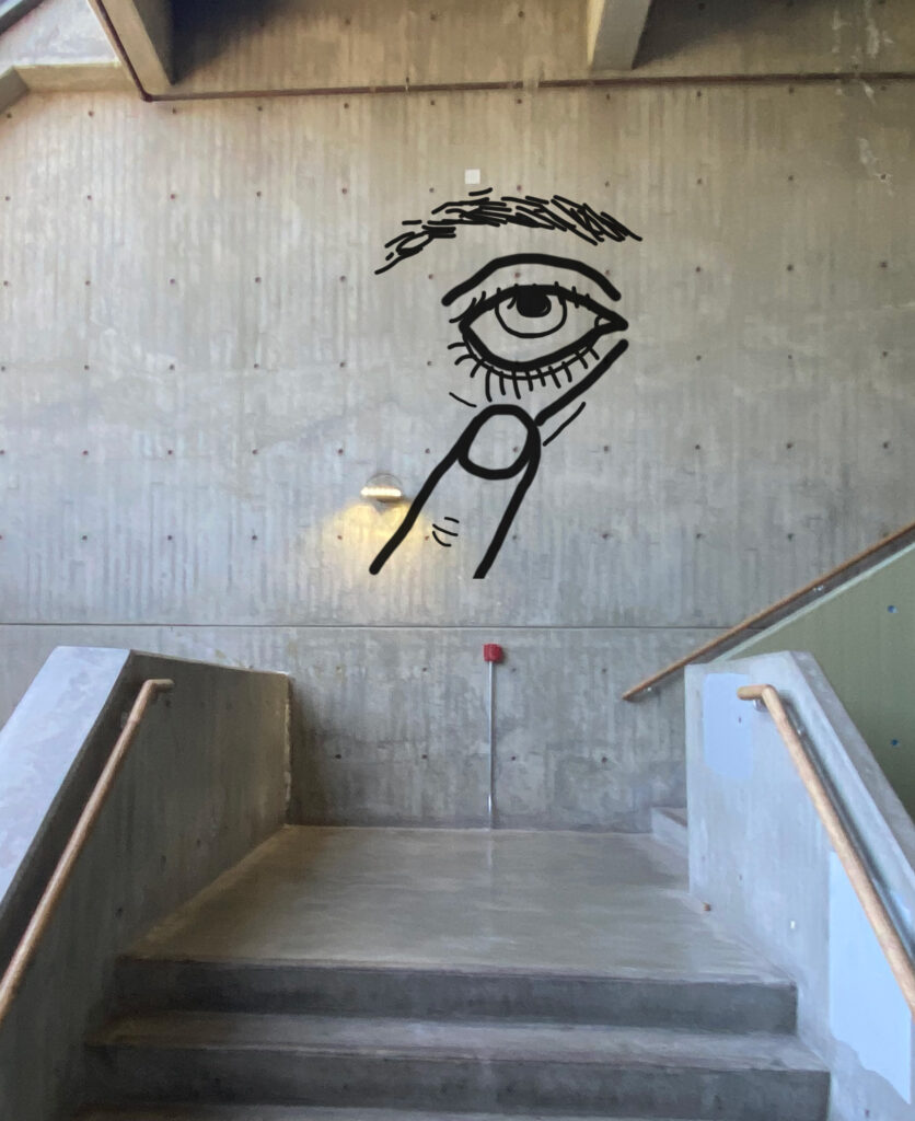
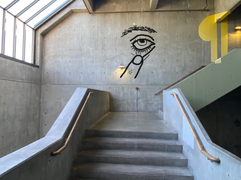
Here is my solution for a fun mural representing my mother.

My mom is very expressive and goofy. When we went to italy when I was young, my mom loved the facial expressions and hand gestures the Italians made.

Ever since that trip, my mom has loved to do this facial expression where you use your finger to pull down your lower eyelid. It’s something you might do behind another person’s back to say “don’t believe a word of this bullshit.” Or jokingly to a friends face to suggest they’re stretching the truth.

Its sassy and pokes fun in a friendly way. I love that my mom attached to this gesture and it always makes me think of her.

Categories
Uncategorized

Bongos Food Truck

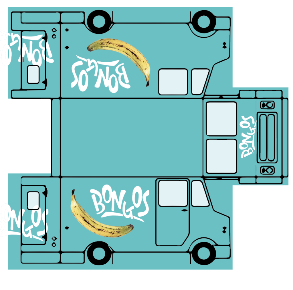
I chose to design a food truck for Bongos because I live near there and I love them for many reasons. First, they have great food. But more importantly, the architecture of bongos is delightful. It’s right on aurora in a spot you wouldn’t think would work for a restaurant, and, until recently the eating area was picnic tables in sand. It just has such weird and fun vibes.

Also, last time I was there I saw they had merch, which I got so excited about, but then I saw they made a terrible logo with a tribal man playing bongos that’s pretty distasteful. I really love what they did with the lettering, though, and I’ve been wishing they had sweatshirts with just the lettering and not the character.

So for designing the food truck, I immediately knew I wanted to use their new lettering. I wanted to incorporate bright colors that they have at the restaurant and evoke the colors of the Caribbean, which is the type of food Bongo’s serves. I also thought it would be fun to incorporate a plantain into the design of the truck since almost every dish there features plantains. It also contrasts nicely with the bright Caribbean teal/blue I chose for the truck and gives it a fun vibe.

I think this design is clean, simple, and modern. It’s not overcrowded with information, yet it makes a strong, memorable statement. The bright blue and the plantain will make the truck memorable as well as playful and will draw people in. The design is in keeping with Bongos’ sense of fun and adventure, as well as mystery. I think among other Seattle food trucks, it would really stand out. I would eat from this food tuck!

Categories
Uncategorized

Blender Reflections

I had a lot of fun collaborating with Walker and Dean for our blender video project. This was my first time meeting and talking with either of them and they are both delightful people.

We took a lot of time to brainstorm our story idea which was a very collaborative process. Walker especially was a good editor. I had a lot of ideas but he was good at noticing when a line or story point wasn’t quite right and needed work, which was very helpful.

We had trouble getting past or original idea of having it all be a dream. In the end, though, I think we simplified our story in a way that made it make more sense.

It was really great seeing how Dean’s creative mind worked. He had a lot of ideas off the bat of the tone of our video. He brought the element of unsettling horror to our movie. He had a lot of ideas of how to translate that into lighting and different types of shots. He said editing was his favorite part of the process, which he did a great job at, but I think he’s underselling his abilities as a videographer. He had a strong vision for how he wanted to shoot each shot and what the lighting needed to be. He had a lot of nervous energy about him but I could tell it was from wanting everything to be perfect.

We all had fun building our set and finding outfits for our characters. Walker did a little bit of voiceover work for the event announcer in our movie.

Overall, the project was a lot of work and involved a lot of planning, but it was a really great experience. I’ve never put together a video like this before and I learned a lot from it. And I really enjoyed seeing everyone else’s videos as well. It was also a great way to get to know some visual media students and have a project that played to their strengths. I also tend to freeze up when coming up with ideas out of the blue, so it was really freeing to have our three sticky notes. It felt like the story wrote itself and we were just there to facilitate it.