New Media
Fall 22

Mash Up
Inspire by Paolo Tossolini’s mash-up concept, I decides to use After Effects, typography, and music as elements to describe my experience thus far in the Creative Academy program. I decided to mash up my comfort zone -music- with one of the classes that have challenged me the most- After Effects. I used this importunity to practice conveying my experience so far. That said, my inspiration for the assignment is feeling like fish in the water. Even though is a new place and at time feel overwhelming, it also feels a sense of belonging in the program. I’m ready for the ride!
Spectrums
In the first three week of the program I am learning many areas of graphic design. How it can be explored and applied. Additionally to that, learning different perspectives and insights from Joe Hallock, the principal design director at Microsoft on the importance of considering where our focus of work will land is significant. As Hallock mentioned, there a crucial way to observar it from broad audience to specific audience and from high information destiny to low information destiny.
I’m learning at this moment that the broader audience to low information density and the Broader audience to high information density spectrum is where I am interested too. Such as museum exhibitions curating and understanding how every element plays a role in an exhibit to airport signing is an important part of the commute for travelers all over the world. The curating and understanding of how every element plays a role in an exhibit. Also, I would like to be more involved in web design and mobile design, and in addition, packaging design in this field can provide experience.
Challenge
There are many experiences in my life that I was never truly prepared for no matter the amount of preparation I put on –I can only say I survived them. That said, in my professional life there is one of many experiences that is fitting for this conversation. It was the first time I was an on-site chef. To be honest I really underestimated what to expect but I thought it would be as easy as just putting food on the plate or not interacting with the client or the guest. Something that I was not comfortable with. Once I got there, there were a bunch of things that clearly I was not prepared for. The First overseen, underestimate timing. We got to the venue on time but it wasn’t really a schedule to specify the urgency of things so with that rather than asking about the time. I assume that this will be communicated to me. Consequently, not realizing the amount of time that will be spent plating. As a person who likes attention to detail, I took my sweet time preparing and presenting the dishes. Obviously, my action put us behind to serve the dishes.
Lastly, speak with the guests and the client about the menu. I was an extremely introverted person a few years ago and the mere thought of talking to strangers was terrifying. Eventually, I came out of my shell. But talking to strangers is a muscle that needs to be practiced constantly. For this event, the client and guest wanted to complement the dishes. When that happened I froze. I didn’t know how exactly to even receive a compliment. I learned valuable lessons with this experience such as preparation, time, and not underestimating that communication skills, Aloof these components, are important to make an experience memorable.
Principales
There are various leadership principal what we get exposed through our professional life regardless of the field we were work on were it land on the food industry or tec industry there is the communality of leadership principle regardless of our position in the company.there will be many time where make decision base on any of this principles. Those are: Customer Obsession,Ownership, Invent and Simplify, Are Right, A Lot, Learn and Be Curious, Hire and Develop the Best, Insist on the Highest Standards, Think Big, Bias for Action, Frugality, Earn Trust, Dive Deep, Have Backbone; Disagree and Commit, Deliver Results, Strive to be Earth’s Best Employer, Success and Scale Bring Broad Responsibility.
Hire and Develop the Best: In my previous jobs I had the opportunity to train cooks and servers in various places that I work for. It was important to communicate the techniques and the standard of the company highlighting the importance of teamwork, that we can all learn no techniques, planning ahead, manage their own time and work from our strengths. The goal was once they are familiar with this parameter they can become autonomous and make a decision based on the standard of the company. I understand that training employees can make a big difference on a company’s strength. For that reason, I took ownership and commitment to train every new employee and held myself -as trainee – to high standards. Not only benefiting the company, but also the new employee and the rest of the team.
Have Backbone; Disagree and Commit. Disagreement with a purpose is an art that not only includes bringing the disagreement to the table, but it is necessary to elaborate on the problem, attentiveness, listening, and a possible solution are important ingredients for a more productive environment. This combination has been the most challenging in my professional life, rewarding when it hits the mark or unproductive when it misses it. Disagreement is an area I am curious to learn and develop with the understanding that if it brings a long-term solution it is worth voicing it.
Exposure
From this week Guest speaker AJ Hanneld,Creative Academy class of ‘17 provides us with a clear example of crossover between Graphic Design and Visual Media fields exemplifying how both fields contribute to her work highlighting how both are connected and not separate fields. It was fascinating to observe the crossover between the design and the visual media world; in addition to learning that they are not separate from each other.
As well, how having an open mind to learn them and apply them into her work. In fact, to understand that both are collaborative is fundamental to showcase a more cohesive work, and an essential tool to reach a wider audience on our work. My first impression of the guest speaker experiences and learning through the new media classes is how fascinating it is to learn various tools and software to make a design more dynamic. Is worth mentioning that learning new skills has been challenging but to understand that is important to make us well rounded professionals, the idea of collaborating and gaining new skills is exciting. Definitely learning how visual media and graphic designers make a cross over opens the door to different perspectives, point of view, collaboration and opportunities.
For example, for history class mid-term projects, we utilize video to showcase activism and protest in a documentary format. Not only I got the chance to learn LGTBQ+ community and the struggle that the community face in history time, but also learn how used the tools for the production. As a team, we utilized cameras, audio equipment, lighting equipment and staging, teleprompter, editing and After Effects. None of this is part of DES, but knowing how to use them made the difference in our presentation. The combination of all this visual media tool gives a little more sophistication to our project. It was fundamental for the project for presentation, and distribution.
For starters, I was not familiar with the visual media equipment that we used. The project made it clear that having an overview of it is important and will be beneficial for future projects. I’m absolutely curious to learn more about it and the many ways I can apply the various areas of Visual media. To begin with photography and video recording and continuing with Affect Effect. This experience made it clear how essential it is to learn this skill and provide top notch work and performance.
Is early to say which area of visual media will be used in the future and how I will be able to apply them but the understanding of the skill and how to apply them will be pivotal in my present and future work.
In all, with this experience, it is made clear how DES and VME fields are interconnected and are absolutely a must to learn and get familiar with. The project’s process and application of visual media have opened my curiosity for learning what other VME tools are out there that can enhance my work as a graphic designer.
Ar Poster: Holiday Card

With the holidays approaching fast it is a great opportunity to create an AR poster project called “Holiday Card”. A simple poster is a Christmas tree, but seeing it through the lens of AR draws you to the holiday spirit with whimsical snow, warm light, and greeting with playful presents.
Augmented Reality Card
How did you come up with your idea? The idea for the Ar comes from the holiday spirit that we are in right now. Using as an inspiration a holiday card. I incorporated Photoshop to create a playful typeface. There were many issues I run through. First, get familiar with exporting layers from Photoshop. Secondly, assign behavior to each asset. Lastly, make a dynamic card. To solve two out of the three I reach out to peers- shout out to Cindy and Jeff for walking thought to the issues- and watched Behance videos. Overall what an interesting project to work on, but definitely I have a lot to improve.
AR APP – UI/UX Review
Ikea Place is an app that provides an Ar tool for DIYers, Interior designers, or anyone who needs a piece of furniture. At first, the app looks promising, selling the idea of no more hassle of purchasing a piece of furniture that does not fit, avoiding returning it, or bringing a picture of how will look to the customer’s home. Ikea Place has some improvements that can potentially improve the experience. Such as a form of introduction on how to use the app to more accurately measure and find the particular item. Another improvement would be to have a majority of the items available on Ar which is what the app is about. Overall is a great idea, but the features need a lot of improvement.
Ar Panel Project: King County Beaches

https://youtube.com/shorts/o67gFN7Yz2w?feature=share
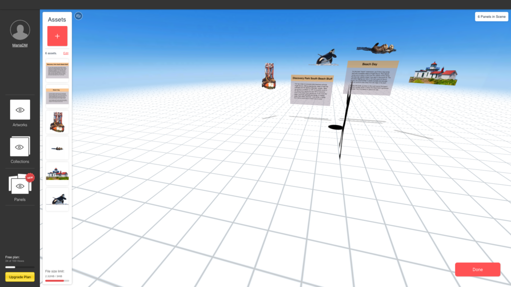
For Our Final Project, my team and I decided to focus on Seattle Beaches. For my Ar panel project, I focus on a tourist /new in the city point of view. I wanted to use this experience as a short guide to facilitating the experience of the user. It can be a way for the city of Seattle to provide more guidance through parks in the region and to create the panel I utilize Photoshop, After Effects, and Illustrator. converting them into png, gif/video\
Redesigning Creative Academy

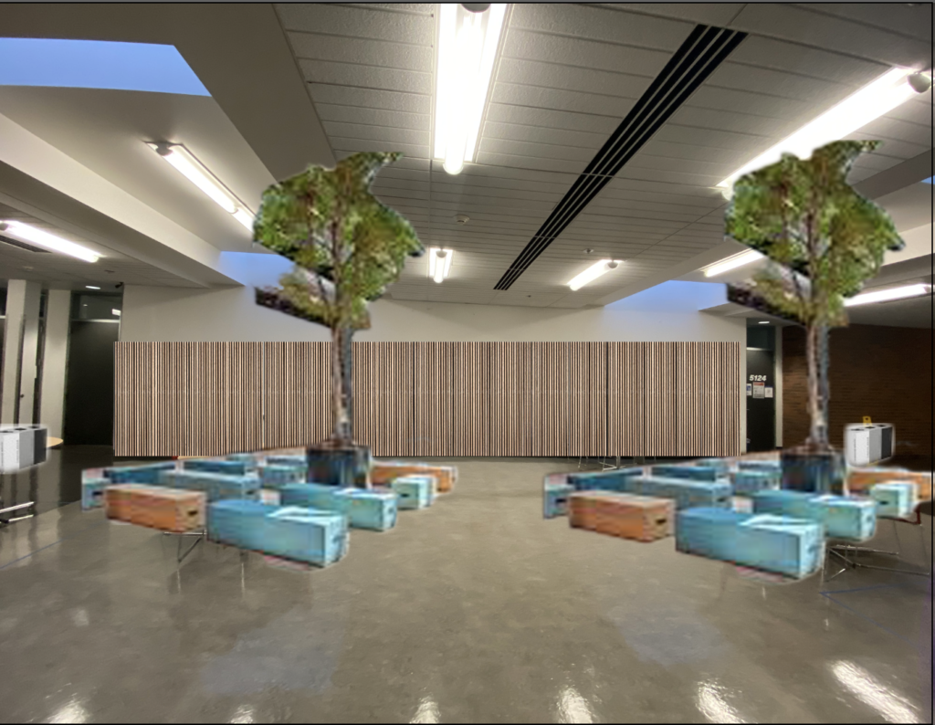
Is common knowledge that nature regulates our circadian rhythm. With that in mind, I choose trees as the element to incorporate into the mock-up. The element would bring a sense of outdoors- the sense we speeding the majority of the time indoors would be super beneficial to incorporate these elements into the creative academy not only would create a different experience, but would also to improve attention, lower stress, better mood, reduced the risk of psychiatric disorders, and even upticks in empathy and cooperation. The soft tone for the furniture color palette can potentially bring calmness and playfulness into the space. The element would be real trees, and bamboo panels- to brighten the soft tone,