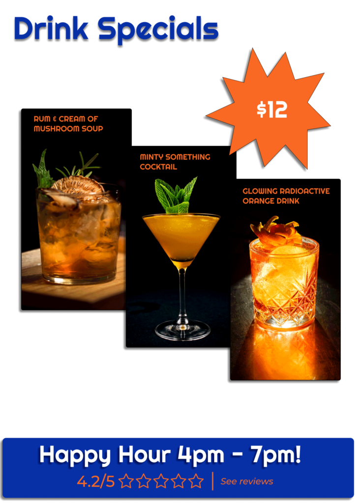
For our final AR project my group decided to feature Bars / Nightclubs in the Capitol Hill area. I decided to go with Linda’s Tavern, since it is probably the bar I am most familiar with in the neighborhood. We decided to have 3 panels total in our design. One Header panel that shows the name of the establishment, one that shows the latest Drink Specials, and one that shows a list of upcoming Events at the venue.
We used Figma to layout our designs for the panels, so that we could all work collaboratively to ensure that our panel designs were cohesive between all of our team members.
I used transparent PNGs, so that you could see through the panels. I thought this would help emphasize the look of the AR and give the panels that 3D pop!


Final Thoughts:
Overall I think it turned out really well! Our simple design that featured bold colors and large images really made the panels standout from the background, even though they were transparent, and were easy to read.
The hardest part was getting the transparent PNG files small enough to get them to meet the file size requirements of the free eyejack account. Also, the panel placement broke a little bit at the end of the video, but I don’t think that had anything to do with our design, just a hiccup in the app.
See a video that demos the AR experience here: https://youtu.be/4-A5ZDBdHRY
