


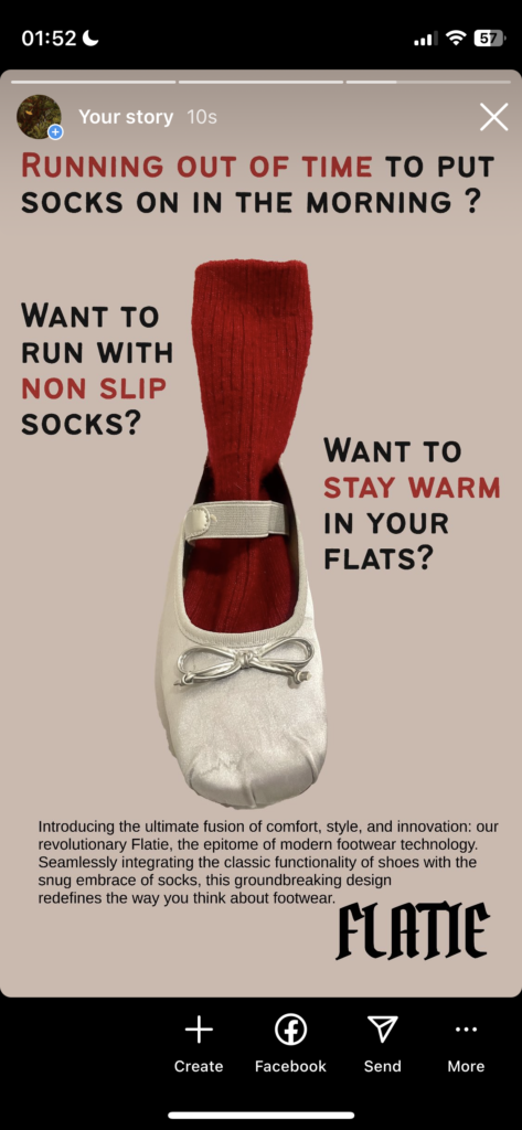
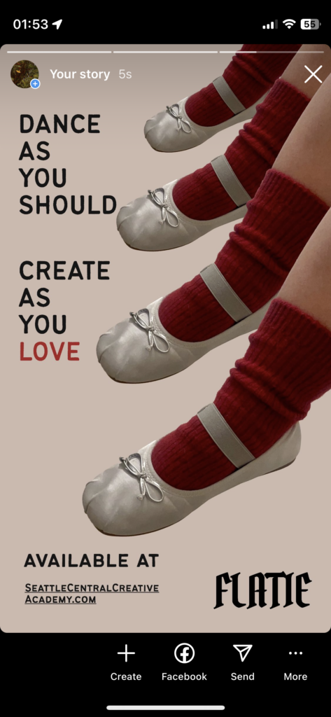
With the fashion trend bringing the ballet flats back this year, I want to modify a flat that comes with a build-in sock as a whole for people who have no time to put socks and shoes on separately in the rush morning, also to make the flat shoe warm for people who want to wear it in cold weather. I will name the new sock-flats “Flatie” which is a bootie shoe in flats.
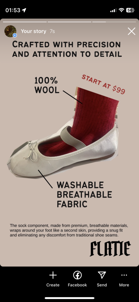
It’s simple steps to “modify” the flats with a connected sock. But considering people may want to wash the socks part often to keep it tidy, Flatie will use 100% wool for the sock material, because wool is a hygroscopic fibre, meaning it readily absorbs moisture – up to 35% of its own weight – keeping the skin surface drier and discouraging bacterial growth. Wool absorbs and locks way odours during wear. Also wool is a far better insulator and thermoregulator than cotton – in both hot and cold weather – with plenty of built-in breathability to boot when compared to cotton. And the flat material will be washable fabric. So hand wash or delicate mode for washing machine as much as you want to keep your Flatie clean.
I edit the photos I took in Photoshop to get rid of the background and made the IG stories.
For the final AR panel project. My group and I decide to make panels about Washington parks, we all feel so lucky to live in the area surrounded by so many awesome parks.
I live 3 minutes from Richmond Beach Saltwater Park in Shoreline, so it is my pick!
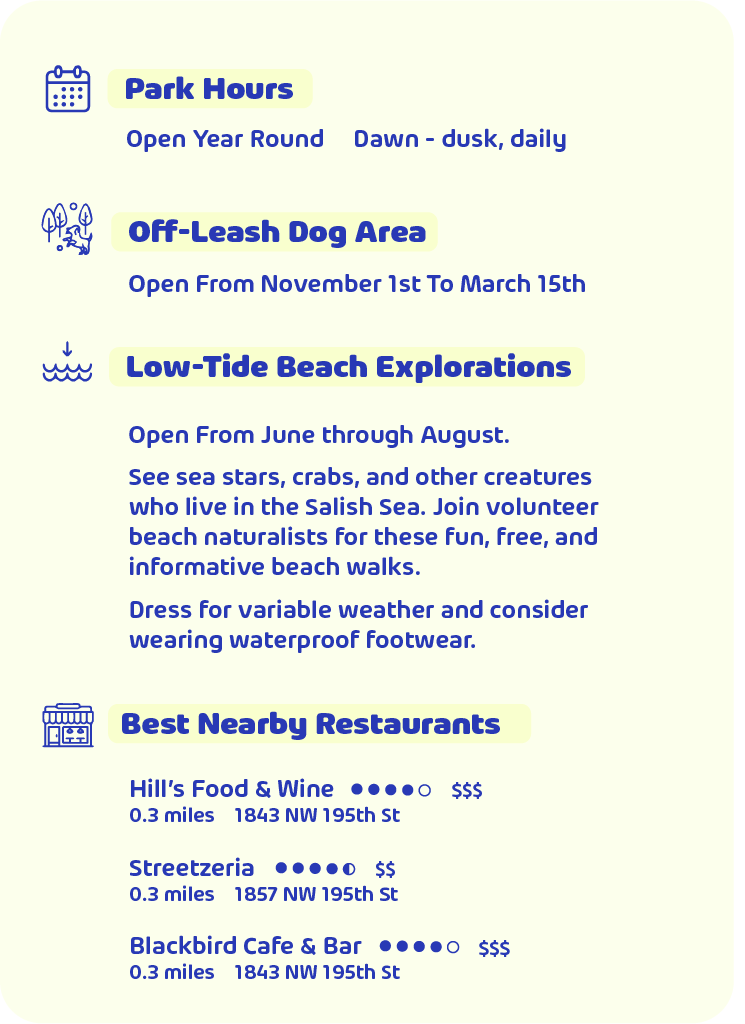
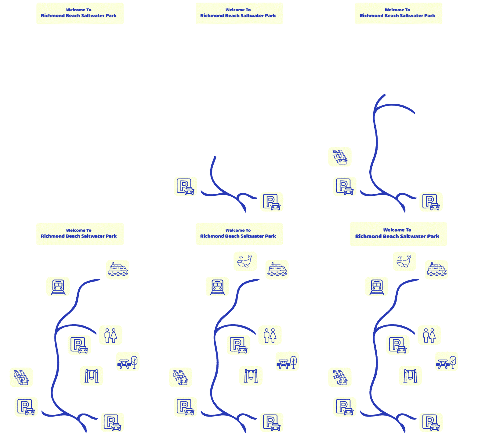
I decide to make three panels. One is about park hours and nearby best restaurants, because I care about food as much as nature! The second panel which is the center one, I want it to be the map of the park shows the amenities and locations. I also want to make it with transparent background, so when the viewer are trying to navigate the locations, there’s no panel background blocking their view. The last panel is about the animals you will see at Richmond Beach Park in different seasons.
To start the project, I start from finding icons to make the map and park information panel, I downloaded the icons that I think would work, and edited them in Illustrator. I chose the blue and light yellow color to match with the park/ocean view.

Here’s the final panel of park hours. I used the font Arlon which I think matches with the style of icons pretty well. I also lower the opacity of the panel background, so it will improve the contrast but not fully block the nature light.
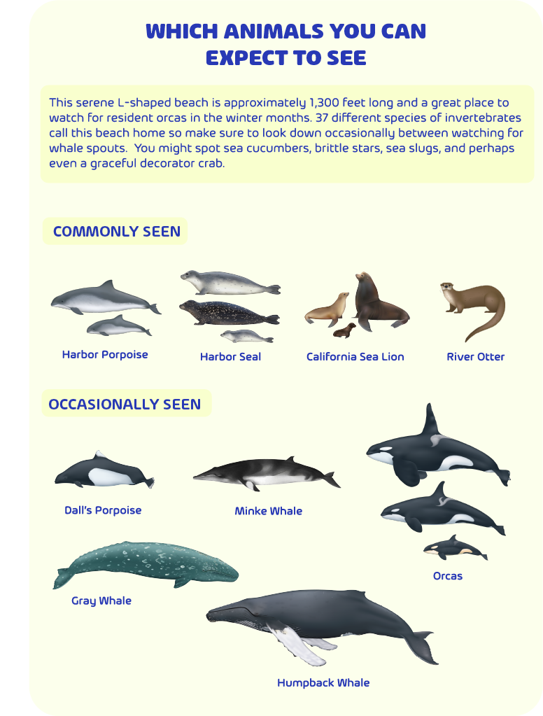
Then I used the animal illustrations on the thewhaletrail.org created by Uko Gorter to build the animal panel.
For the map, I want to make it into GIF, so I created the map trails in Procreate, and edit the reveal effects in After Effect.
Then I brought all the panels to EyeJack.

To view the AR Panel in Eyejack:

I had so much fun to make this project, I enjoyed to learn EyeJack and build panels in different softwares. I think EyeJack is not very hard to learn and AR project has so much possibilities for designers. I think I would do a better job if my final week is not so crazy/
This week, I reviewed an AR app – Night Sky.
Night Sky is a powerful AR personal planetarium. You can quickly identify stars, planets, constellations and satellites above by simply holding your iPhone.
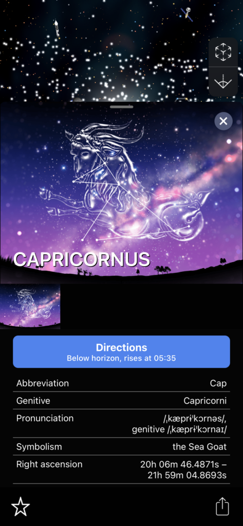
My favorite thing about it is the beautiful visual graphics they have. For people who are interested to the galaxy or astrology, they imagine the beauty of the outer space.
To use the AR feature, your have to zoom in and double click the object, the you interact with the sky object in your reality camera.
But it is hard to exit the AR interface sometimes.
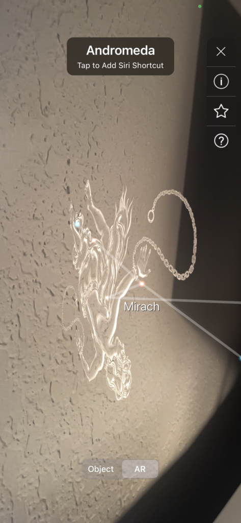
Another feature I like about the app is that you can set up notifications of the event you are interested. Like meteor showers at your location, etc.
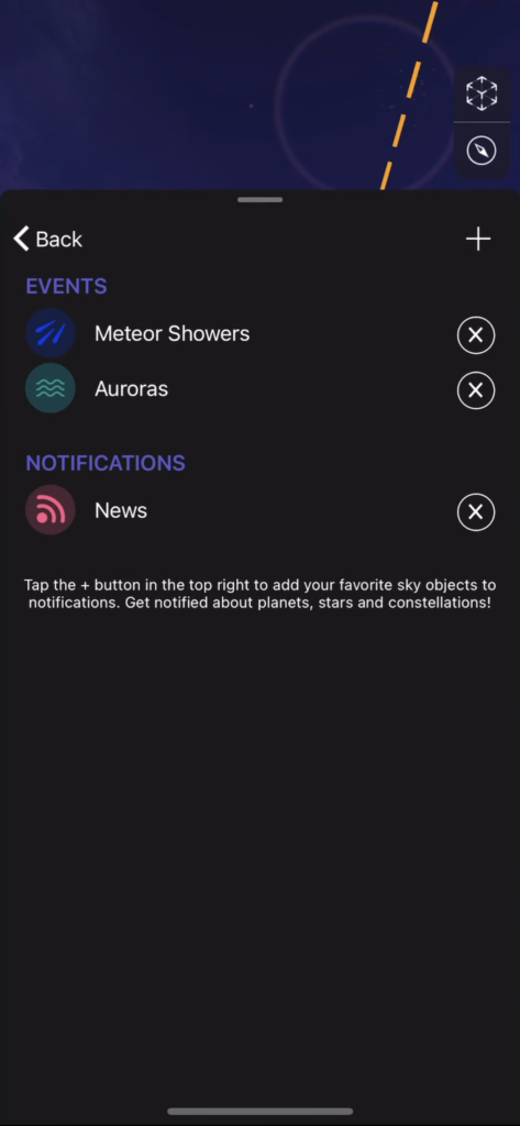
Overall, I found this app is super educational. It has a paid premium subscription to explore the deeper features, but without paying, there’s already lots of information for user to explore.
This week, I learned Adobe Aero. I used one of my previous illustrations, and changed the information on it to make it for a festival in Las Vegas as a social media promote video.
Here’s the final AR video:
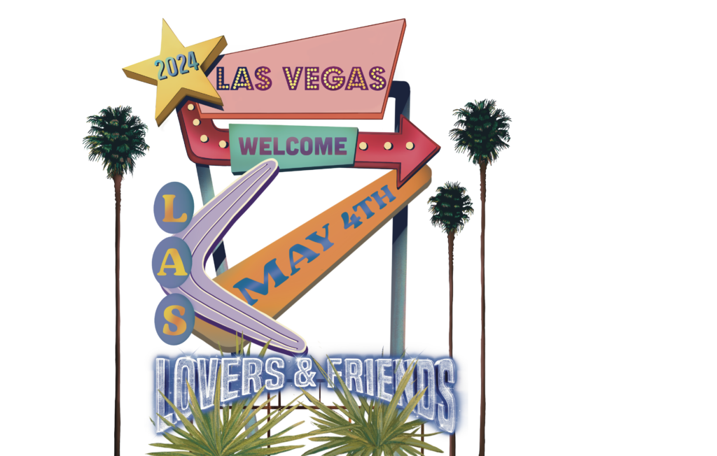
I separated my illustrations into layers to create more perspective scene. And I used the hummingbird asset that already on the AR to trigger the animation. I had so much fun to make this project, and see my 2D illustration transformed into AR.

This is a photo I randomly took of Schilling Hard Cider. As my main object, I want to create an environmental story about it. I want my audiences to feel the vibe, so I include the nature as a background, have the product sit on a deck by the water, and showing a little of the beach towels. Even I didn’t show any humans in the picture, I expect my audiences to image the scene is that a mid-summer, hot sunny day, friends hanging out on the deck by the lake, jumping into the water, laughing, chilling and drinking the cold Schilling hard cider, enjoying their life.
We’ve been introduced to EyeJack in the first class, it is so interesting and new to me that I can turn a 2D work into a video.
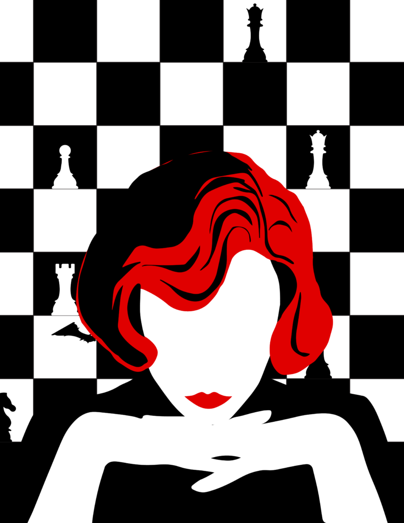
My idea is based on a social media prompt video I made couple of years ago for the TV series Queen’s Gambit, I want to create a poster for it without revealing the video, but draw people’s attention to it, which is scanning the QR code to watch it.
Here is the poster I did.
The video is too big to upload on here. But below is the QR code to view the video.
I had fun doing this project. I think one of the biggest reason is that EyeJack allows me to make extension of 2D work into a video, and showing them at the same time.

My favorite 5 Superbowl commercial ads are:
1.Budweiser
2.Reese’s Carmel Big Cup
3.Google Pixel 8
4.T-mobile Home Internet
5.Bud Light
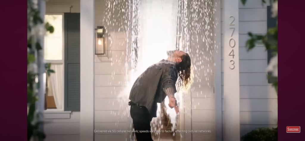
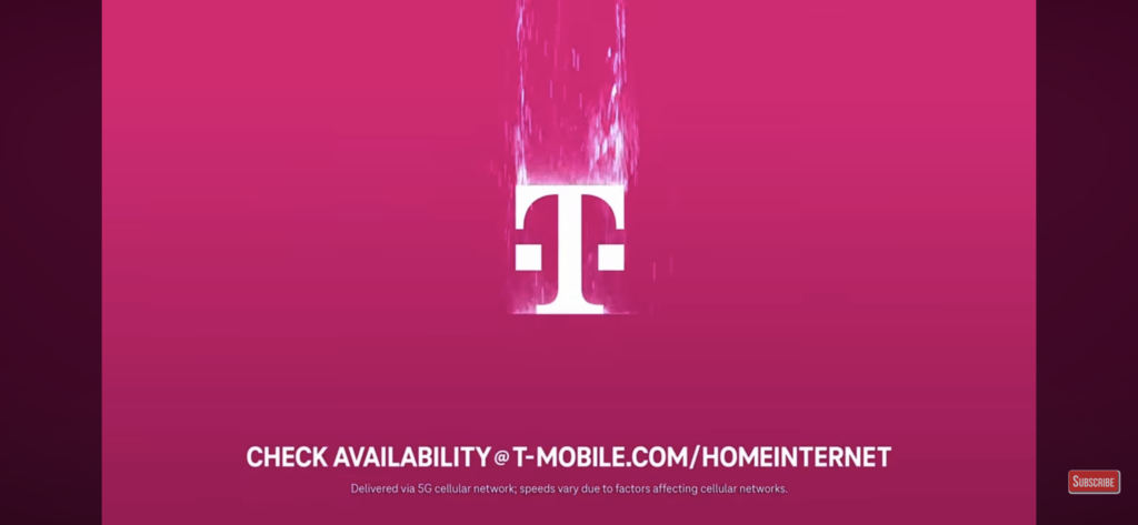
T-mobile Home Internet’s commercial “feeling” is themed about watching the Superbowl game with the neighbors at home with T-mobile internet/wifi. Jason Momoa, Zach Braff and Donald Faison dance and sing through the song “What A Feeling” by Irene Cara from the movie “Flashdance”, but they change the lyrics to about the internet service. At the end, Jennifer Beals pops up for an extra fun. I like the joyful funny dance and singing in the ad. And I think the last scene when Jason Momoa got pulled by the water extended to the logo animation is so lovely. I don’t really see the cons in this commercial, if I would add anything to it, I probably will add some on brand graphics throughout the video besides just at the end.
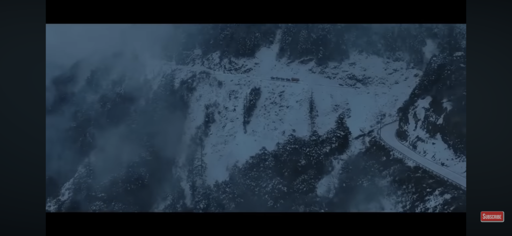
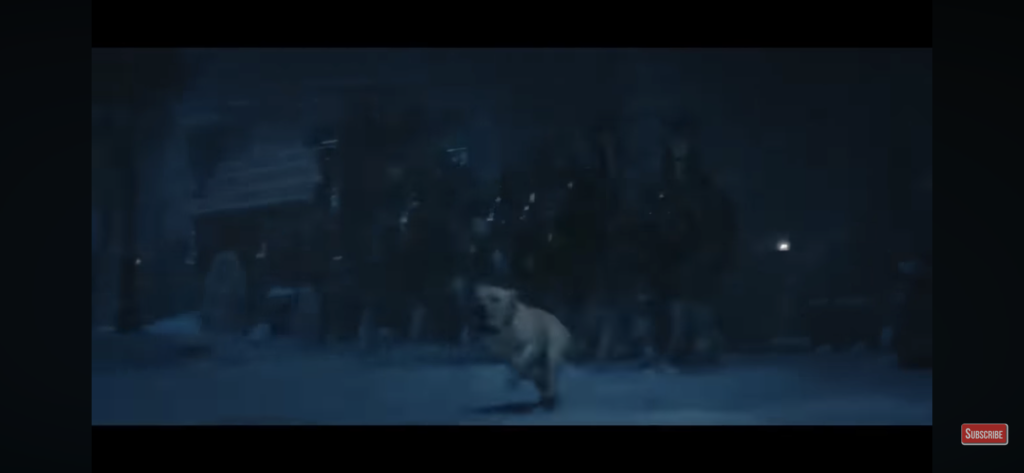
The Budweiser commercial “Old School Delivery” tells the story of how Clydesdale and dog helped to deliver the beers through a snowstorm to the rescue a small town that has lost power. The animal duo are an iconic part of our Super Bowl history. I touched by the scene of horses galloping and dog leading the way in the video. The Band’s classic song “The Weight” plays in the background also brings the nostalgic vibe to the ad. I think the brand uses the “old school” concept to deliver the key of how their product is made, to build the connection and trust with their audience, which is super successful. The prompt “Delivering since 1876” comes out on a perfect timing. If I would make any change on the ad, I probably will make the change of the type placement on this scene below, or make a little effects on the type. But mostly, I like this commercial the most of the year, I think it doesn’t need any change.

10 personal project ideas:
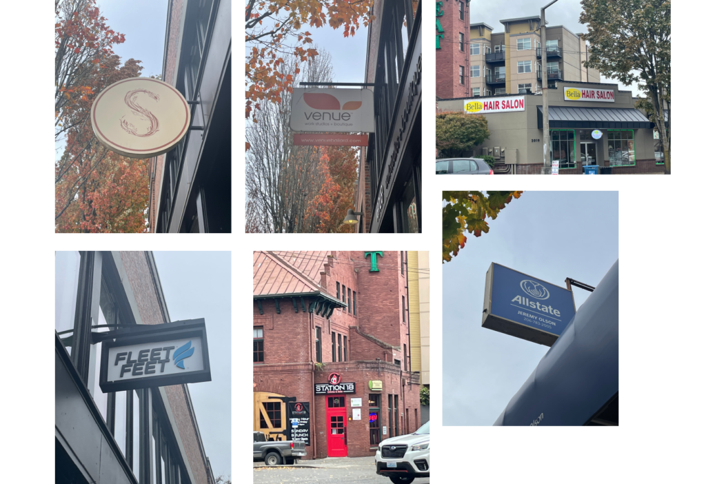
Among all the personal project ideas, I think I will choose to redesign the shop logos I see on the street. I used to live in the Ballard neighborhood in Seattle, there are many businesses that have a logo/sign could be redesigned to match with the business better. So I took some photos of the ones I want to start with.
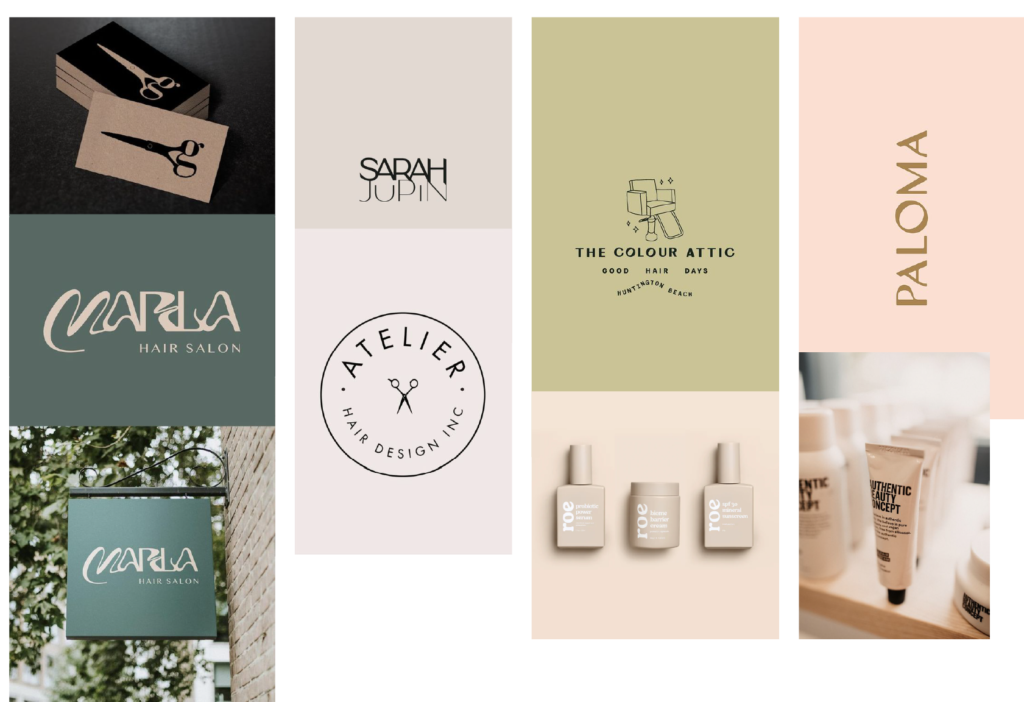
And here’s the mood board and some ideas I made for Bella Hair Salon.
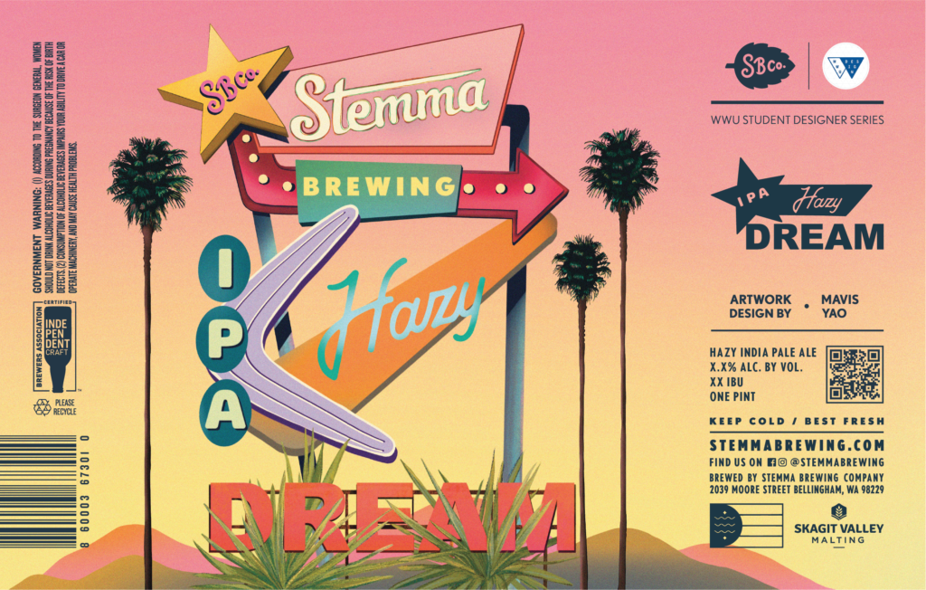
I did a label design for a design contest of a summer edition beer by a Bellingham local brewery Stemma in 2022. First I started with the research of what this “Hazy” IPA tastes like, the story of the brand, and their target audience. I went to the Stemma brewery shop in Bellingham, ordered the “Hazy” IPA, I noticed their shop is decorated with rain forest vibe green plants, after I talked to the owner of the shop, understood their main customers are local people between 21-70.
Then I move to design, I came up with the idea of the motel signs filling with the beer information. Imagine having an ice beer in the desert on a hot summer day. I did the illustration in procreate and move it to Indesign for the layout.
I didn’t end up winning the contest, but I am still pretty proud of the design I made. I hope one day I can design for other drinks and see them being produced out in the market.