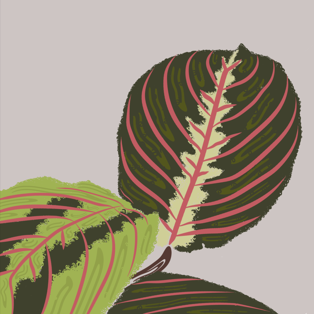
A recent experience where I had to make a pivot to accommodate circumstances that I did not predict was working on a project for Jason’s indesign class. The parameters of the project were to select a typeface that represented a plant or animal of my choice, seven letters or more, and create my interpretation of that plant or animal. I could only use those letters only to create my interpretation in illustrator.
I chose the Maranta plant, also referred to as a prayer plant. I have one and I enjoy the texture of the leaves, with pops of pink pinstripes within. It seemed pretty straight forward, use each letter of the plant name and create shapes using the blend mode or a variety of brushes etc. Once I opened illustrator and started messing around, I soon realized that I chose a very difficult subject to create in this format. I thought for sure that I’d be able to at least get the foundation of the plant set up with letters rotated or blended together, but I was having difficulty with the contours of the leaves. I wasn’t getting the amount of detail I was seeking and nothing was layering together the way I thought it would.
My pivot turned into completely scrapping what I had already messed around with and choosing a different type face that was smoother than the previous. I then created my interpretation using solely brushes in order to get the detail I was seeking. Luckily I was able to figure out that blending together a letter was able to give me somewhat of a solid line, and then I turned that into a brush to give a solid structure for the pink pinstripes. I then used the scatter brushes for the remainder of the project, which was highly time consuming. Overall it turned out with the level of detail I was seeking, but there are some adjustments I would like to make after looking at it for a while.
