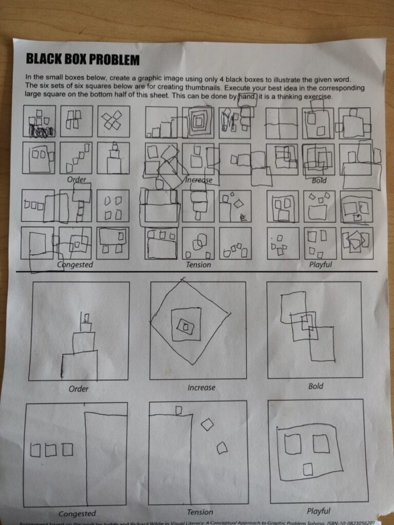
- Freedom to express. For this saying I would make a poster. The poster would have a person made out of words and a background with smaller words surrounding them. The words in the back would be more negative like, for example, self doubt and anxiety. And the words in the front would be more positive like expression, motivation, support. The words would also be separated by color so the poster would have a greater contrast. And the words in the back would be slightly out of focus to signify the parts viewers should focus on.
- Freedom to explore. For this phrase I would make a 3D landscape. In this 3d landscape there would be trees and grass scattered throughout to signify a nature scene. In the middle there would be a metal box with an open door and a small window. Inside this metal box there would be a single person on a computer. They are seen by the open door reaching for a light switch with a bag on there back. This represents a place where anyone is free to explore where they want.
- Freedom from expectation. For this I would make a poster with a person holding up a huge pile of random things. These things represent responsibility and and expectation. Over this pile of stuff is a crane lifting it up off of the person. This crane can represent freedom.
Category: Uncategorized
Blog #7

Blog #6

Blog #5
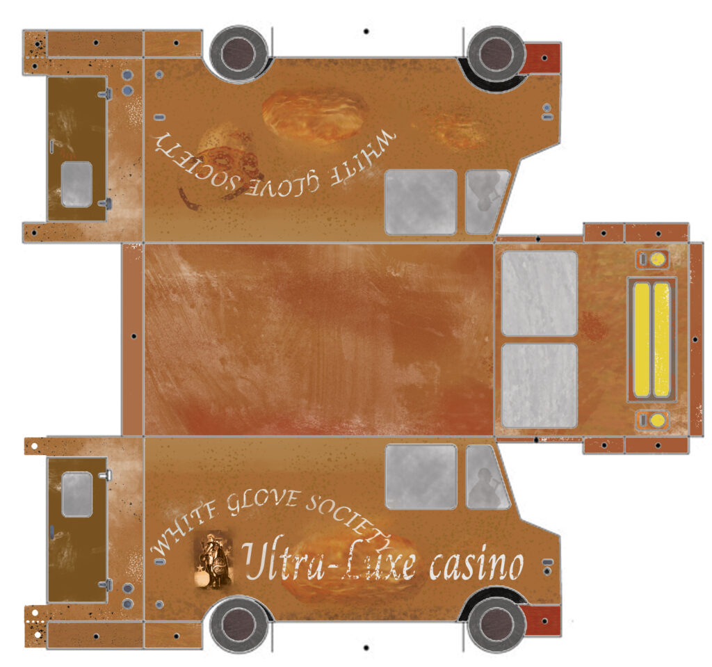
The restraint I choose for my food Truck is the Ultra-Luxe casino. This casino run by the white glove society serves all kinds of meat based foods there specialty being strange meat pies. These meat pies are well known for being some of the best in the Las Vages Strip and people from all over come to get them. I wish to design my food truck in a way that best represents there brand and spread the absolutely delicious food they make. To do this I started by using a very muted color scheme to highlight the color of meat and the color of the desert sands. This is to give the truck a grungy, real rough looking vibe. This caters to customers that want not just a good food item but also a fun experience. On the truck sides there are pictures of there meat pies and also the logo of the restaurant. This helps a lot with advertising what the truck sells and the tasty look of the food they sell. On this truck there is also the mask of the white glove society, this is a trademark of the Ultra-Luxe casino and it is immediately recognizable to anyone in Las Vages Strip. Along with this I made sure to have the windows a solid see through gray color so any thing inside does not take away from the food. The color scheme I used for this project was muted to have a greater connection to the dessert that this truck will be driving in and the place where it will be serving food. The words on the side of the truck are worn down because of this environment as well. This makes the truck look like its been around for a long time and that the people that cook there have a lot of experience.

Blog #4
Collaboration is something that I believe my team did well. The first week was fairly slow in relative progress as our team was getting to know each other and going over the rough concepts of what we wanted to do for our Blender project but after that we went at a fairly lightening pace. I would say our team did a good job at splitting up the work, they came up with the script and story board along with the printing and all the design aspects of the shoot while I did all the film and editing elements. This distribution of work helped all of us to not be super under pressure as no one person had to do all the work. One thing I especially liked about our team is how we decided to split up the work. Everyone got to do what they liked doing, the graphic designers got all the set design aspects and I got all the film and post production aspects. This was one of the reasons why I believe things went as smooth as they did. The timeline of our process was first of all to find a concept that could combine all three of the sticky notes. It was the second most time consuming part of this entire project. After we found a concept that worked, the graphic designers started story boarding it and getting all the design elements ready for the shoot. I had to figure out all the equipment we needed and the location of where we would be shooting. After we that we started the shooting process, this took about 6 hours in total. It was incredibly fun seeing everything come together at the end. And after the film shoot was done I started the post production aspect, with input and help from my teammates. This was definitely a project I enjoyed doing, it was fun working with new people and seeing what everyone could bring to the table. I am incredibly proud of all my teammates and what we made : )
Blog #3
If I had 25,000 dollars to donate to any Seattle none profit I would give it to the Bill and Melinda gates foundation. Now to some this might seem strange because these organizations already have billions of dollars but that is exactly why I think they are the best choice. Because they deal with vast amounts of money they know how to handle large sums of money. This is good because at scale, a lower percentage of the 25,000 dollars will go to waste. I also believe that the Bill and Melinda gates foundation gives to good causes and they have saved a lot of lives. It is great that the foundation works on giving vaccines and other healthcare to the poorest people in the world. This has saved millions of lives over the past few decades and they have a proven track record of being good at there goal. This type of work is dear to me because it is important to help out our fellow man and save as many lives as possible. And vaccines and anti mosquito measures tend to have the best return on investment on this front. There are not many other Seattle based none profits that operate at the scale that the Bill and Melinda gates foundation does. Certainly none that have the networks or connections they do. Because to make a real impact in saving human lives you need a lot of money. Not just a lot of money but a sustained large amount as development, testing and distribution are incredibly expensive. So me giving the Bill and Melinda gates foundation 25,000 dollars would overall give me the best bang for my buck. Even though some would say that donating to a smaller charity would be better because they are more strapped for cash I think that’s bad because a lot of that cash ends up getting wasted.
Blog #2
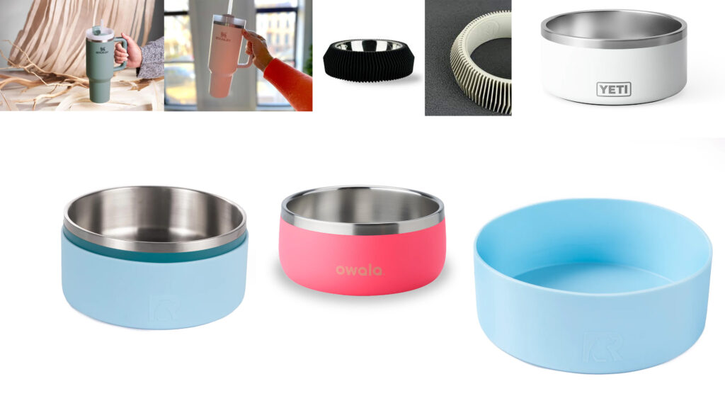
Mood Board for Stanley Dog bowl
My Stanley Cup Dog Bowl will be inspired by a flat minimalistic design, much like the other Stanley cups. This would be for it to blend into the other products that the company sells. I want the outside of the bowl to be covered in a soft padding, this is so that it can be transported with ease and it makes it less likely that anyone will be injured by the bowl. I also want it to have a sleek and minimalistic design. Also, and the side there could be grooves to allow for a better grip when picking up the bowl. The feel of the product should be futuristic and smooth.

Blog #1
Atlassian Design System
When visiting this website I immediately noticed that the sight was incredibly color directed. It had a gray background with pops of color showing what you could click on. This helped me and my user experience with the site. Especially when it came to color coding sections of the website that were similar to each other.
Another thing I liked about this website was the use of easy to understand logos in each area that could be looked at. The logos helped me navigate through the website and made the entire flow of the experience better.
The final thing I liked about this website was the upper bar that could be used to go to all the different sections of the website. This bar made it easy to switch between the Home Screen and getting started. It was also great to use to get back to where I was after I clicked a few logos and icons.
Mail Chimp
For this website I was immediately struck by the simplistic design of the site. It did not have a big header and seemed more focused on the site color and layout. I liked how the site directly told what was where with little to no bloat in the design.
The second thing I liked about this website was the fonts it used, they were simple and concise throughout. This helped me view the site as neat and clean. It also contrasted well with the simplistic layout of the site and its colors.
The third thing I liked was the use of font size to show what was important and to break up the site into different parts. This helped me see the website the way the ux designers wanted me too and it allowed my user experience to be better.
The Guardian Digital Design Style Guide
The first thing that stood out to me about this site was the use of bright colors. These bright colors immediately brought my attention to what the site was telling me about. This is good because the site is about the design of the newspaper The Guardian. The bright colors continue as you scroll down on the site showing how things are designed out in a compressible manner.
The second thing I liked was the use of the scroll wheel, instead of clicking on things you scroll down and can see the entire design process from start to finish. This layout was also good because it allowed me to not miss anything the site wanted to show me.
The final thing I liked was the use of a drop down menu that you could use to navigate to different section of the scroll down menu. This helped me go back to parts of the website I liked and also it helped split up the site into multiple different sections.
Blog #10
