Categories
Uncategorized

Final Blog for Fall Q

Guest Speaker :: Mara Stokke, Experiential Designer
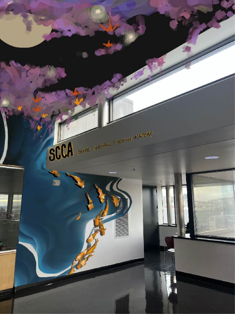
I chose the front left nook when you first enter the fifth floor,

no shade but I remember my first day and walking into the minimal modern floor making me sad, it’s a floor full of creatives yet few of their influences were present upon greeting.

the medium I used is procreate and within said program, two brush settings, the round one and the flat paint brush. I originally wanted to make a very comforting forest scape. Cottage core has been a term popular over the last couple years and I was intending that but then hated it as my ideas started being vomited out. And while mulling over my bad ideas the demon slayer opening started playing while I was illustrating and I thought of the wisteria scenes.

so I chose to lean into the more whimsical fantasy nature of it and create a more finished scenery piece. The wall would have the pond aspect be flat with the fish raised from it to create visual texture. And post installation, the next graduation class would have each member fold a paper crane to be strung together and suspended with the wisteria (which is a 3D suspended element of)
Categories
Uncategorized

AR: Project 4

Group topic :: Seattle Parks

Members :: Shane, Olivia (me), AJ, Preston

We settled into our topic the day is was introduced,

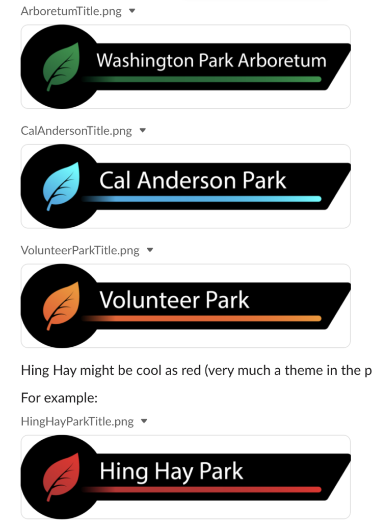
named our channel parks-n-wrecked and it was relatively smooth sailing from that point. I suggested our color palette– black and white and each of us chooses an accent color, Shane suggested the items we have on the panels (i.e amenities, phone numbers, points of interest) and provided some simple icons to have our panels family together beyond just the topic.

I chose Hing Hay Park simply out of familiarity,

I can’t define myself as a park person, or someone particularly nature savvy, so Hing Hay was one of the few I find myself walking through on a regular basis. I’ve always been fond of the art implemented throughout it, and also how it serves as the heart for so many asian festivals and celebrations in Seattle.

It’s proximity to great food and cafes adds brownie points too.

Shane was the first one to build out his in eye jack, so I modeled the layout after his. It followed the basic tri-fold from the whale video and our added titles on the top.

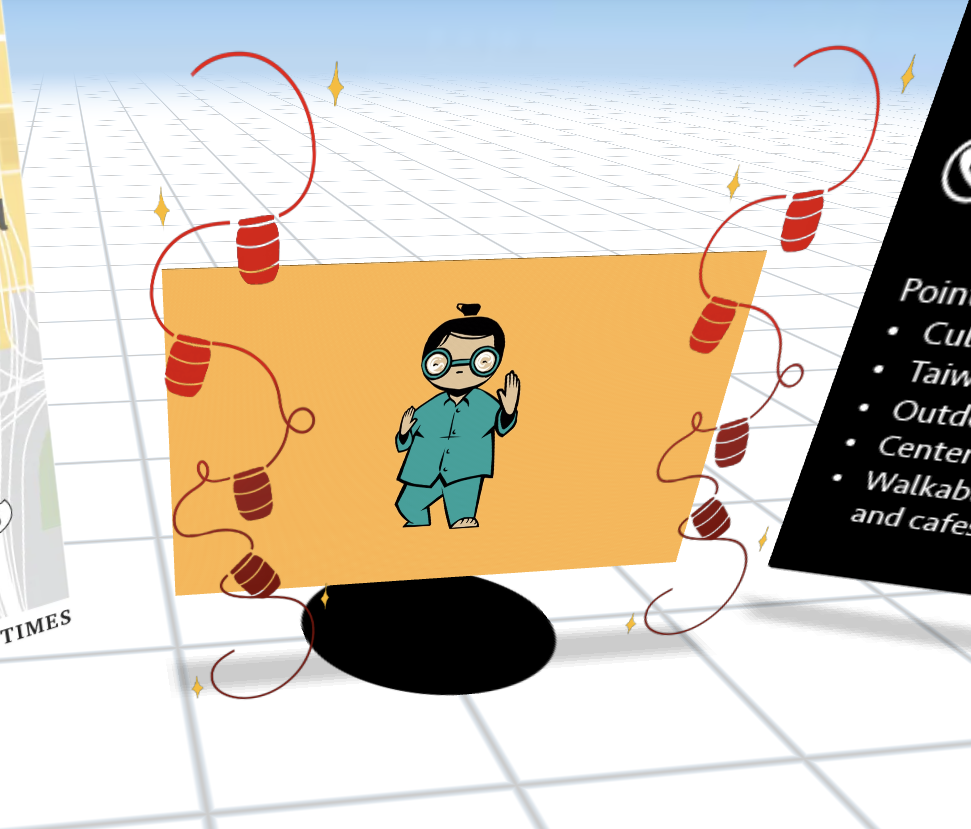
I used a mixture of gif and png’s to construct mine, I sourced my gif right from googles images– elders doing tai chi, qi gong, or just walks in the area when it’s sunny is common so I wanted to have a friendly very animated looking gif for that.

I added red lantern details to frame the gif within the panels, mainly for funsies since I already had them ready on procreate, all I had to do was re color and give it a transparent background, the red of the lanterns was used to reinforce my chosen accent color.

Categories
Uncategorized

AR: Project 2

Overall the process for creation wasn’t too rough,

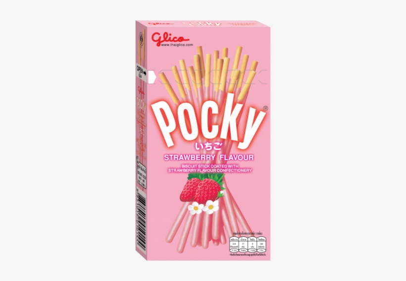
I chose pocky/pepero day due to my ongoing obsession with kdramas and manhwas, it’s a cute capitalist holiday where you buy and share pocky on 11/11. (11/11 due to how they look like the little biscuits)

it’s seen as kind of a young love holiday as well, hence the use of flowers and brighter colors 🙂

with the images below, I had the specific problem of trying to source all of them at once, without checking for the file type… all of these were jpegs 😀

ahahahahahahaha jpeg
just about cried when I realized it
very annoying indeed

One of the issues that came up during tutorial was people not being able to figure out how to get their folders to disappear in the beginning of the preview. The solution was as simple as hiding the folder from view in the layers panel before interacting with it.

I forgot completely about it

and proceeded to approach the situation with a new type of frustration and eventual doneness

I did in fact figure it out later.